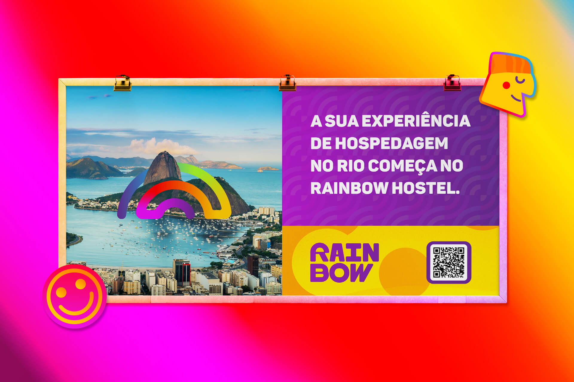
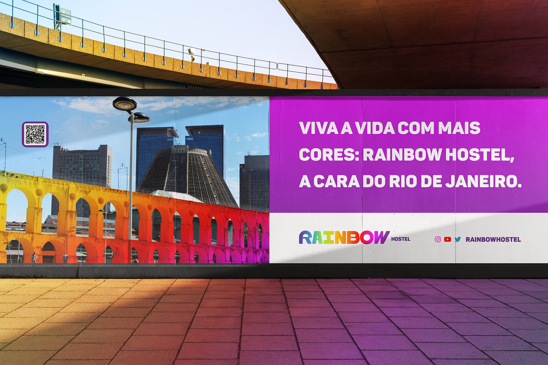
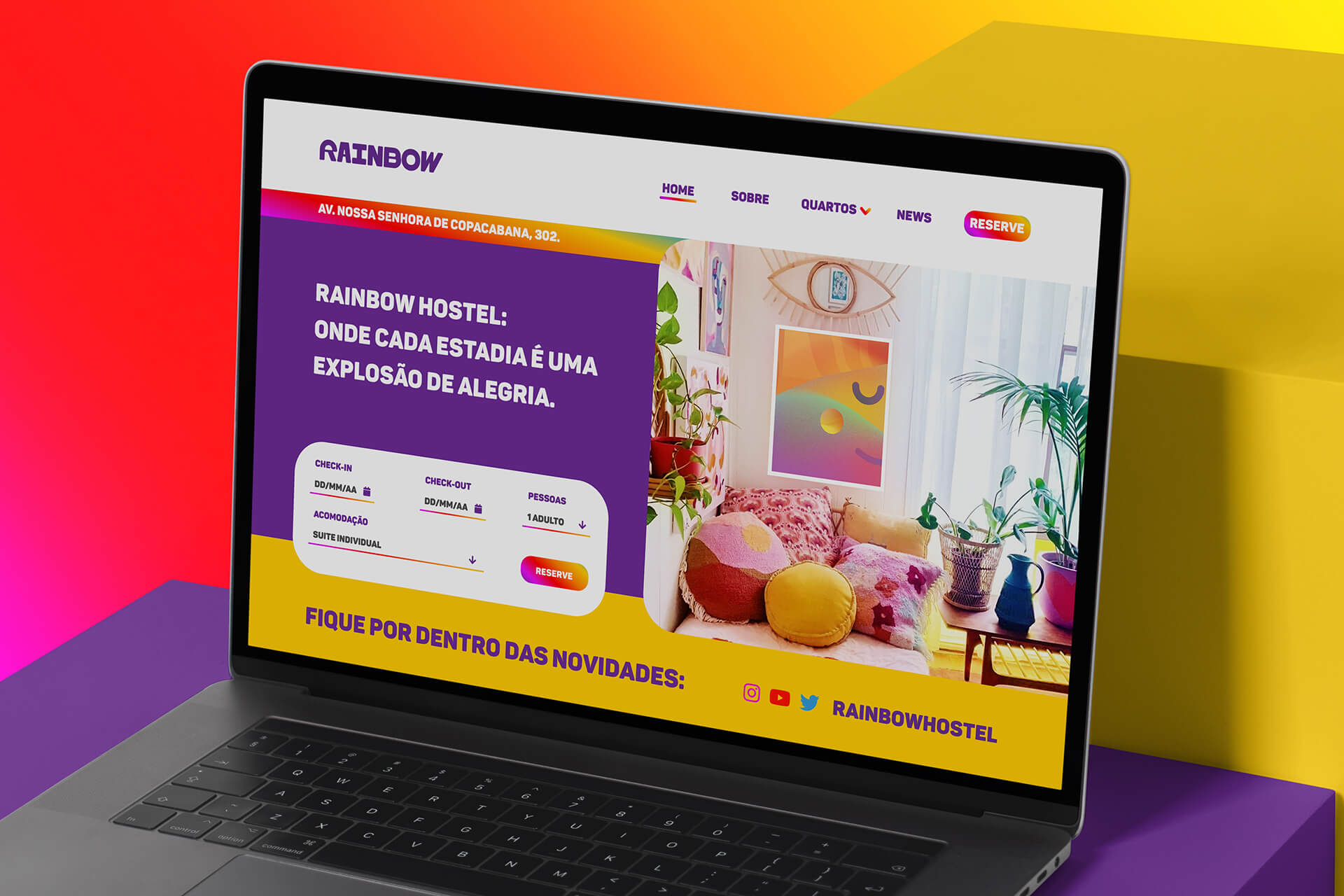
Rainbow is a new Hostel located in Copacabana, Rio de Janeiro. Our main goal was to capture the essence of Rainbow and convey it in a visually striking way. Through a strategic and careful approach, we sought to create a unique identity that would reflect the joy, quality of life and improvements that the brand wants to bring to people.
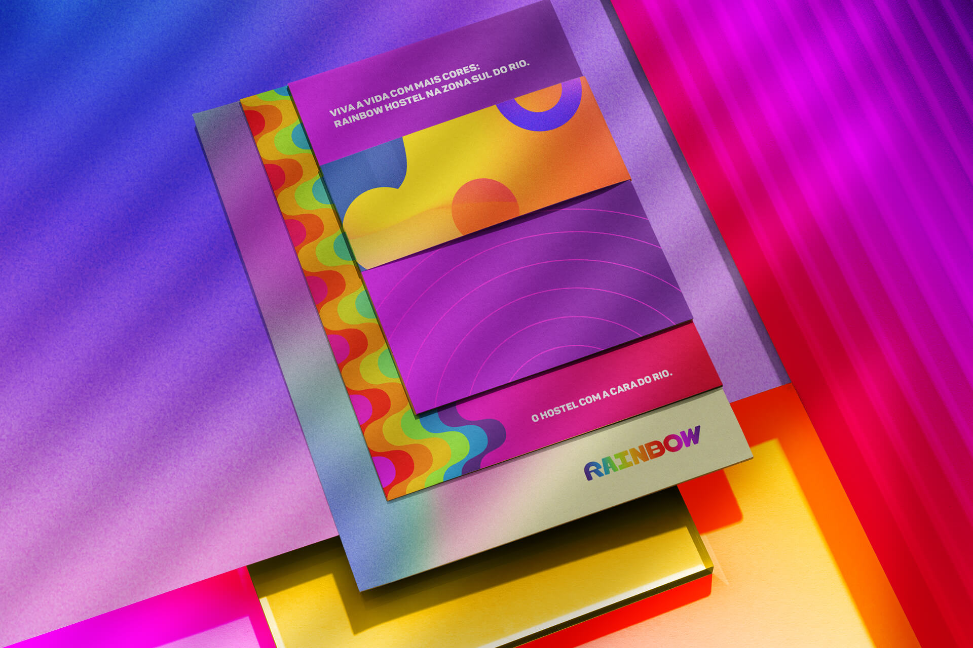
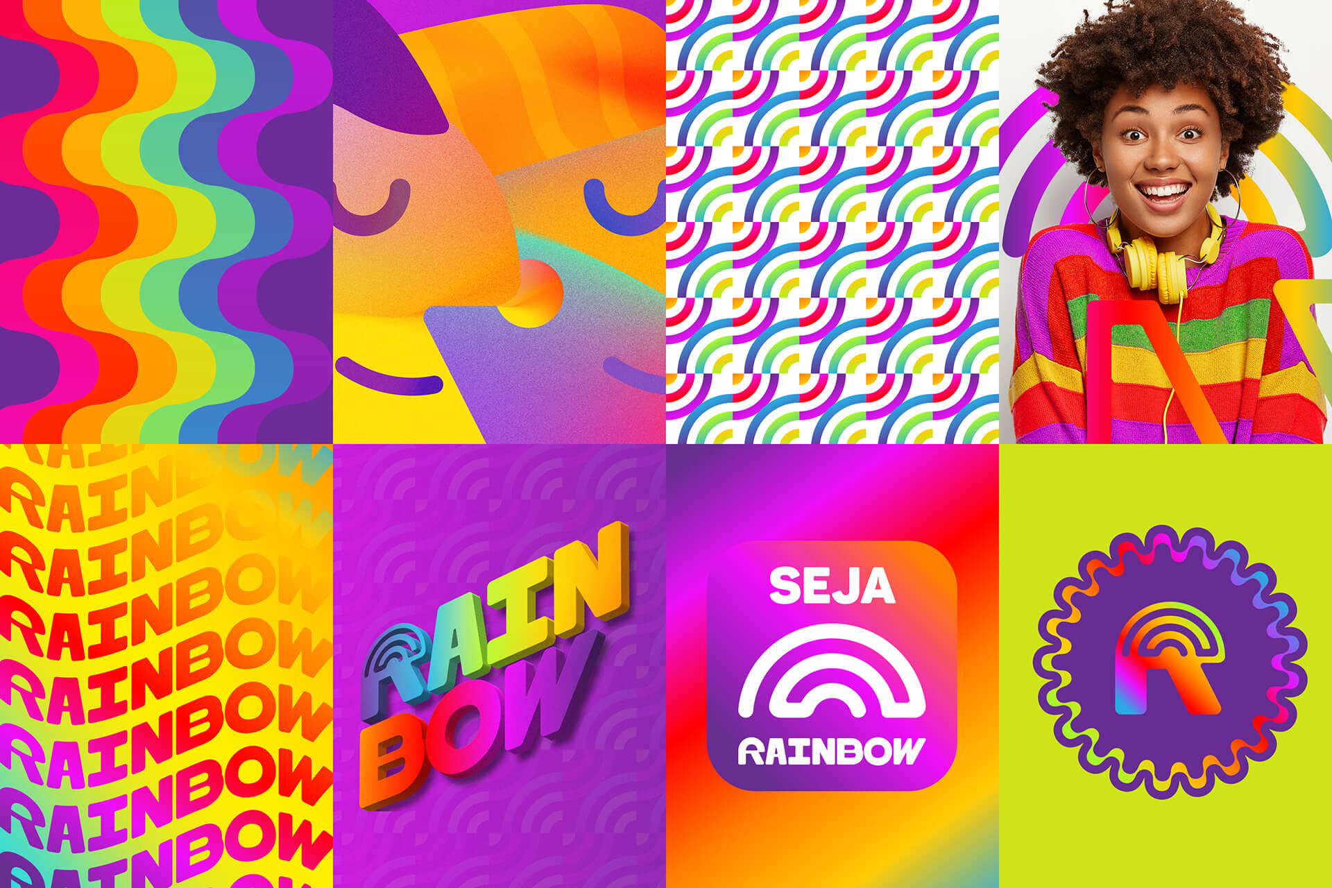
Considering the diversity of segments that Rainbow will cover in the future, we focused our efforts on creating a versatile visual identity, capable of adapting to different contexts and sectors, without losing its vibrant and popular essence.Our inspirations were based on the colors of the rainbow, the symbol of the brand, and on the characteristics that the rainbow evokes – joy, harmony, celebration and good things.
We seek to convey these elements through a vibrant color palette and creative combinations, ensuring that Rainbow’s visual identity is striking and memorable. Throughout the project, we explored several possibilities, testing concepts and refining every detail to create a consistent visual identity that is coherent with the brand’s values.
We value originality, craftsmanship and attention to detail in each element created. We are confident that the Rainbow Visual Identity will successfully convey the brand’s values and objectives, becoming a recognized and admired symbol throughout the ‘Cidade Maravilhosa’ (Rio de Janeiro)
The rainbow has a strong symbolism associated with the union of the different facets of life, the natural diversity of the world and the beauty of creation. The rainbow can also symbolize the promise of better days after a storm, representing hope and renewal. The rainbow also symbolizes transformation and evolution; the path that people take to transform themselves into more complete and evolved beings, going through different stages of learning, overcoming and growing. The brand Rainbow represents this journey, offering products and services that help people develop in different areas, such as leisure, food, fashion, among others.
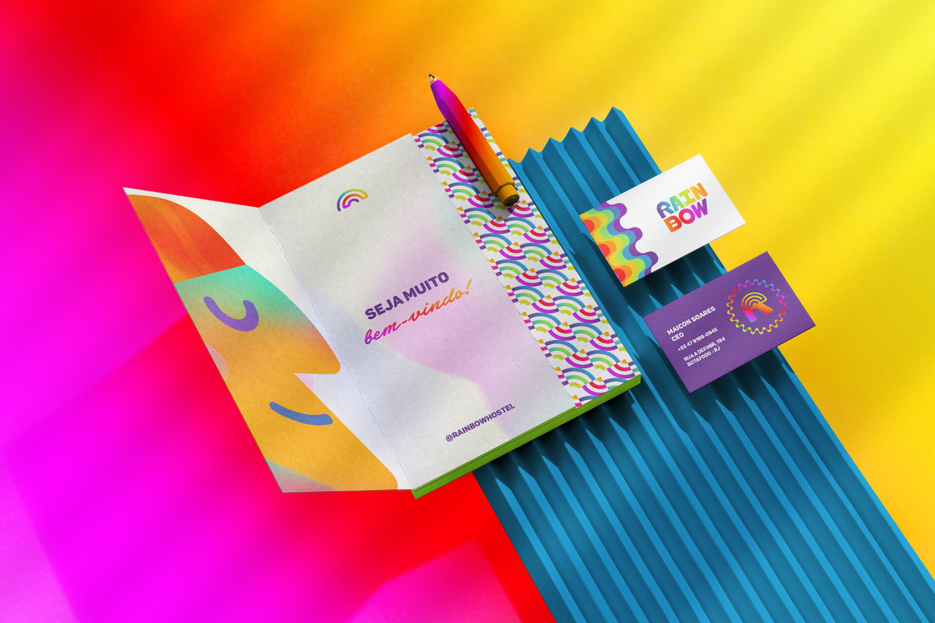
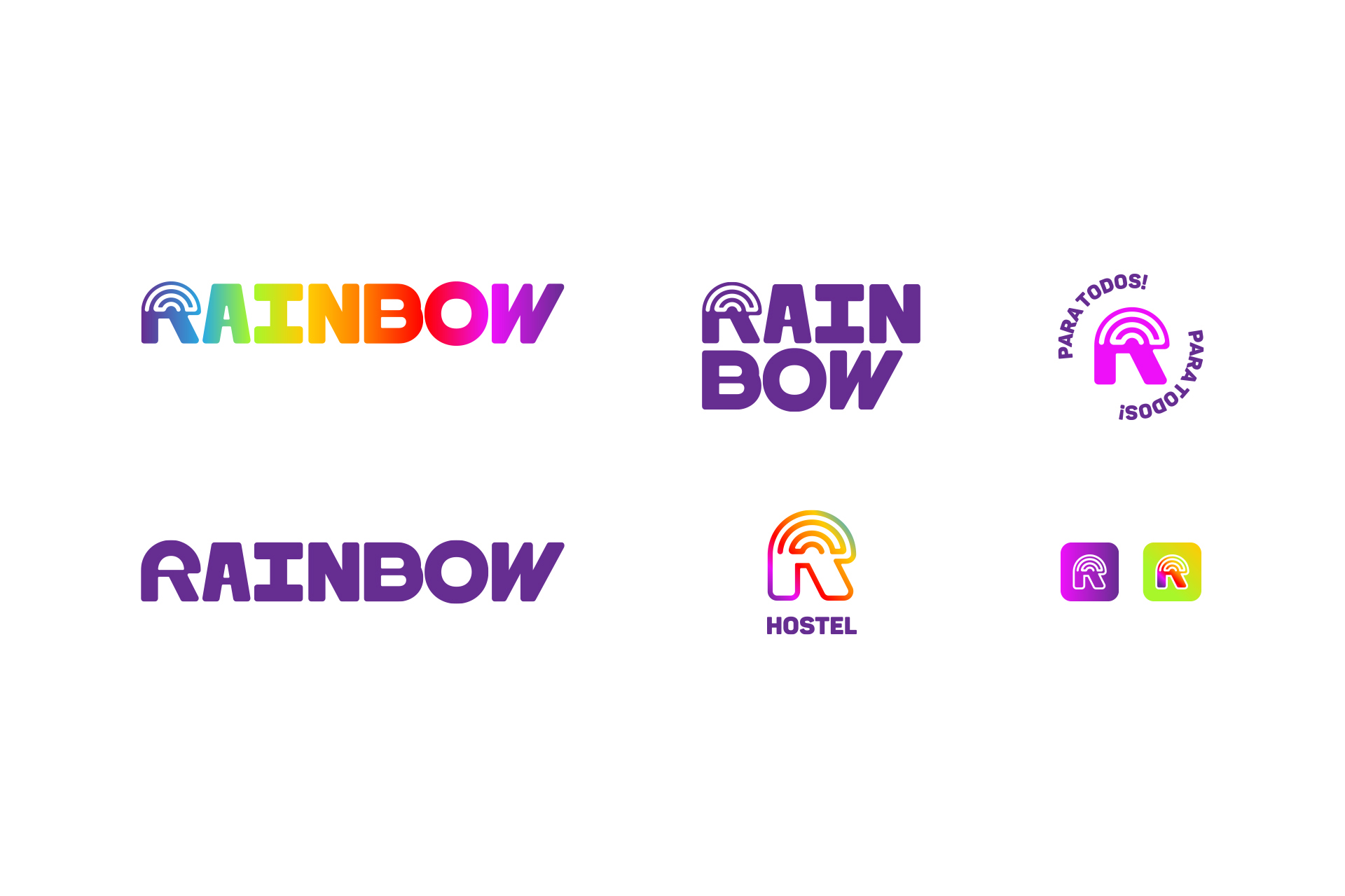
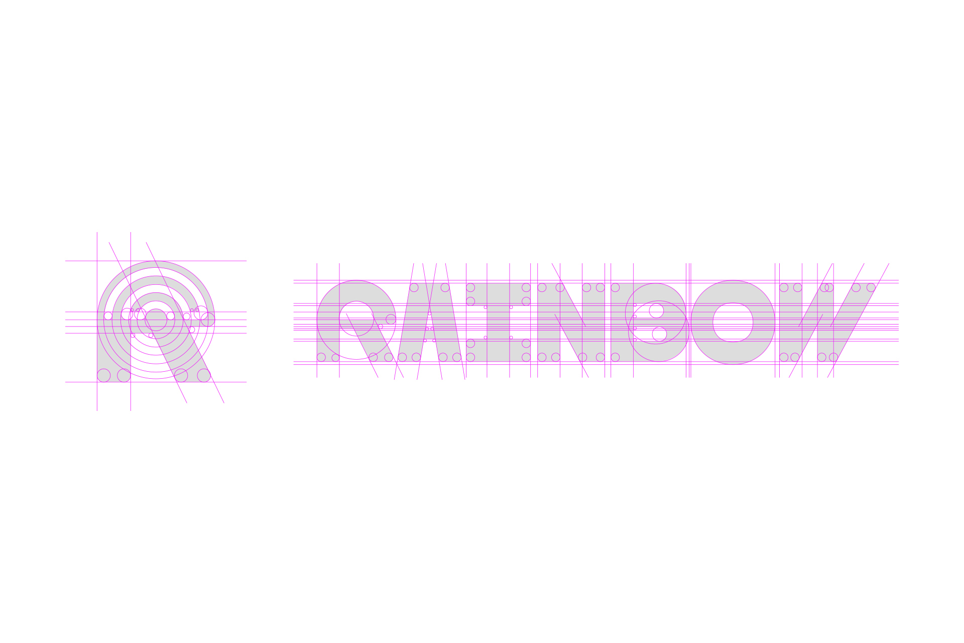
We defined a symbol for the Rainbow that presents the initial R + the design of a stylized rainbow. The idea is to convey that the brand is always looking for innovation and creativity, in addition to representing its essence and visual identity in a clear and objective way.
The logo versions designed for Rainbow feature variations in shapes and positions. We can use the ‘R’ with the silhouette of our rainbow or in the natural version of the letter, depending on the application.
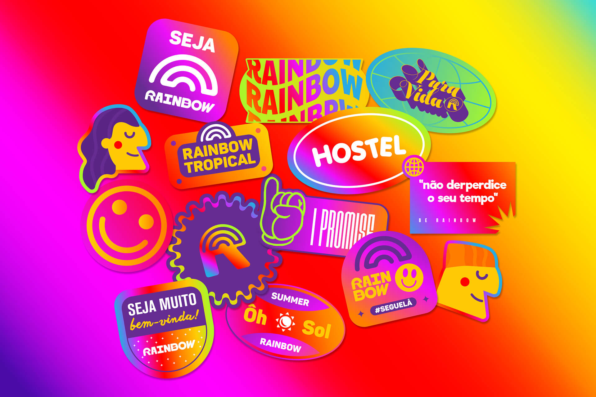
We use the shape of the letter ‘R’ to create mascots that will bring even more personality to Rainbow’s visual identity. The idea is to become increasingly closer to the public, demonstrating the natural fun and relaxation of the brand and its employees.
The choice of the seven colors of the rainbow as the Rainbow brand’s institutional colors is a wise choice, in line with the brand’s concept. Each of the seven colors has a meaning and represents an emotion, which makes Rainbow’s color palette rich and diverse.
Red represents passion and energy, orange joy and creativity, yellow happiness and positivity, green nature and hope, blue tranquility and serenity, purple intuition and wisdom, and pink is spirituality and magic.
These seven colors together form a harmonic, cheerful and vibrant set, which refers to the idea of celebration, party, fun and self-esteem – characteristics that are fundamental to the identity of the Rainbow brand.

CREDIT
- Agency/Creative: 268 Estúdio Design
- Article Title: Rainbow Hostel Vibrant Visual Identity
- Organisation/Entity: Agency
- Project Type: Identity
- Project Status: Published
- Agency/Creative Country: Brazil
- Agency/Creative City: Rio de Janeiro
- Market Region: South America
- Project Deliverables: Brand Design, Brand Identity, Branding
- Industry: Hospitality
- Keywords: rainbow, rainbow hostel, hostel, 268 estudio, brand, visual identity, rio de janeiro
-
Credits:
Graphic Designer: 268 Estúdio Design


