


Ragged Edge unveils a new name and identity for Tilt, a financial technology company expanding access to cash and credit for the working rather than the wealthy.
Good for it
The US credit system leaves over 100 million hard-working Americans without reliable access to fair credit, keeping many stuck in survival mode. Tilt (previously Empower) aims to change that with its innovative underwriting built on over 250 non-traditional signals of financial health.
With their recent business acquisitions, a growing suite of credit and cash products and a need for a new name and identity, the rebrand aimed to reframe Tilt’s role, from a lifeline in crisis to a long-term financial partner.
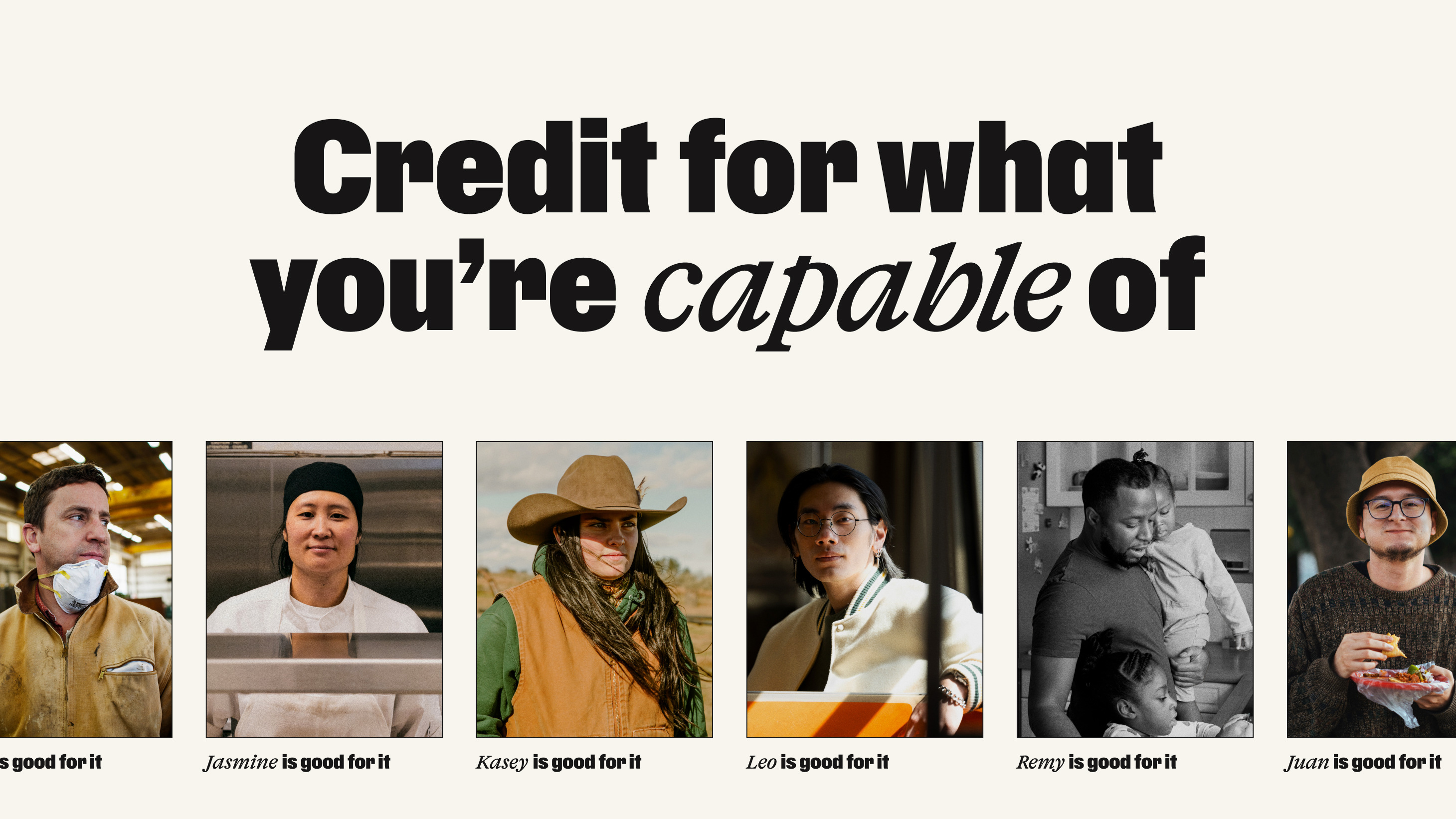
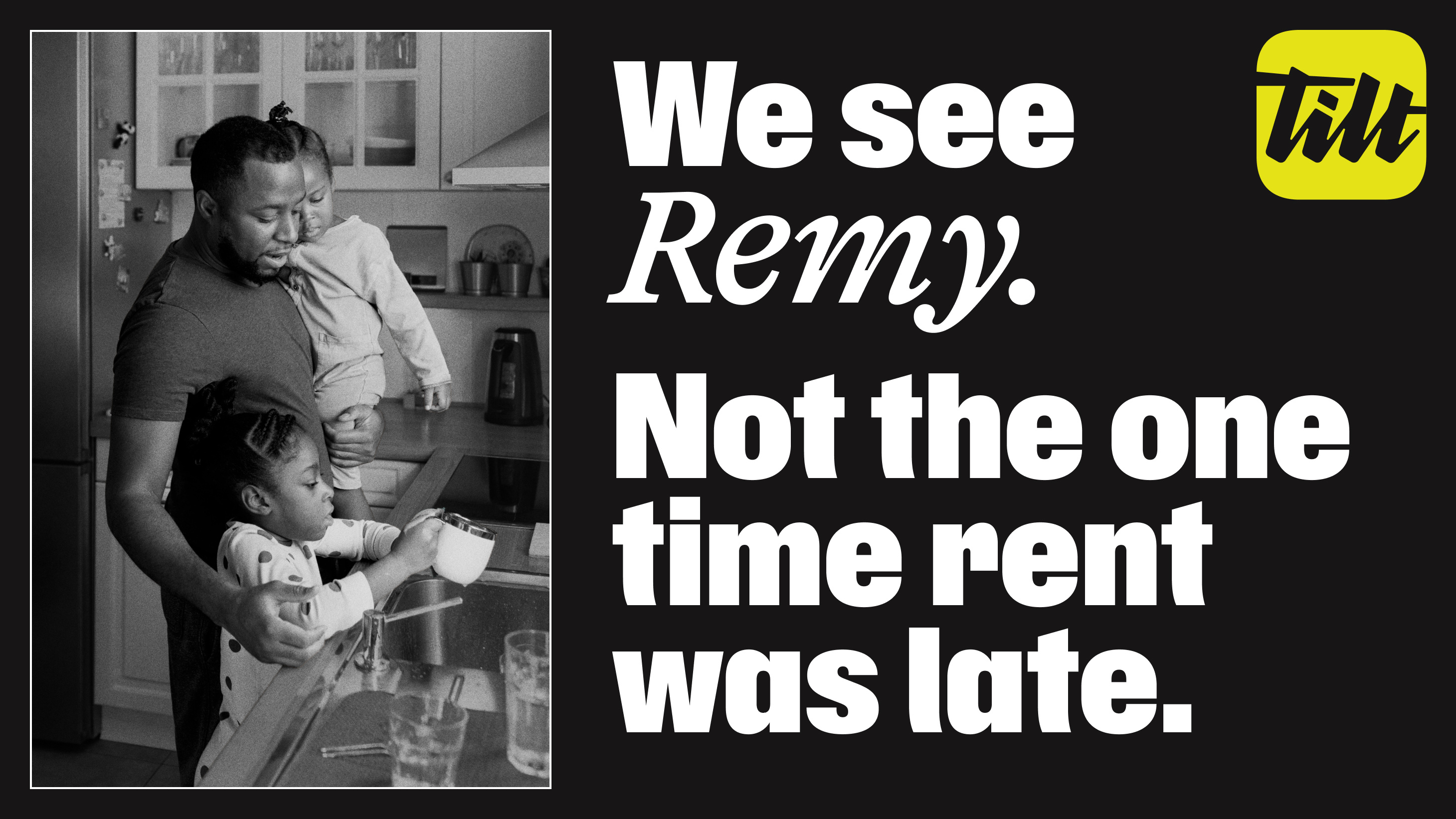
Instead of judging people for what’s come before, Tilt credits them for what they’re capable of. So Ragged Edge and Tilt created a brand built on faith in people.
“Traditional lending sees people through the lens of risk. We look for potential,” says Stephanie Lin, CMO at Tilt. “The new Tilt brand reflects the intelligence of our underwriting and our conviction that millions more people deserve a fair shot at credit and cash. We’re building a new credit system that sees people fully and helps them rise.”
Levelling the playing field
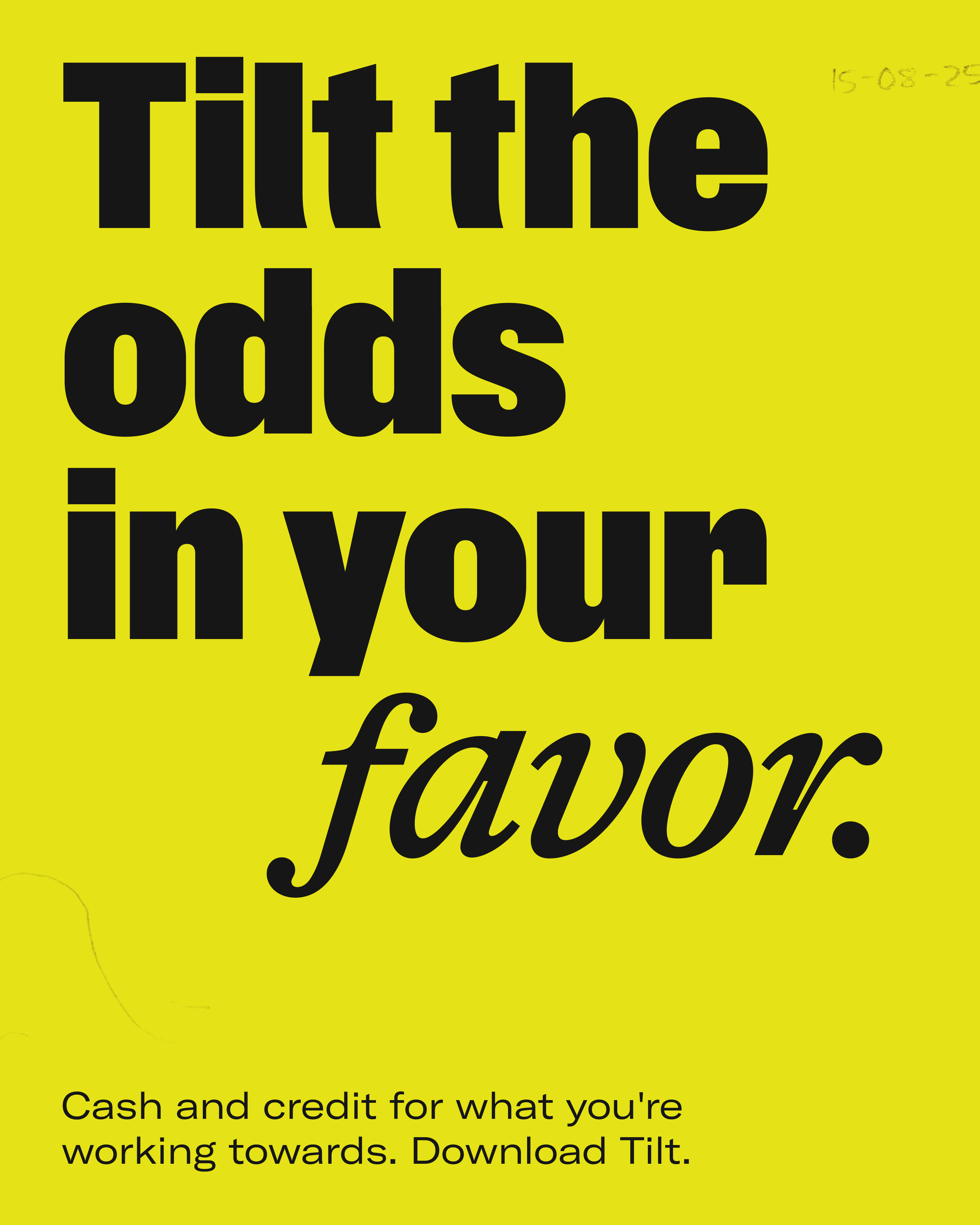
The need for a new name presented an opportunity to double-down on the mission: tilting the odds back in favour of the people often underestimated by traditional lenders: those earning steadily and managing expenses responsibly, but whose credit history is recovering, limited, or still in the making.
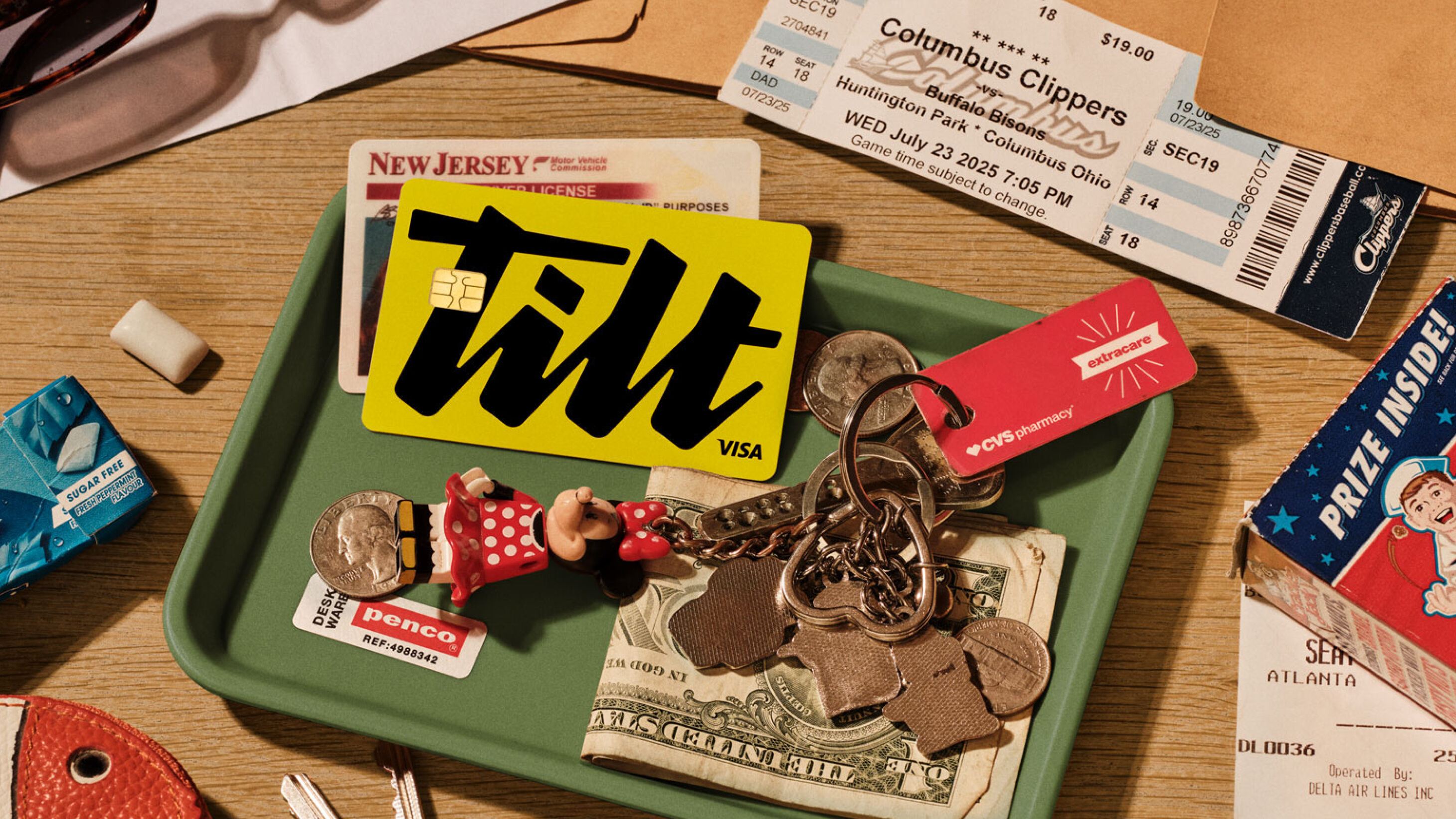
A signature-style logo functions as a commitment to the people Tilt serves. A bold black and white identity emphasises Tilt’s straightforward approach, accented with chartreuse to inject the brand with optimism.
The voice is soulful, intelligent and unwavering, punctuated with bold statements of belief which feel refreshing in this space.
Fia Townshend, Copy Director at Ragged Edge adds, “So many brands try to act like your friend. But Tilt customers don’t need another friend. They need help kicking down doors. So the Tilt voice has an urgent and unwavering belief that emboldens people to keep pushing.”
A customised headline script, featuring a literal tilt, gives the typography a sense of urgency.
Collaborating with illustrator Pearl Chuaynarong, Tilt’s painterly illustrations embrace imperfection with brush-stroke textures, celebrating the messiness of human endeavor.
“Designing a financial brand to feel this alive meant finding the right balance,” says Jessica Bong-Woon, Associate Creative Director at Ragged Edge. “We wanted Tilt to welcome newcomers while still resonating with those who’ve felt let down by the system. That tension between grit and warmth became central to the brand.”
Proof in progress
Since launch, the rebrand has already delivered traction. Meta campaigns achieved a 70% higher click-through rate, attributed to the distinctiveness of the new identity. Customer acquisition has continued with zero downtime during the transition, and the Tilt team is now aligned under a shared mission.
“This wasn’t about creating another friendly fintech,” adds Matt Smith, Executive Creative Director at Ragged Edge. “Tilt needed a brand with teeth. One that could challenge outdated systems and credit people for their potential. That clarity of purpose is what makes this rebrand transformative.”
The Tilt rebrand marks more than a name change: it signals an intent to redefine a legacy category. Tilt is set to accelerate access and make cash and credit more inclusive and fair, backing working people, whatever they’re working towards.

CREDIT
- Agency/Creative: Ragged Edge
- Article Title: Ragged Edge Rebrands Tilt With an Identity That Credits Your Potential, Not Your Past
- Organisation/Entity: Agency
- Project Type: Identity
- Project Status: Published
- Agency/Creative Country: United Kingdom
- Agency/Creative City: London
- Market Region: Global
- Project Deliverables: Brand Creation, Brand Design, Brand Identity, Brand Naming, Brand Redesign, Brand Strategy, Brand Tone of Voice, Branding, Copywriting
- Industry: Financial
- Keywords: rebrand visual identity copywriting tilt ragged edge
-
Credits:
Executive Creative Director: Matt Smith


