


For too long, clean energy has been associated with compromise. Messages telling us to dial it down or turn it off, all while expecting us to pay through the nose. Palmetto, a US-based clean energy company, worked with London-based branding company Ragged Edge to change that. To get Americans excited about running their homes on renewables.
The result is a rebrand that flips the traditional narrative, positioning Palmetto as the consumer brand for abundance, and reframing clean energy as a gain, not a sacrifice.
Abundance over sacrifice
“Palmetto is building a consumer-obsessed home energy marketplace that makes clean energy easy. For too long, energy has been complicated and confusing. We’re here to change that- giving people a simple, affordable way to power their homes and their future. This rebrand represents a huge step forward in our journey,” said Chris Kemper, Founder & CEO, Palmetto.
Christy Madden, Strategy Director at Ragged Edge, adds: “The category has always leaned on guilt. But guilt only gets you so far. By shifting the story from scarcity to abundance, Palmetto makes renewable energy feel like common sense. Not a cause. Not a compromise.”
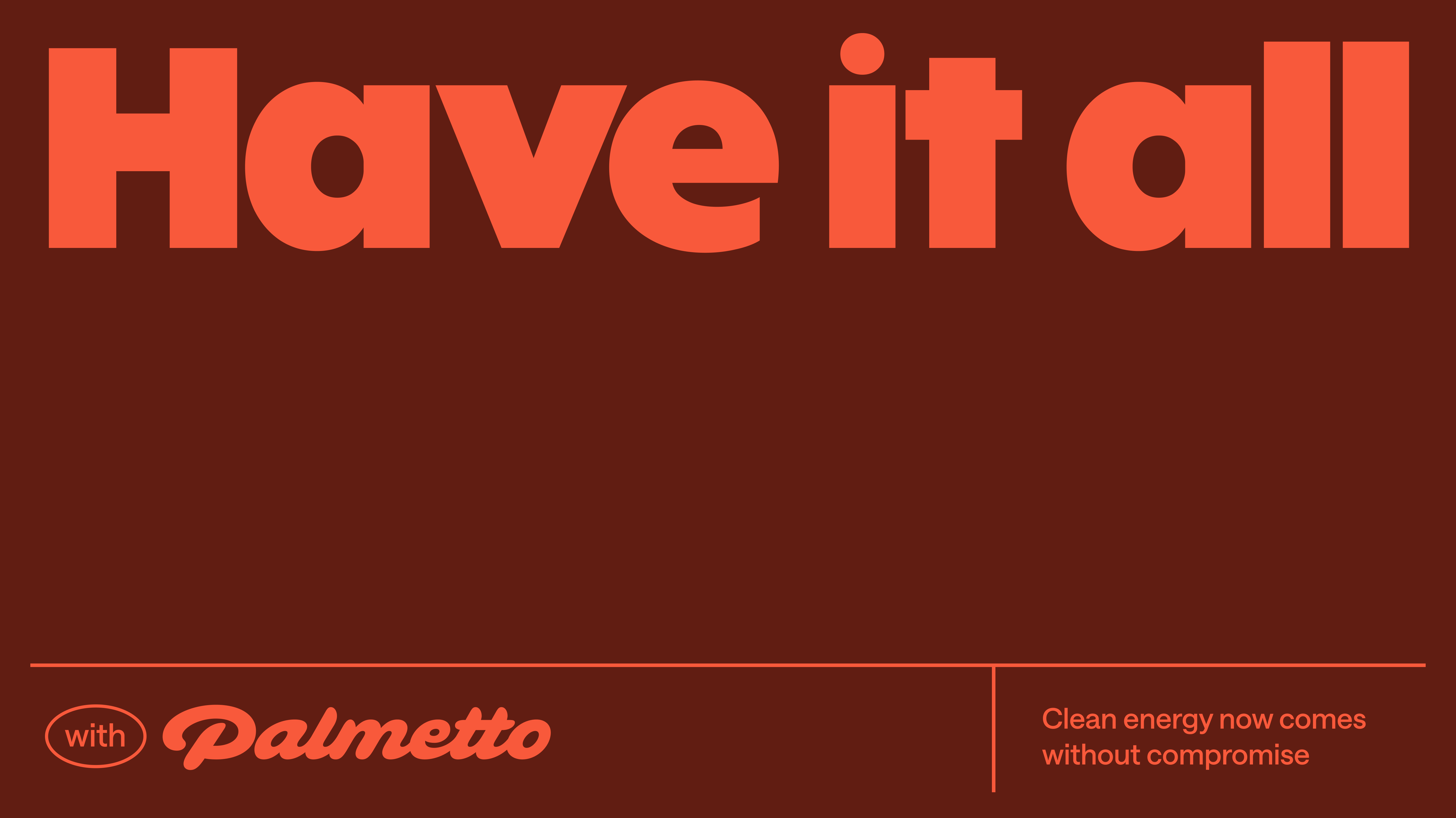
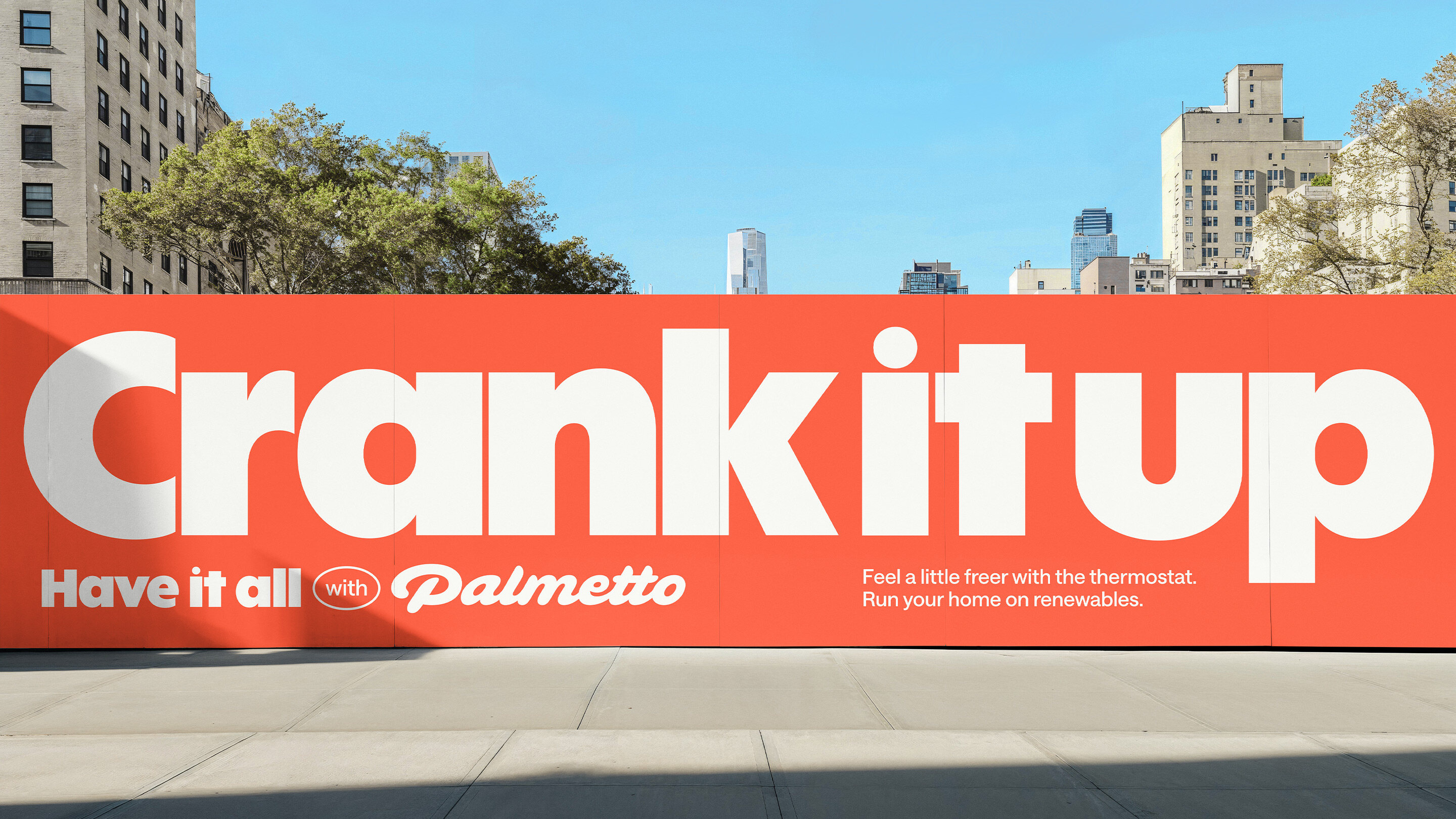
Have it all
The new brand idea, ‘Have it all’, positions clean energy as the solution for an audience that refuses to compromise. Coming clean becomes a no-brainer when it gives you all the benefits you’ve been looking for: lower bills, resilience in a storm and maybe even a cleaner conscience.
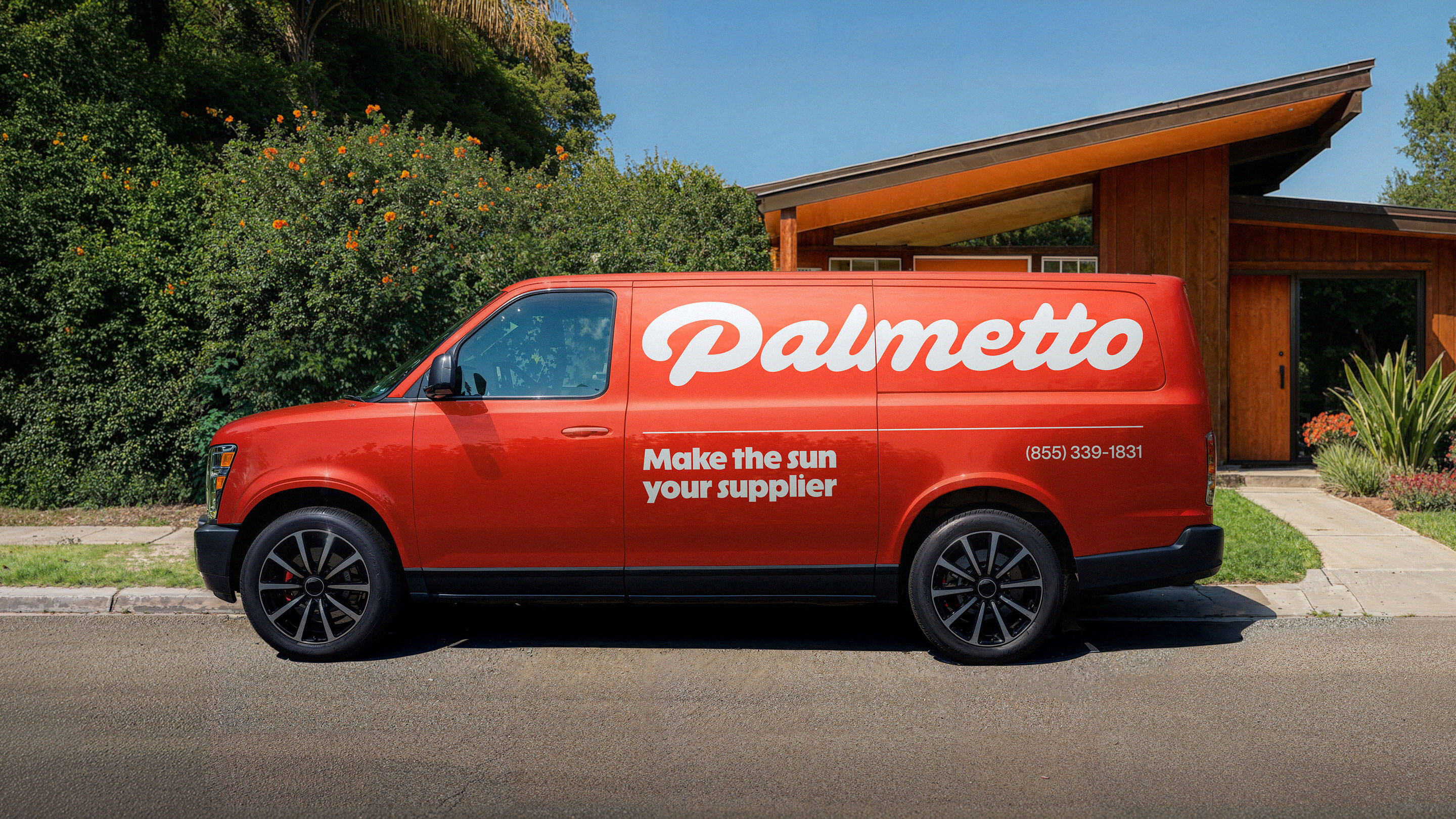
The new logotype has a languishing cosiness, crafted in a warm script that sinks into the space. Typography balances character with clarity, anchored by the aptly named ABC Solar. And the illustration style acts as an antidote to the soulless solar depictions that dominate the category.
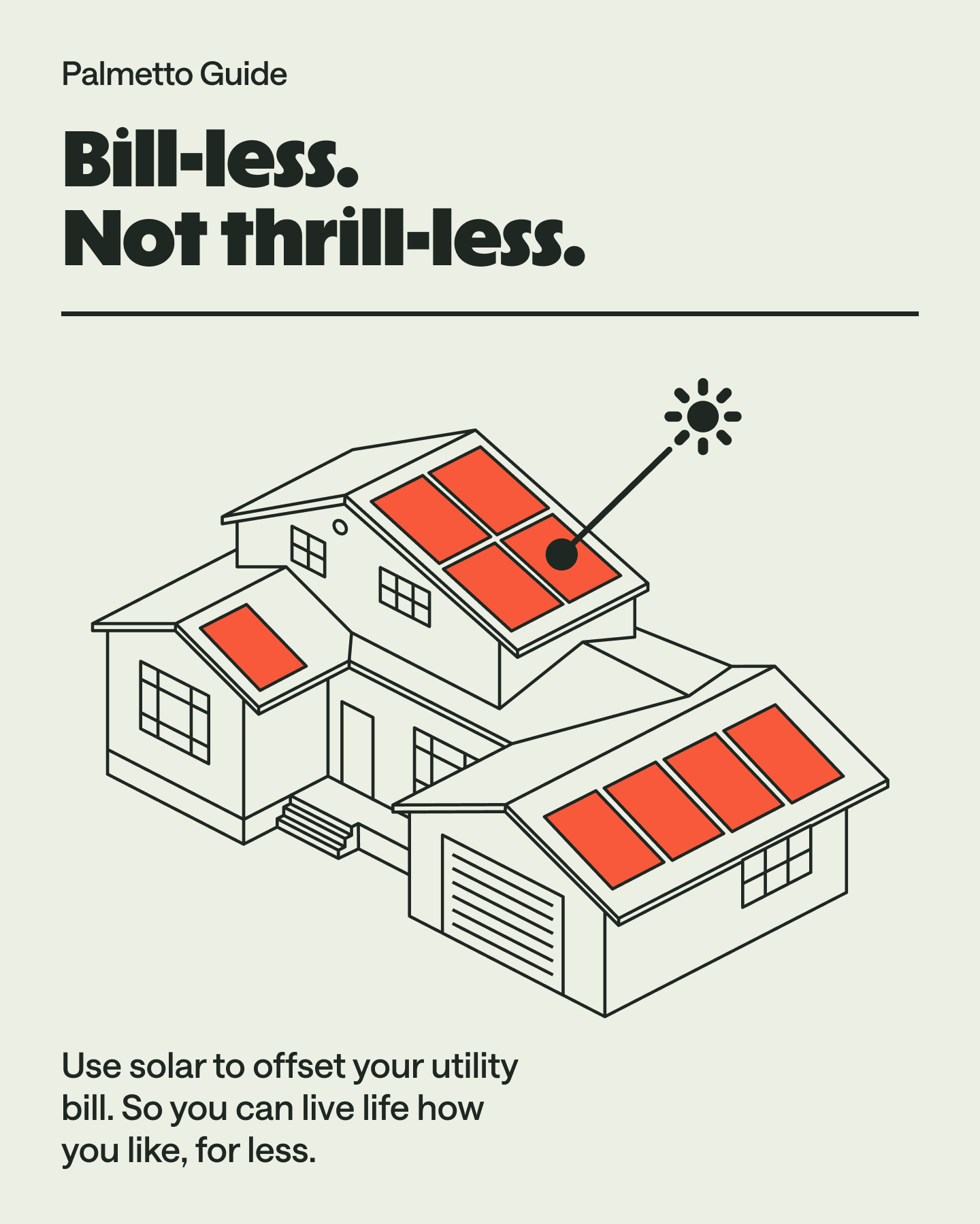
The art direction is unexpected for a clean energy company. No cold solar panels, but visuals depicting warm homes filled with people using their appliances as they please.
The verbal identity works alongside the art direction to liberate the audience, reframing how it feels to use renewable energy. “The brand is speaking to people who haven’t yet seen a good reason to swap. Inviting you to indulge your energy desires.” says Fia Townshend, Copy Director at Ragged Edge. “It’s radical change under the radar. And not a soapbox in sight.”
“Designing for abundance meant breaking every visual trope of green tech,” adds Andrew Kitchener, Associate Creative Director at Ragged Edge. “We needed a system that felt rich, abundant and guilt-free. Presenting a version of clean energy that can cut across political divides. Palmetto makes renewable energy feel like common sense, not a cause.”
Proof of abundance
Since launch, the rebrand has already delivered traction online. Social follower growth is up 92%. Daily reach has grown 729%. And sales notices-to-proceed are up by 7% overall. By working closely together on every detail, from the digital experience to billboards at summits, Palmetto and Ragged Edge turned abundance into a reality people can feel.
“The rebrand embodies our mission to make clean energy irresistible,” says Jessica Appelgren, SVP Communications & Marketing at Palmetto. “And our new app launch is the next step in bringing that promise to life, putting energy insights, rewards and upgrades directly into people’s hands.”
A category that once punished people for wanting more is now being redefined by Palmetto: the home energy company that lets you have it all.


CREDIT
- Agency/Creative: Ragged Edge
- Article Title: Ragged Edge Rebrands Palmetto as the Home Energy Marketplace Making Clean Energy Irresistible
- Organisation/Entity: Agency
- Project Type: Identity
- Project Status: Published
- Agency/Creative Country: United Kingdom
- Agency/Creative City: London
- Market Region: Global
- Project Deliverables: Brand Design, Brand Identity, Brand Redesign, Brand Strategy, Brand Tone of Voice, Identity System
- Industry: Energy
- Keywords: palmetto ragged edge energy renewable sustainability rebrand new identity
-
Credits:
Associate Creative Director: Andrew Kitchener


