Scolari is a company located in Brasília – DF , Brazil and operates in the area of Service and Events Design. The company recently underwent a name change and market positioning, which led the client to look for a designer to modernise the brand. The client shared the desire for a symbol that represented the new phase of the business and the new methodologies that the company will use from the year 2021 in a simple and minimalist way. A point raised during the briefing that impacted the analysis of competition was the use of complex elements such as arabesques and flashy colors by other companies in the same area, which goes againts with what the company wants to convey to customers. Therefore, the challenge was to convey all the company’s values in a visually pleasing and efficient way.
The construction of the symbol was inspired by three elements; the S, the brand’s initial, the double infinite and the double diamond. The Infinite Double represents balance, balance and commitment. The Double Diamond is the central element of the symbol since it represents the new methodology that the company will use in its services, it was created and popularized by the Design Council. The Design Council was stablished by Winston Churchill’s wartime government in December 1944 to support Britain’s economic recovery. The Council of Industrial Design had the founding purpose of promoting ‘by all practicable means the improvement of design in the products of British industry’.. The Double diamond and represents the four phases of Service Design; Discover, Define, Develop and Deliver.
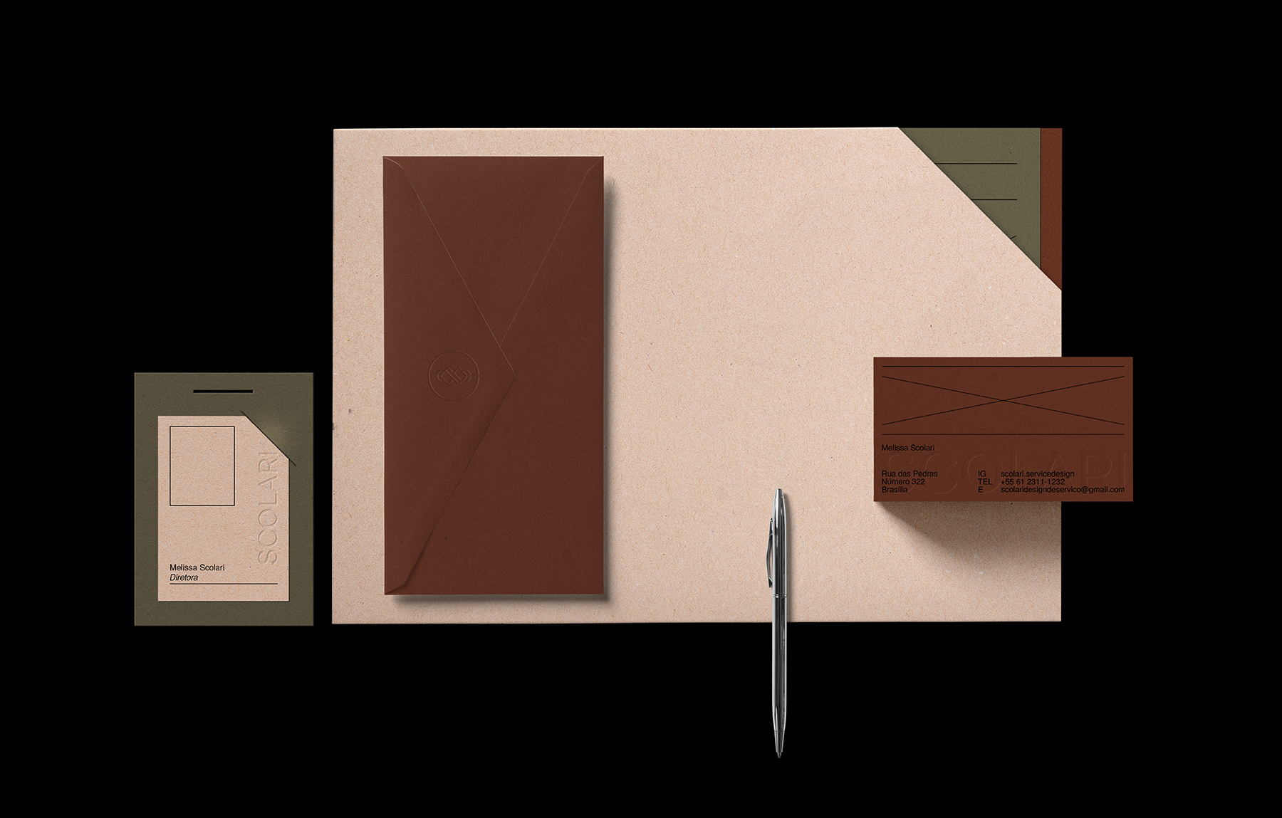
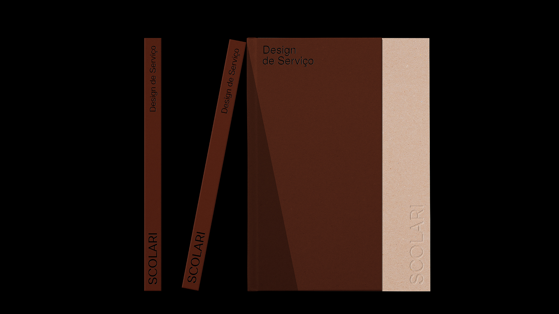
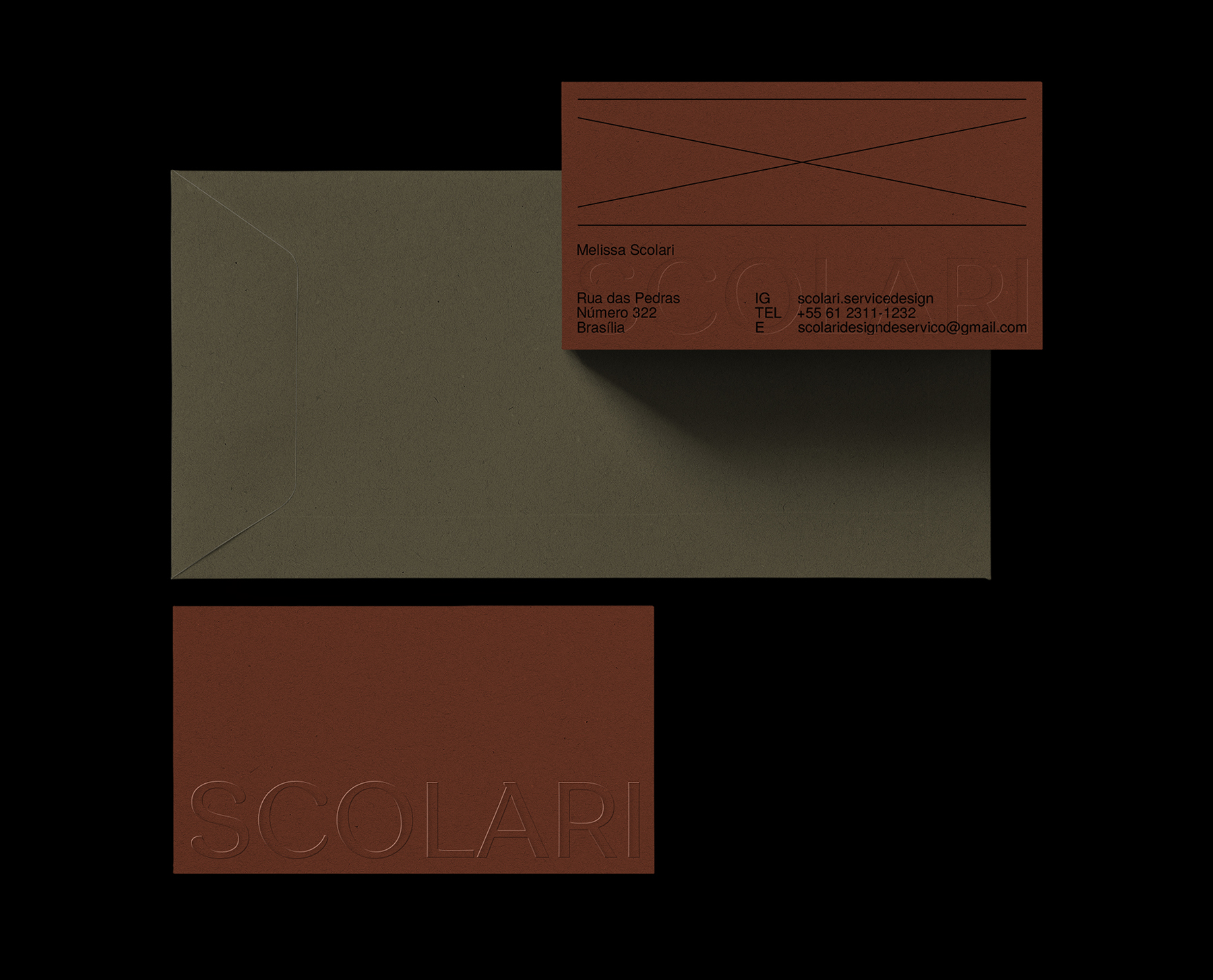
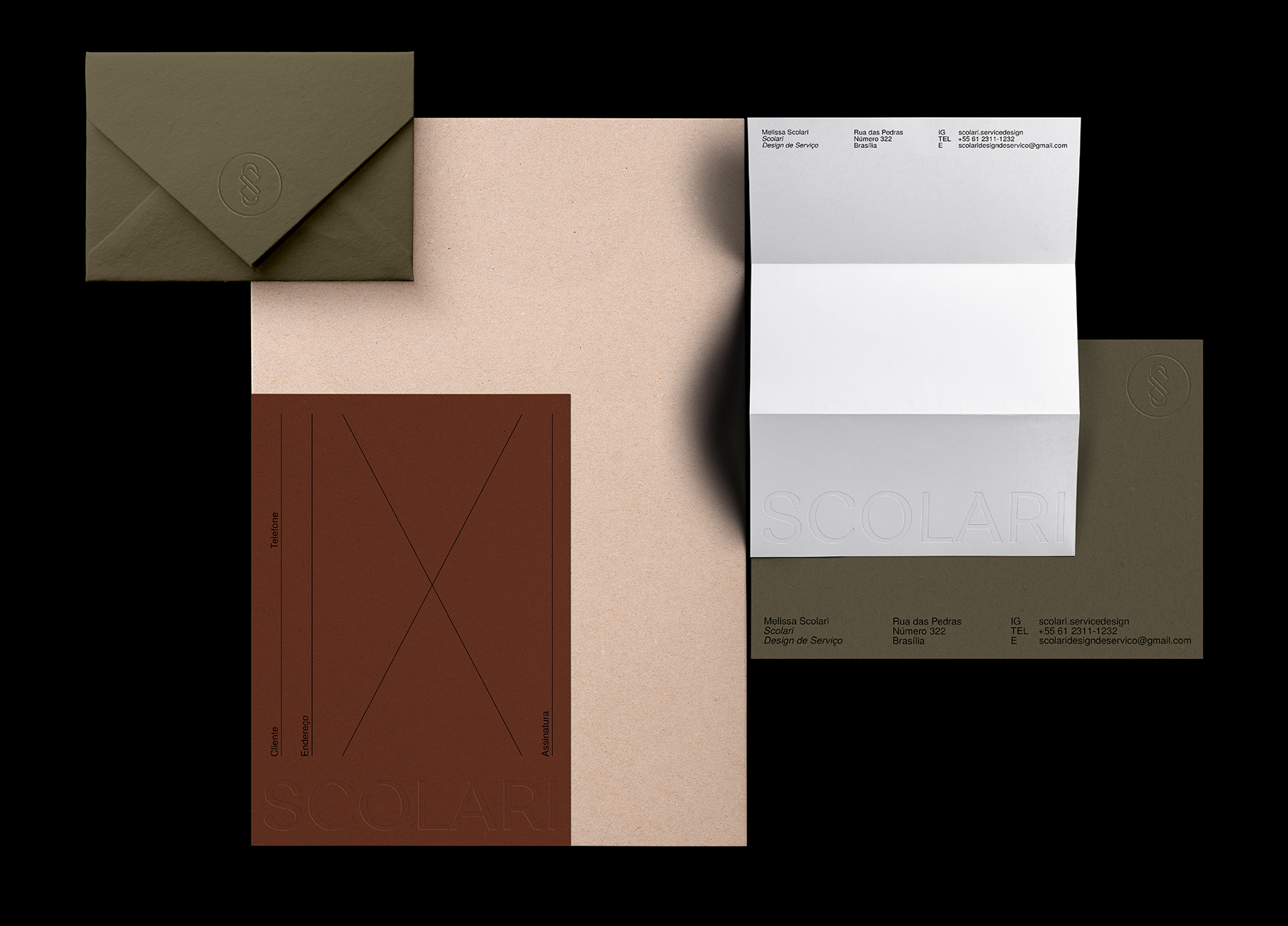
With a new positioning of the brand, the client wanted to transmit elegance and simplicity to the clients. In order to generate a balance between warm and cold tones, the colors terracotta and pastel green were chosen to compose the color palette. Serif typography was implemented to bring elegance and minimalism, characteristics that are also present in the developed symbol, which is composed of rounded shapes and fine lines that harmonise with the typography. The logo started to be implemented in social networks since the beginning of January 2021 and applied to graphic materials such as folders, envelopes, business cards and letterhead.


CREDIT
- Agency/Creative: Rafael Cardoso Design
- Article Title: Rafael Cardoso Design Create Brand Identity for Scolari Service Design
- Organisation/Entity: Freelance, Published Commercial Design
- Project Type: Identity
- Agency/Creative Country: Brazil
- Market Region: South America
- Project Deliverables: Brand Architecture, Brand Creation, Brand Identity, Branding, Graphic Design, Identity System, Product Architecture
- Industry: Entertainment
- Keywords: Entertainment, Events, Service Design


