


Krafla follows the Game: Scandinavian dedication and love for sport. Radar agency has developed a design system and philosophy for the new “Krafla” brand owned by the “Fitatlon” company. In the process of creating packaging for the new Krafla brand of the Fitathlon group of companies, the communication agency Radar formulated the legend and positioning of the new brand.
Task
Fitathlon is one of the largest wholesale distributors of fitness equipment, bicycles and sporting goods in Russia and the CIS. At the starting point of the project, we had only the logo and the name – Krafla (“krabla” – a caldera in the north of Iceland, zone of volcanic activity). The new brand was a blank page that needed to be filled with meaning: we had to create a legend and develop a philosophy that would share values with its target audience.
Solution
In order for the brand to stand out from the competition, it needed a unique story explaining the idea and mission.
Together with the client’s team, we chose an idea of the comparison of the natural forces hidden in the caldera and the internal energy of a person, which is revealed through the game. Krafla, which is protected from the winds from all sides, has become the metaphor of a place where there are comfortable conditions needed for sports activities.
Start of the project
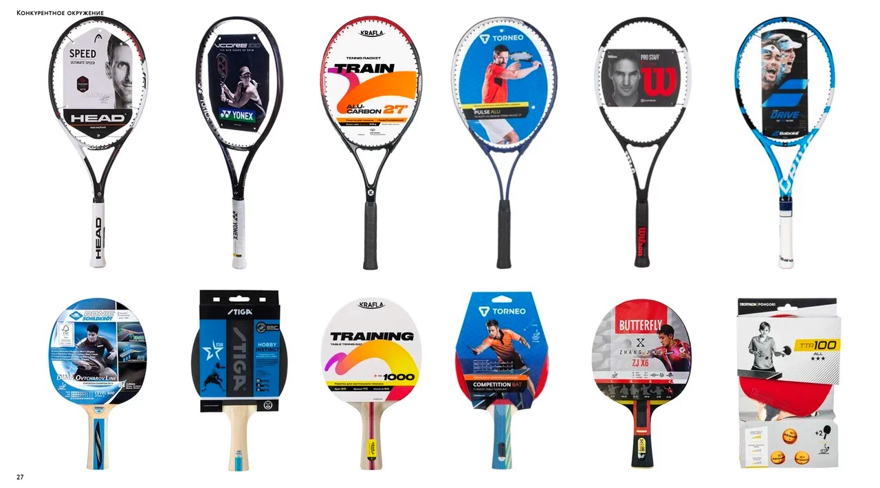
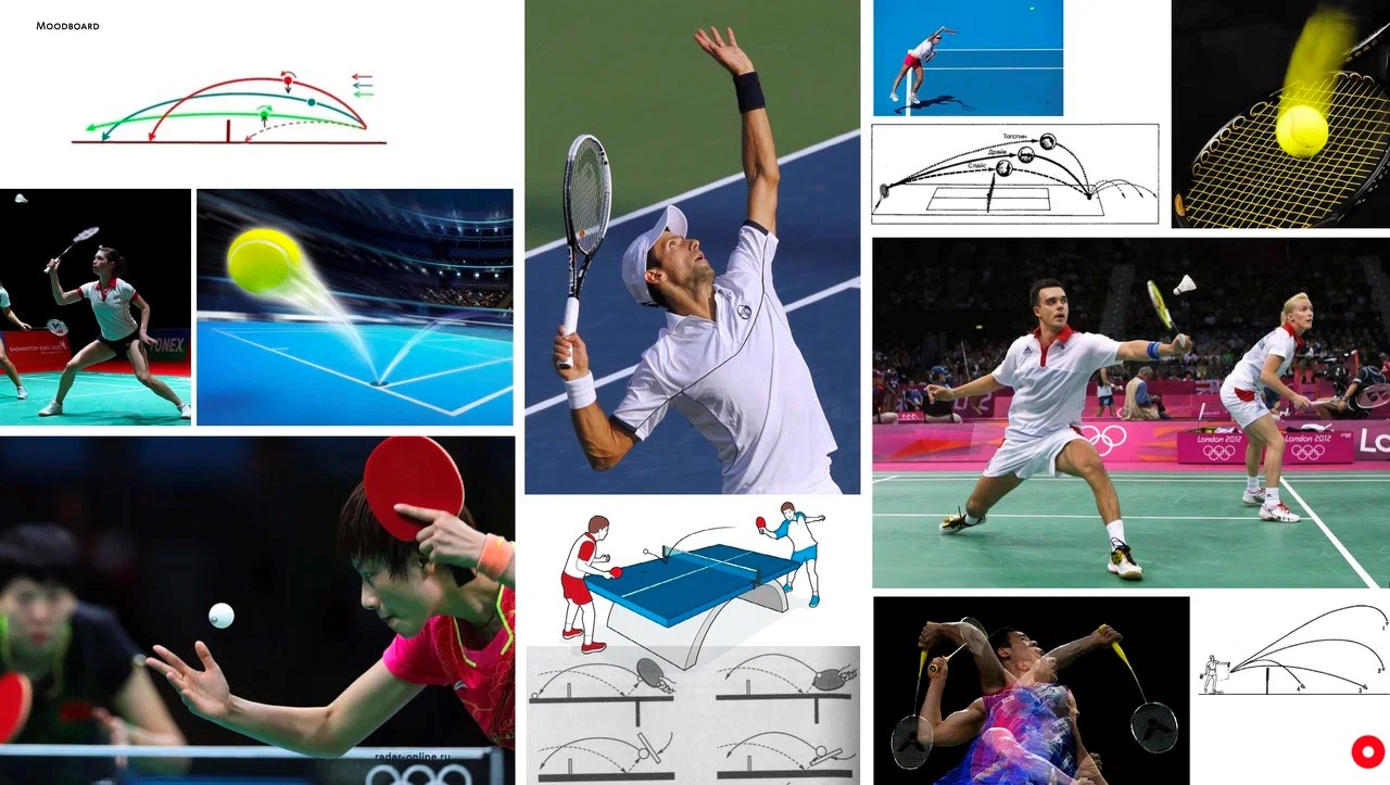
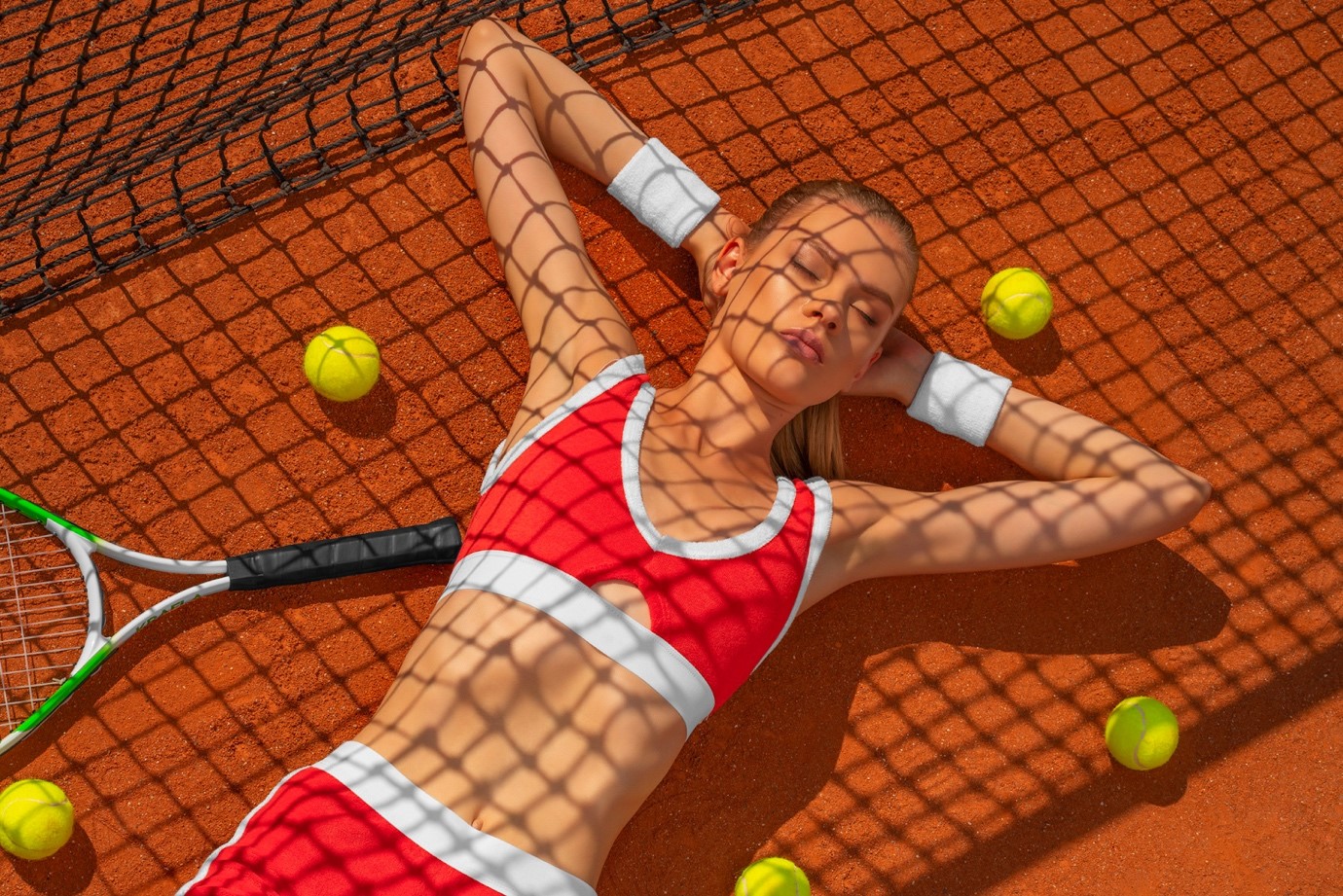
New brands often enter the market through collaborations with popular athletes. Recognisable faces, beautiful images, on the one hand, allow you to attract customers, but, on the other hand, we are getting visually similar products on the shelves. We decided to take a different path: abandoned photos and visual clutter.
The game is always with you
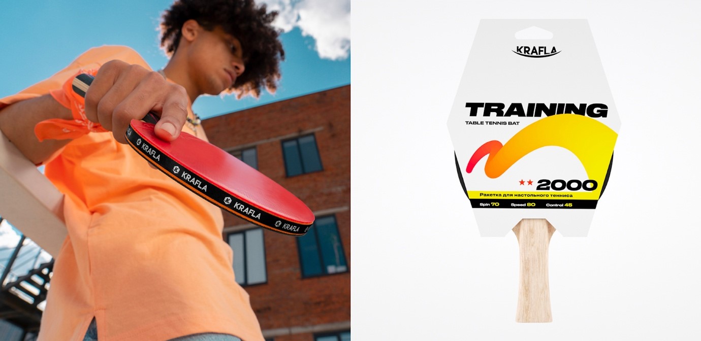
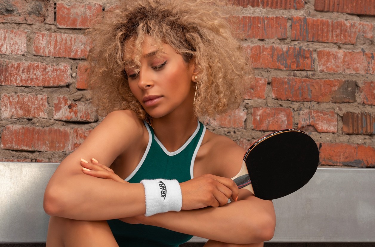
Target audience analysis made it possible to outline the nature, mission and values of Krafla. The brand’s customers are not professional athletes who choose equipment for constant training and competitions, but fans of an active lifestyle and those who like to actively spend their leisure time by time. The decision to buy sporting goods is made spontaneously, and not planned in advance. They need an affordable brand with a good values and clear idea: “The game is always with you; you just need to pick up a racket.” The final formula of the brand’s positioning: high-quality and reliable equipment for a wide range of customers, inspired by Scandinavian dedication and love for sports.
Brand perception
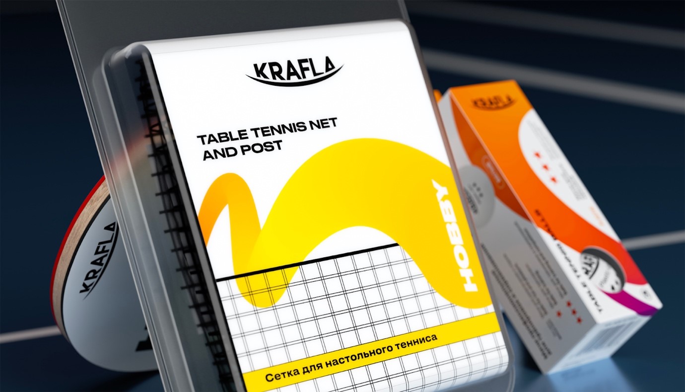
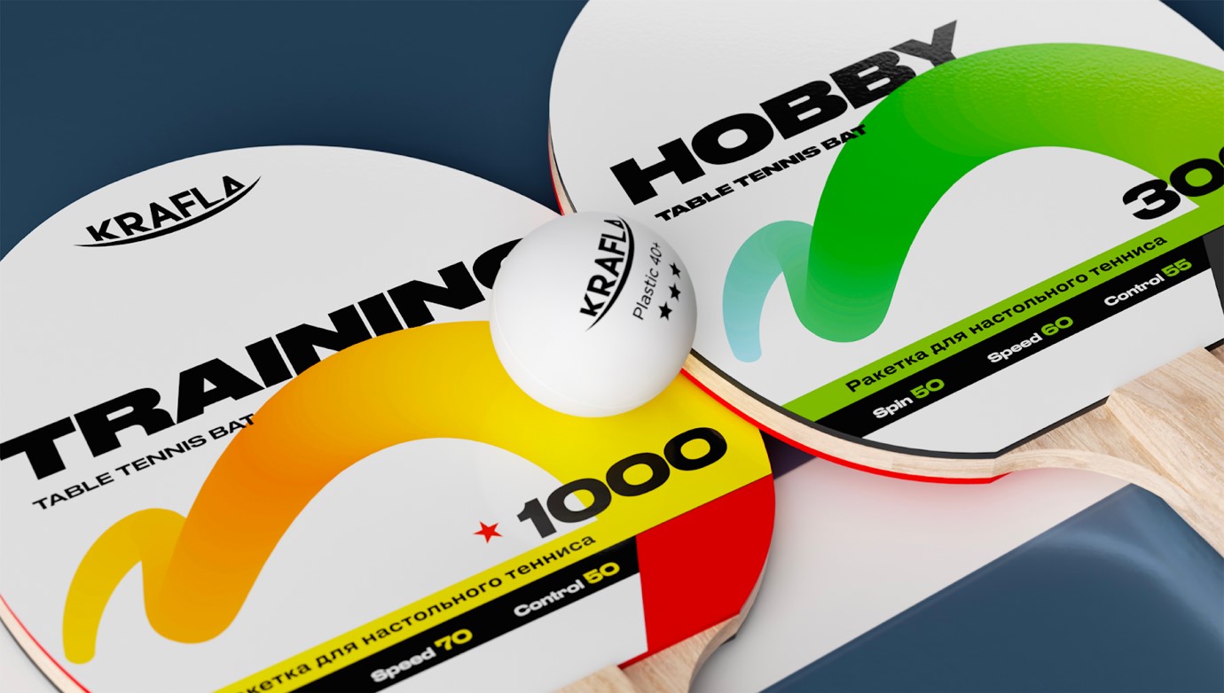
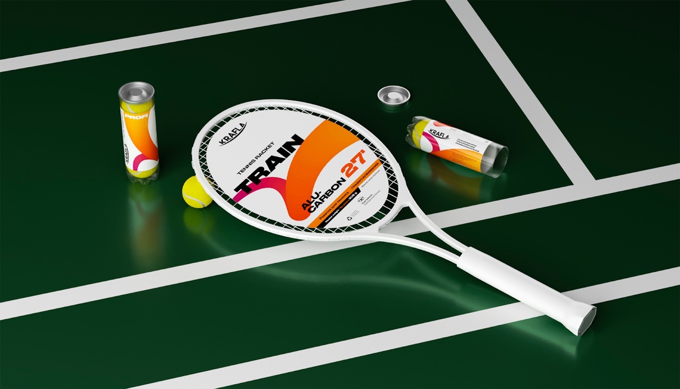
Athletes are used to the color coding: green is for beginners, yellow is for medium, orange and red is for professionals. Such colour division is commonly used and can be called a standard, so we integrated it into the design system. The main focus was to use pure white background and neat graphics based on the movement of the ball during the game: in badminton, table tennis and tennis. The flight of the projectile has its own trajectories – we embodied them in the design elements. Catchy typography reflects the characteristics of the brand and helps to navigate the shelf and helps the products to stand out from the competitive landscape. Wide italic symbols maintain dynamics and symbolize constant movement during the game. A strict hierarchy of fonts organizes information by importance and logical blocks. The white color corresponds to the legend, reminds of the harsh northern nature and Scandinavian mentality. All together this creates a perception of a quality product from an experienced manufacturer, corresponding to the legend of Krafla brand.
“Usually, sport brands use photos of athletes, which makes all the packaging of different brands look similar. Our team have found a solution that does not include such images, remains relevant to other sports and creates its own unique visual language. The brand has the opportunity to stand out on the shelf and be remembered among competitors” — Daniil Shumakov, Art Director Radar.
Results
The brand has successfully entered the market and today is presented both online and offline. During our work, we managed to build strong partnership with the client, achieve a high appreciation of the team’s professional skills and continue our work.
“The customers’ needs simple and understandable sports equipment for leisure, communication and emotions. The name and brand have a strong chance to become a household name in Russia – like the term “hugge”. With proper systematic work in the media field, the word “Krafla” can become synonymous with a game of tennis. For us, this is a bright fascinating project with a brand in which we see the potential to become the absolute leader in our niche” —Anton Grishchenko, Strategy Director Radar.
“When Radar started designing for Krafla, the brand had only a name and a logo. It is clear that for modern high-quality packaging this is not enough – without a legend, thoughtful values, it is difficult to achieve our business goals. The Radar team began working with the brand’s mission and the main message. Thus was born the legend of Nordic power and the inspiration of nature – an association with the name Krafla. In a short time, we developed a packaging design that supported the formulated values,” — Anna Baeva, Head of Marketing Department Krafla.
CREDIT
- Agency/Creative: Radar
- Article Title: Radar Create Branding for Krafla Scandinavian Dedication and Love for Sport
- Organisation/Entity: Agency
- Project Type: Campaign
- Project Status: Published
- Agency/Creative Country: Russia
- Agency/Creative City: Chelyabinsk
- Market Region: Europe, Global
- Project Deliverables: Branding, Design, Packaging Design
- Industry: Entertainment
- Keywords: KRAFLA, Scandinavian, sport
-
Credits:
Strategy director: Anton Grishchenko
Senior copywriter: Daria Lukina
Art director & designer: Daniil Shumakov
Senior designer: Alexander Rakitin
3D visualization: Dmitri Saveluev
Photo: Daniil Ivanov
Motion-design: Max Lott, Diana Begysheva
New business manager: Vladimir Ogorodov
Senior account manager: Anastasia Gorushkina


