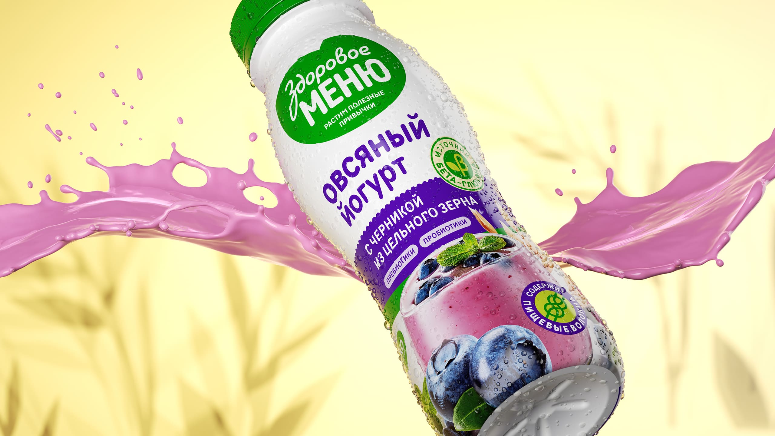
The aim: To develop the brand platform for all products from “Healthy Menu” line: define the overall meaning of the brand, its mission, to create a new visual style that would be different from any competitors. Create a unified easy recognizable design system for all products. With all those changes ease up the way to the major Russian stores shelves.
Soyuzpisheprom Russia’s largest food producer with a 120-year history. Owner of a lot of popular brands and trademarks “Tsar,” “Soyuzpischeprom”, “Healthy Menu”, “Green Milk”. Production includes vegetable drinks, various oils, cereals, pasta, yoghurts and ready-made breakfasts. The new “Healthy Menu” shows benefits that familiar products can bring in a new, high-quality performance with an aim of healthy and sustainable consumption.
Platform: One of the main trends of 2020 was the interest in healthy nutrition. Demand in this category has tripled compared to the previous year. This trend opens up new opportunities for expanding the target audience. More and more people are expecting brands to meet new nutrition standards. A significant part of Russians strives to improve their diet, but it is not easy: high prices sneaky manufacturers limit the buyer’s choice. People are waiting for new solutions – they are tired of overpaying for “eco” labels, they need real quality without empty promises. After careful analysis and strategic search, we have outlined a clear brand mission for the “Healthy Menu”: “To provide healthy nutrition with safe products of highest quality and make them widely available”. We reflected this mission in the slogan “Grow Healthy Habits”.
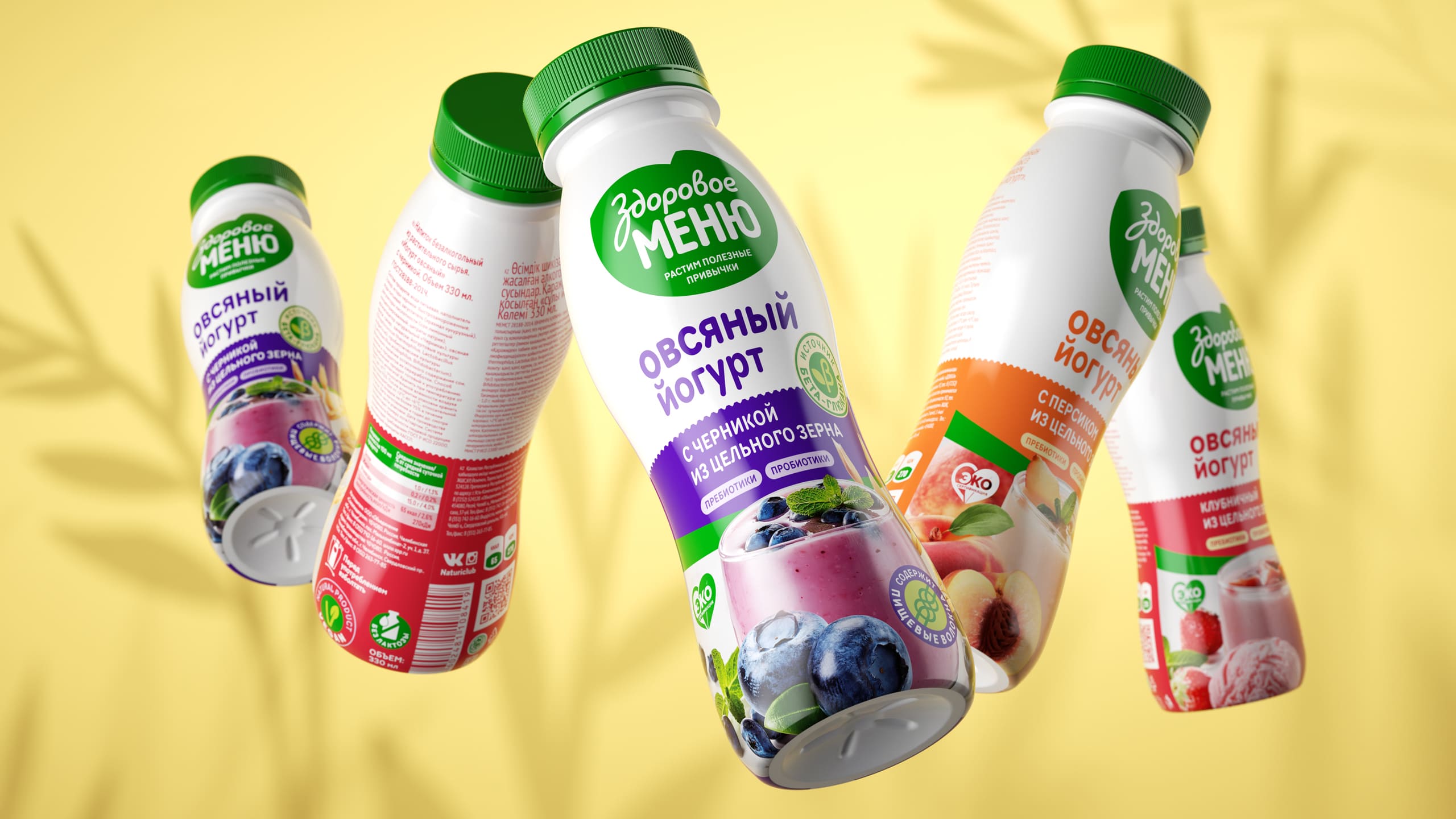
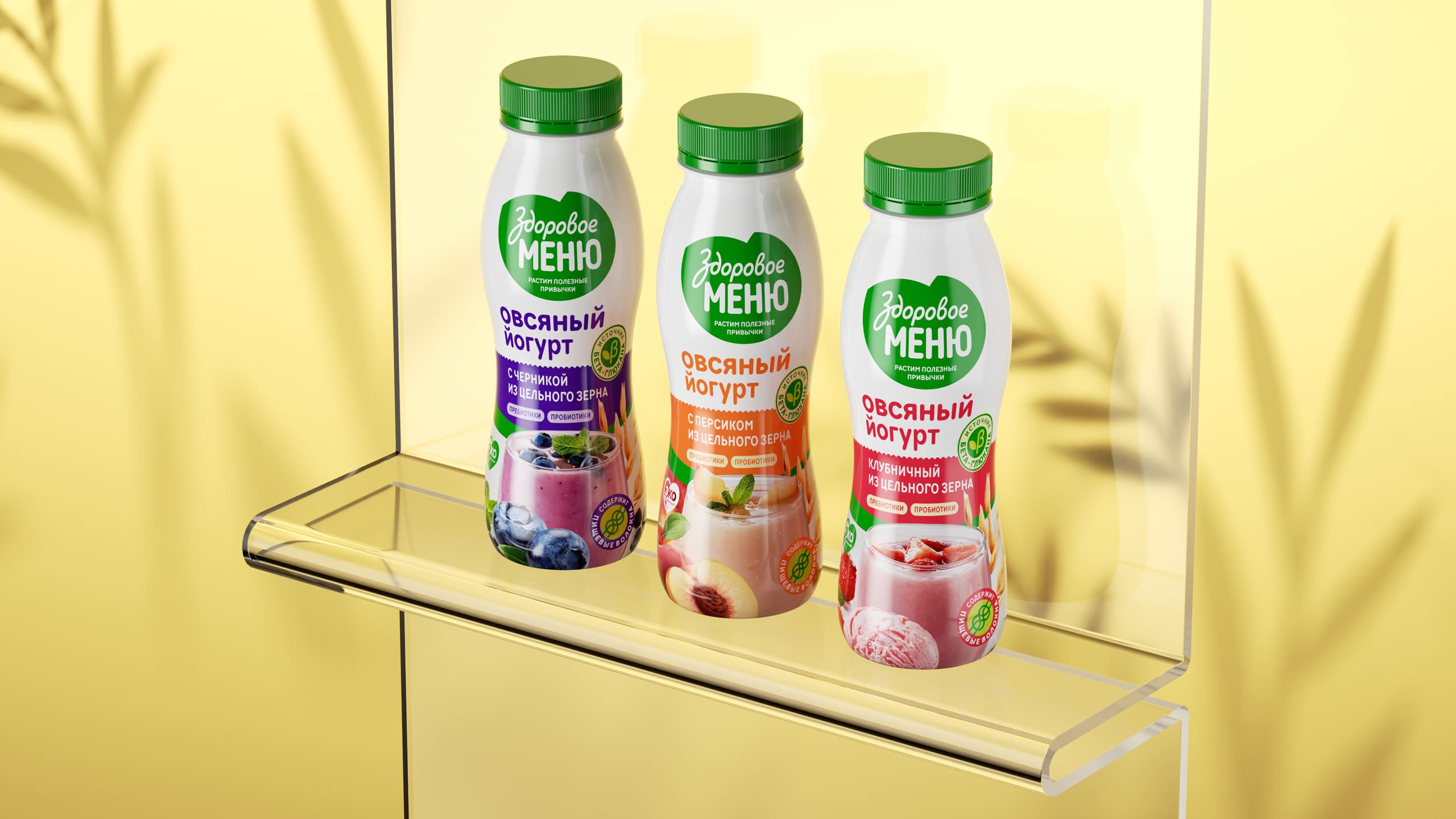
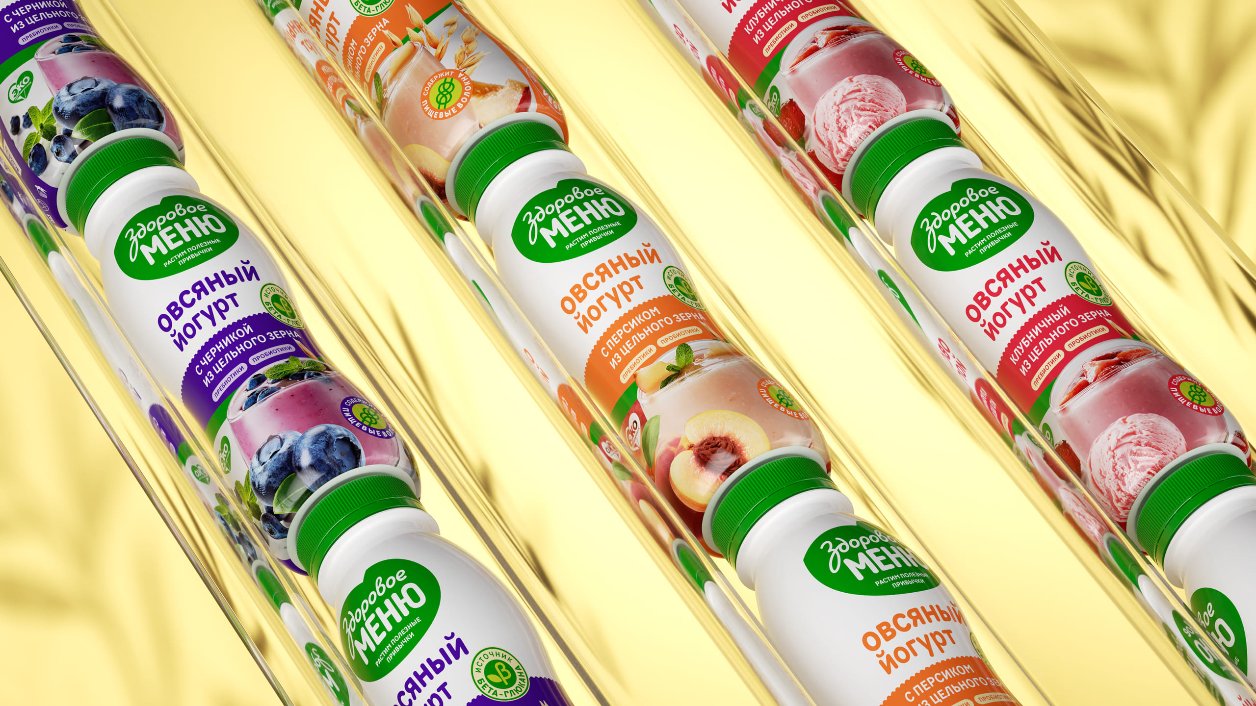
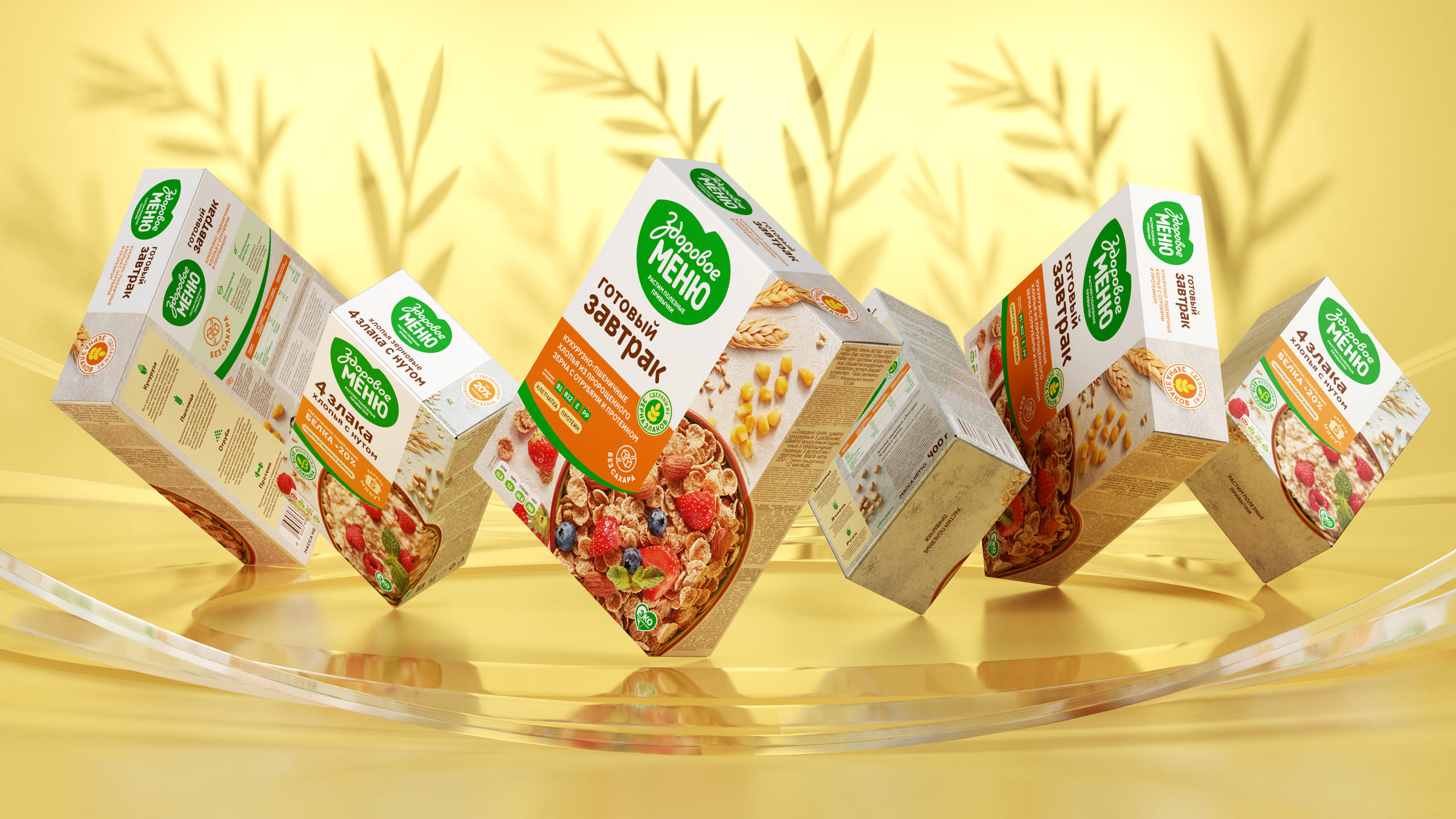
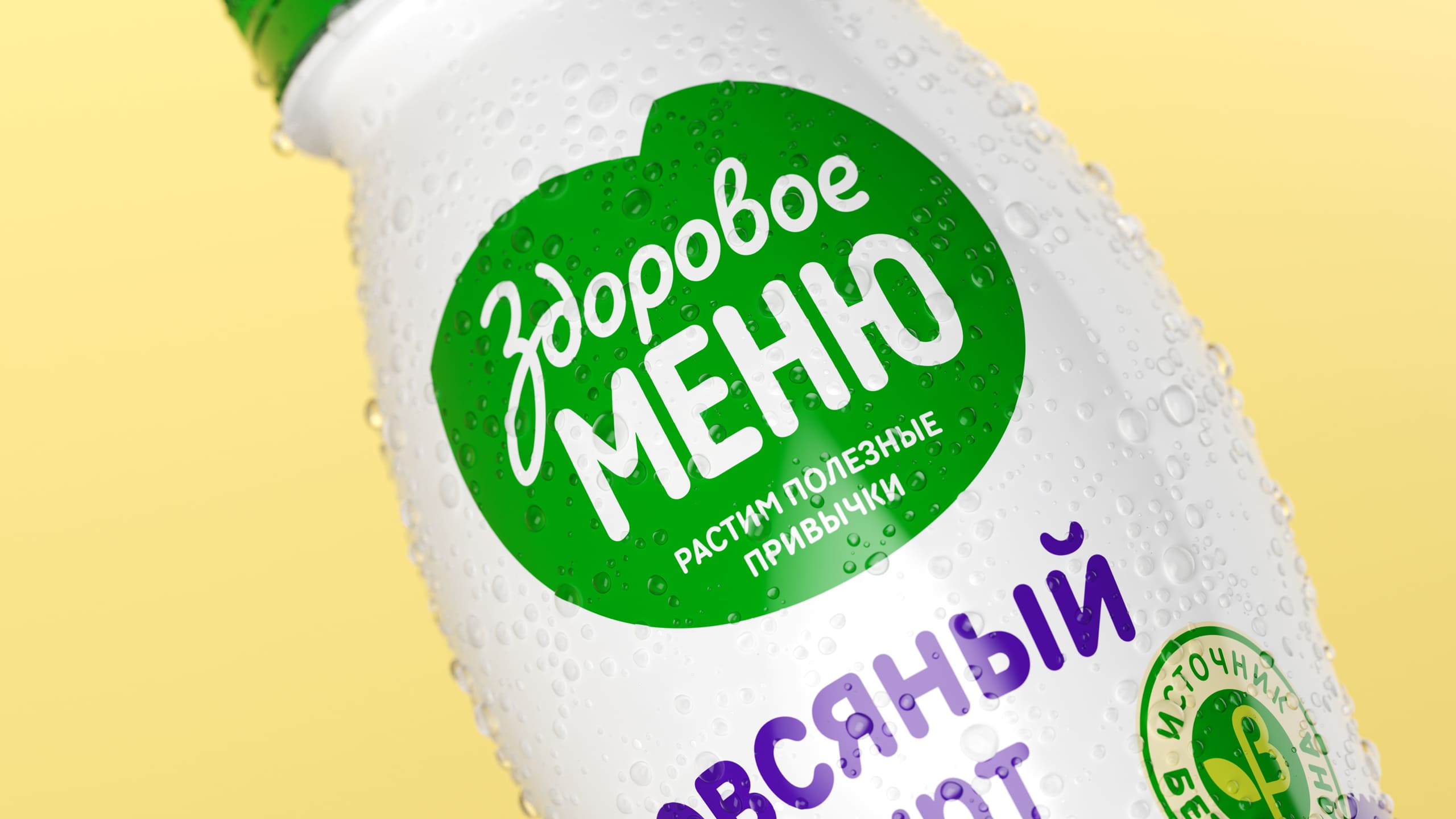
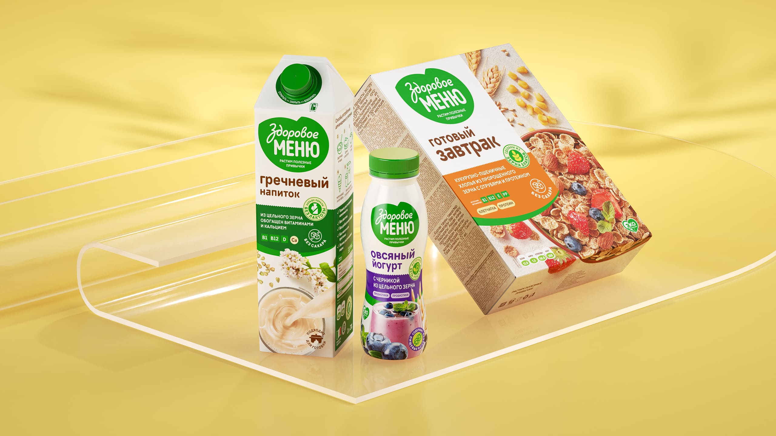
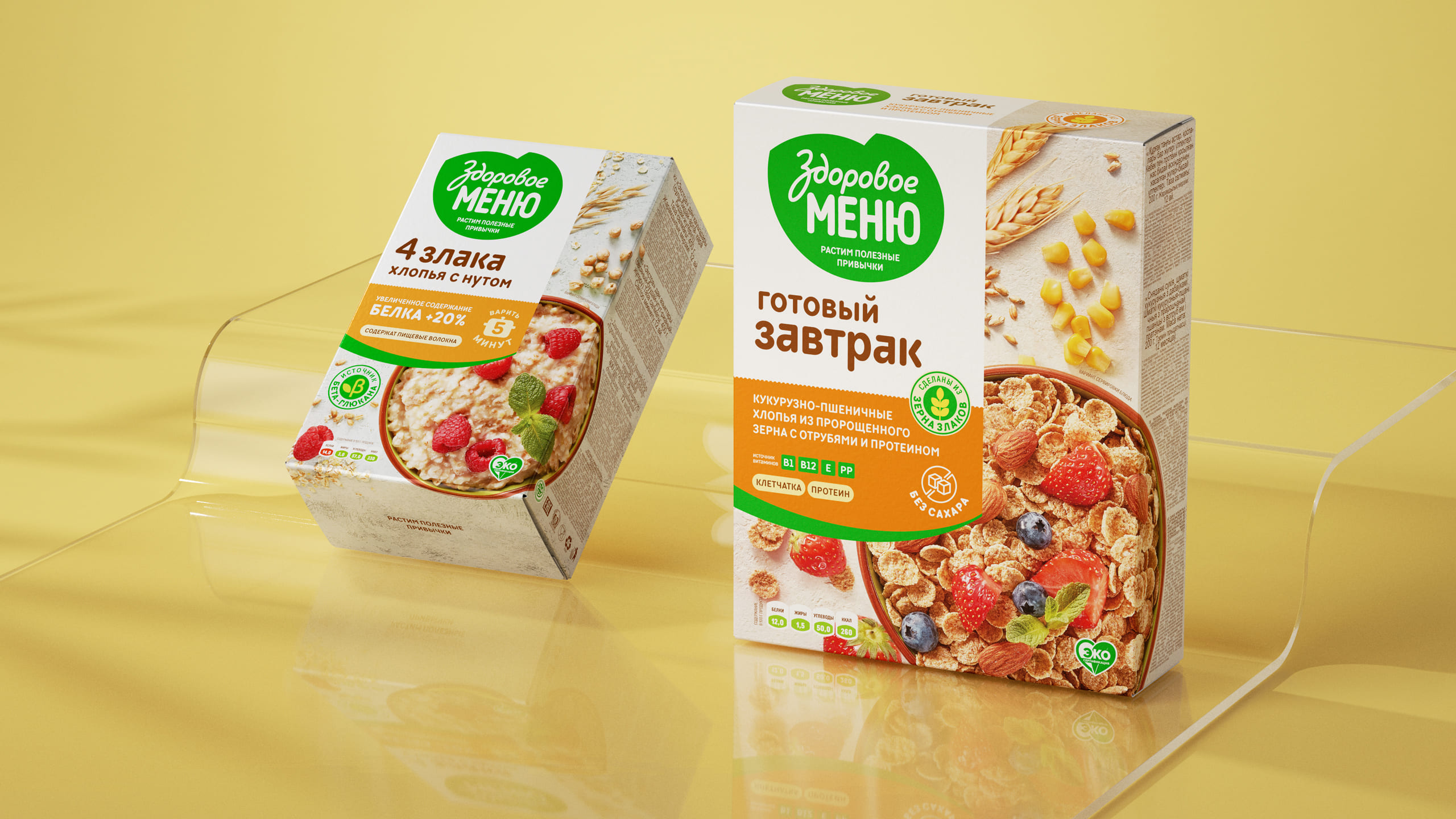
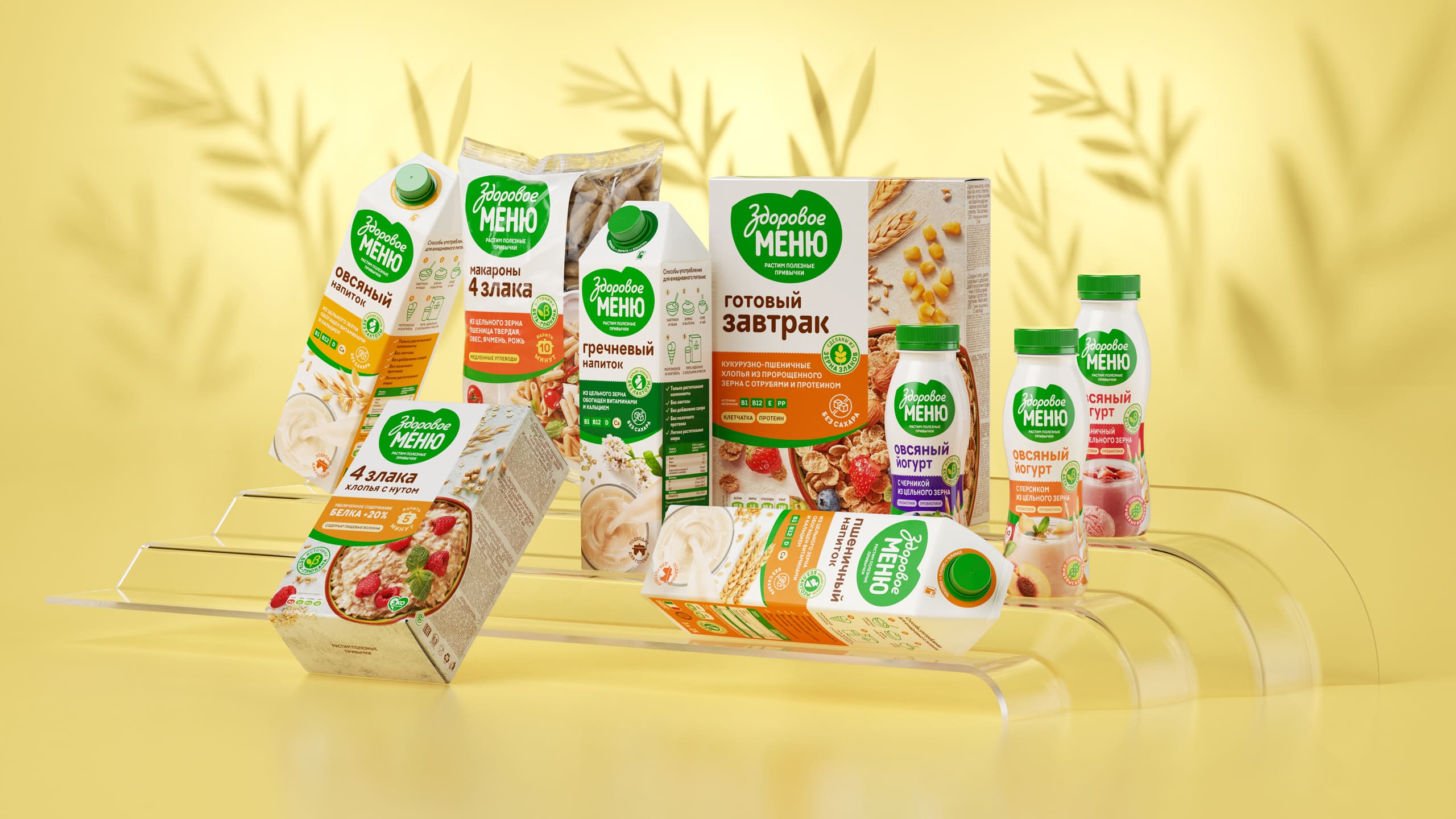
Design: First, we’ve changed the logo, and created a heart-shaped base. Now it has a subtext that refers to the brand mission. To make it highly visible, we placed it on a white die, creating a bright contrast. Unlike the previous version, the combination of die and logo has now become a single component on all types of products – thus we have united the entire line. This technique significantly increases product awareness.
Second, we eliminated the detailed product description and left only the most valuable information. To make the packaging efficient rather than effective, we placed all the components in a strict hierarchy, taking into account how the consumer sees the product. The bright logo catches the eye, then – the name, and then all main characteristics and advantages. We have replaced some of the texts with icons, to increase the visibility.
The last but not the least, the final touch in branding is its bright presentation, so we made performed a food photoset and made delicious foodzones for the the entire line of products – 28 units.
Conclusion: We managed to build a solid, unified, easy recognisable brand with clear aim and product description. All this work was done with a Soyuzpishcheprom team – the combination of expertise and practical experience has become a starting point for achieving the goals. With an updated brand we were able to penetrate to the shelves of a major retail chains (Auchan and X5).

CREDIT
- Agency/Creative: Radar
- Article Title: Radar Create Branding and Packaging Design Design System for Healthy Menu
- Organisation/Entity: Agency, Published Commercial Design
- Project Type: Packaging
- Agency/Creative Country: Russia
- Market Region: Multiple Regions
- Project Deliverables: Brand Architecture, Brand Guidelines, Brand Identity, Brand World, Packaging Design, Rebranding, Tone of Voice
- Format: Bottle, Box, Sachet
- Substrate: Plastic, Pulp Carton


