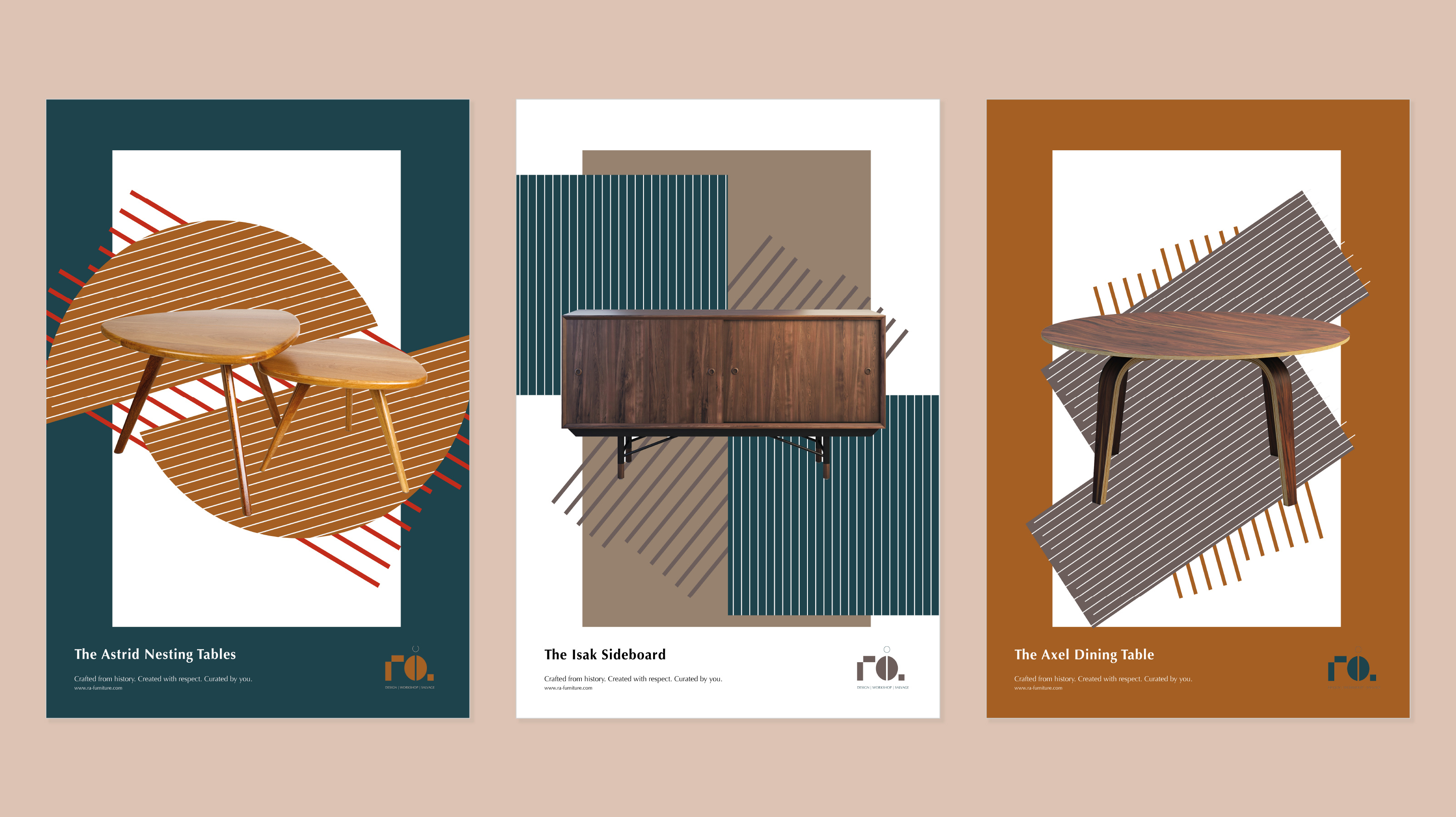
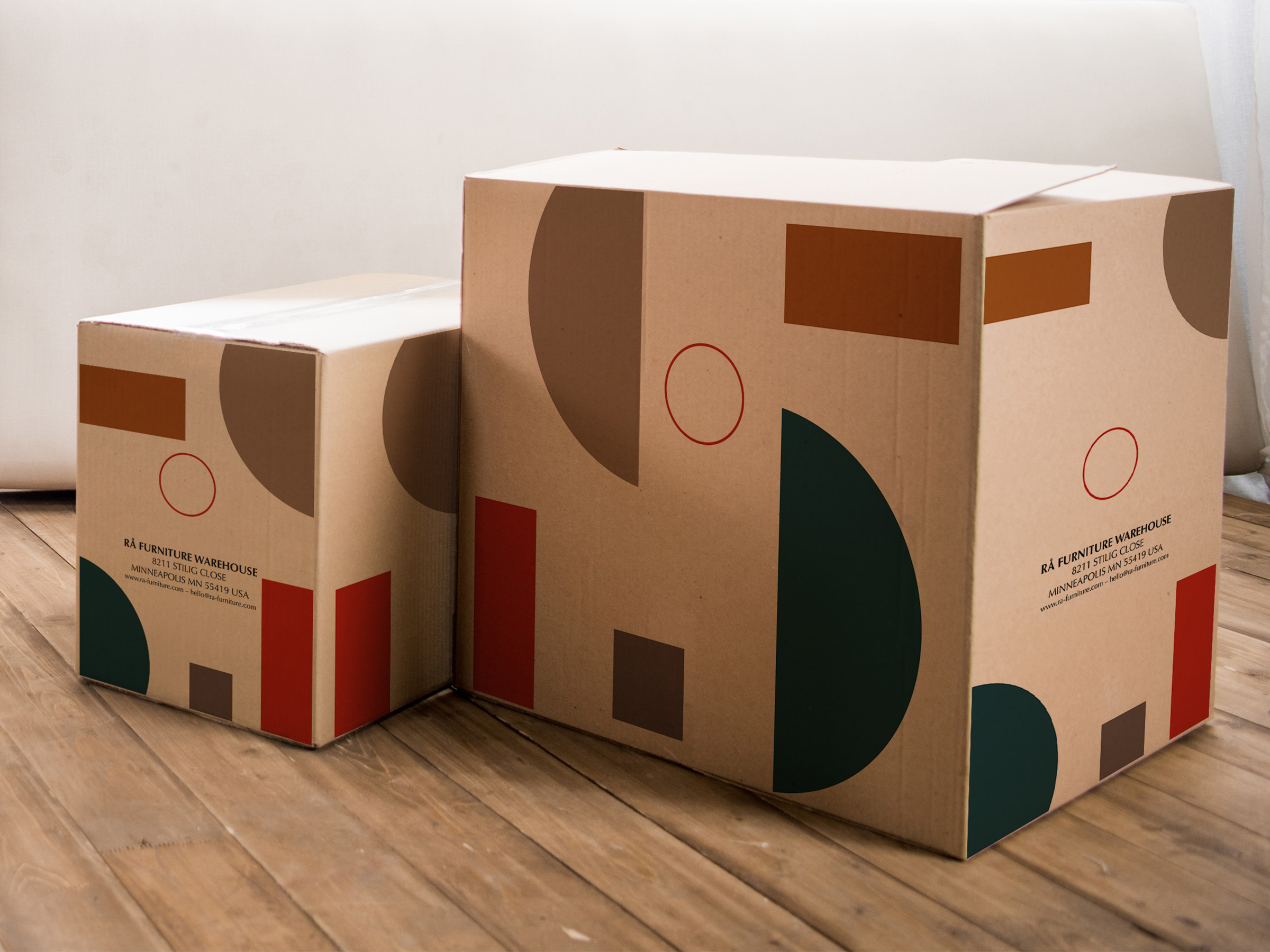
The Karlsson family have lived in rural Minnesota for generations, ever since their ancestors immigrated from Sweden in the early 1870s. They see a new vision for their family’s lumber business, planning to transform into a modern recycled and reclaimed materials hub closer to the city. This space will sell beautifully crafted and reclaimed furniture in the Mid-century Scandinavian design style as well as raw and found/salvaged materials.
They want a brand that comes across as timeless, well-fashioned, and sophisticated, celebrates their commitment to sustainability, and demonstrates that they are a family-run business with decades of experience and craftsmanship.
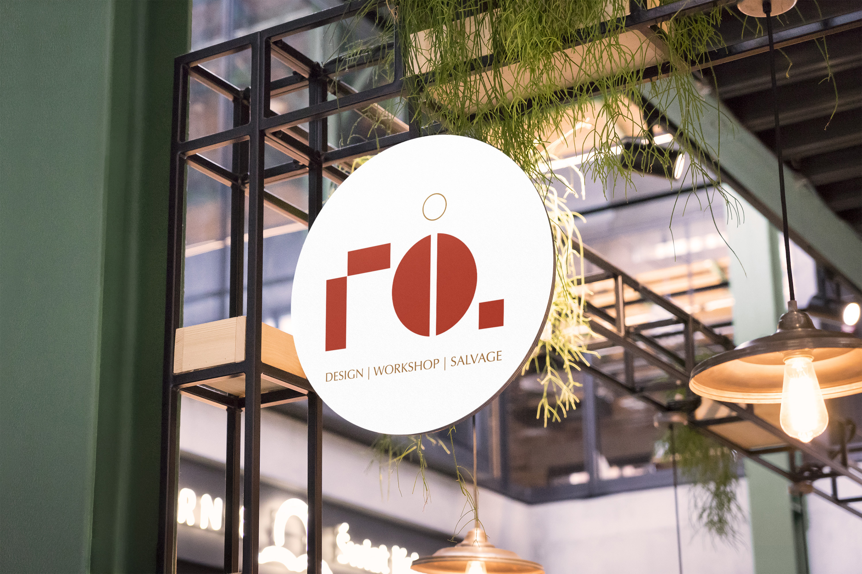
The logo and visual identity represent the idea of construction, breaking things down to simple forms and putting them back together, reflecting their new business model. The brand colours are organic and sophisticated. The name is taken from their Swedish roots, and means rare or raw, perfectly highlighting the qualities of their crafted pieces and aesthetic. A custom typeface was also developed to expand their visual language, further the themes of deconstruction.
CREDIT
- Agency/Creative: Krista Kay Design
- Article Title: Rå Furniture Brand and Identity Design by Krista Kay Design
- Organisation/Entity: Student, Non Published Concept Design
- Project Type: Packaging
- Agency/Creative Country: United Kingdom
- Market Region: North America
- Project Deliverables: Brand Advertising, Brand Creation, Brand Design, Brand Identity, Brand Naming, Brand Strategy, Brand World, Branding, Graphic Design, Identity System, Packaging Design, Product Naming, Research, Retail Brand Design, Tone of Voice
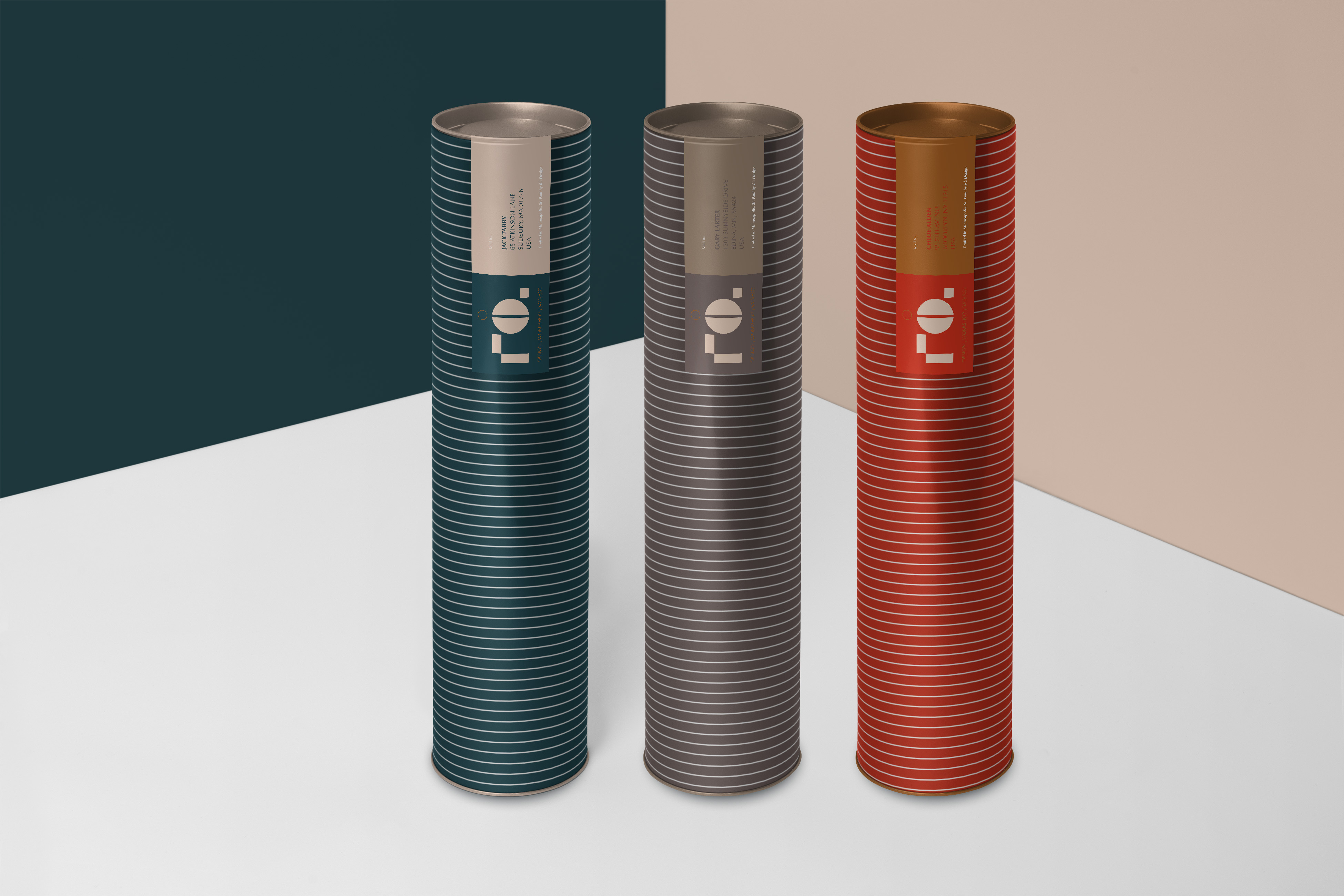
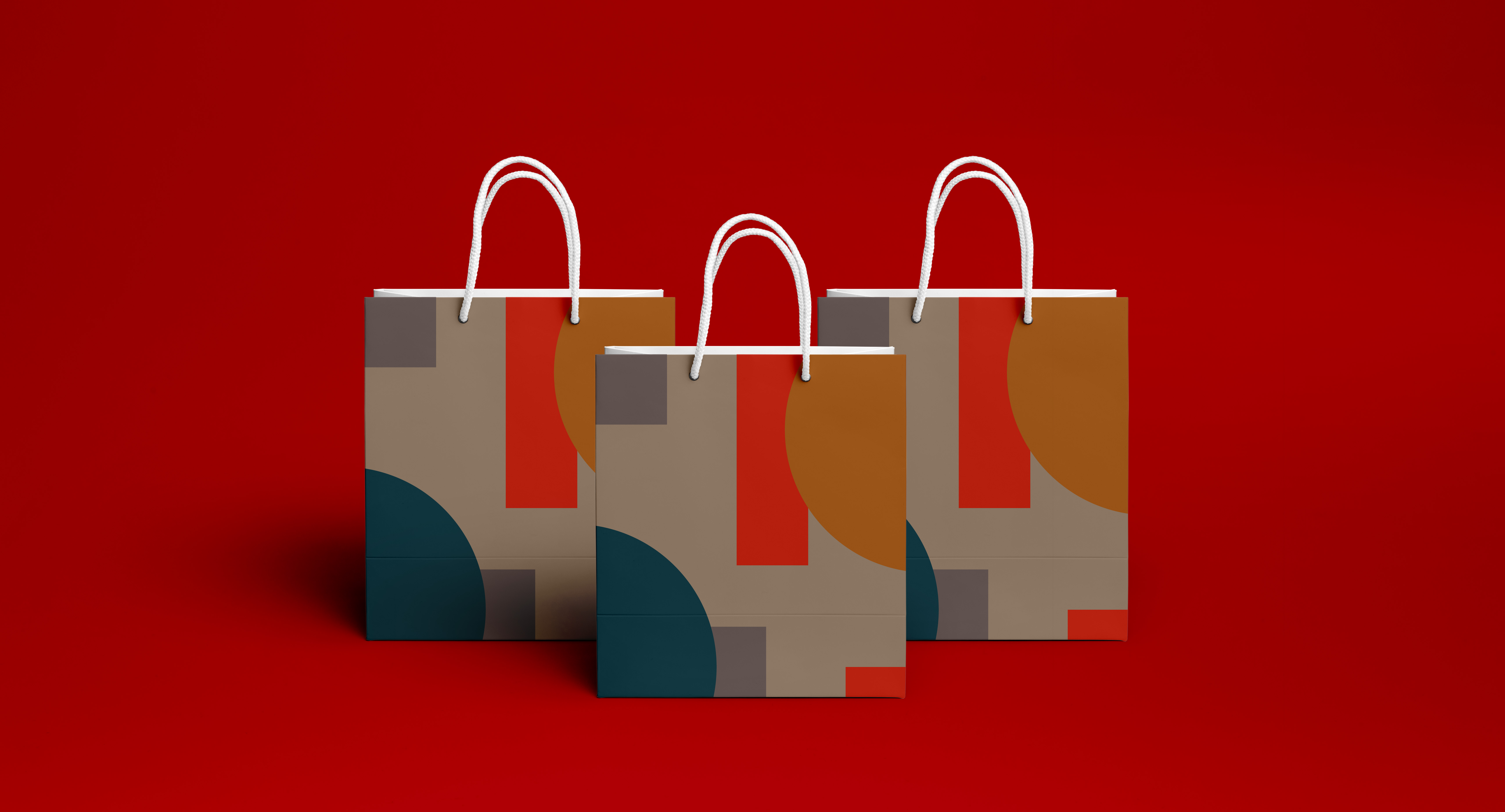
- Format: Bag, Box, Tube
- Substrate: Pulp Carton, Pulp Paper


