Crackers design studio – Bake Brown cookie box
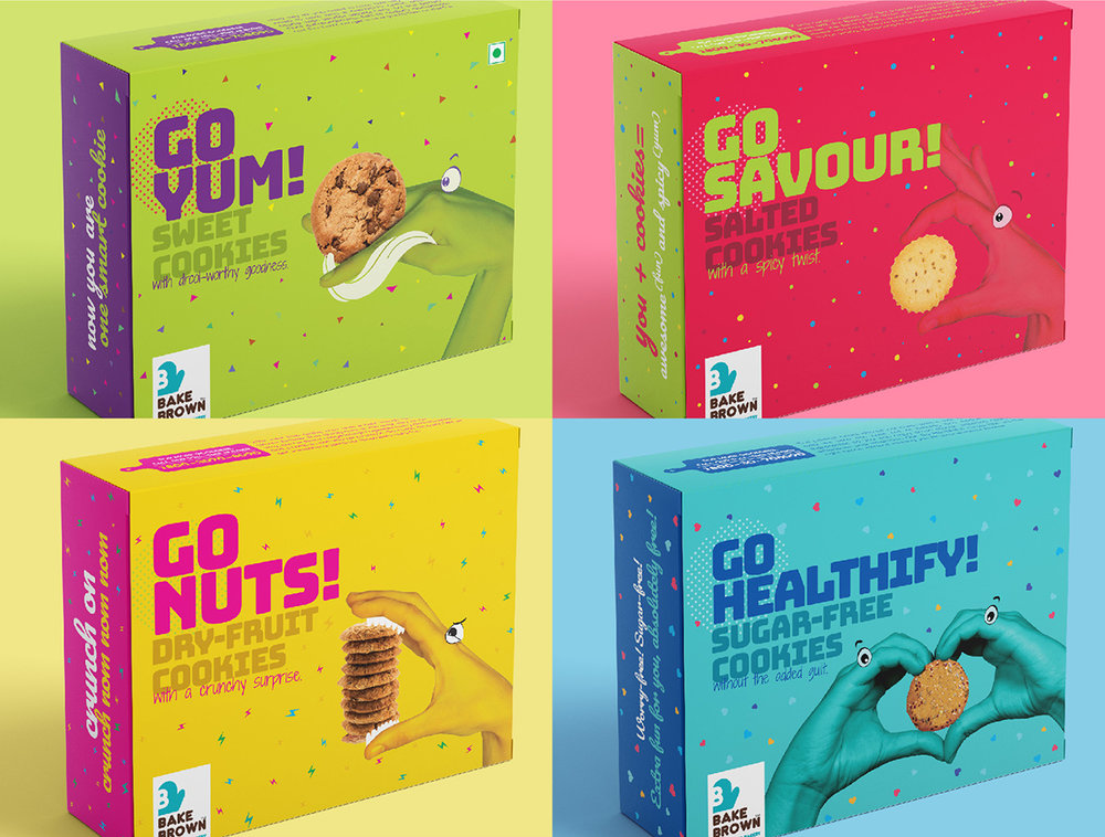
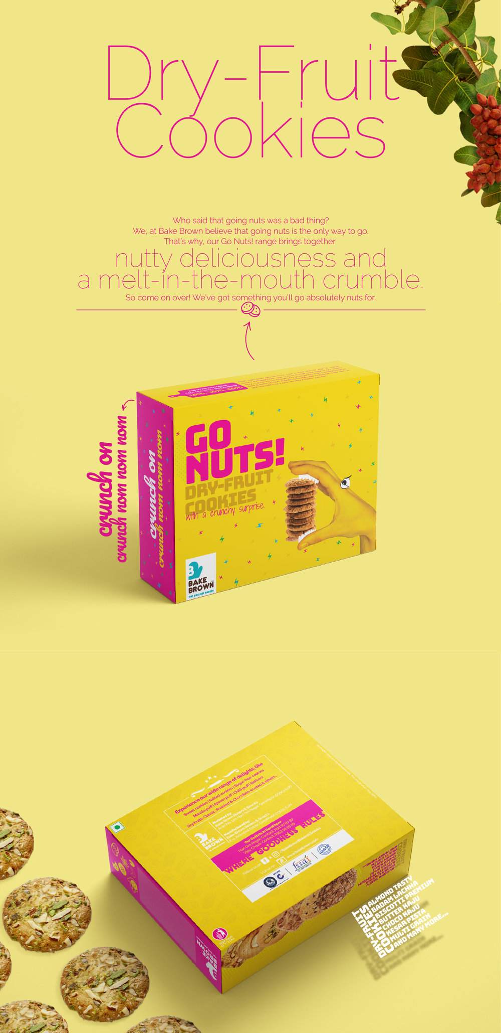
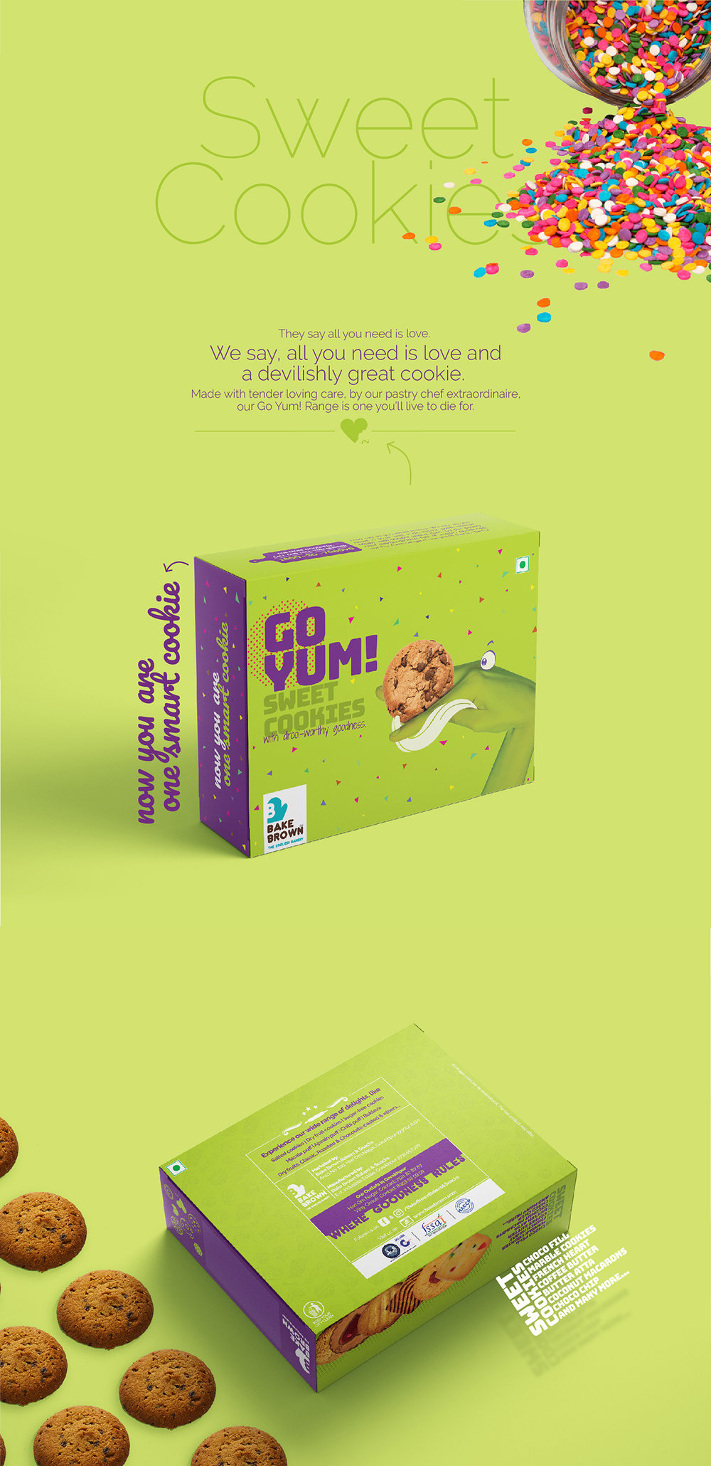
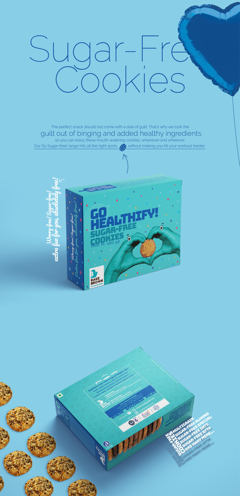
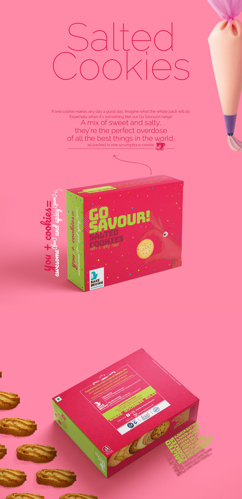
“Bake Brown cafe approached us to design a cookie box packaging for their wide range. It is an undisputed fact that apart from all the health benefits that come with eating with one’s hands, it is far more satisfying than anything else. Our hands are the first contact we make with food, especially in the case of something like cookies. For the product naming, we’ve given all the four ranges a sense of action by using the word “Go” as an initiation into the act of eating. As a visual , we’ve used the form of hand disguised as various characters and designed them as the real eaters.”
CREDIT
- Agency/Creative: Crackers Design Studio
- Article Title: Quirky Conceptual Packaging Design for Cookie Box
- Project Type: Packaging
- Agency/Creative Country: India
- Market Region: Asia
- Format: Box
- Substrate: Pulp Paper
FEEDBACK
Relevance: Solution/idea in relation to brand, product or service
Implementation: Attention, detailing and finishing of final solution
Presentation: Text, visualisation and quality of the presentation


