


“We craft timeless brands that emotionally connect with the target audience, leaving a lasting legacy in a crowded market.”
quirk+quill (q+q) offers design, content, marketing, and strategy-building services with a unique focus on psychologically rooted brand development. As a brand, we needed to look and speak the part.
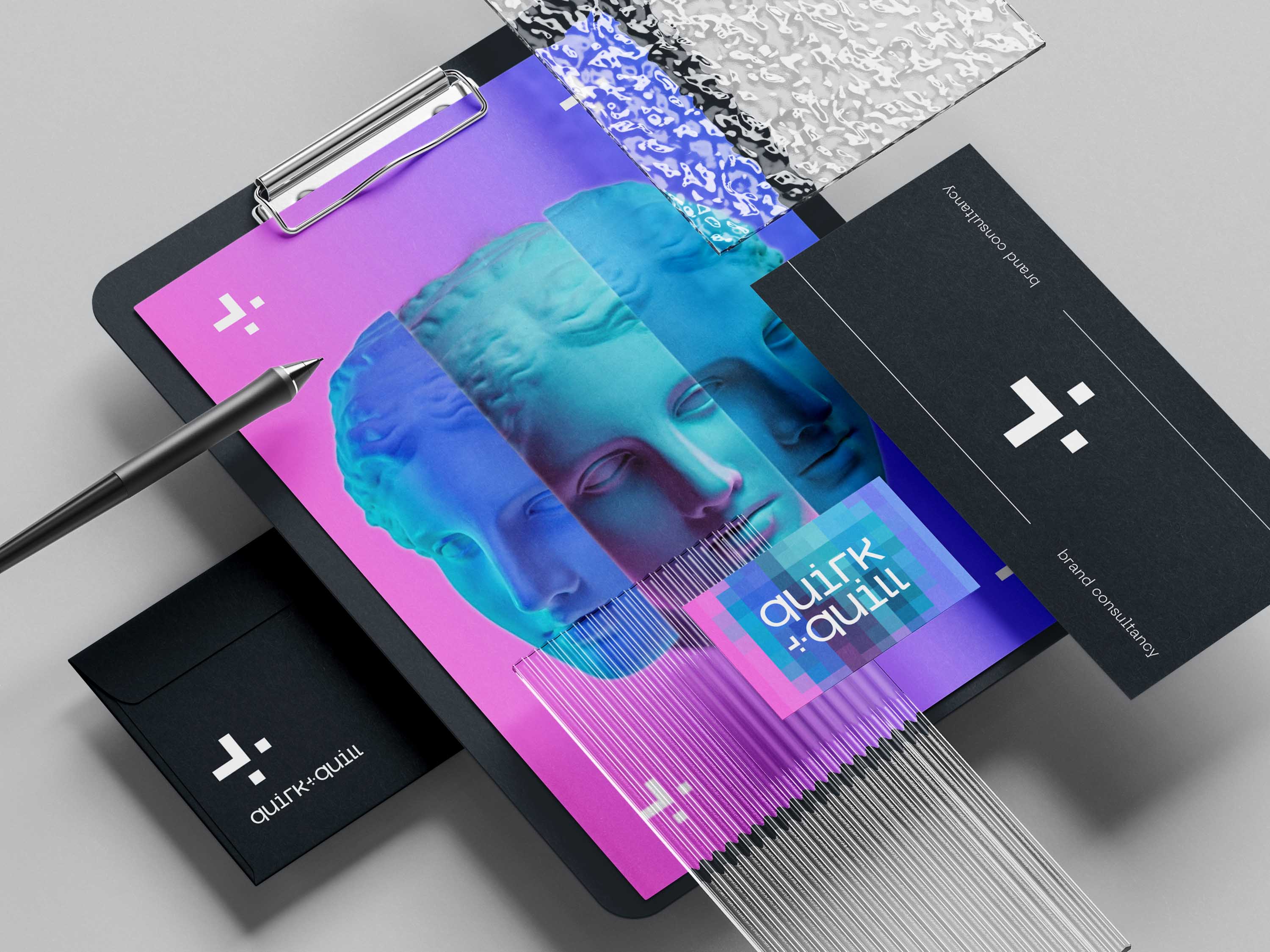
Brand Naming: Through creative exploration and extensive research emerged the distinctive name quirk+quill. ‘quirk’ embodies the unique and emotive essence found in every brand. ‘quill’ on the other hand, signifies the versatile skills needed for crafting brands, be it design, strategy, or content creation.
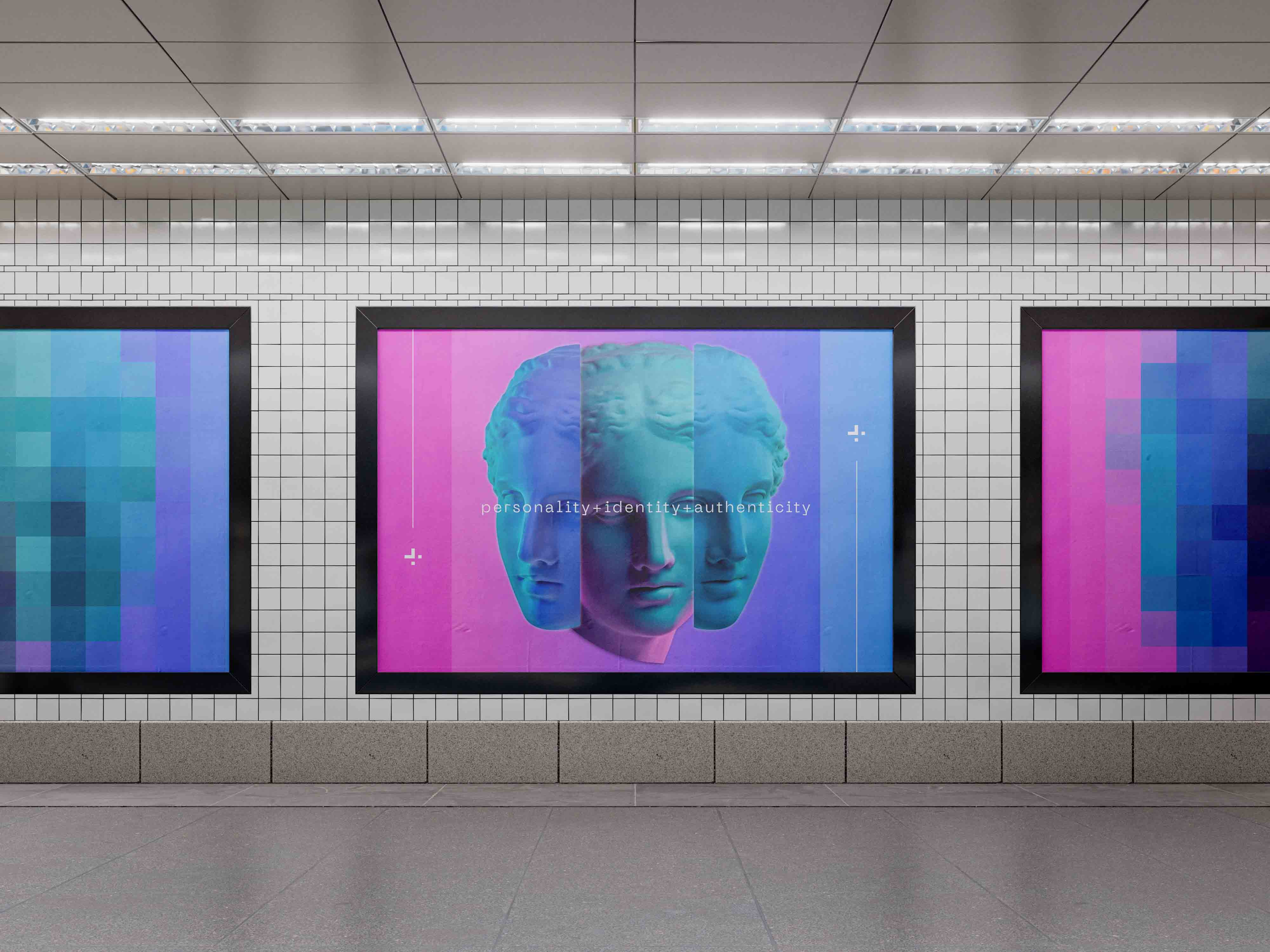
Brand Identity: At the heart of quirk+quill (q+q) lies a distinctive framework known as PIA, a visionary concept crafted by our founder Klaudia Bacinska (a book on this is in the making!). PIA encapsulates the essence of a successful brand, embodying a Personality, Identity, and Authenticity. Drawing inspiration from Greek mythology, our approach utilises timeless brand archetypes to sculpt narratives that have proven to work across centuries.
Inspired by this framework, our brand identity takes form in the graceful silhouette of Greek figure, embodied in three distinct phases, each echoing an aspect of PIA’s ethos (personality, identity, authenticity).
The q+q logo is a testament to our commitment in blending tradition with innovation. With its fusion of typewriter aesthetics, retro pixel elements coupled with classical art aesthetics, it serves as a visual representation of our journey, bridging historically proven psychological insights with cutting-edge design.
As for the choice of colour, we dare to defy convention. While embracing the classic black-and-white foundation, we infuse it with vibrant accents of pastel pinks, blues, greens, and purples. This harmonious blend sparks creativity, capturing attention and igniting engagement in equal measure.
But it’s the retro pixel look married with classicism that truly sets us apart. Inspired by the origins of digital technology, our pixelated motifs pay homage to the past while embracing the future.
This blend of nostalgia and innovation breathes life into our brand, creating an immersive experience that resonates with modern audiences whilst retaining a strong sense of symbolism.
Brand Personality: Complemented by a strategic and uniformed tone of voice and use of language selected using the PIA framework, the brand narrative comes alive, seamlessly merging deep-rooted frameworks with contemporary technology. This dynamic composition embodies the essence of q+q, reflecting our dedication to modernity, thoughtfulness, and unmistakable uniqueness in the realm of branding.


CREDIT
- Agency/Creative: quirk+quill
- Article Title: quirk+quill In-House Brand Naming and Identity
- Organisation/Entity: Freelance
- Project Type: Identity
- Project Status: Published
- Agency/Creative Country: United Kingdom
- Agency/Creative City: London
- Market Region: Europe
- Project Deliverables: Brand Creation, Brand Design, Brand Guidelines, Brand Identity
- Industry: Professional Services
- Keywords: Brand Identity, Brand Personality, Brand Design, Creative Visuals
-
Credits:
Co-Founder: Klaudia Bacinska
Co-Founder: Justyna Kaminska


