


Throughout over more than seven hundred harvests, Quinta do Gradil changed owners several times who implemented improvements and brought the Estate new stories to tell.
Based on a rich body of historical research, we created a strong storytelling and a very valuable concept for this Lisbon wines.
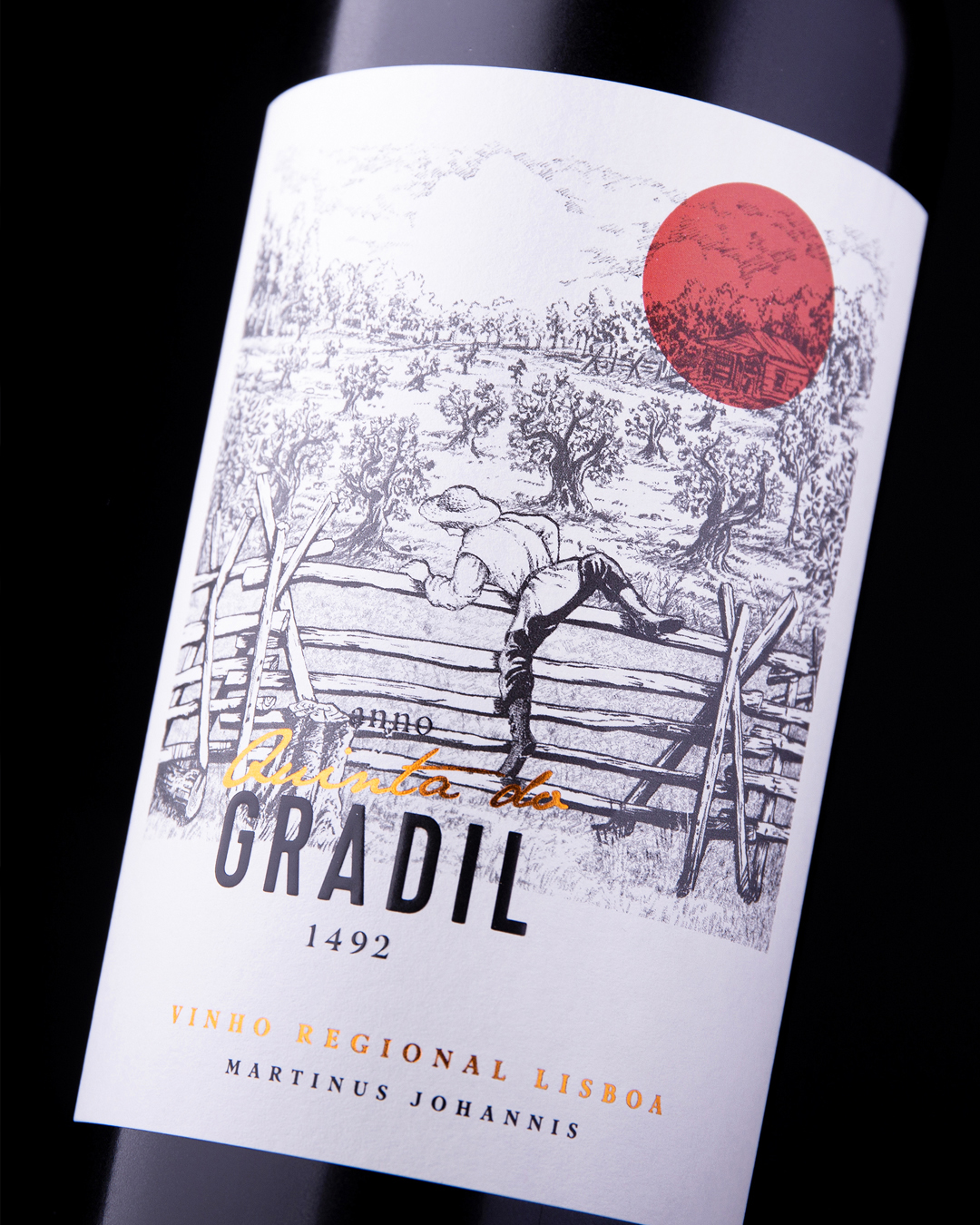
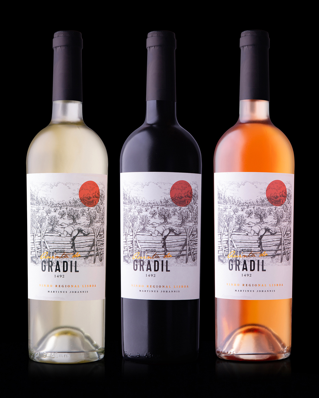
In the late 13th century, a clever man called Martinus Johannis discovered Gradil, bought the property and enclosed it with a fence. Next, he planted a vineyard, which marked the beginning of a great odyssey.
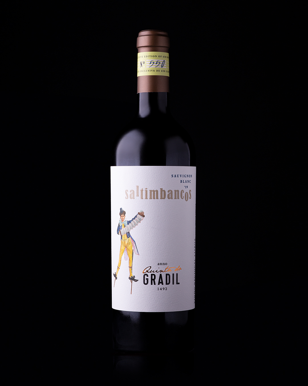
We found the first written reference of Quinta do Gradil in a document signed by King D. João II of Portugal on 14th February 1492, demonstrating the estate’s great value as early as the 15th century.
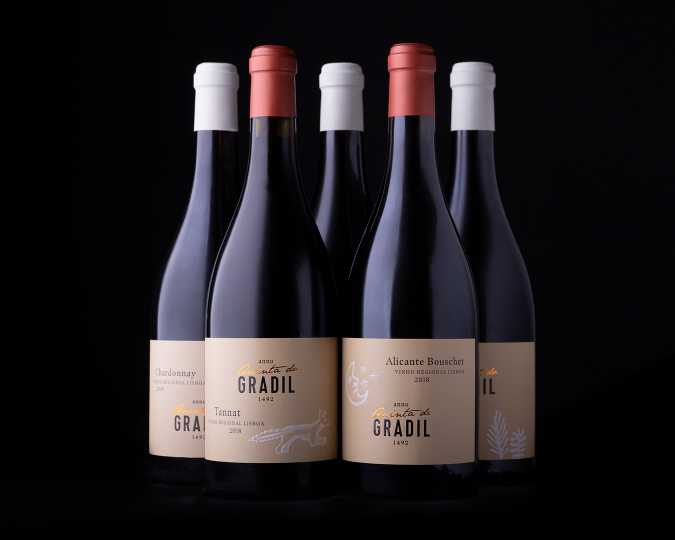
Surrounded by woods and forests, in the 16th century Quinta do Gradil was inhabited by partridges, hares, foxes and deer. For this range, which pays tribute to the estate’s biodiversity, we recreated medieval drawings that express the purity of each grape variety.
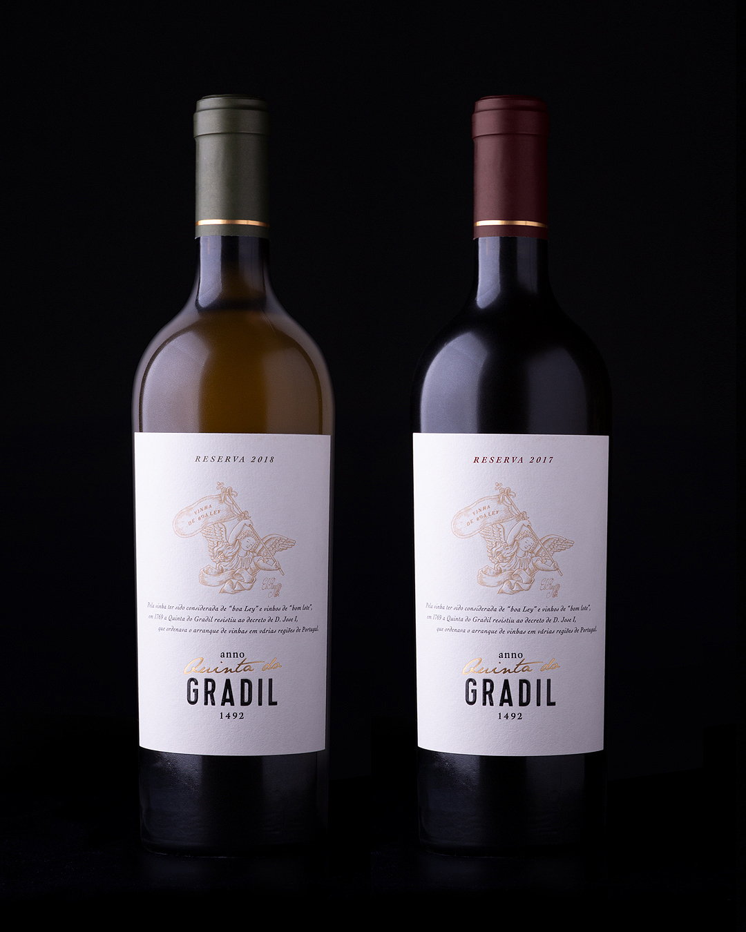
Because the vineyards were considered “from good soil” and the wines “from good batches”, in 1769 Quinta do Gradil withstood the decree by King Jose I that ordered the extraction of vineyards in several regions in Portugal.
In the 19th century, Quinta do Gradil was owned by a poet, and “Saltimbancos“ (Travelling Players) was one of his most famous poems. Because not all vintages are alike and every grape variety behaves differently, each character in this range of travelling players appears with a new act whenever necessary.


CREDIT
- Agency/Creative: RitaRivotti®
- Article Title: Quinta do Gradil Label Design by RitaRivotti
- Organisation/Entity: Agency
- Project Type: Packaging
- Project Status: Published
- Agency/Creative Country: Portugal
- Agency/Creative City: Lisboa
- Market Region: Europe
- Project Deliverables: Packaging Design
- Format: Bottle
- Substrate: Glass Bottle
- Industry: Food/Beverage
- Keywords: #branding #identity #packagingdesign #winedesign #ritarivotti #design #wine #packaging
-
Credits:
CEO & Creative Director: Rita Rivotti


