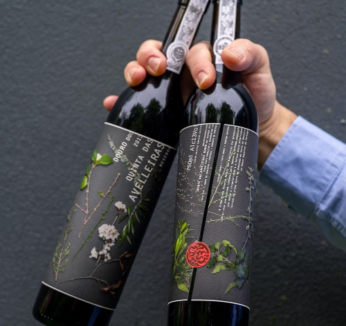
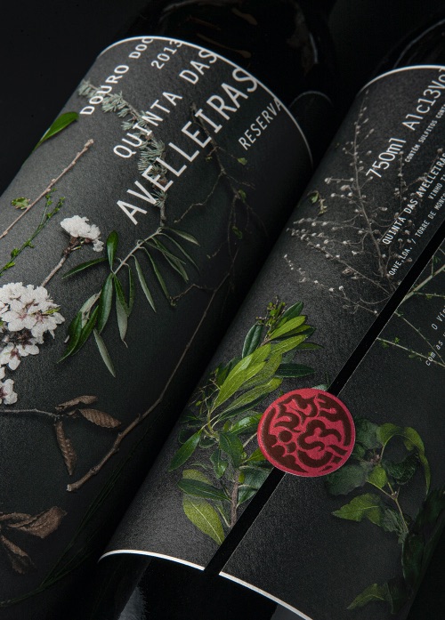
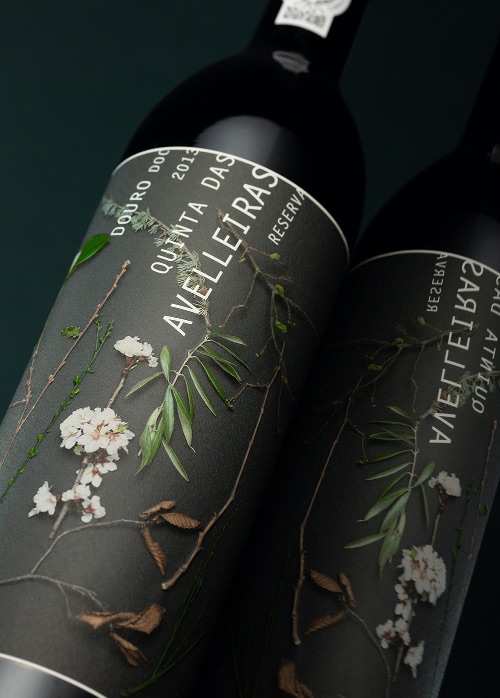
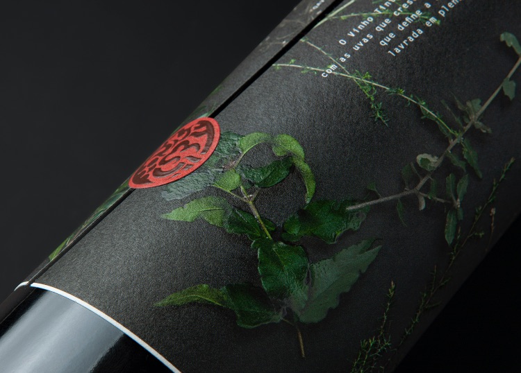
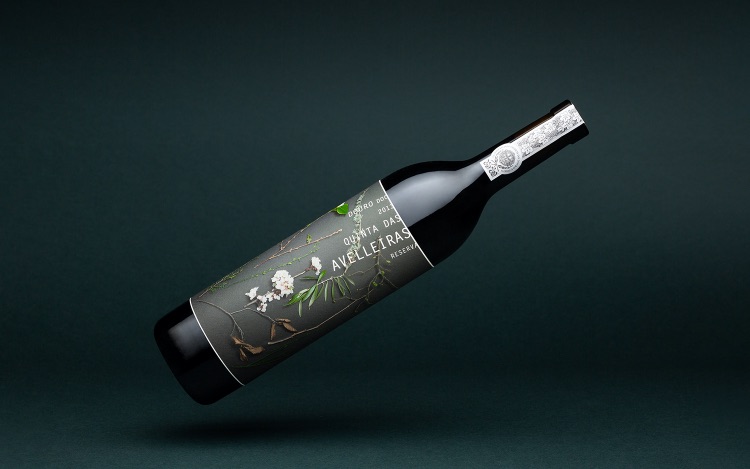
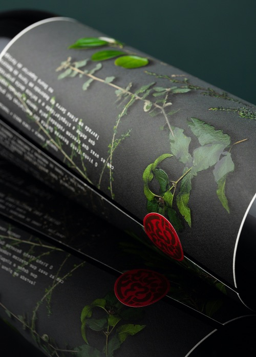
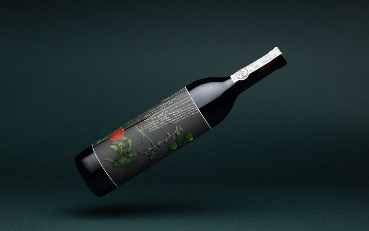
“Nature reserved for you” is the message we wish to convey. The aim was to obtain a distinct, contemporary image harmoniously reconciling the physical and graphic media. The tall, narrow Bordeaux bottle enabled the use of a large-format combination front and back label that wraps almost right around the body of the bottle. The image takes up all available space on the label. It is a photo in the style of a herbarium featuring a selection of plants found in the “nature reserve” at the wine estate. The layout of the text highlights the height of the label and keeps pace with the pattern of the background image, respecting the hierarchy required for the content of front and back wine labels. The single label incorporating traditional front and back label information is cut at a slant at both ends, joined together with a cut-out of the brand’s seal, also visible on the top of the capsule, and in the profile of the IVDP seal of authenticity. The base image was photographed against a neutral background, with the lighting emphasising the plants and allowing the text to spread across the white border. The slanted text, set parallel to the angle of the label’s slanted cut, flows down from the upper band to the lower band creating a framework that allows the graphic elements to breathe. The rigour of the drawing, the offset printing (CMYK), the application of finishes – reserved matte varnish and high relief – as well as the choice of paper (Arconvert Cotone Bianco) has produced a label that adds quality to the product by adding value to the Quinta das Avelleiras Reserva Douro packaging.
What’s unique?
The label design favours the organic forms of the plants represented photographically and offset printed, fashioned with the application of high relief and serigraphic matte varnish applied in different ways depending on the real shine of some of the plants. The text is set in “Letter Gothic MT Std Bold” and keeps pace with the rhythm of the plants and determines the cut of the angled label. The end result of the packaging image is authentic and appealing, highlighting the value of the product and of its origin.
CREDIT
- Agency/Creative: Mpfxdesign Lda.
- Article Title: Quinta Das Avelleiras – Nature Reserved for You by Mpfxdesign Lda.
- Organisation/Entity: Agency
- Project Type: Packaging
- Project Status: Published
- Agency/Creative Country: Portugal
- Agency/Creative City: Porto
- Market Region: Europe
- Project Deliverables: Packaging Design
- Format: Bottle
- Substrate: Glass Bottle
- Industry: Food/Beverage
- Keywords: WBDS Agency Design Awards 2021/22
-
Credits:
Photographer: Paulo Serra
Photographer: Jose Eduardo Cunha
Photographer: Joao Pinto Fu00e9lix


