Round Corner Brewing is a new brewery and taproom in the heart of Melton Mowbray’s livestock market. In a region celebrated for its authentic character and flavours, Round Corner offers inspired takes on classic beer styles and an eclectic choice of seasonals and one-offs, to real acclaim.
In a craft beer world full of arresting designs, we wanted to create a range that was eye-catching but could reflect of Round Corner’s emphasis on brewing finesse and drinkability for an emerging, increasingly discerning drinker fatigued by the excesses of craft experimentalism.
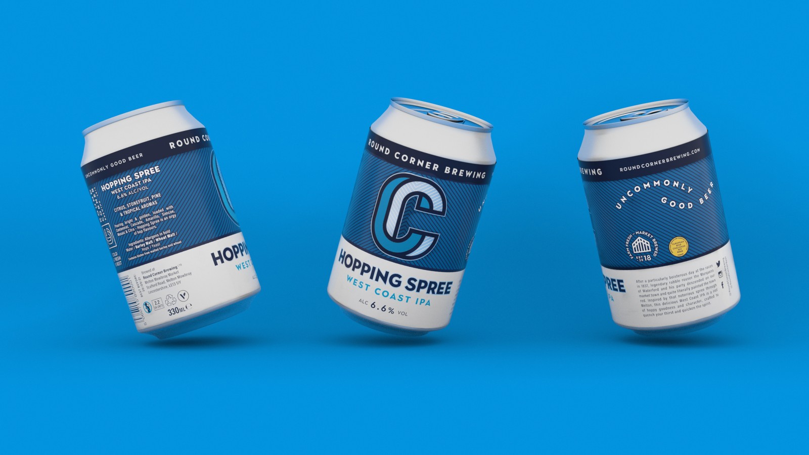
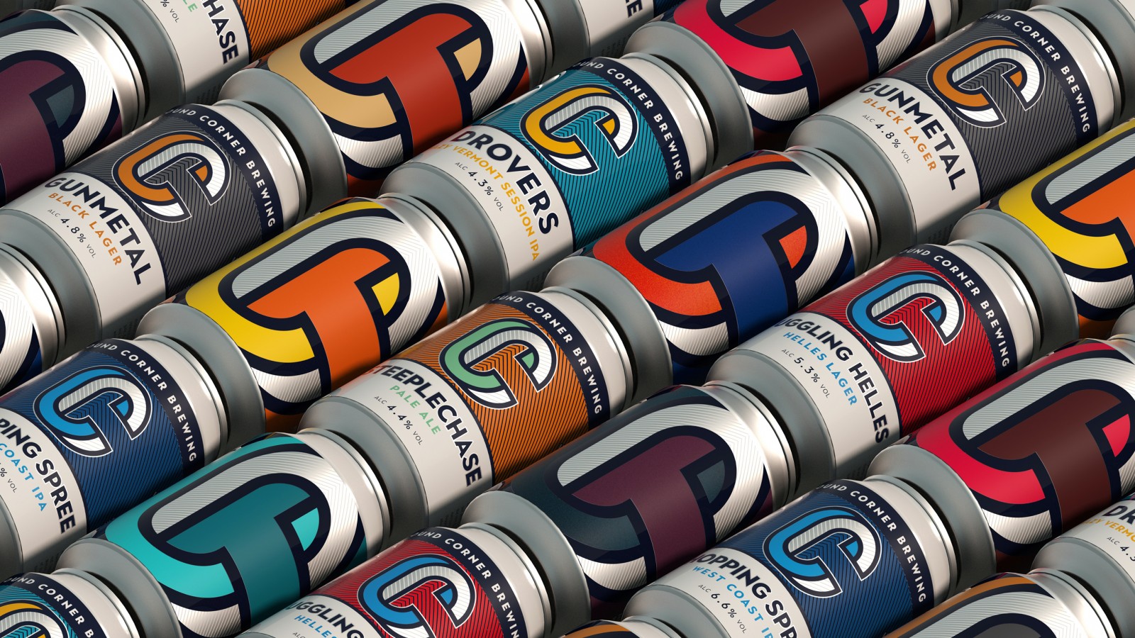
Inspired by the name (a local expression for a wedge of stilton), the identity explores the idea of a tromp l’oeil – the ‘Impossible C’ – an icon with a quality of line reminiscent of a branding iron which upon examination reveals a lower-case ‘R’. Typography is celebrated throughout the design, not least in our humourous curved type highlighting our ethos of “uncommonly good beer”. We make our provenance explicit with our “shed” icon – the very real source of our beer in the centre of the market and remind drinkers of our premium quality – we’re “farm-fresh and market-brewed” and a true reflection of the place we call home.
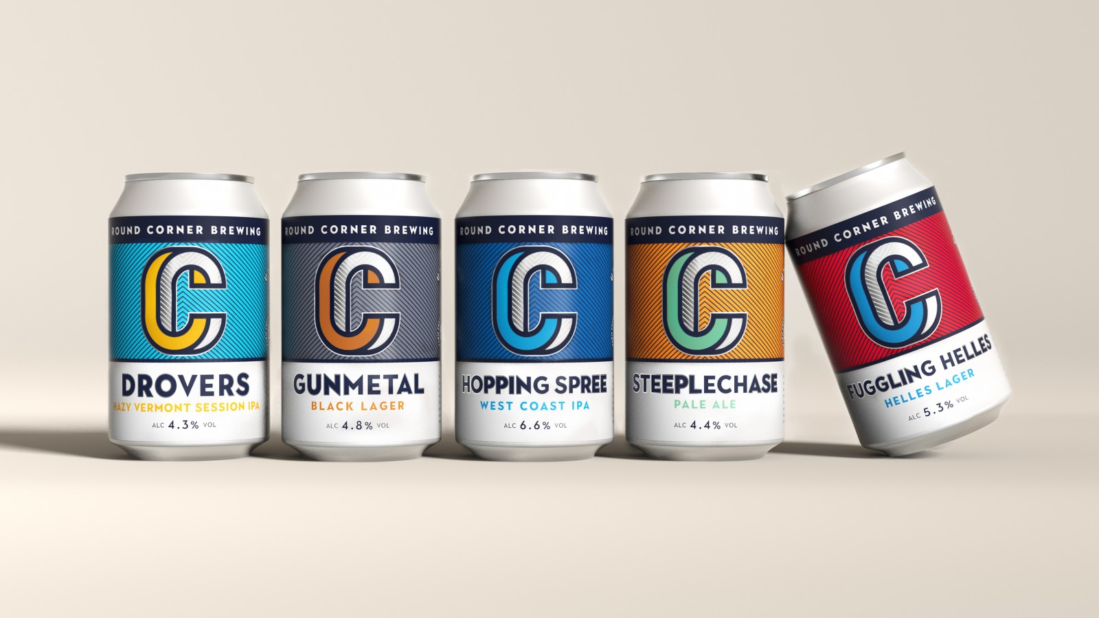
For the core range, the mark is housed in a two-thirds band that sweeps across the can with the name, variant and ABV in the lower third. The colours are printed flexo with pantones for clarity and richness. A textured varnish is applied to the herring bone detail and the coloured element of the C for an effect that is more crafted than it is ‘craft’.
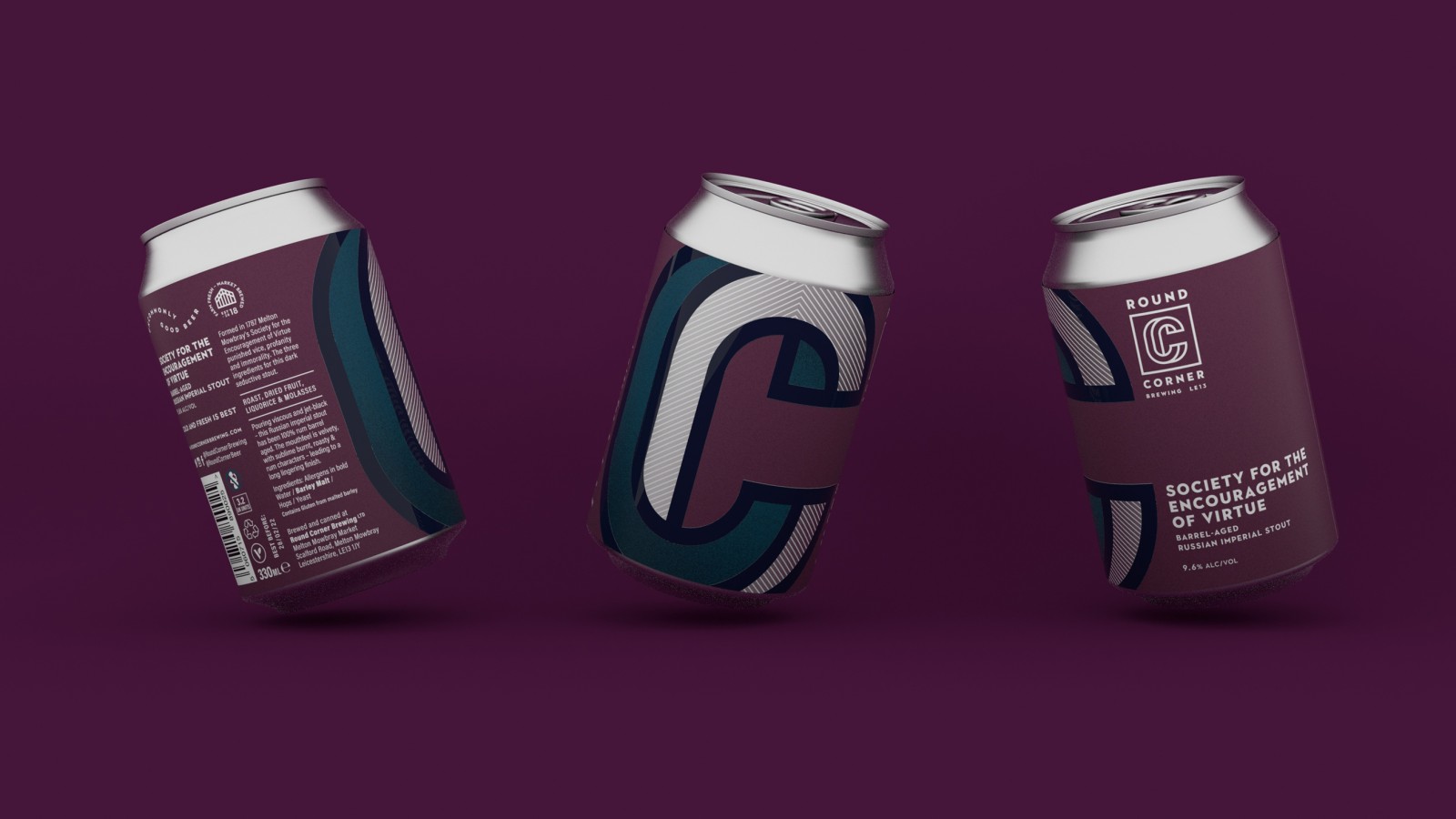
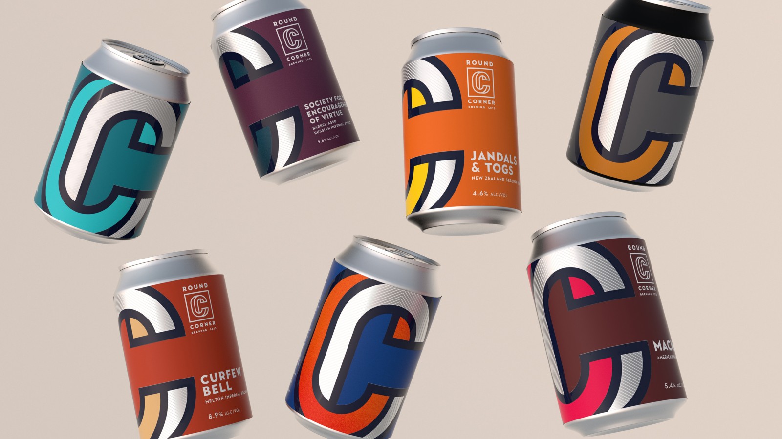
We bring timeless detail to each design with silver highlights – the silver trapping around the brandmark and names, or the silver rendering of the ‘Impossible C’ with a touch of white herring bone. The Seasonal cans offer their own characterful touches but share the supersized icon that takes over the front face – one that we hope will soon be synonymous with uncommonly good beer everywhere.
The beer names and product stories deepen the connection with our characterful and occasionally eccentric home by offering memorable bar-calls and witty takes on our surprisingly eventful local history. The “Society for the Encouragement of Virtue” whose efforts to tame the moral excesses of this hard-working farming community are fittingly commemorated with a 9.9 ABV Barrel-aged Russian Imperial Stout or our award-winning “Hopping Spree” – a delicious West Coast IPA inspired by the exploits of one Marquis of Waterford – himself legendary rabble rouser whose nocturnal revels in our fair town introduced the marvellous expression “painting the town red” and idea of a “spree” to the English vernacular.

CREDIT
- Agency/Creative: Quietly Studio
- Article Title: Quietly Studio Creates an Eye-Catching Packaging Design for Round Corner Brewing
- Organisation/Entity: Published Work
- Project Type: Packaging
- Project Status: Published
- Agency/Creative Country: United Kingdom
- Format: Can
- Keywords: WBDS Agency Design Awards 2020/21


