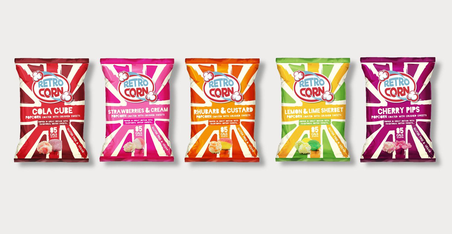
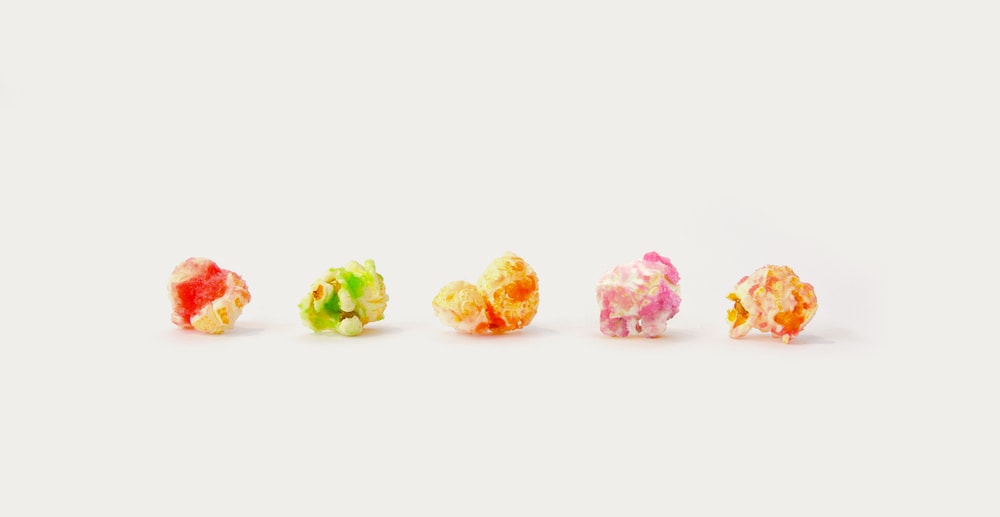
” You can’t move for popcorn brands these days; In fact there’s no shortage of popcorn brands that mostly taste and look just the same. Very few indeed, in a crowded sector, have the character and originality to genuinely stand out from the crowd.However, RetroCorn, who began producing small batches of its tasty all-natural, gluten-free, vegan popcorn in Essex in 2012, were already well ahead of the game; Each batch is gently hand-popped, and using their own secret technique, coated with crushed classic sweetshop sweets [Candy Shop hard-candies] ; Cola Cubes, Strawberries & Cream, Rhubarb & Custard, Lemon & Lime Sherbet and Cherry Pips.The brand is distributed through Farm Shops, Delis and retailers including The Co-op and Mr Simm’s; They were the Official celebrity goody-bag snack of both the 2016 Brit Awards and the 2016 Rock Awards, and have produced bespoke flavours for the Radisson Blu Hotel Group, Elemis and a special “Brain flavour” in conjunction with NOW TV’s release of “The Walking Dead”. Despite all this, purchase frequency wasn’t as high as they’d like – and that, clearly, had to be addressed.”
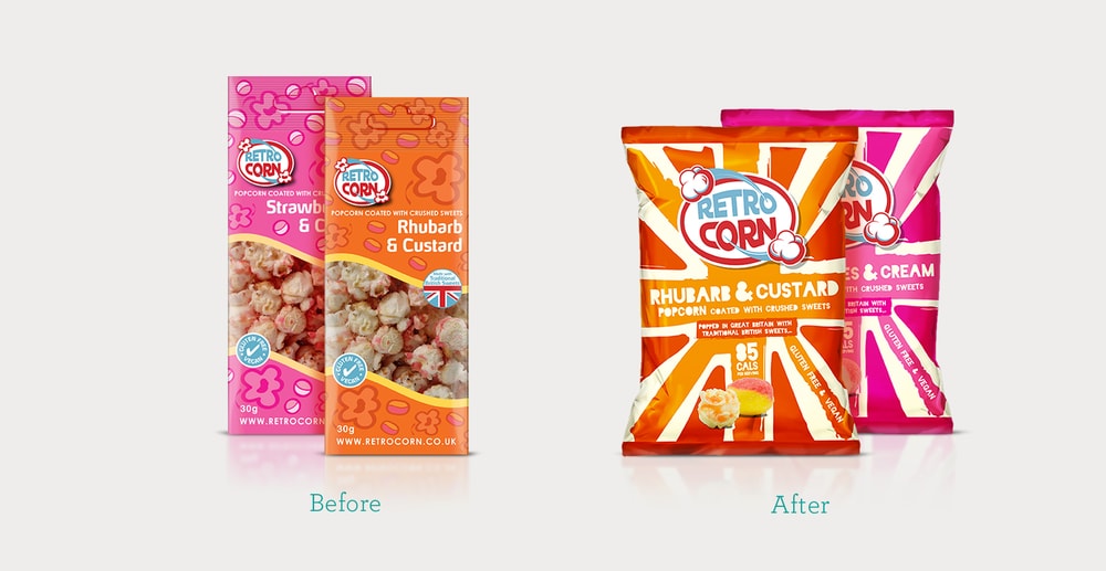
“Brief : The popcorn category has experienced recent huge growth, with myriad new opportunities in usage occasion – so RetroCorn needed to stay one step ahead of the competition. After tasting RetroCorn Popcorn we were genuinely amazed. The quality is outstanding – with truly original, classic and unforgettable flavours, so it was clear that we needed to create packaging with equal impact that was classic yet edgy; fun, but different. We were briefed to reinvent the brand in a modern and relevant way whilst being respectful that at the heart of the RetroCorn brand are the traditional British Sweetshop Sweets of Old, which is integral to the individuality of the product.”
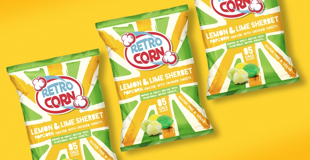
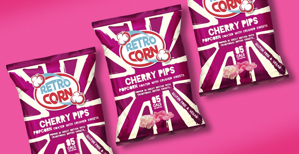
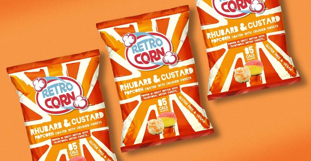
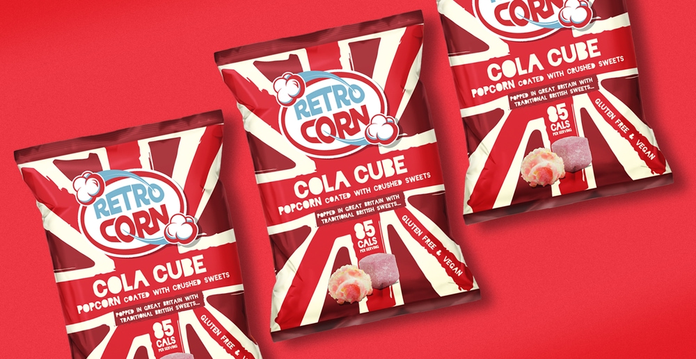
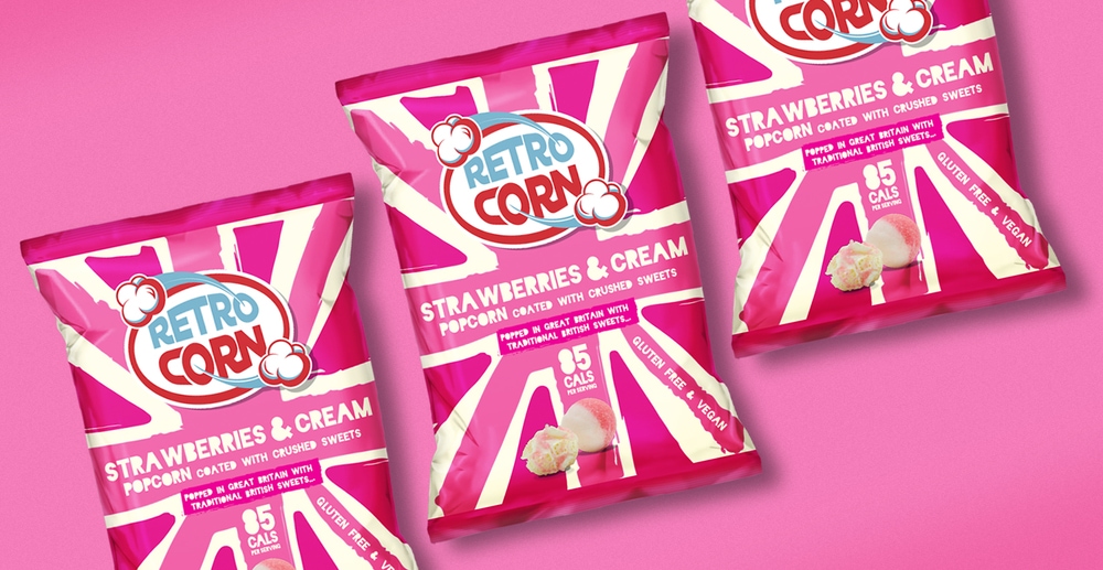
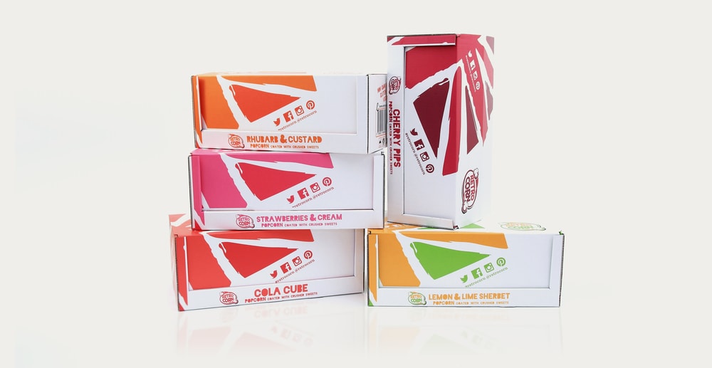
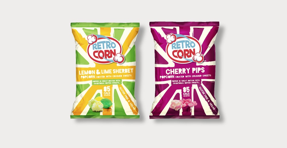
“Approach : The key to getting them noticed was to ensure the design re-injected the spirit of, and clearly communicated, the “Britishness” of the product in order to attract both nostalgic grown-ups and recruit real foodies, without resorting to the cliché’d bucket and spade/end-of-the-pier gift-shop look.Inspired by both the spirit and the aesthetic of the Punk movement, classic British irreverence and freedom-of-expression-without-reprisal – a smidgin unconventional for the popcorn category – whilst taking cues from other relevant categories such as sweets and crisps [Candy and Chips] we developed a system of bold, confident colour combinations – a palette that shouted loud and proud about the brand’s unmistakably eccentric, inventive and slightly bonkers British origins. Together with using a bold Union Jack motif as a stamp of quality and provenance, with these bright unconventional colourways – to differentiate the flavours – and confident, anarchic punk typography -combined with great product photography – we were able to emphasise the amazing ingredients and eccentric and innovative nature of the product.This kind of nuttiness wouldn’t happen in, for example, Germany; who’ve only recently graduated from having just two flavours of crisps – Kartoffel and Paprika; or Norway, where Plain and With Salt, it would seem, are the only popcorn flavours permissible. Like a lot of other world-changing British inventions the genesis of RetroCorn may have begun with a simple but crazy idea. However, this essentially British brand of innovation exemplifies a propensity for playful inventiveness, a special British kind of “Bonkers”.”

“Results : The new design clearly differentiates itself from the competition through its bright and original and provocatively punk aesthetic. However – most of all, the design gets rid of any dated preconceptions that popcorn packaging must follow a certain look, what we like to call the “red plush and cinema lighting aesthetic” – and instead creates a new enticing brand – rich with British flavour, offering consumers a distinctive, iconic, modern, and crucially- different – product. Working to a tight deadline, we enabled RetroCorn owner Greg Taylor to transform his imaginative and original product into a genuinely standout brand.New-look RetroCorn Popcorn was released in April and they’re already beginning to go down a storm; achieving first-time listings in new UK supermarkets, and stores internationally, within it’s first week of relaunch. Since then, we’ve applied the system to a wide range of in-store materials, from Posters to FSDU’s and an array of communications, including literature and ads – all infused with the new vibrantly visual and verbal flavours of RetroCorn. What the client says: Retrocorn is absolutely delighted with the work that Quiet Storm Design did on the re-branding. Retrocorn now has a really strong new identity that promotes its inherent Britishness and its unique selling points. The new designs have allowed us to reach new customers at home and further afield in Europe, The Middle-East and China, and make us instantly recognisable on the crowded popcorn shelves in stores across the UK. We are really excited about our future and look forward to working closely them again on new products for new markets.”
CREDIT
- Agency/Creative: Quiet Storm Design
- Article Title: Quiet Storm Design – RetroCorn Popcorn Redesign
- Project Type: Packaging
- Substrate: Metal, Plastic


