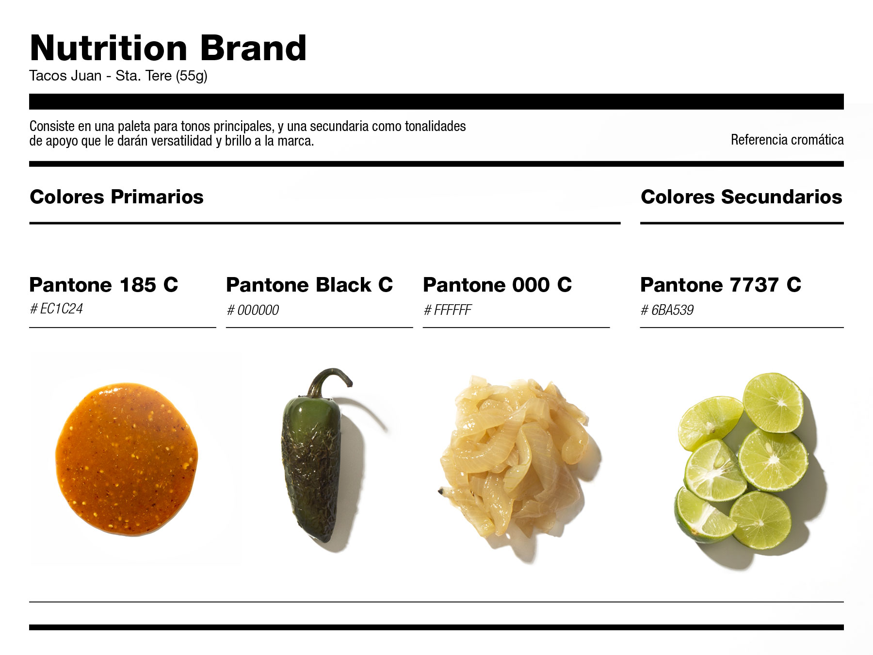
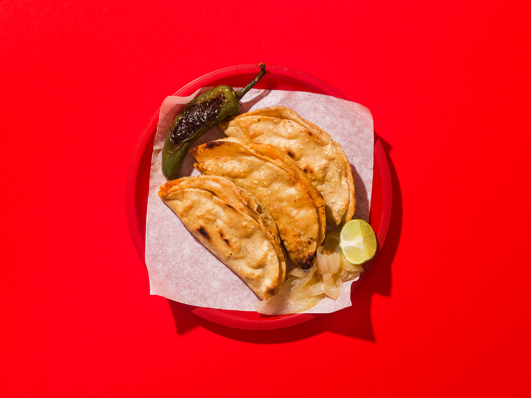
Boostraped from the back of a pick-up truck, Juan made its way up until he became an icon of barbacoa tacos in Mexico. Even when his business broadened to several locales, word of mouth was his main advertising strategy — not that he intended for it.
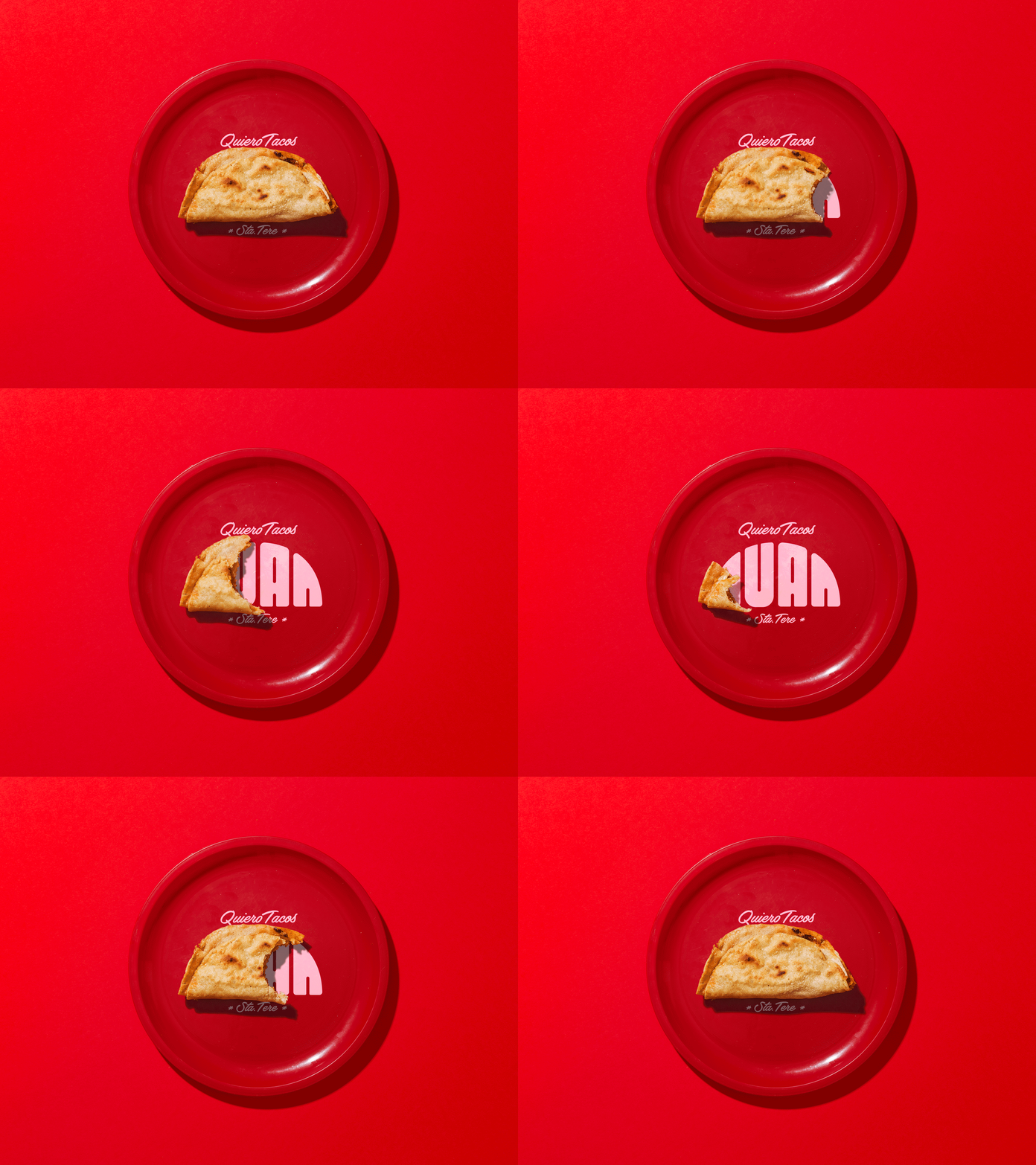
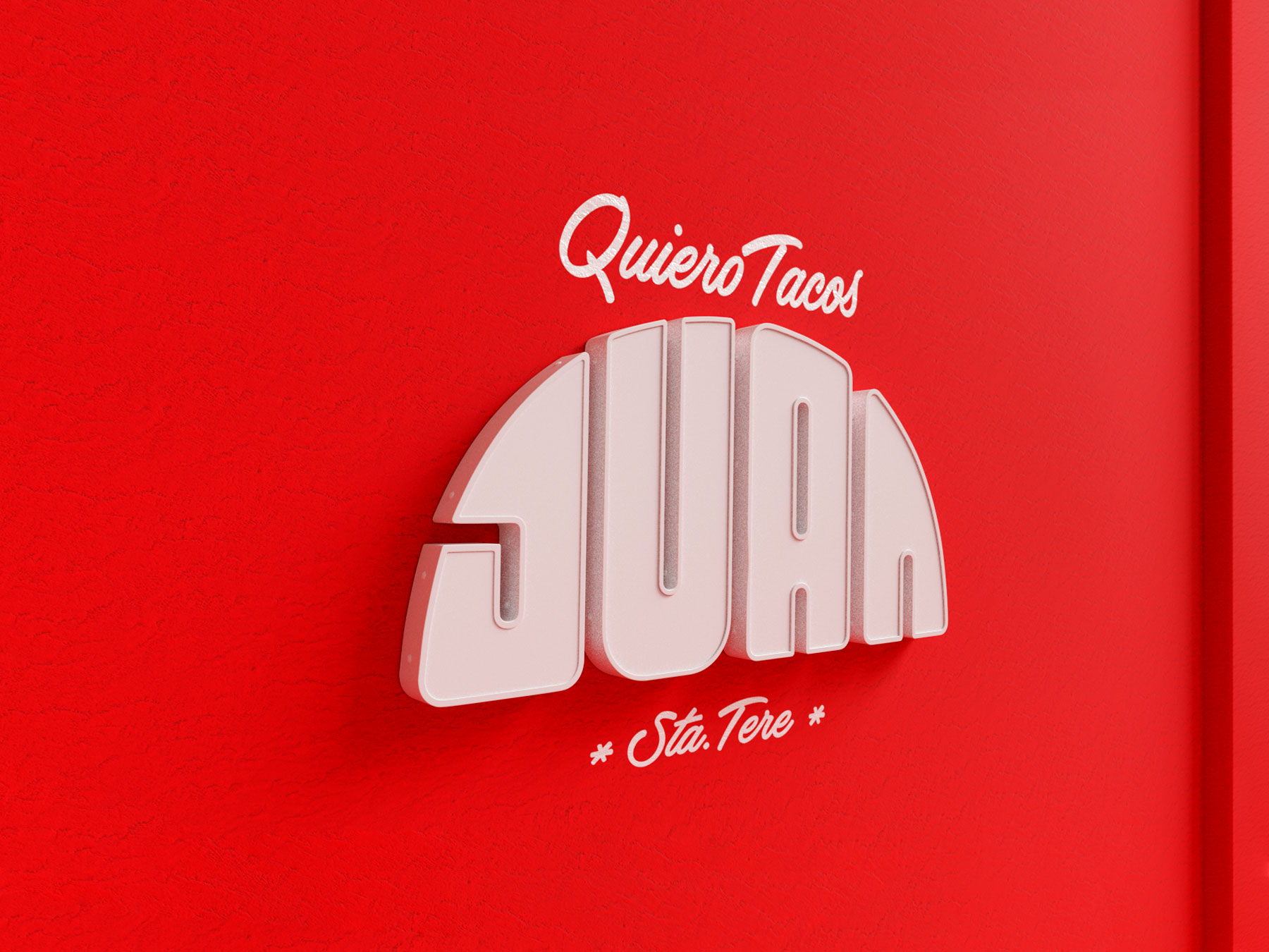
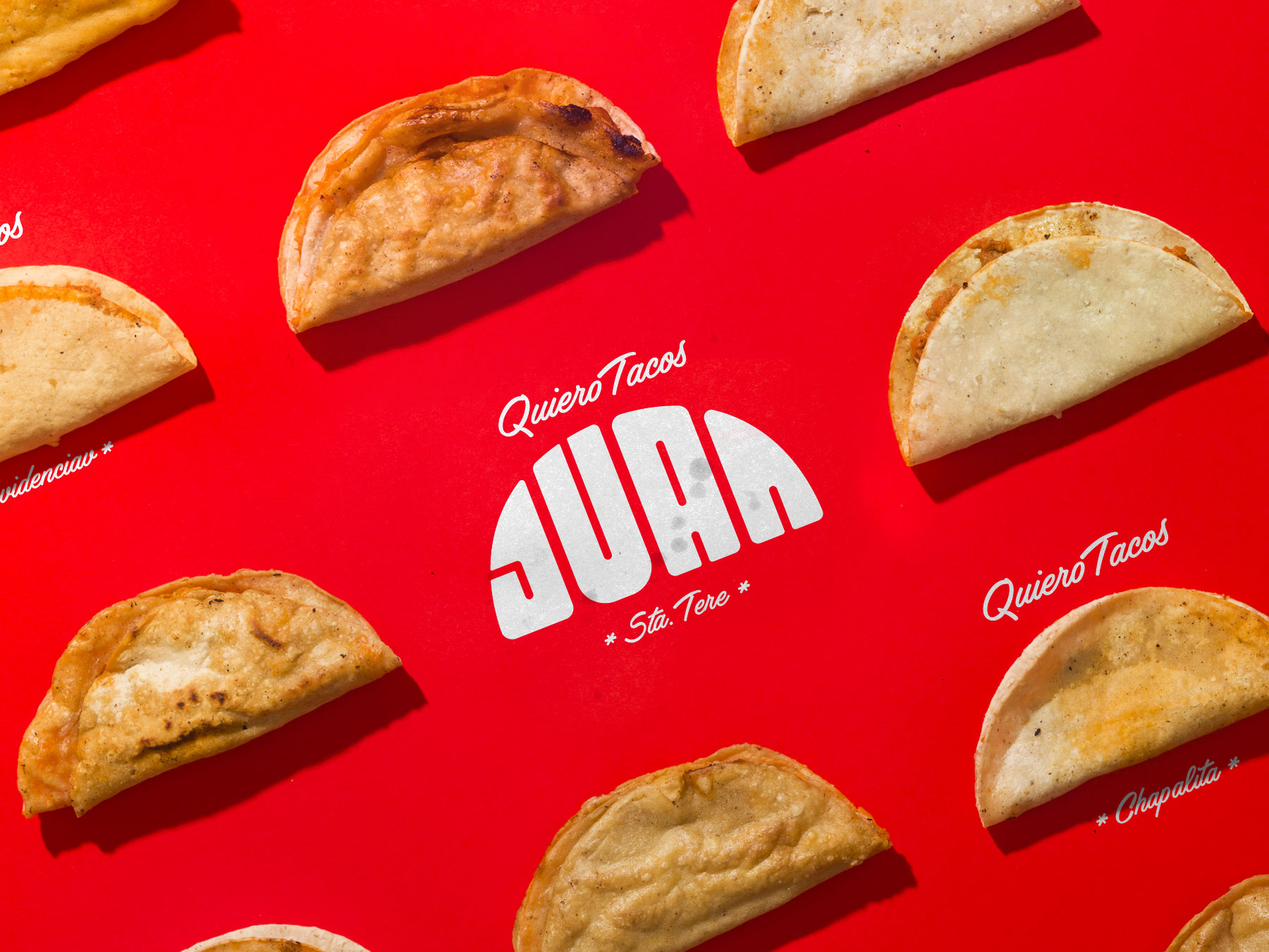
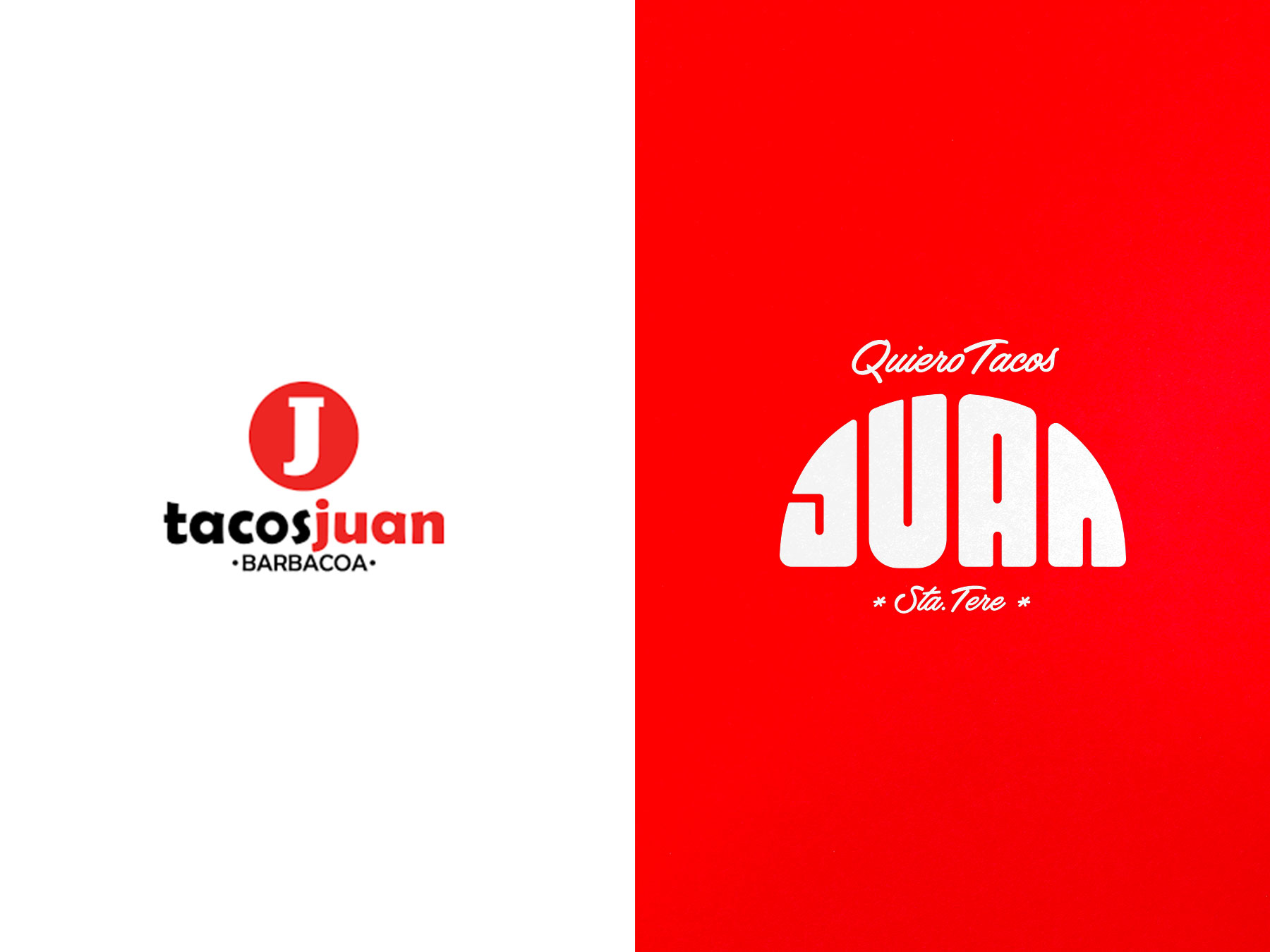
A basic logo resembling that of a competitor went in use until he approached us with the goal of achieving a fresh brand whilst remaining true to the taco stand original feel. Traditional signage gives way to a wordmark in the shape of a taco because, well… tacos.
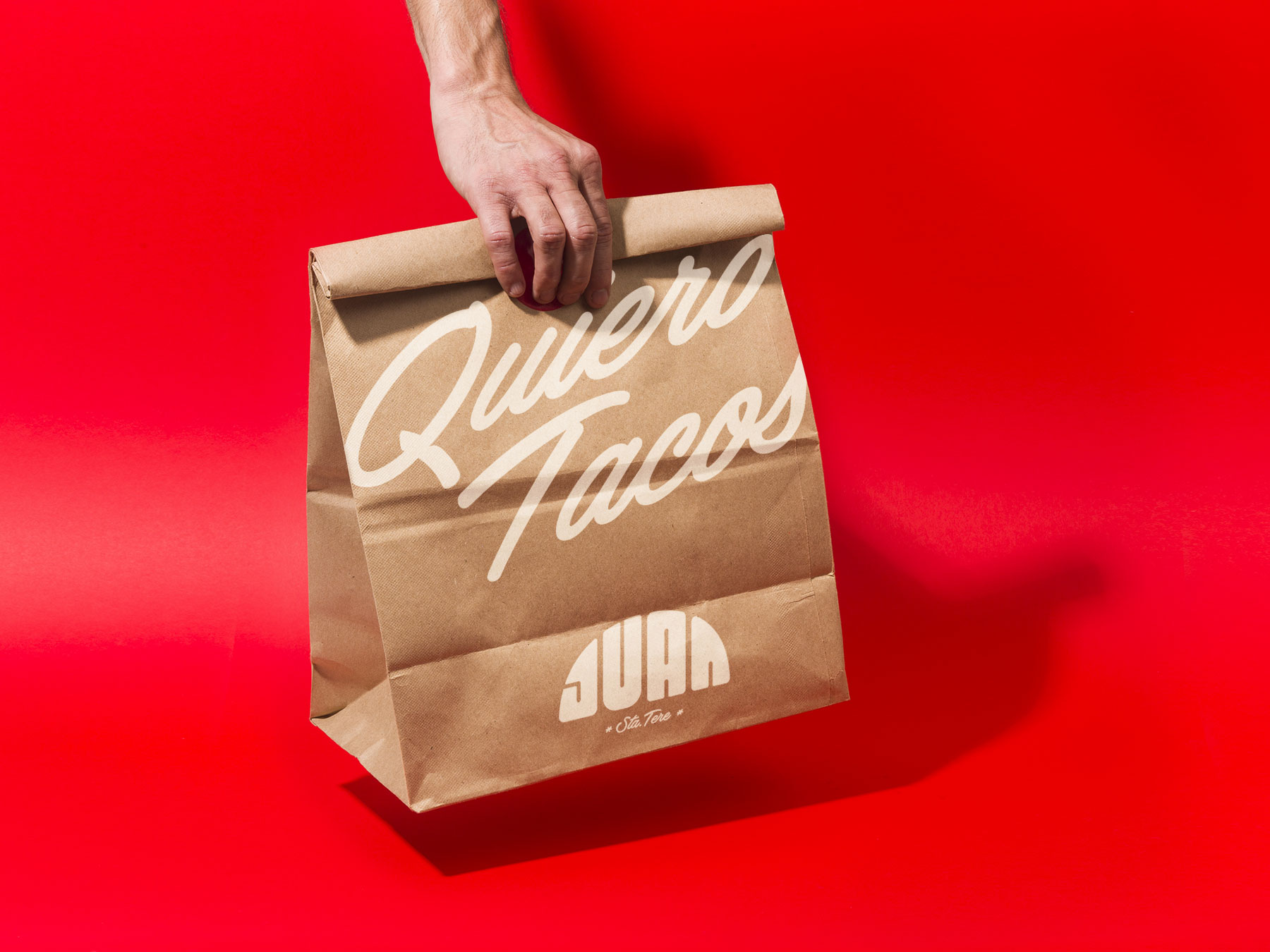
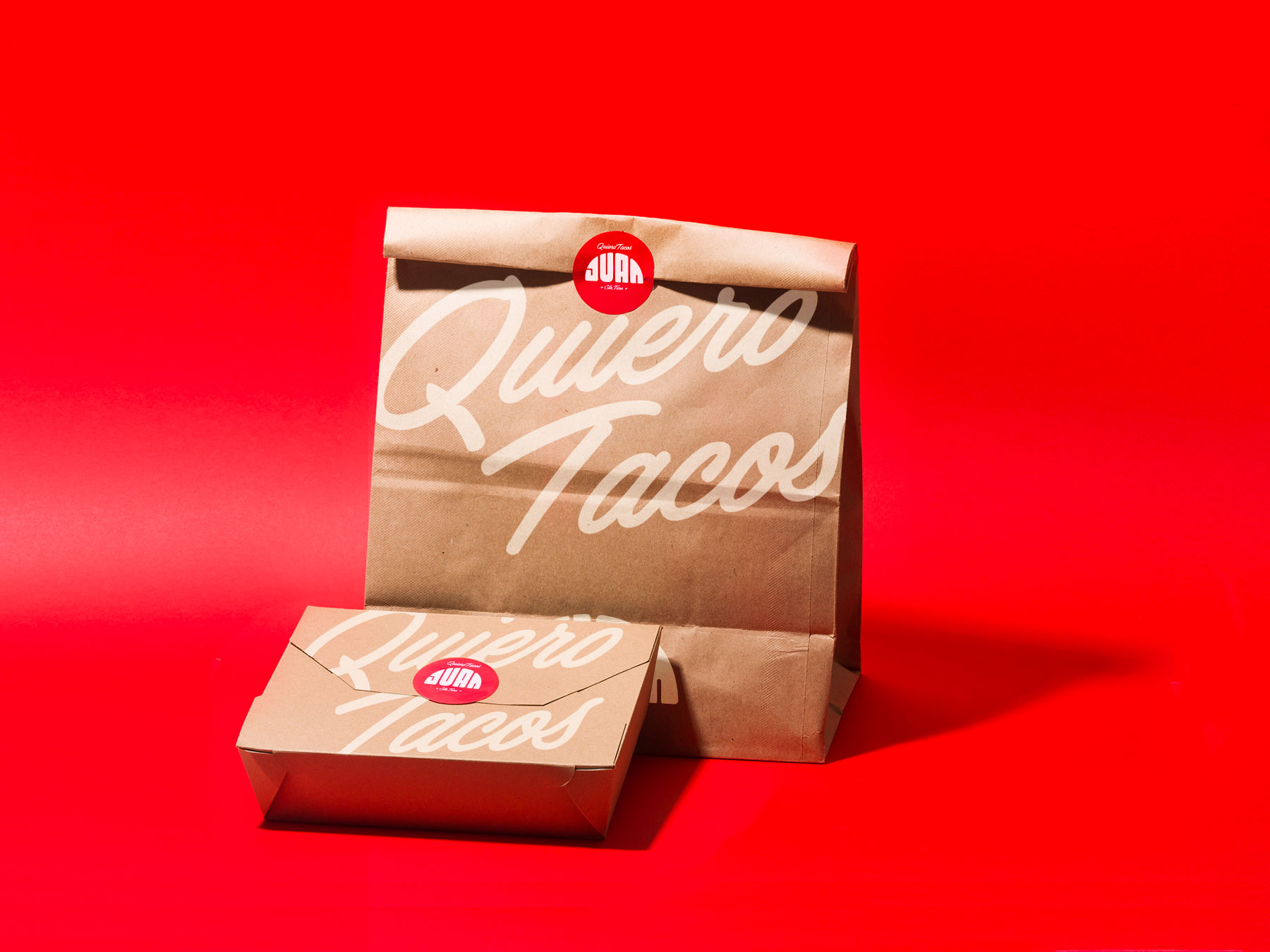
To-go packaging and instant messaging stickers were also developed as part of an all around graphic design project for one of our all-time favorite brands. Enjoy!

CREDIT
- Agency/Creative: YuJo! Creatividad Aplicada®
- Article Title: [Quiero] Tacos Juan® — Re-Branding Tacos From Within
- Organisation/Entity: Agency, Published Commercial Design
- Project Type: Packaging
- Agency/Creative Country: Mexico
- Market Region: North America
- Project Deliverables: Brand Guidelines, Graphic Design, Packaging Design, Rebranding, Research
- Format: Bag
- Substrate: Pulp Carton, Pulp Paper
FEEDBACK
Relevance: Solution/idea in relation to brand, product or service
Implementation: Attention, detailing and finishing of final solution
Presentation: Text, visualisation and quality of the presentation


