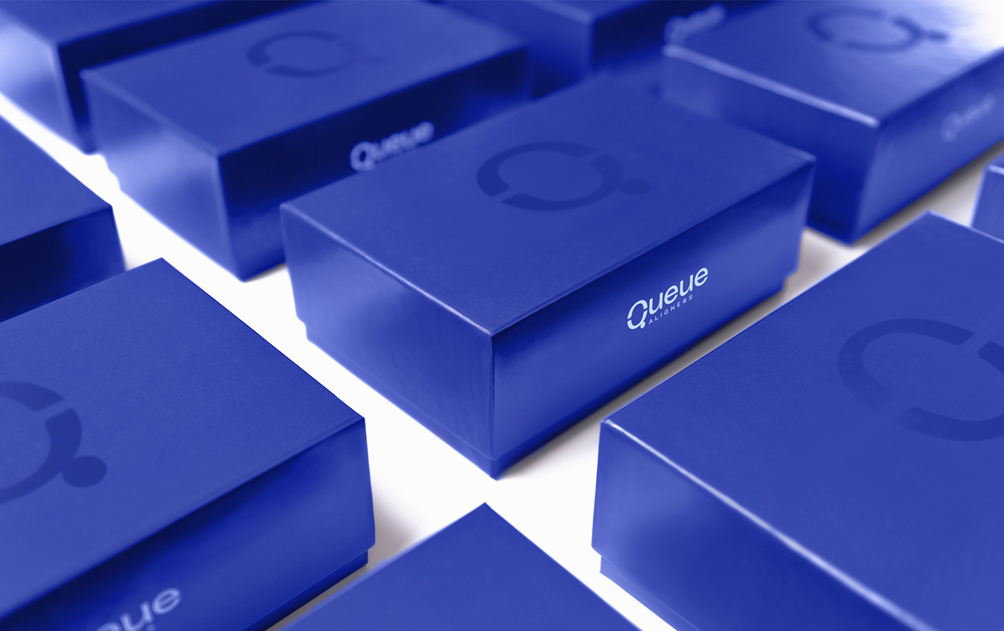
Queue™ Aligners is a state-of-the-art digitally engineered system designed to bring people’s best smiles forward. The orthodontic specialists behind this game-changing dental alignment program don’t believe in a ‘one size fits all’ approach. With the understanding that successful, lasting results only come from a tailored strategy, they developed a whole new treatment system. One that’s completely customized to each patient’s unique dental situation and needs, and closely monitored over the course of the program. Their mission is to give each person the attention and care they deserve, and a beautiful, healthy smile that will last a lifetime.
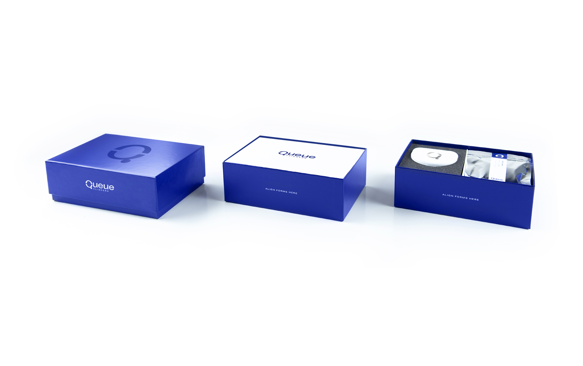
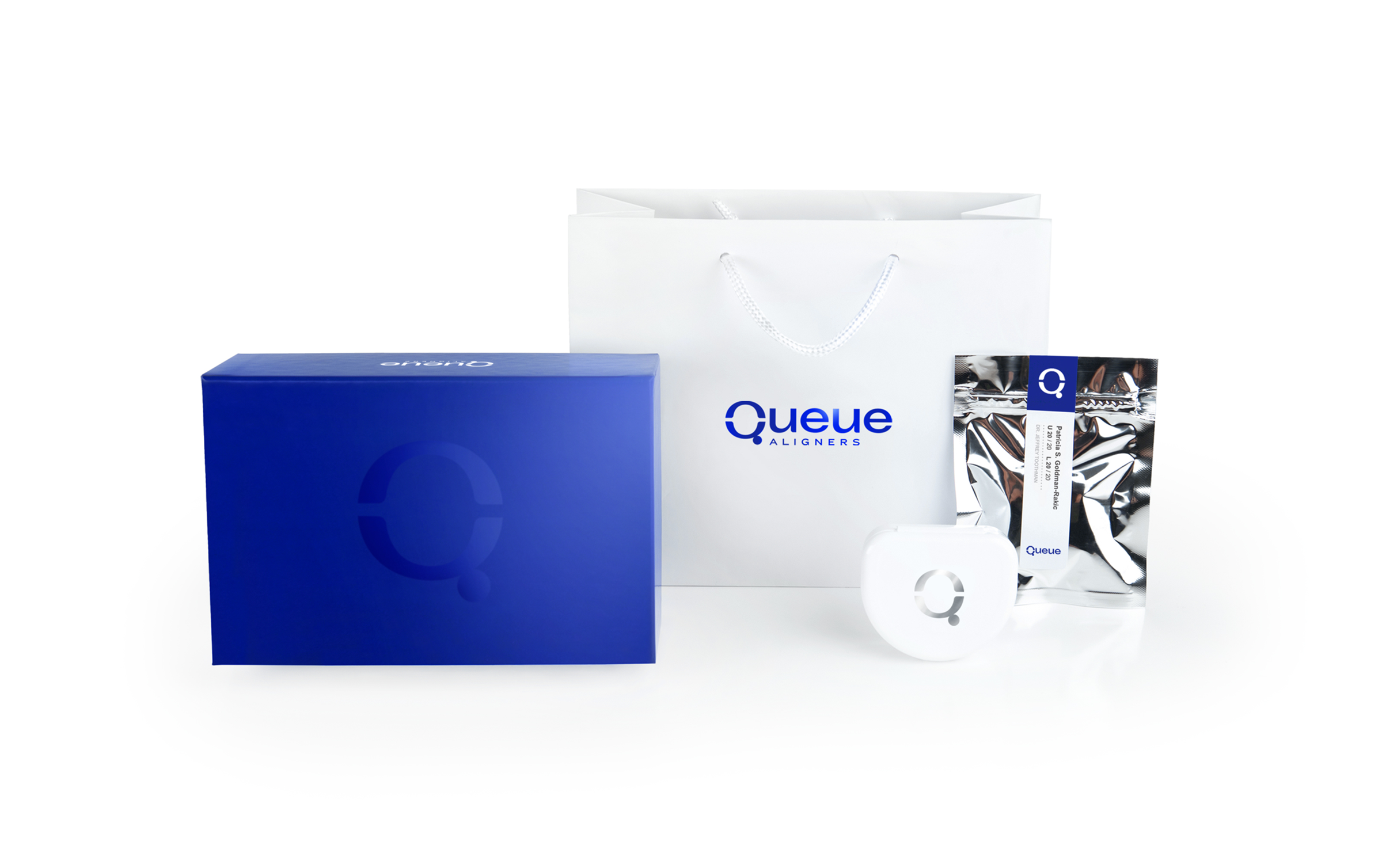
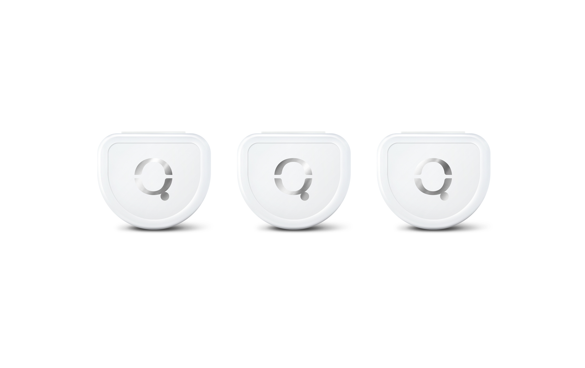
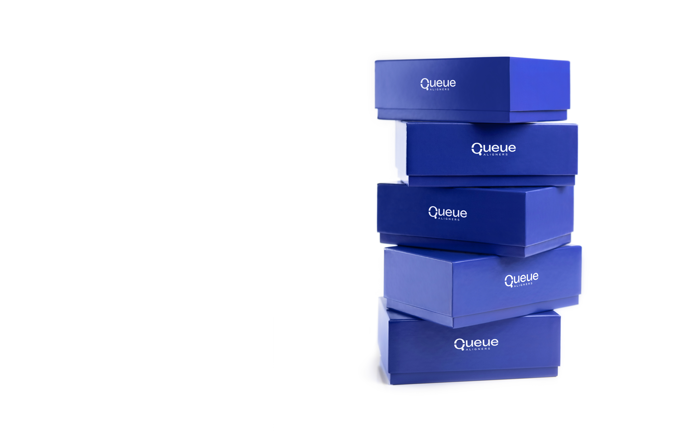
The developers of this new aligner system came to Lisa Gorham Creative to create a highly appealing, polished brand, visual identity, and packaging suite that not only aligned with their mission and goals, but also with their exclusive new product. Our objective was to differentiate Queue Aligners from similar products in the marketplace by giving the brand a strong platform that would speak to the consumer. While it’s true that the engineering and technology behind this aligner system are intricate and impressive, what people really care about is having a beautiful, confident smile. With the health and aesthetic goals of the customer in mind, our target was to create a brand and packaging system that’s both approachable and desirable. Additionally, we wanted to highlight this unique product’s benefits—it’s sleek, refined, and it works, straight out of the box.
The end result—bold, confident, and clean, just like the product’s results. When all the pieces line up, Queue Aligners assures confidence in the consumer and that the solution to their unique, beautiful smile is right there in their hands.

CREDIT
- Agency/Creative: Lisa Gorham Creative
- Article Title: Queue Aligners Branding and Packaging Design by Lisa Gorham Creative
- Organisation/Entity: Agency, Published Commercial Design
- Project Type: Packaging
- Agency/Creative Country: United States
- Market Region: North America
- Project Deliverables: Brand Advertising, Brand Identity, Brand Naming, Brand Strategy, Branding, Graphic Design, Identity System, Packaging Design, Product Naming
- Format: Bag, Box, Case
- Substrate: Plastic, Pulp Board, Pulp Paper


