


Quantifo is an investment app focusing on young investors. Their services include fractional shares, thematic investing and micro-investing. Another key component to their operations is coaching young investors to ease the learning curve of the investment world. They have all kinds of assets available from cryptocurrency to government bonds.
Naming:
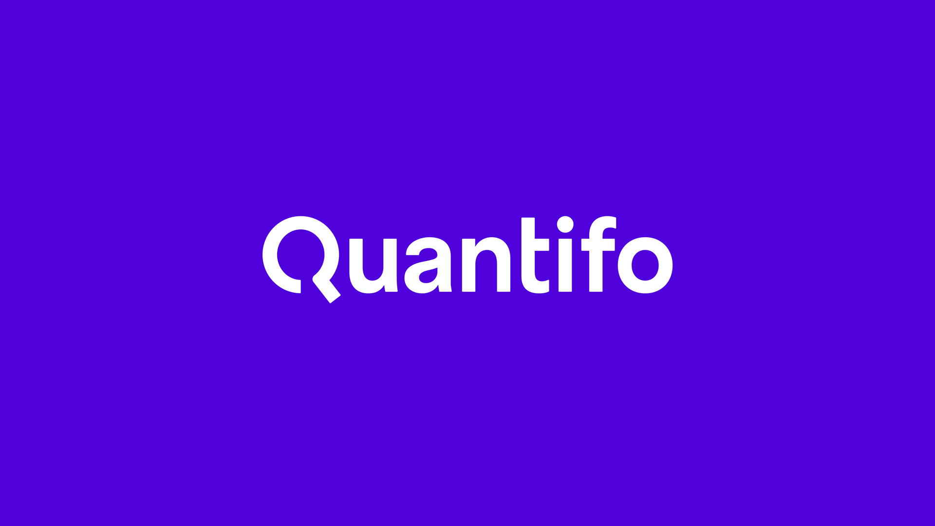
The name Quantifo derives from the combination of the word quantity with the word info. That name is suggestive to the quantity of information they provide to their young user base. At the same time it is representative to the company’s subjects, since both quantity and information are key concepts to investment.
Brand Identity:
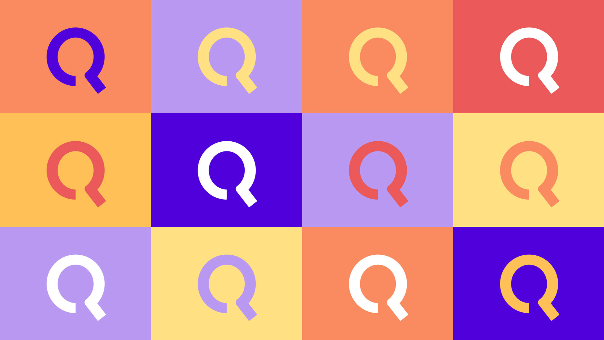
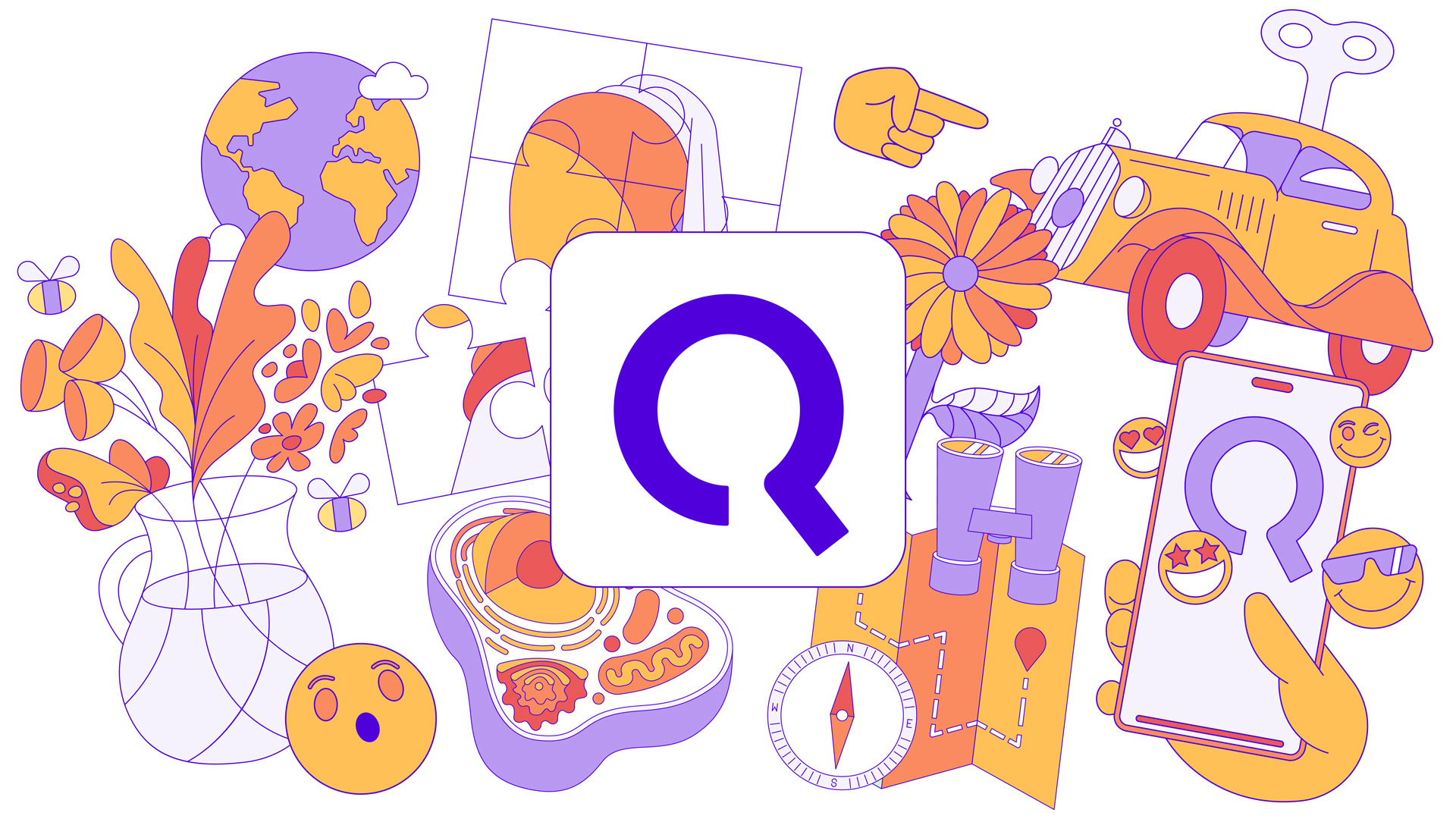
We chose a typographical approach to Quantifo, which suits their finance core. We drew inspiration from the looking glass and pie charts to morph the letter Q into a symbol. This gave it both a characteristic symbol, as well as a more playful note, suitable to their younger audience.
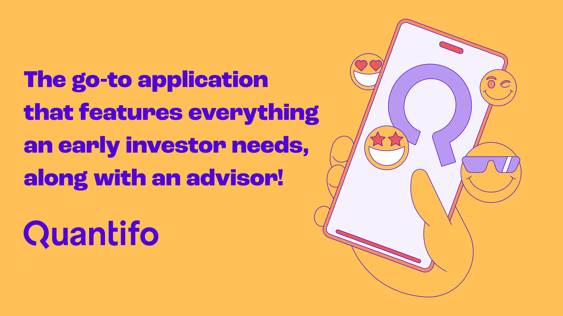
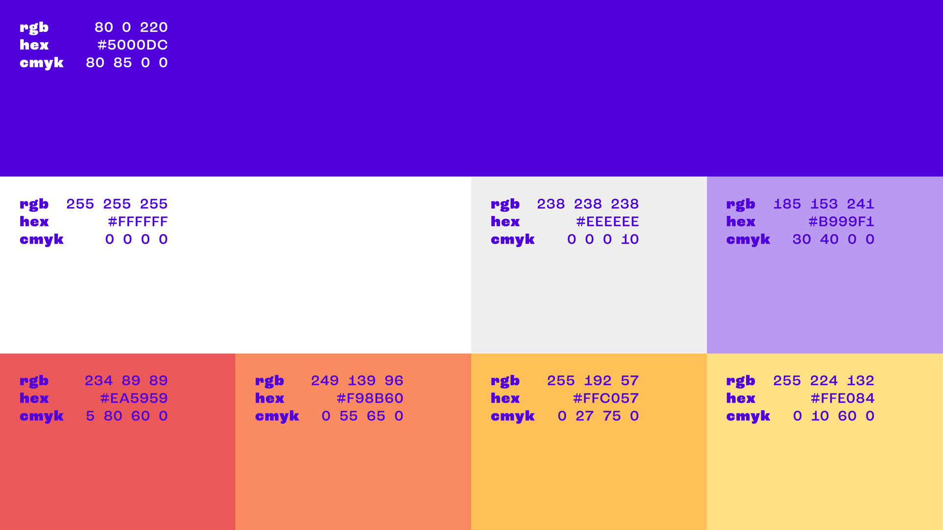
The balance between serious and playful is key to the brand identity. Roc Grotesk with its clean overall look and its playful details, was chosen as the font to serve the above concept. The brand’s color palette focuses on complementary colors to add contrast. The main color is a vibrant purple, that assists to identify Quantifo as a financial company, while giving it a younger, hip character. Technically it contrasts with the hues of red, orange and yellow to create a lively identity.
Illustration:
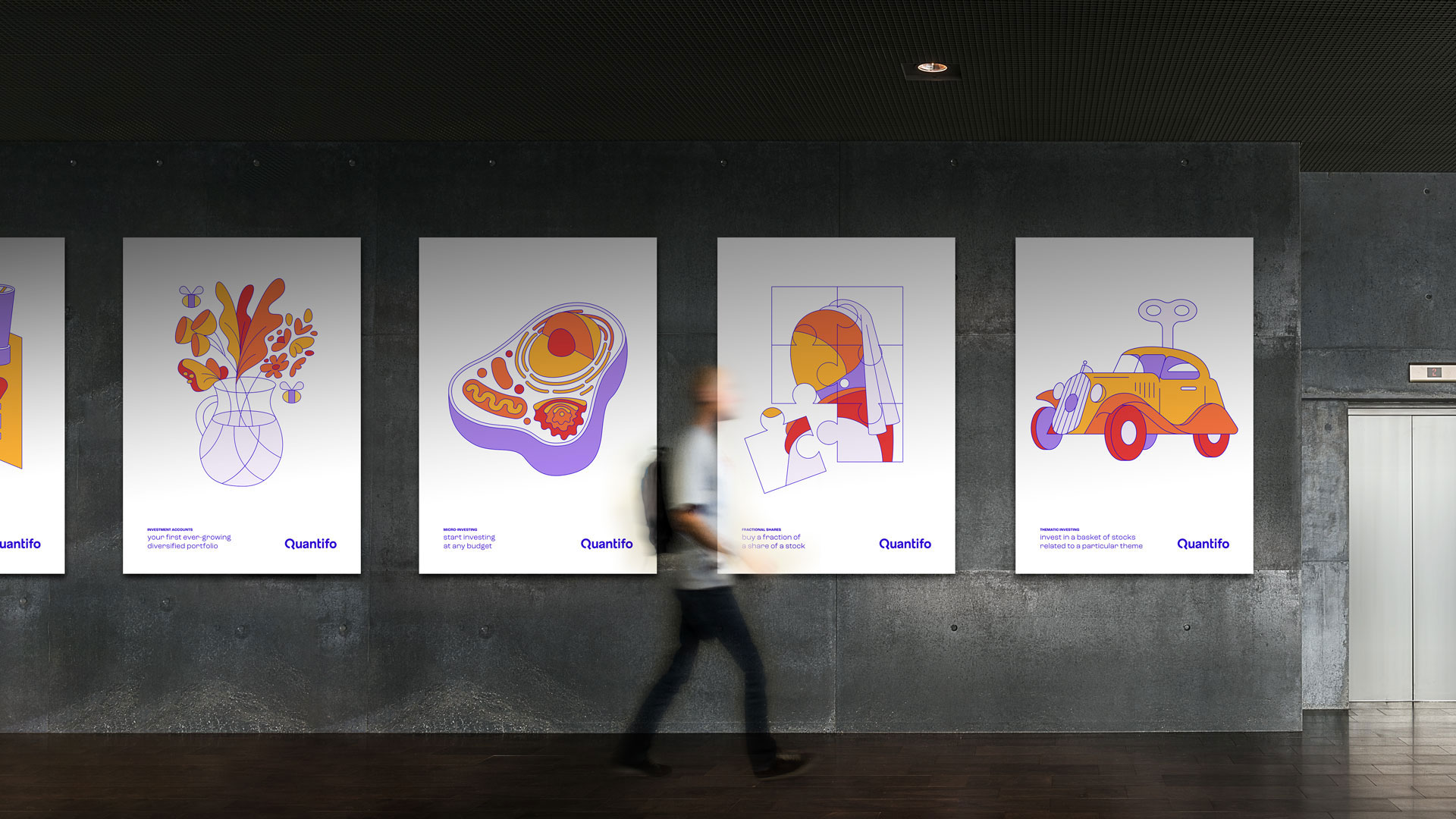
Another key element to the overall design are the illustrations and their usage. They are playful in character. The single weight strokes and austere usage of the brands colors completely harmonize the illustration with the surrounding identity elements.
Each product category is represented by an illustration, which is used throughout all communication materials. In the outdoor posters and animated billboard design each product’s illustration is the key element, along with a discreet descriptor of said product. In the website each illustration is used as the main element in the intro section of the product page.
Web Design:
The Quantifo website’s primary function is to provide information to first time users and prospect users of the app. That objective doesn’t require as much information as website dedicated to the regular users would.
This allowed us to adorn it with large titles and illustrations to create an immersive website that informed the soon to be users, while also creating a solid brand atmosphere. Straight lines throughout the design reinforce the grid and communicate the image of a finance app. Lively scroll animations are utilized to balance out the rigid look that the straight lines create and re-focus the image to a younger audience.
UI Design:
The app was designed to serve utilitarian purposes while communicating the brand in an understated manner. That is served through the usage of the main brand color in text and lines, while the two complementary colors are used sparingly to signify the selected tab and notification indicator. Red and blue are used strictly for functional purposes, and in line with the well established color coding of the trading world. Since it is highly popular among users, and in compliance with smartphone operating systems, we designed a dark theme user interface for the app.
CREDIT
- Agency/Creative: SEMITONE Design Studio
- Article Title: Quantifo Investment App
- Organisation/Entity: Agency
- Project Type: Identity
- Project Status: Non Published
- Agency/Creative Country: Greece
- Agency/Creative City: Athens
- Market Region: Europe
- Project Deliverables: Advertising, App Design, Brand Identity, Identity System, Illustration, Logo Design, Poster Design, Typography, User Experience, Web Design
- Industry: Financial
- Keywords: Finance App Young Investors Brand Identity Design Logotype Illustration Typography Brand Colors UI Web Design
-
Credits:
Designer: Alexandros Tsakiris
Designer: Chris Gerokostas


