


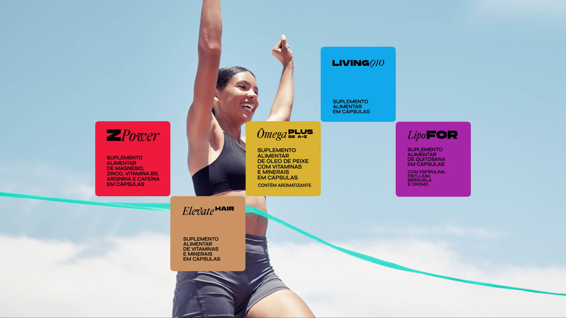
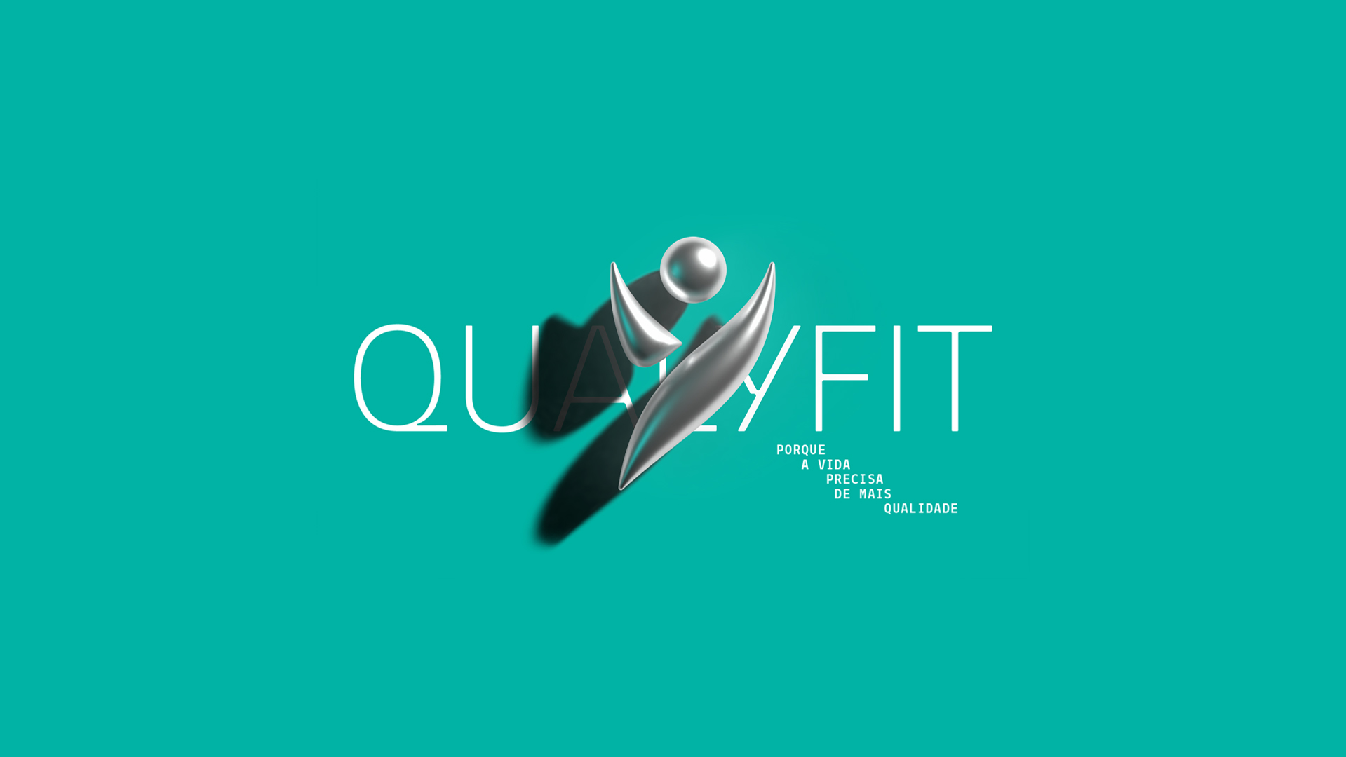
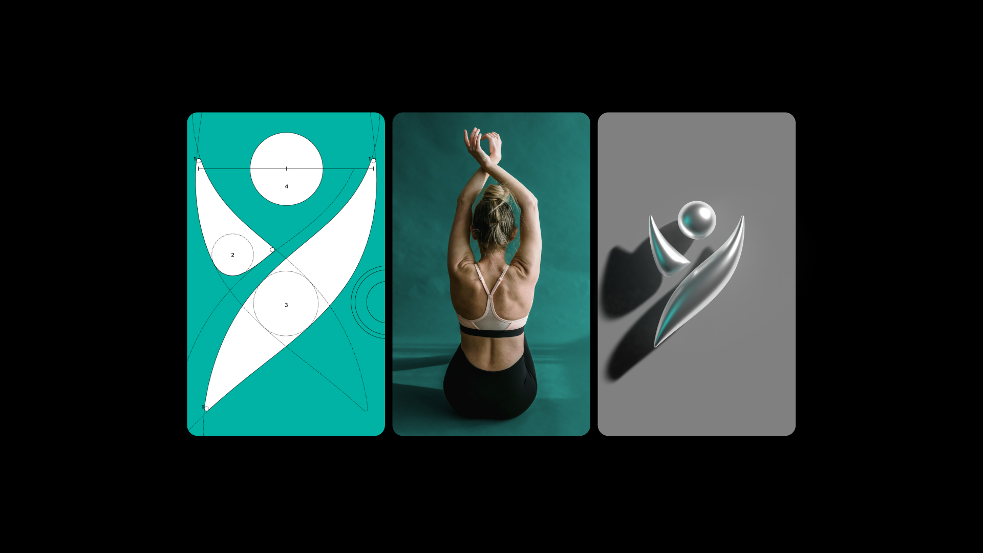
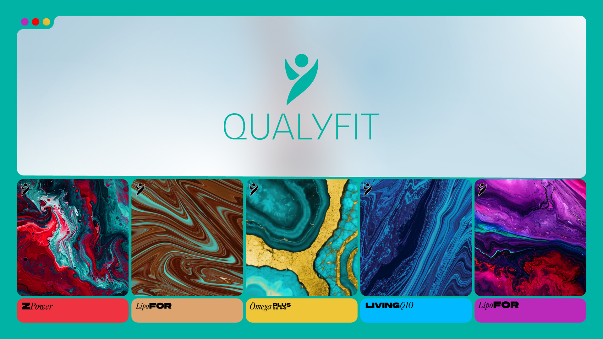
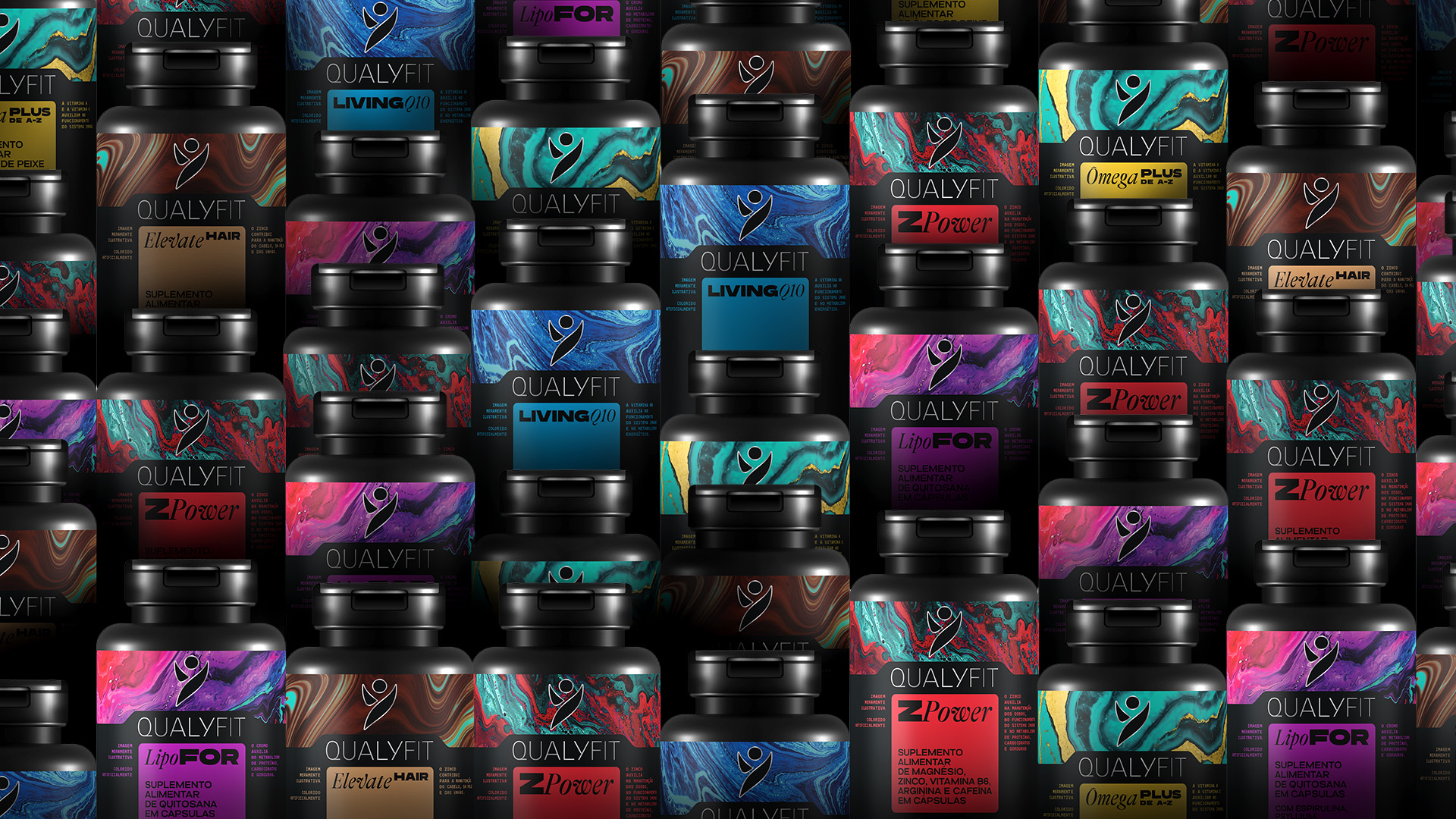
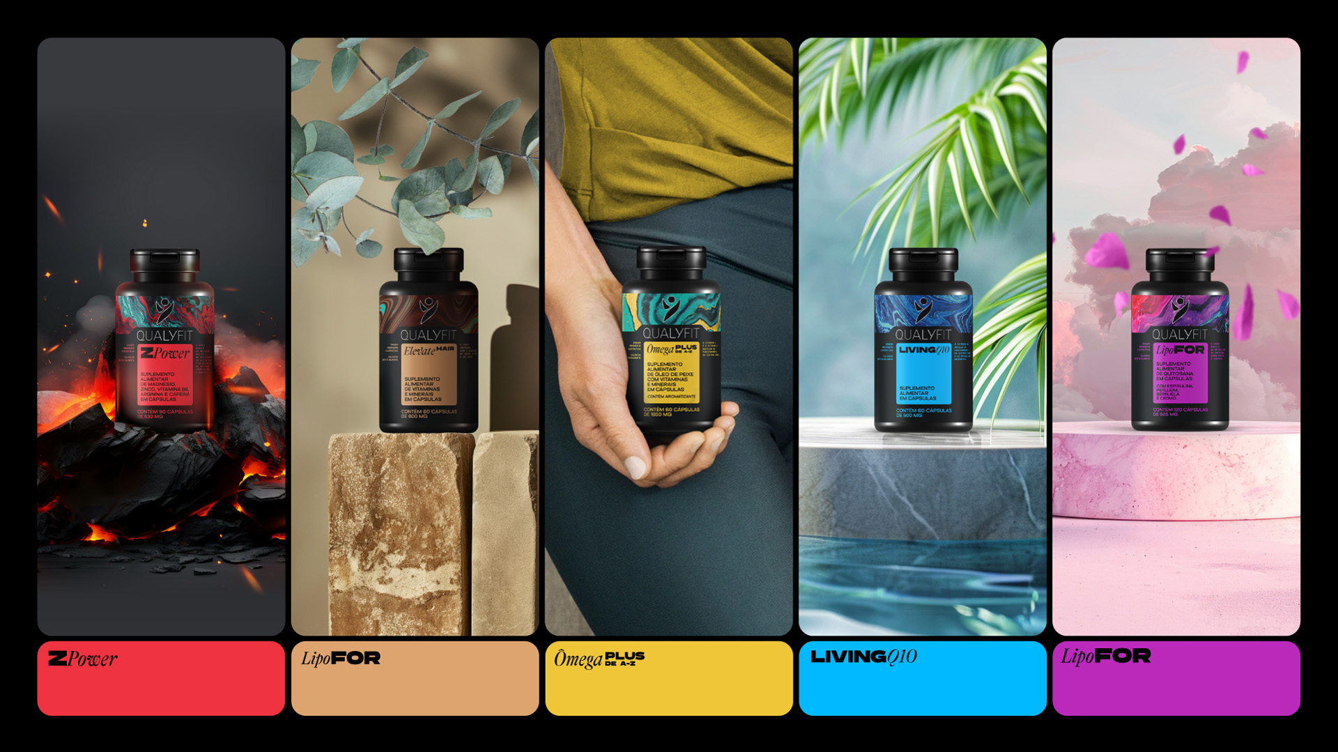
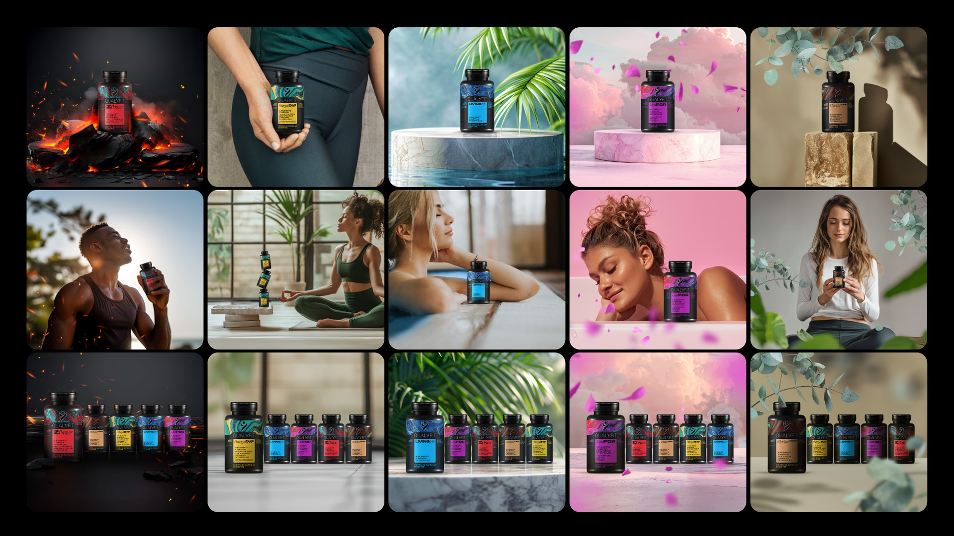
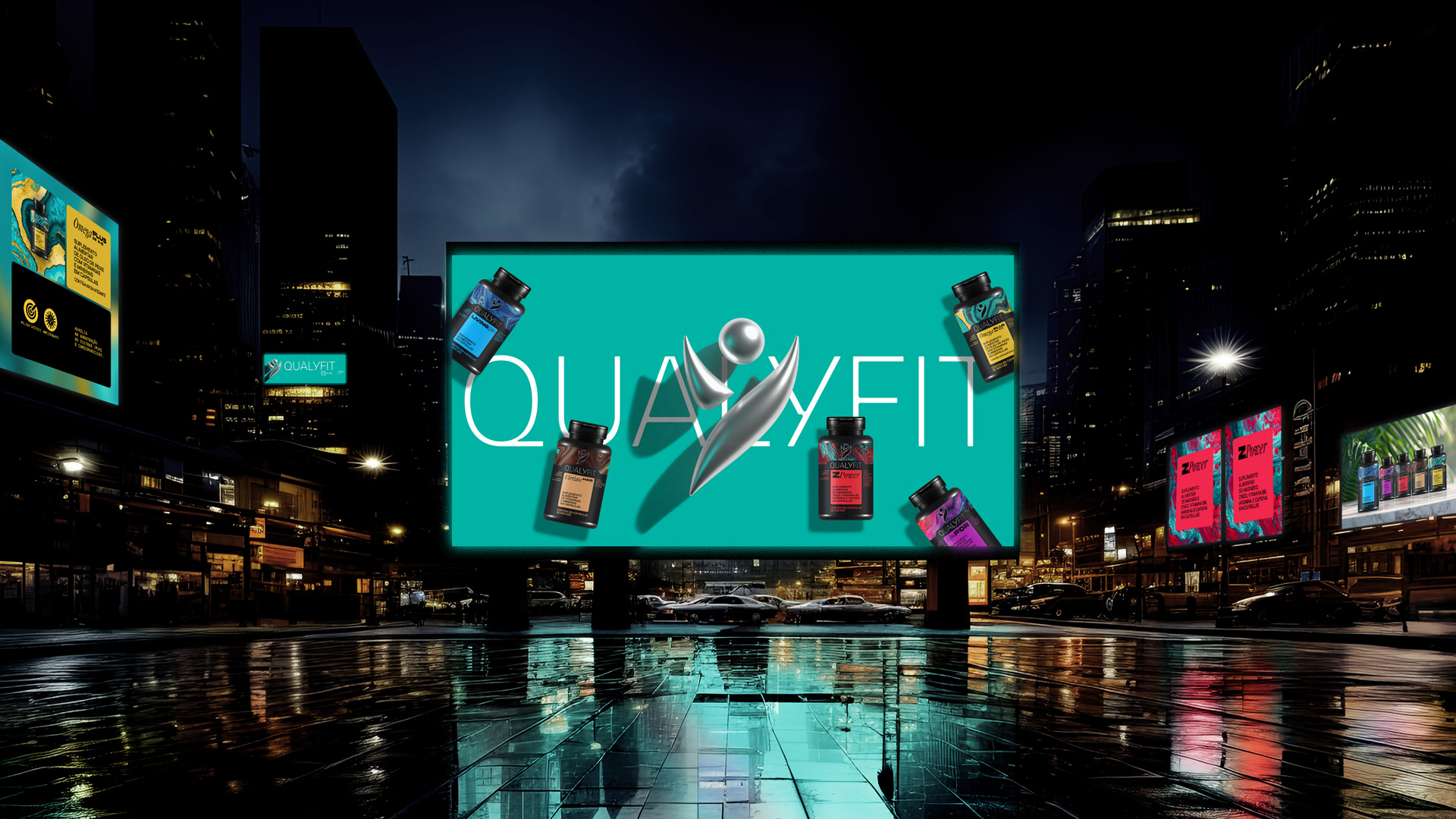
The Qualyfit redesign project aimed to elevate the brand’s visual identity, reflecting themes of energy, health, vitality, and well-being. This comprehensive redesign included updating the logo, creating new product labels, developing a brand manual, and enhancing the social media presence with fresh visuals and templates. The logo was refined to maintain its original sense of freedom but now features thinner, more elegant letters. The product line—comprising Lipofor, Ômega Plus, Zpower, Elevate Hair, and Living Q-10—received new labels with vibrant colors symbolizing freshness and dynamism.
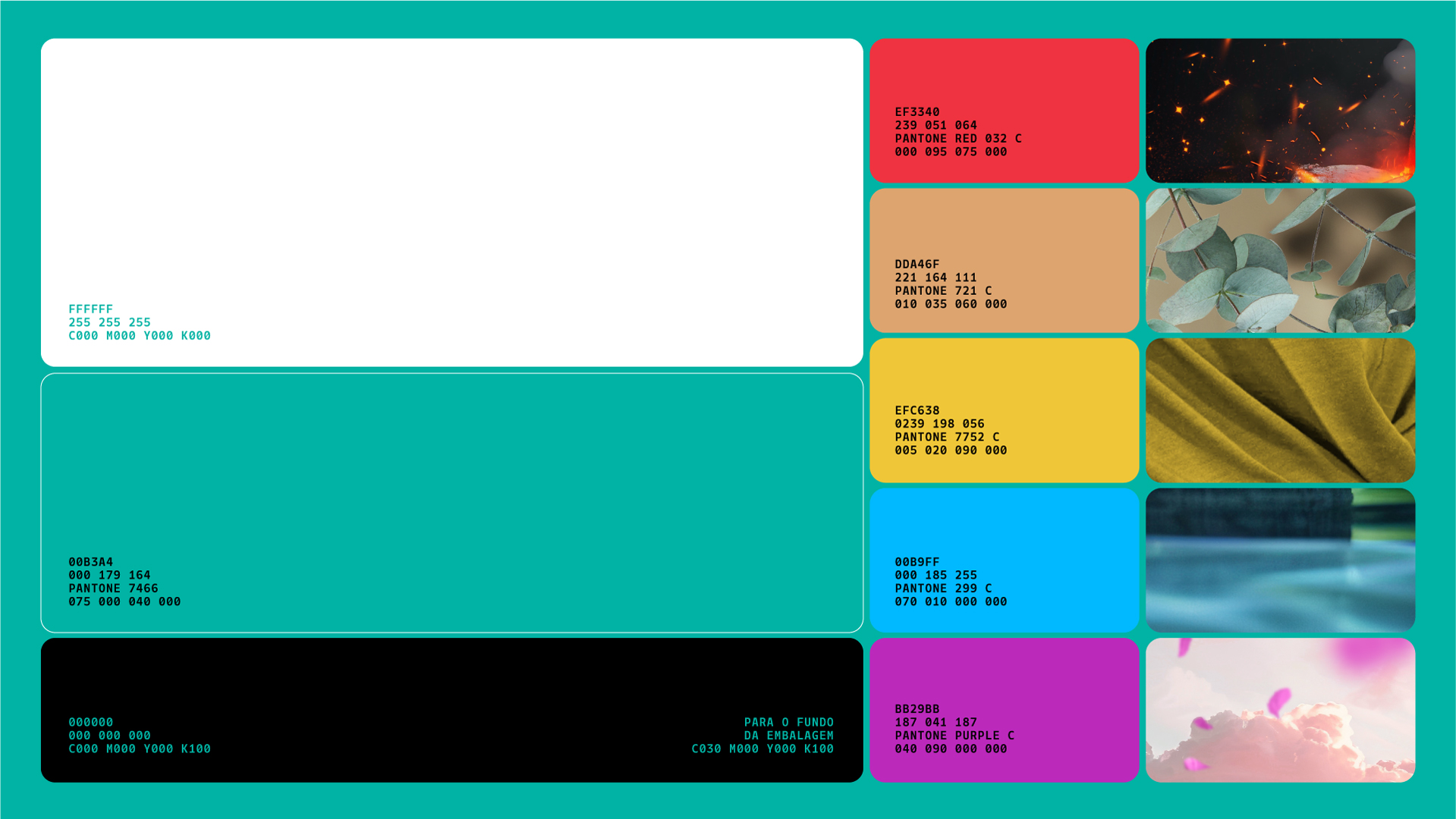
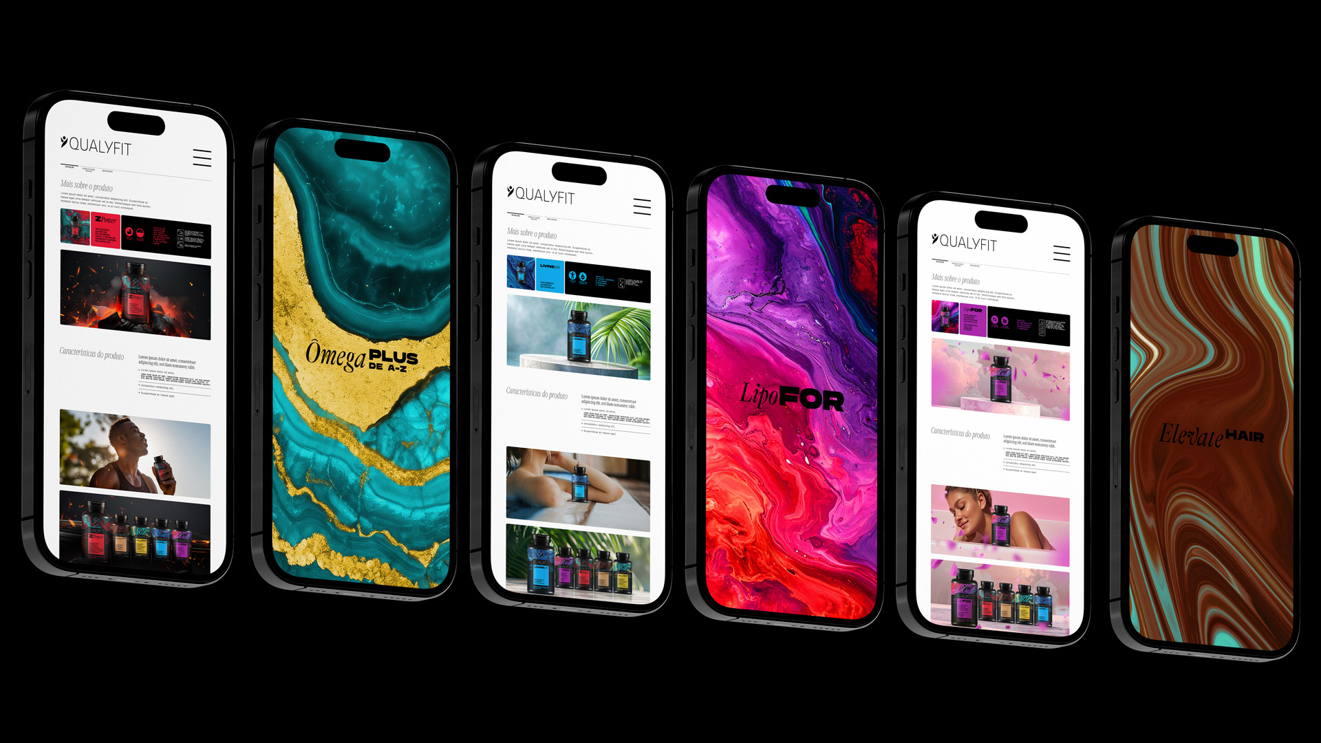
A detailed brand manual was created to ensure consistency across all visual elements. This guide includes instructions on the correct usage of the logo, typography, color palette, and other visual components. The redesign also focused on enhancing the brand’s online presence. New social media templates were developed to maintain a cohesive and attractive online identity, increasing engagement and visibility. The new visual identity extends to the company’s website, providing a harmonious and visually appealing user experience.
The packaging for the five main products was redesigned to highlight each product’s unique features, using a harmonious combination of vibrant colors to reflect a fresh and dynamic brand image. This approach not only modernizes the appearance but also strengthens the brand’s presence in the market.
The redesign was meticulously planned and executed, resulting in a revitalized visual identity that stays true to Qualyfit’s core values while adopting a modern and sophisticated brutalist appearance. This successful transformation not only reinforces Qualyfit’s market presence but also positions it as a dynamic and innovative brand ready for continued growth and distinction.
This comprehensive redesign project underscores Qualyfit’s commitment to maintaining a strong, consistent brand identity while adapting to contemporary design trends. The use of vibrant colors, modern typography, and cohesive visual elements ensures that the brand remains relevant and appealing to its audience, enhancing its overall market positioning and appeal.
For more details and visuals of the redesign project, you can visit the Qualyfit project on Behance.
CREDIT
- Agency/Creative: Rex Machina
- Article Title: Qualyfit Supplement and AI by Igor Sá Fortes
- Organisation/Entity: Agency
- Project Type: Packaging
- Project Status: Published
- Agency/Creative Country: Brazil
- Agency/Creative City: São Paulo
- Market Region: South America
- Project Deliverables: Advertising, Brand Design, Brand Guidelines, Brand Identity, Design, Packaging Design
- Format: Bottle
- Industry: Health Care
- Keywords: Qualyfit, supplement, vitamin, sport, Packaging, brand identity, artificial intelligence, AI, A.I., Brutalism, graphic design, branding, Health
-
Credits:
Head of design: Igor Sá Fortes


