


A “fake brand” that changes annually, adapting its clothing to the sector of reference, investigating behind the logic of design choices, too often evaluated as exclusively aesthetes.
This Brand Non Exists is a project born during the lockdown with the aim of creating an explanatory model, which, through a series of graphic-visual declinations, present to the reader the fundamental concepts that link the brand identity to its events, creating the perceived value attributed by the consumer.
QBNE presents itself as a “liquid brand”, able to transform itself and adapt itself to the different sectors in which it operates, placing its ultimate aim at the centre of the project: to disseminate the logic of building an identity system, communicative and consistent with the brand, respectful of the user and attentive to current issues.
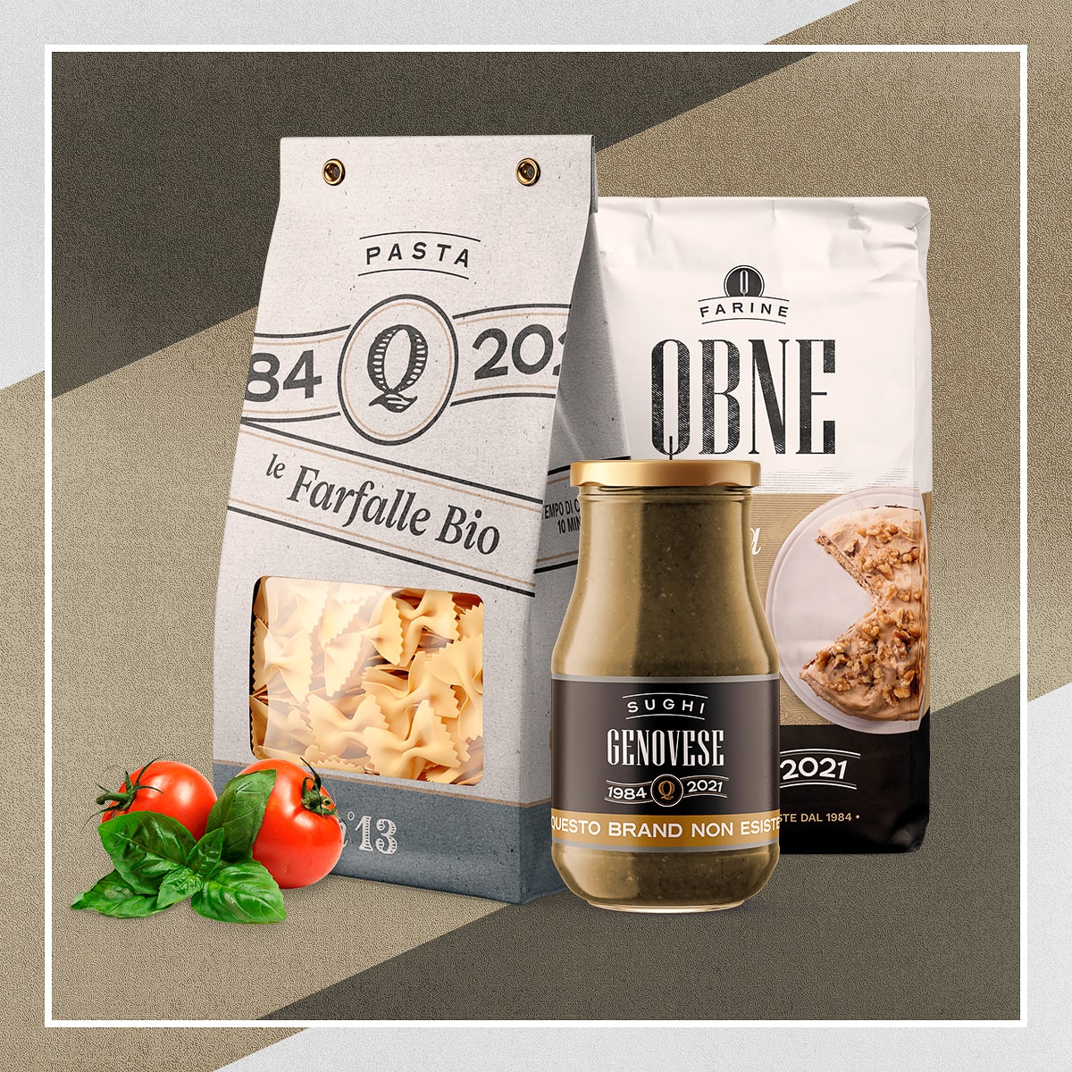
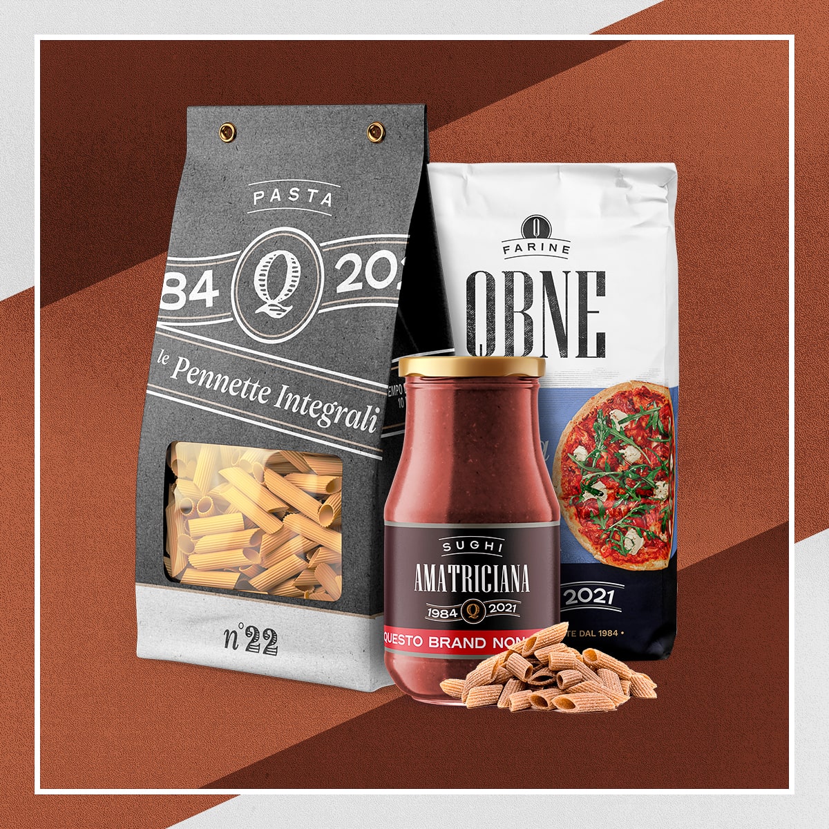
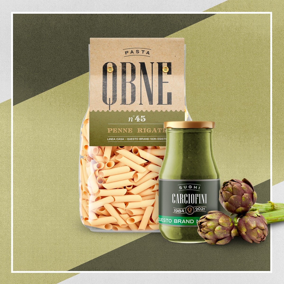
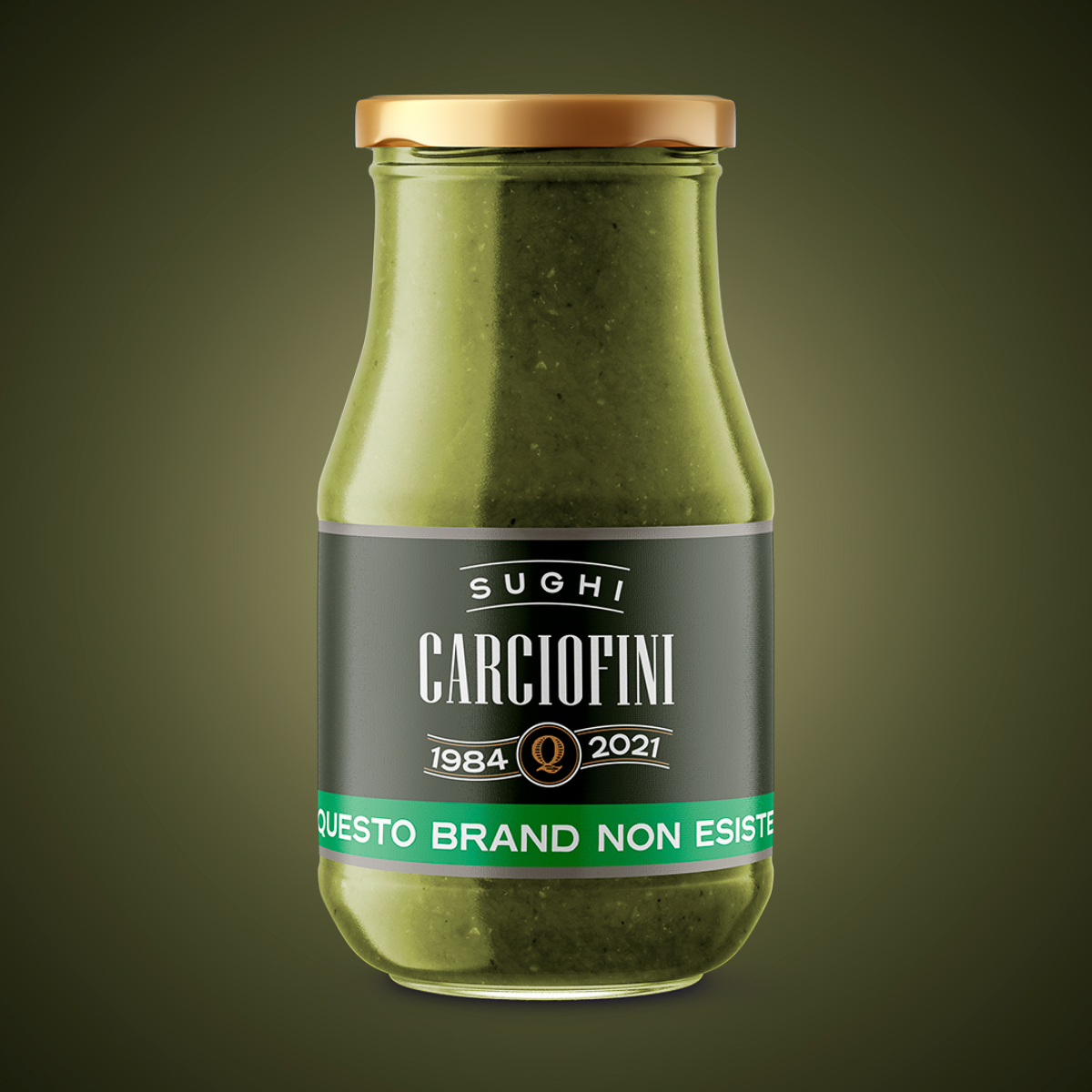
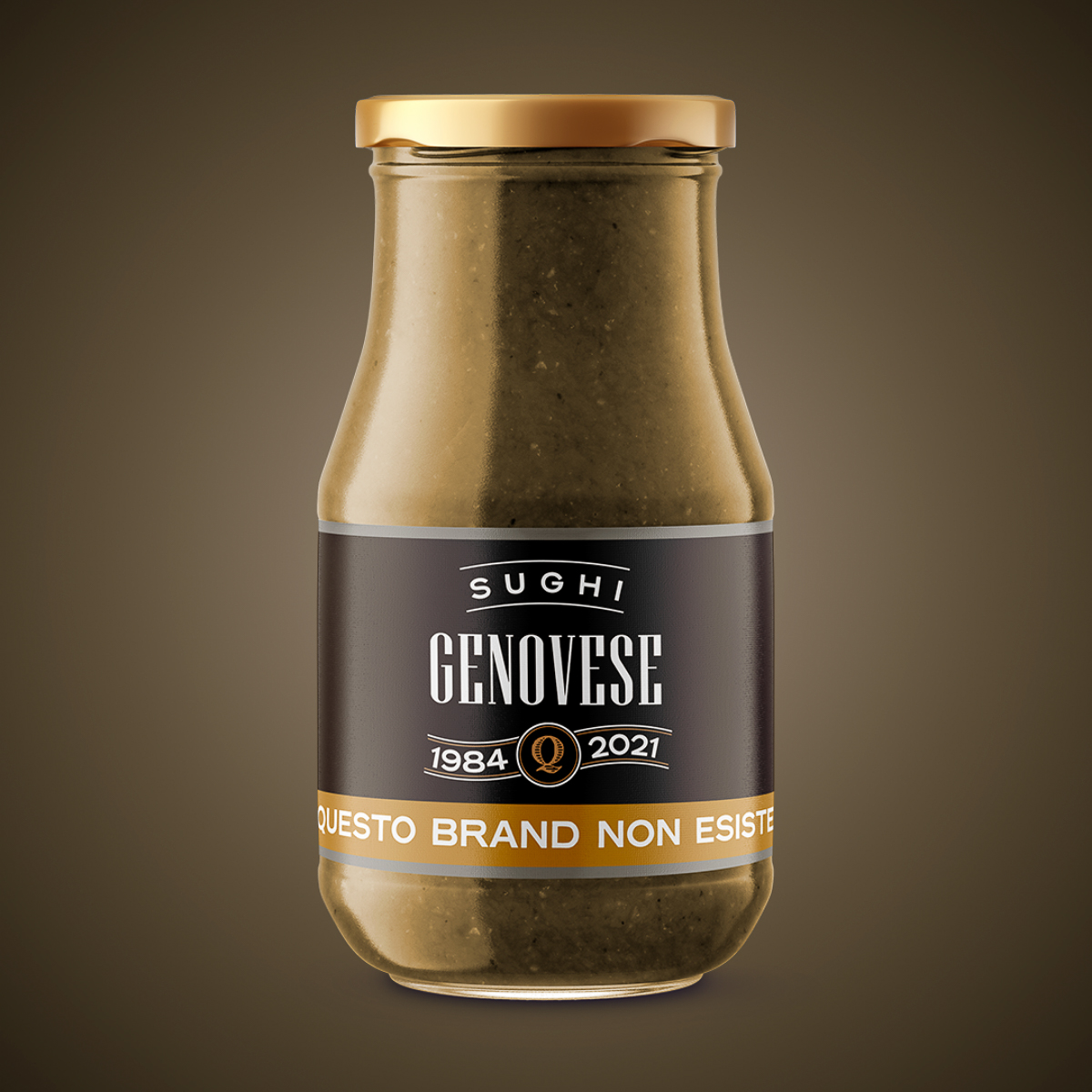
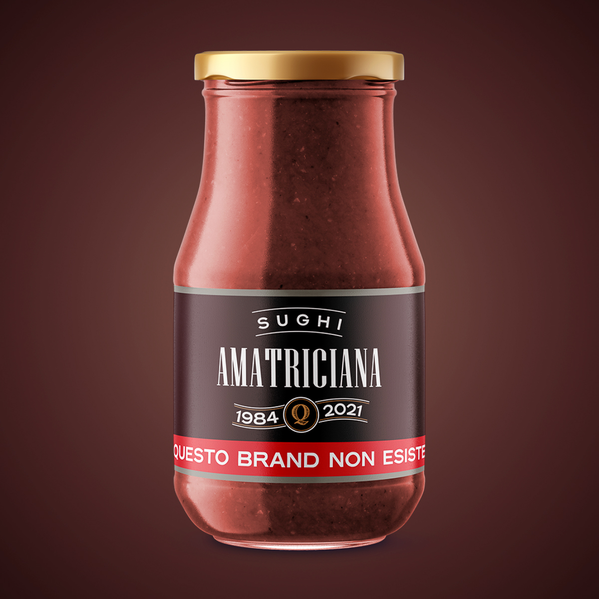
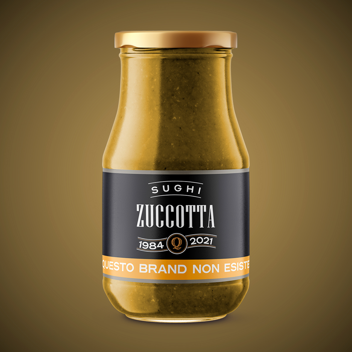
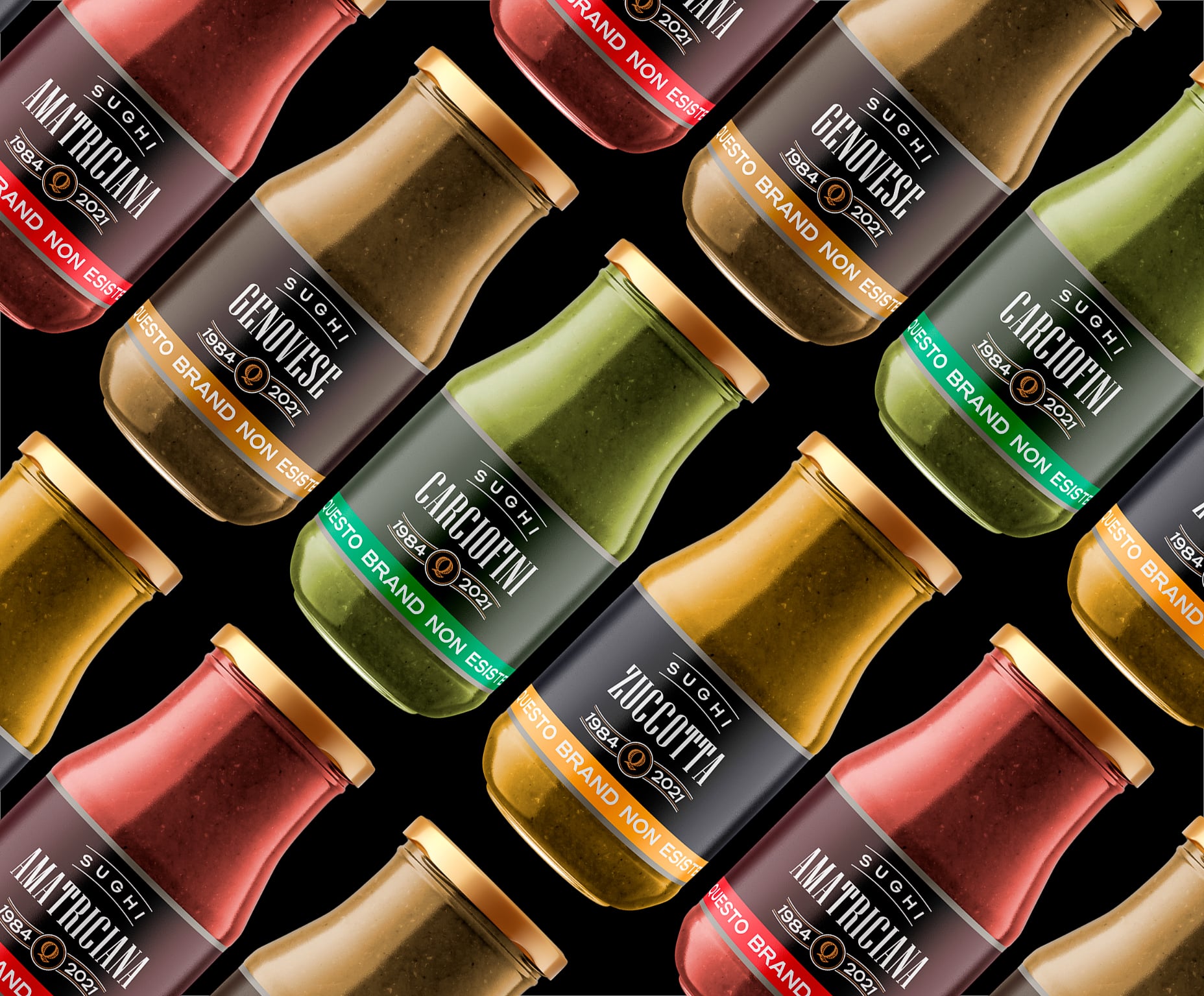
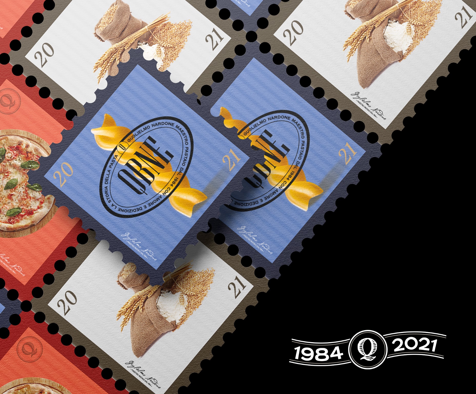
In the first “pilot project”, QBNE takes on the role of an Italian pasta factory operating in Organized Distribution, headed by Guglielmo Nardone, an expert master pasta maker attentive to production processes and the selection of raw materials.
A legacy of values, knowledge, strong bond with nature, passion and constant attention to production methods, are, from the very first jokes, the empathic drivers that bind the consumer to the product, all supported by a careful design of visual systems on packaging and labels.
Through the visual of the product, the signs, the color palette and the printing materials, concepts such as Line Extension and Brand Awareness become, to the reader’s eye, unconsciously more and more present, recreating in the mind of the observer a thread that connects the different declinations.
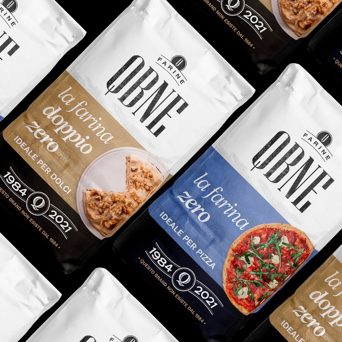
Choices of “strategic design”, such as the simplification and use of a “Z Pattern” for the packaging of flours, intersects concepts of user experience with concepts of neuromarketing and neurobranding, investigating the objective difficulties of reading by the end customer, increasingly at the center of brands.
CREDIT
- Agency/Creative: Antonio Golia / designinth
- Article Title: QBNE Vol.1 Packaging Design
- Organisation/Entity: Freelance
- Project Type: Packaging
- Project Status: Non Published
- Agency/Creative Country: Italy
- Agency/Creative City: Avellino
- Market Region: Europe
- Project Deliverables: Brand Creation, Brand Identity, Branding, Concept Art, Packaging Design
- Format: Bottle, Jar, Sachet
- Substrate: Glass Jar, Plastic, Pulp Fibre
- Industry: Food/Beverage
- Keywords: brand identity, branding, packaging, label, pasta, logo, food, concept design, flour, sauge
-
Credits:
Designer: Antonio Golia


