“Qanun” accounting company is a company that has proven itself for a long time in the local market. The word “Qanun” means law in Azerbaijani.
The initially desired requirement of the customer is to make a sharp differentiation from the existing competitors in the market.
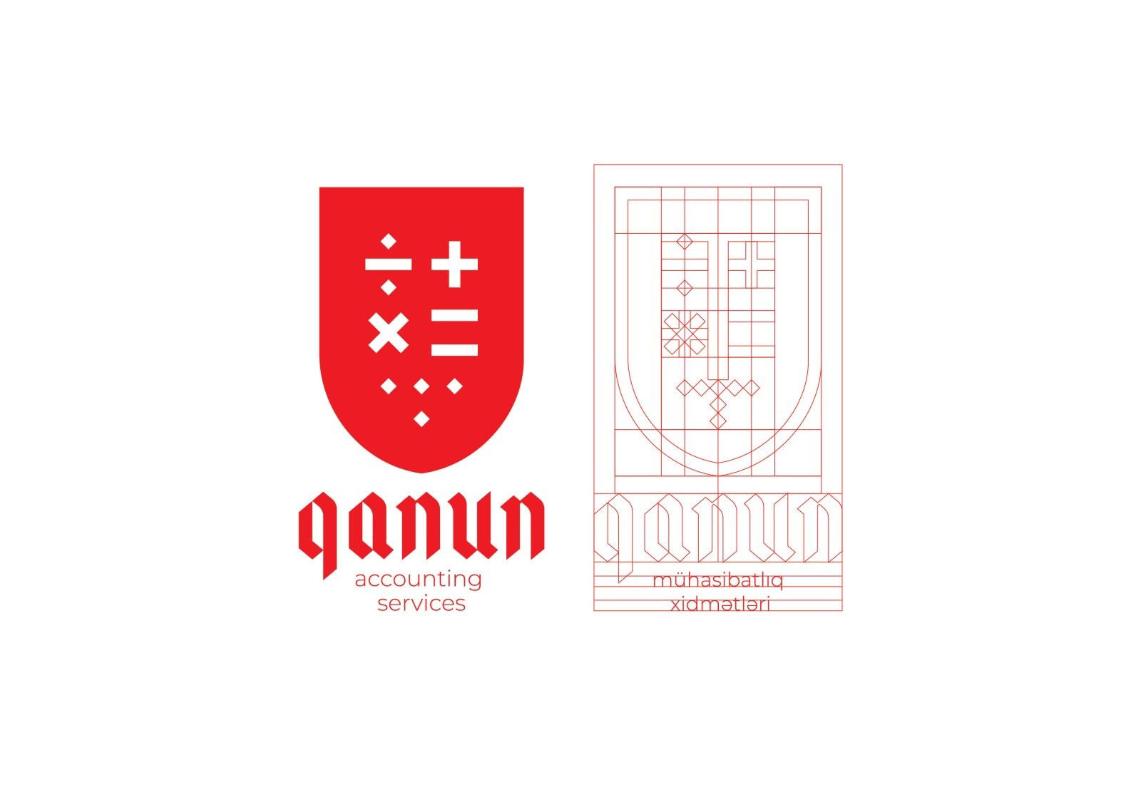
While designing the logo, the heraldic shape of the logo emphasizes the ancient traditions of accounting, at the same time giving confidence to its clients (the shield in the background of the logo conveys the message that your calculations are in safe hands). The typography used has the same purpose as well.
The core components of the logo reflect the symbols of the basic mathematical methods of the accountant, which have not changed for many centuries. At the same time, I completed the logo by showing the final figure of the accountant’s operations with dots. The company’s client segment is mainly large and medium-sized entrepreneurs and customers.
The colour of the logo is red. Although it is widely used in the local market, it is a rarely seen colour in this field of activity. At the same time, the red and white concept increases the colour sensitivity of the logo and ensures that it is always clearly visible. And it also completes the heraldic logo and national symbol (gerb). If the company wants to test itself in various close activities in the future, versions of the logo with other colours have been developed to distinguish several areas of activity.
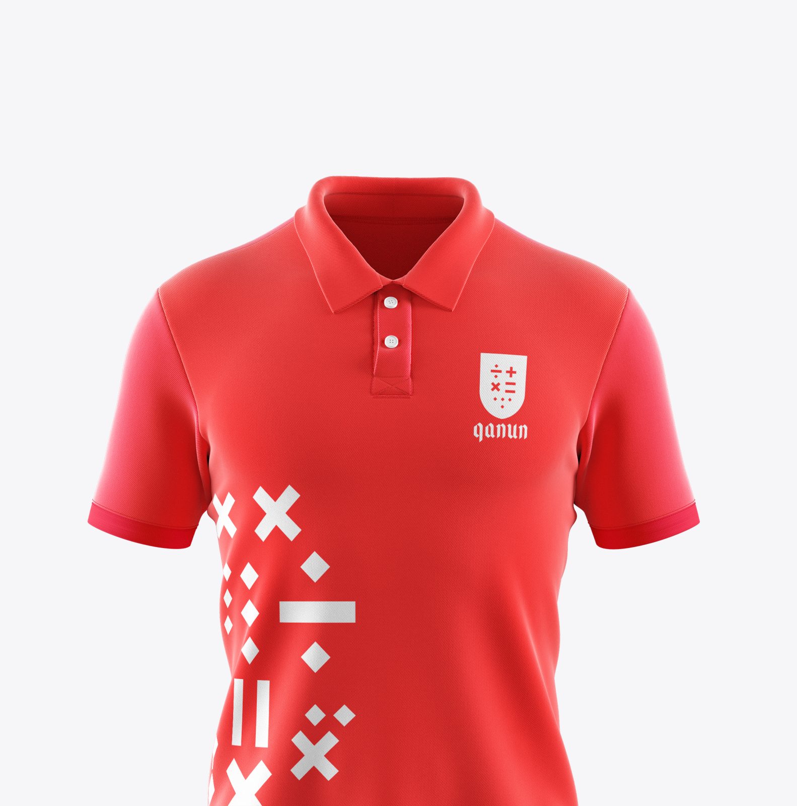
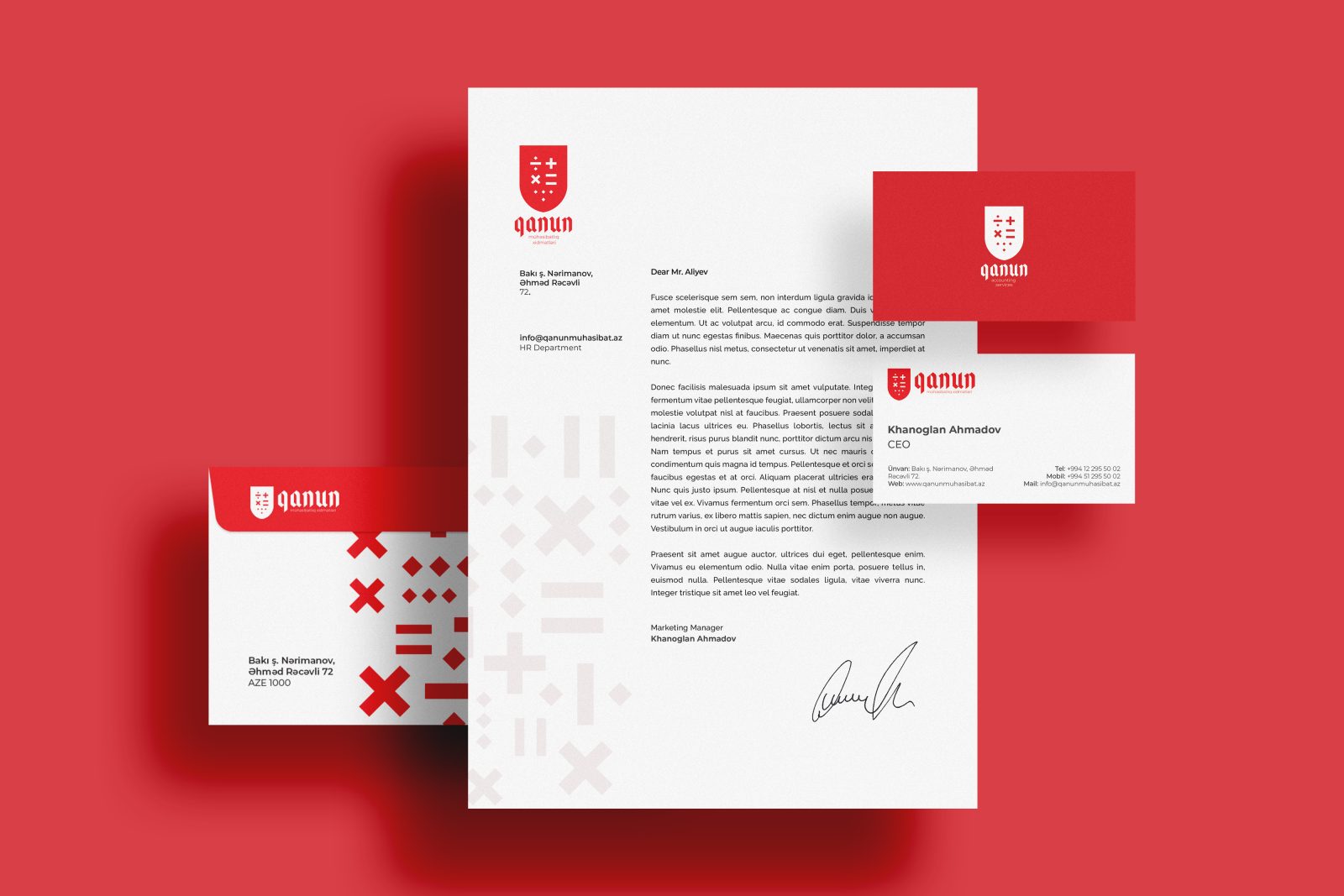
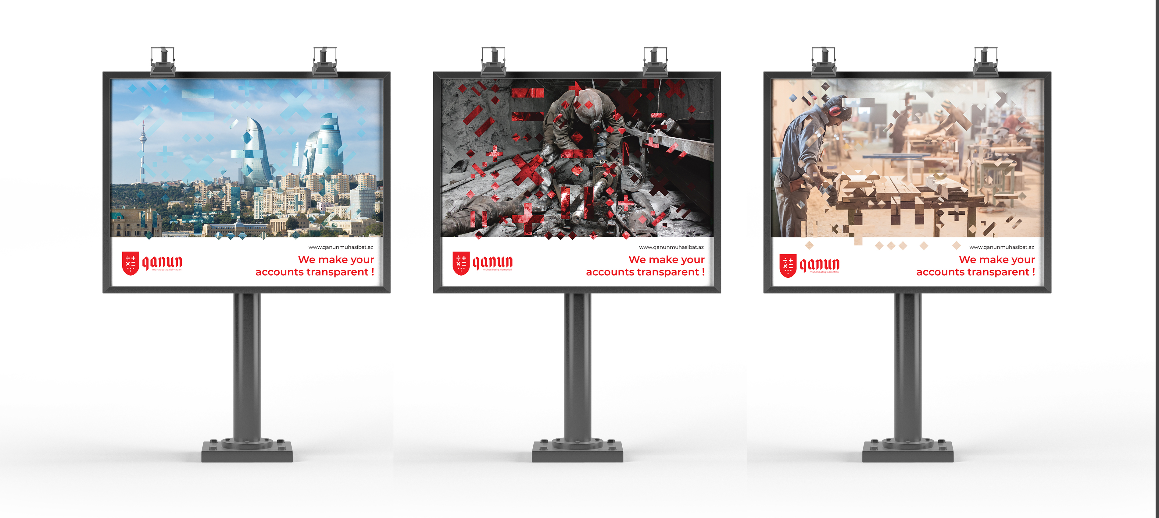
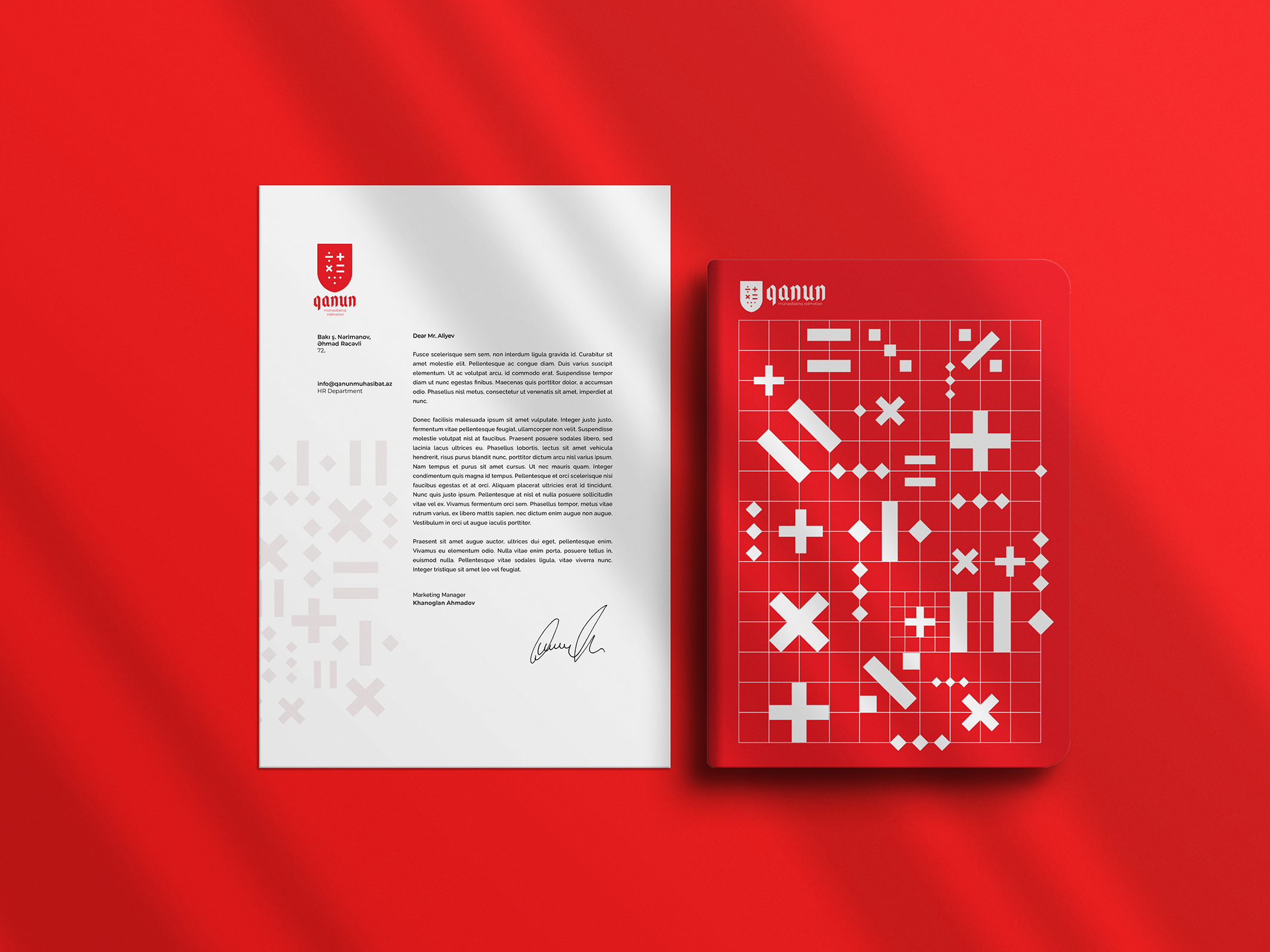
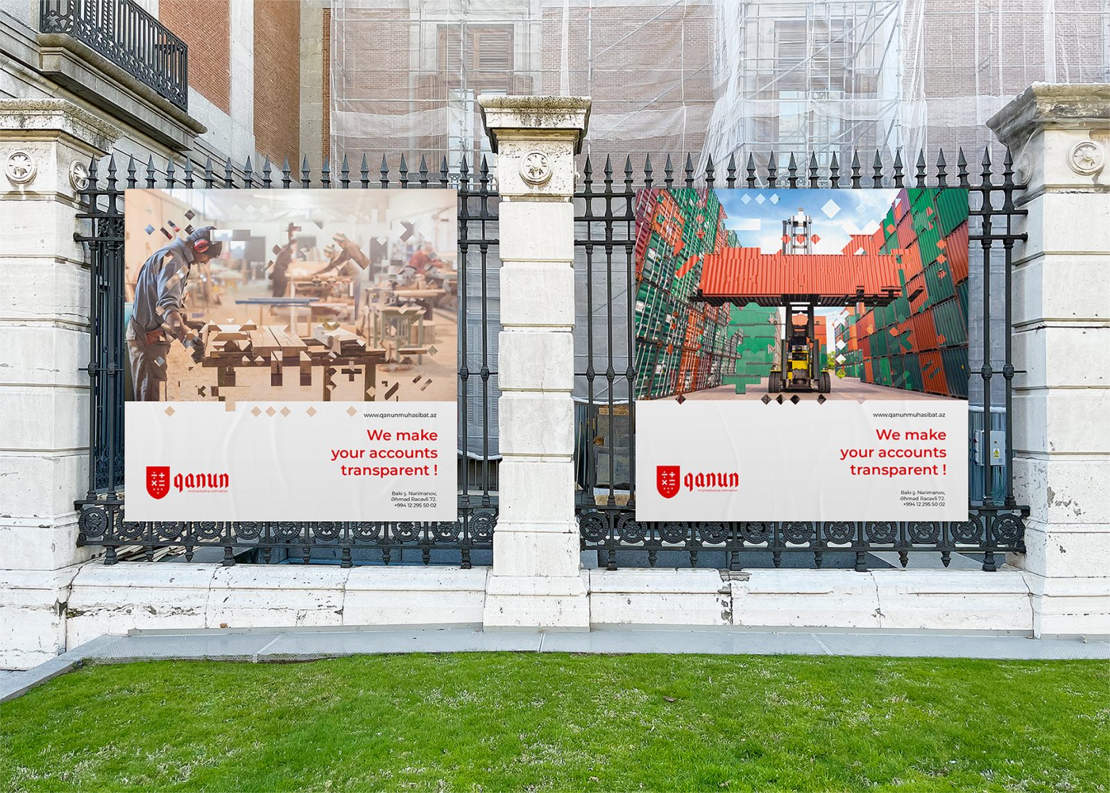
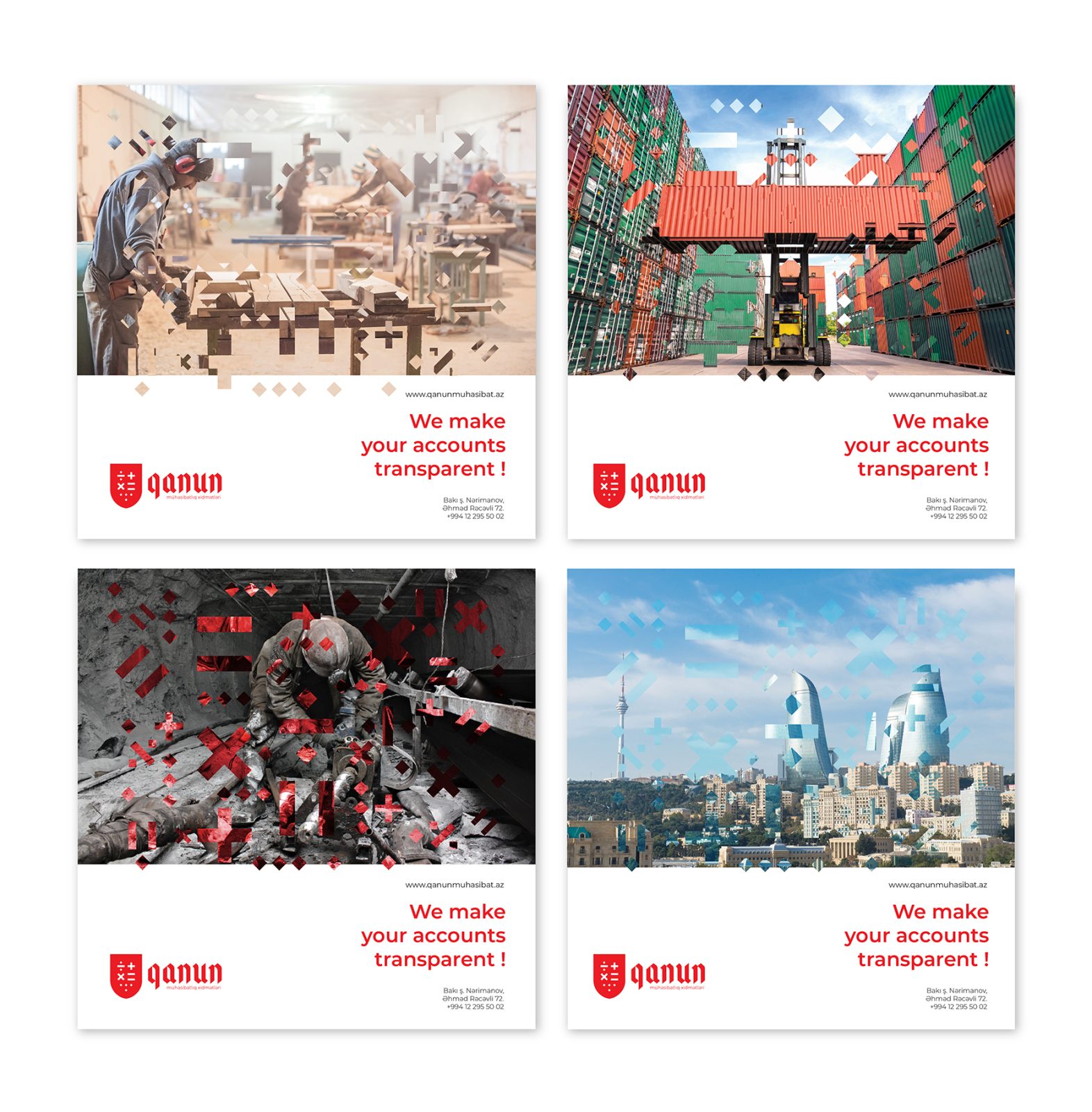
In other methods of communication, the main symbols of the logo become pictographic patterns and complete the corporate identity. To show transparency which is the company’s cornerstone it is used over images.
Pictures depicting different areas of activity on the posters more accurately describe the segments that the “Qanun” accounting company cooperates with and targets. And it is a clear example of an individual approach to each area. Pictograms were uniquely used in all promotional products to identify the brand even without a background. However it sounds classic, the symbols representing the field in the logo easily express the company’s field of activity in communication media without confusion.
When I implemented the branding, although it seemed heavy at first, reflecting the company’s philosophy, I was able to convey the details based on the principles of simplicity in a visual form.


CREDIT
- Agency/Creative: Elmibay Aliyev
- Article Title: Qanun Accounting Service Brand Design Creation
- Organisation/Entity: Creative
- Project Type: Identity
- Project Status: Published
- Agency/Creative Country: Azerbaijan
- Agency/Creative City: Baku
- Industry: Entertainment
- Keywords: WBDS Creative Design Awards 2022/23
-
Credits:
Art director, Graphic designer: Aliyev Elmibay Ali


