The challenge: We’ve changed – and we can help change the market
When founded in 2005, Q4 was little more than a provider of website solutions to listed companies. Over the past 18 years, the company has extended its capabilities to include earnings and event solutions, partnerships with major stock exchanges and, via a suite of complex data surveillance tools and evolved technologies, a broad range of innovative desktop solutions for its clients. Q4’s ability to digitally drive connections, analyze impact and target the type of engagement designed to help public companies work faster and smarter represents a new era for the capital markets.
CEO Darrell Heaps wants to empower companies to win. He sees growth and success as critically dependent on identifying, attracting, retaining, and nurturing relationships with valuable stakeholders. His vision is to break down the old existing barriers and create a place of connection for the evolving IR environment of today and the future. Our role was to help bring this goal to life with strategic vision and clarity and a corresponding brand refresh.
The solution: a new company for a changing market
Q4 has come a long way. With its huge and growing footprint, extraordinary client roster, and the wealth of information and valuable actionable insight at its disposal, it is clearly more than just a website or events or CRM or analytics intelligence company. Our discovery and strategy process led to the recognition that Q4 is actually an entire ecosystem, a network in a unique position to transform the capital markets by providing unprecedented scale, access, efficiency, and market insight. In a hitherto disconnected world, Q4 is a single trusted resource for issuers and investors and the sell-side, connecting, simplifying, improving efficiency by transforming how they connect, communicate, and engage with one another. Q4 is the capital markets access platform, making the markets smarter, faster, and more informed.
Think about a title here, e.g.: A brand for a single place of connection
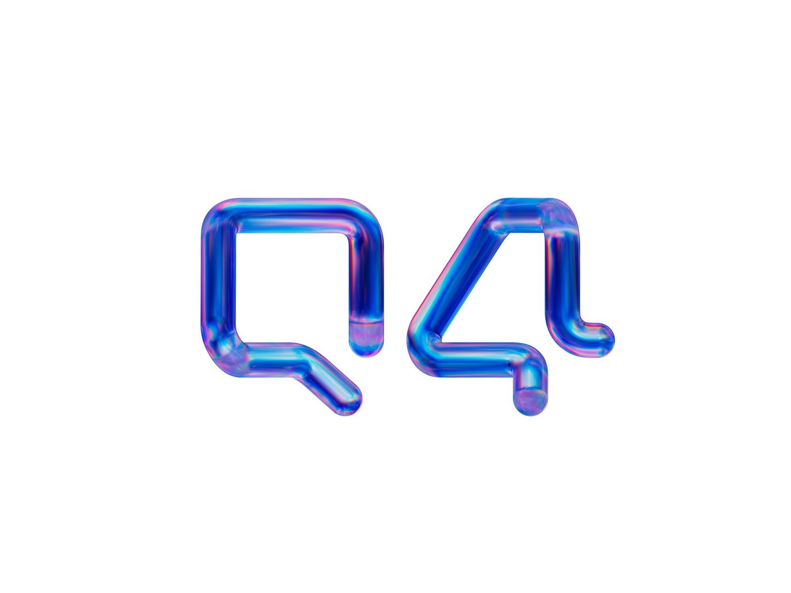
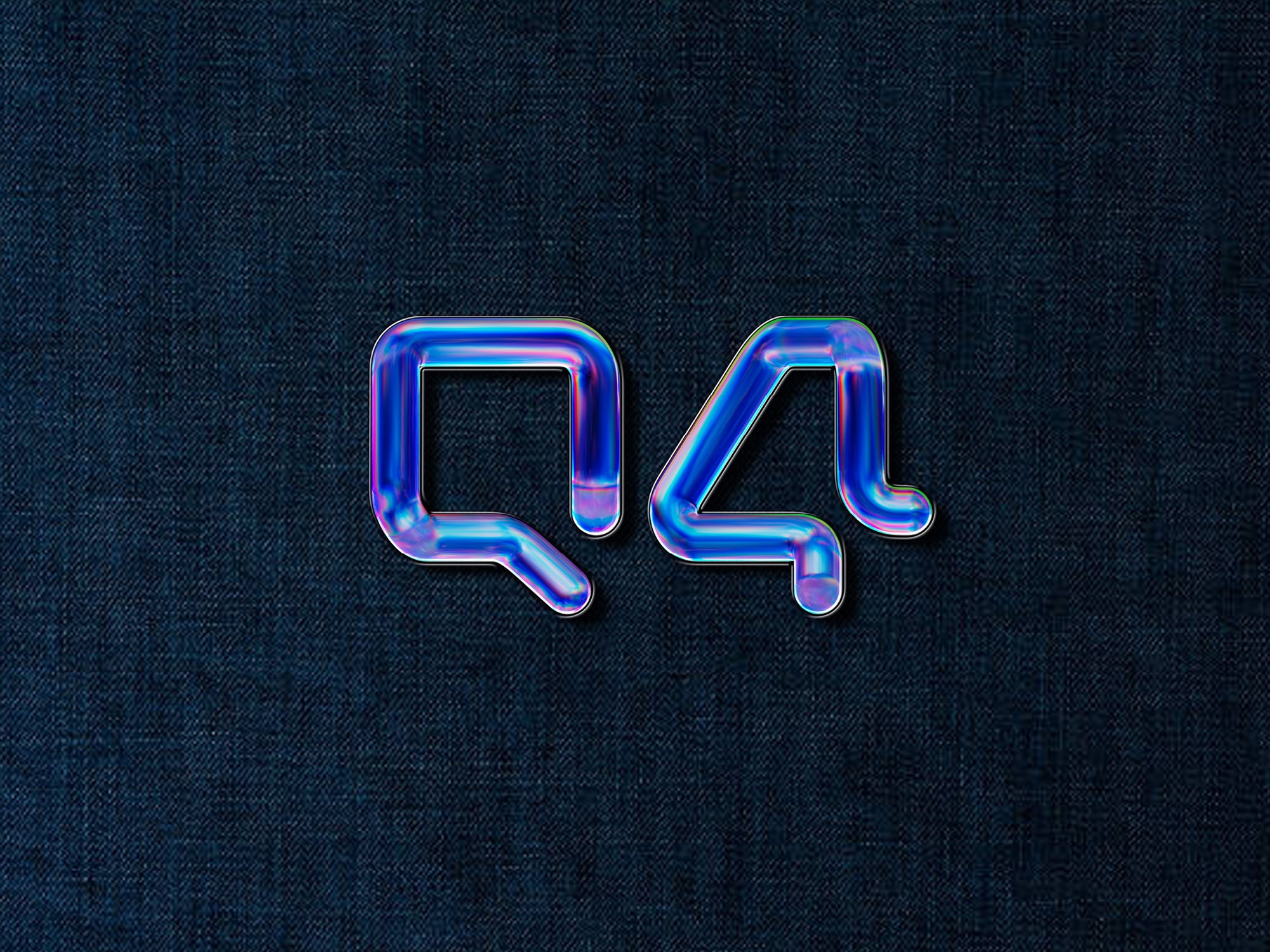
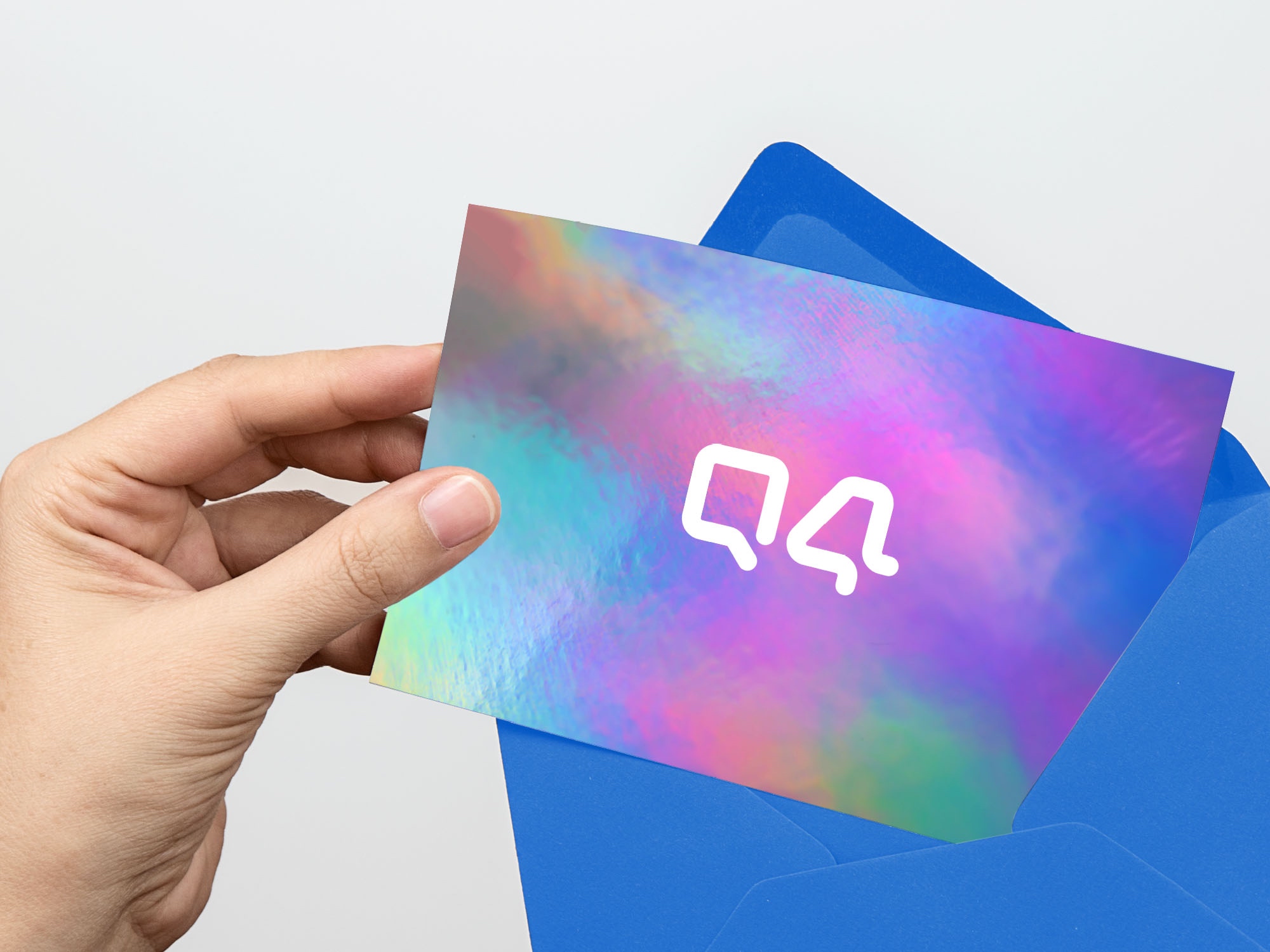
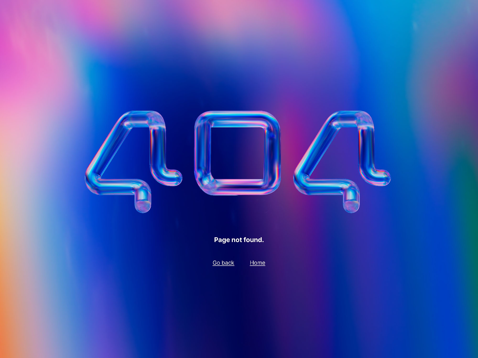
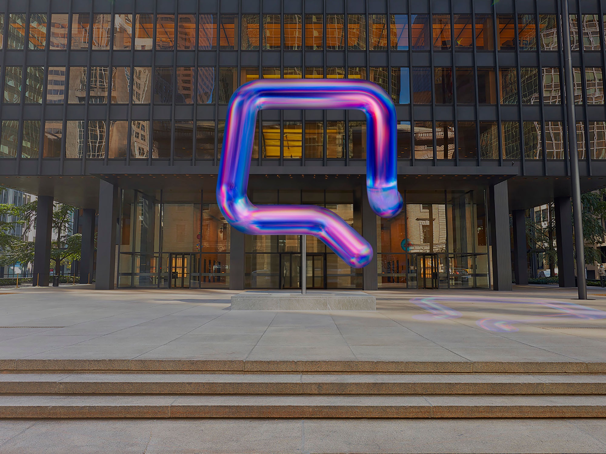
The rebrand had rather humble beginnings, the flexibility of a paperclip fashioned into the letter Q provided the vital inspiration for the new brand: when rotated, the Q is seen as the number four. Hence movement and unity are the core of the concept, which represents the single platform/single marketplace and the ceaseless collaboration and connections that the platform delivers.
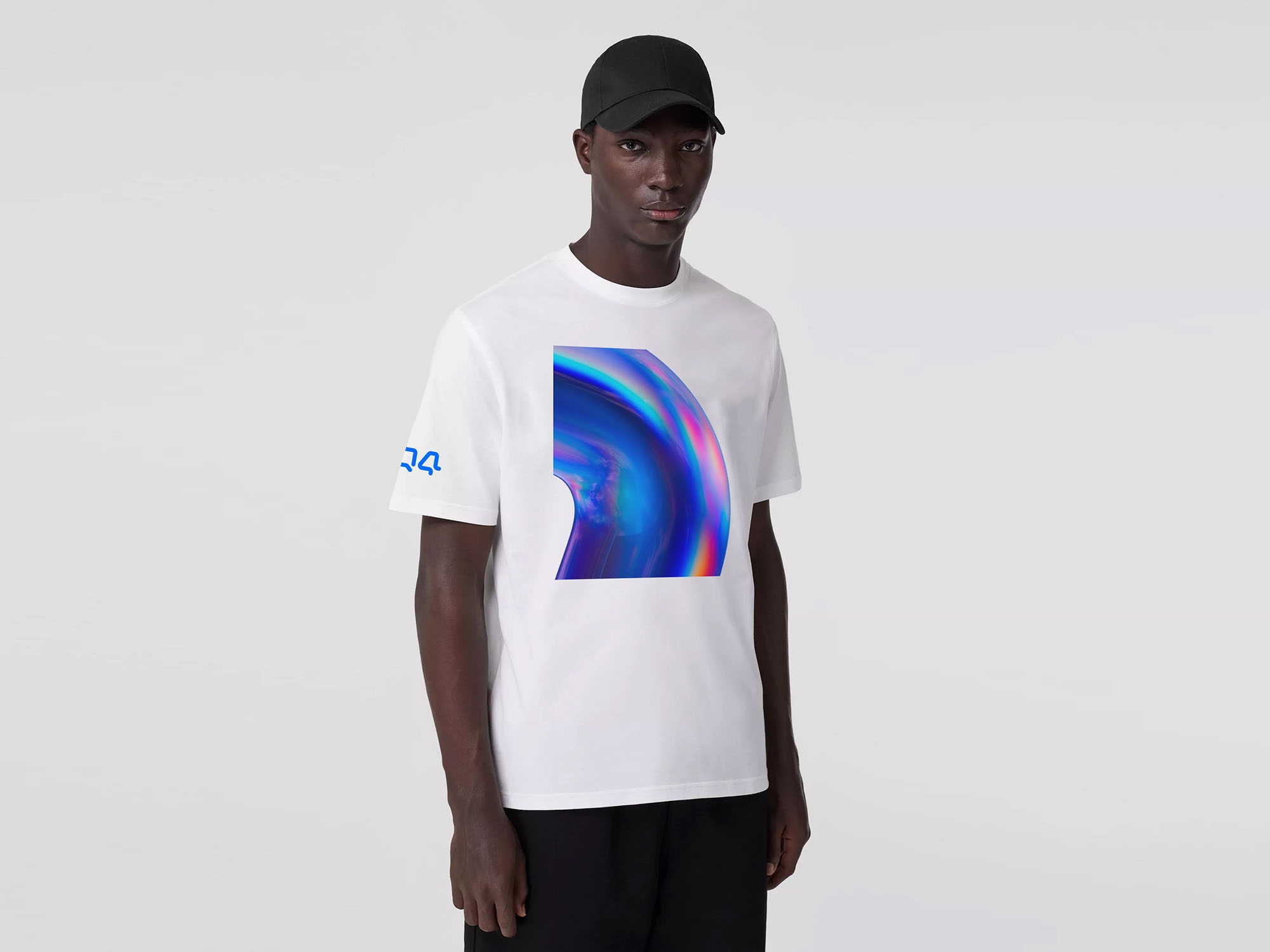
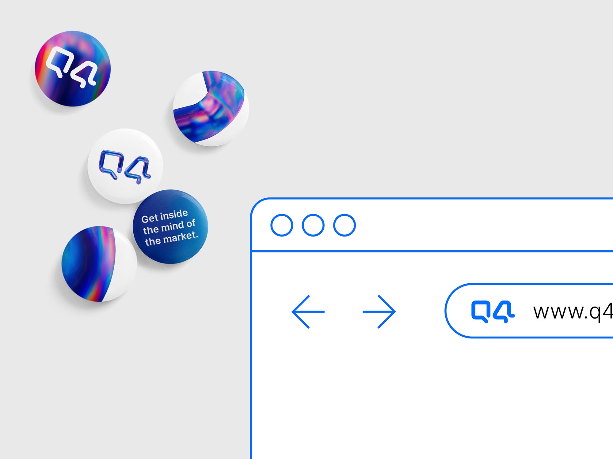
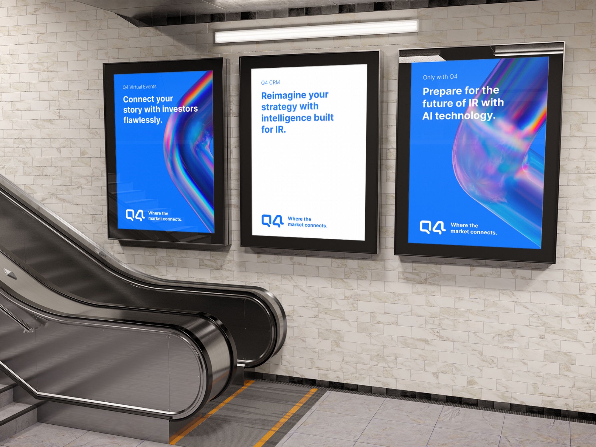
A suite of shimmering animated logos forms the basis of the new identity, which features a range of rich, vibrant gradients and super crops. There is something deeply satisfying in the humble origins of the logo of the visionary digital innovator that is redefining one of the most powerful markets in the world.


CREDIT
- Agency/Creative: Thackway McCord
- Article Title: Q4 Platform Brand Identity
- Organisation/Entity: Agency
- Project Type: Identity
- Project Status: Published
- Agency/Creative Country: United States
- Agency/Creative City: New York
- Market Region: North America
- Project Deliverables: Brand Identity
- Industry: Technology
- Keywords: WBDS Agency Design Awards 2023/24
- Keywords: Identity, Brand Redesign
-
Credits:
Designer: Tim Woolliscroft
Creative Director: Steve Clarke
3D Artist: Robert Marks


