Looking at nature for inspiration is risky: one can easily get stuck in the “styling” territory or even go outright kitsch. For the PYNE Hand Wash concept, I took this risk and studied one of the most primal and ancient natural entities: the pinecone.
In essence, the pinecone is a seed vessel. It contains pine seeds in between its spikes, which are scientifically called “scales,” and have a rigid yet ductile composition. The scales are positioned in a spiraling fashion around a main stem. This is called a phyllotaxis structure, a fractal-like arrangement that is also present in pineapples, flowers, etc. The main function of the scales is to transport water collected on its creased surface to the main stem. Furthermore, these protrusions are not static, but are in fact dynamic: throughout the year, depending on the temperature, humidity, and other factors, they expand at the right time and release the seeds into the environment. I wanted to bring these properties into my design and incorporate the cause-effect relationships found in my subject matter. Because only then, I believe, taking inspiration from nature also known as biomimicry actually works. The omnipresent phrase “form follows function” is best observed in nature, and ignoring the function behind the form by utilizing solely the form from a sculptural perspective is in a sense missing on the potential.
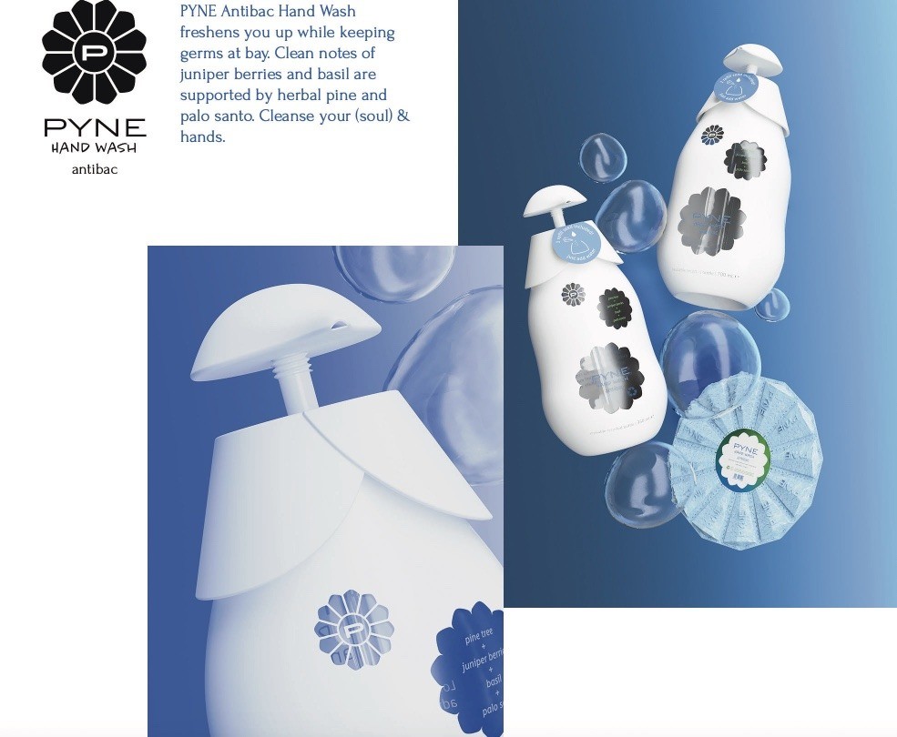
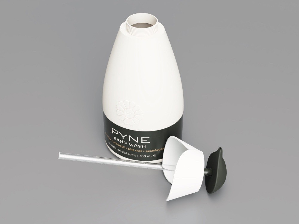
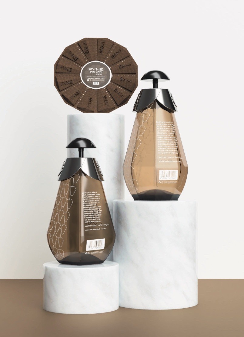
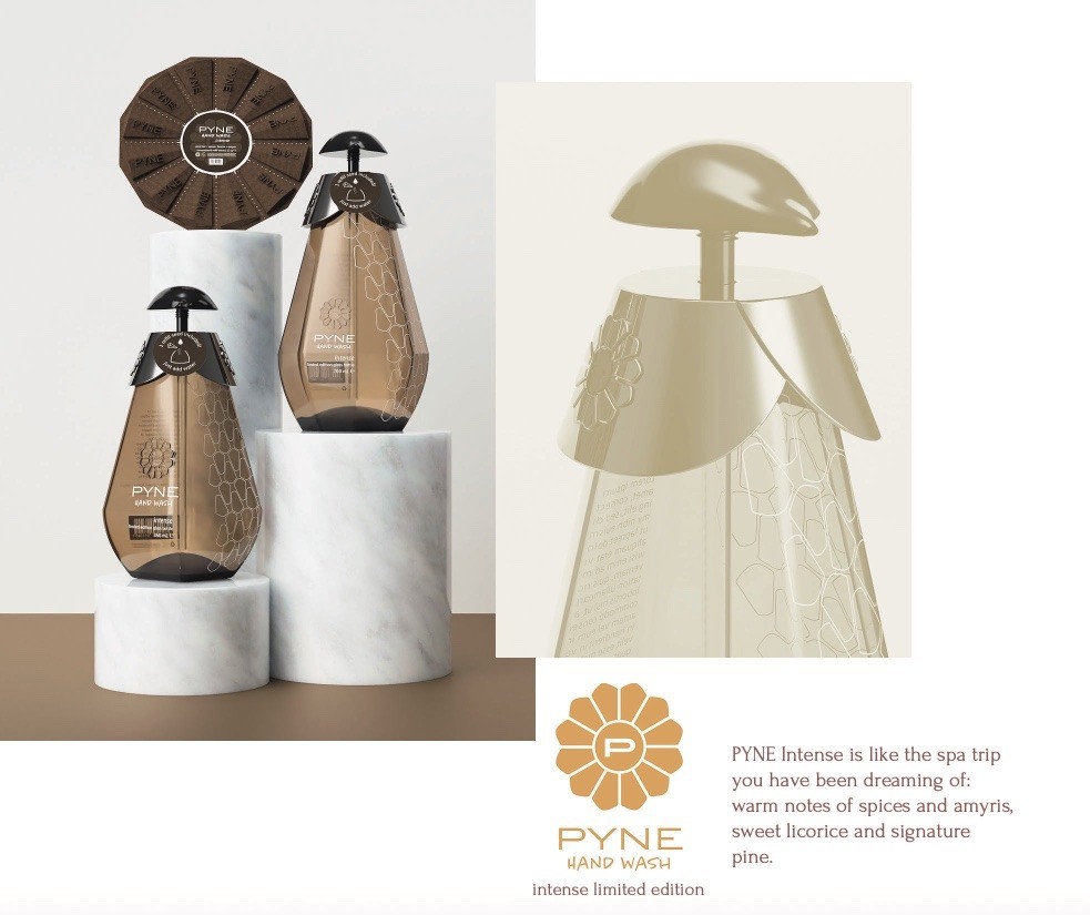
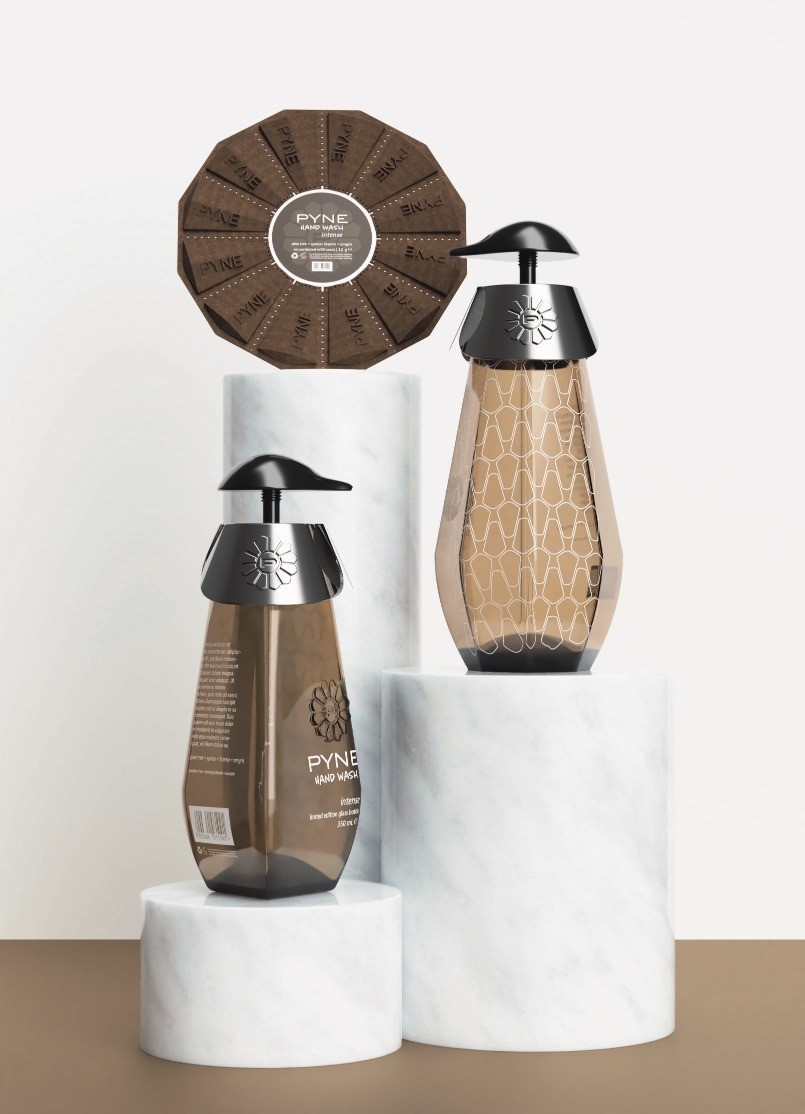
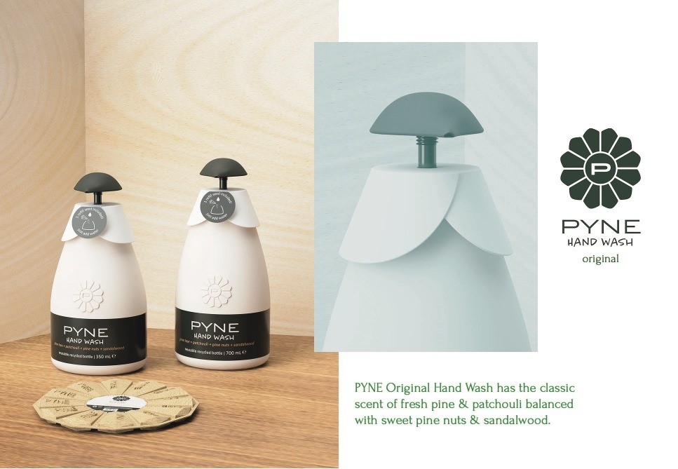
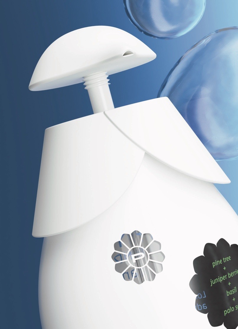
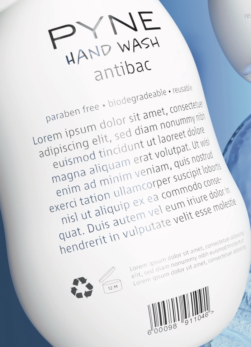
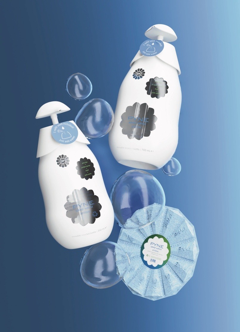
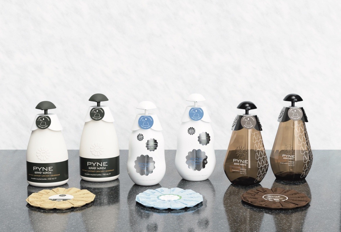
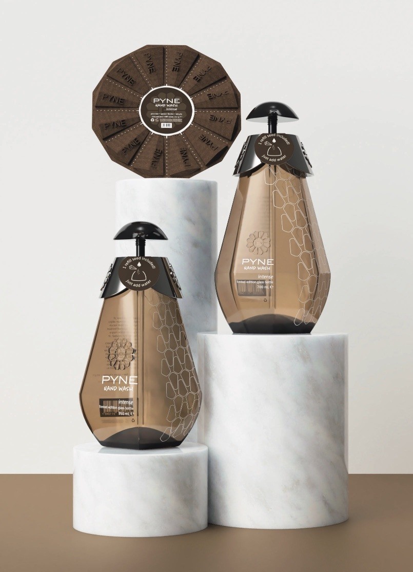
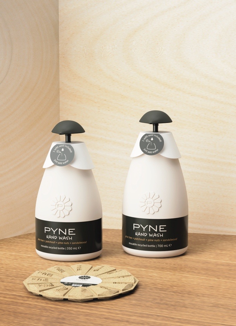
I first started my concept by creating a brand. I knew I would refer to the pinecone for the design so I wanted this whole brand to be pine-related. Hinting to the subject matter with the aesthetic choices is okay in my biomimicry book as long as it is for the sake of setting up the context of the brand and everything ties in for the consumer who is presented with a cohesive story as the end product. I crafted three scent profiles for three variants offered in the PYNE Hand Wash product line. All three have pine tree as a common note, which creates a consistent olfactory brand identity. PYNE Hand Wash Original is the main variant; it has an iconic, earthy, and balanced character with additional notes of patchouli, pine nuts, and sandalwood. The Original is meant to be an instant classic giving a classy vibe. These qualities are also present in the packaging design: a muted color palette with beiges and dark greens on an oblong bottle shape. PYNE Hand Wash antibac has a bubbly, crisp, and bright personality with juniper berries, basil, and palo santo as additional notes. The antibac variant evokes memories of sipping gin tonics on a warm summer day, as it associates hygiene with freshness. The bottle design has a bulbous form and is mainly white with blue and green accents, with windows peeking into the hand wash inside. On the other hand, PYNE Hand Wash intense limited edition is the complete opposite with spices, licorice, and amyris as its additional notes creating a gourmand, deep, and luxurious experience. It is like the spa trip you have been dreaming of in a bottle, which has a faceted, gem-like form and is made of amber colored glass with white printed graphic elements.
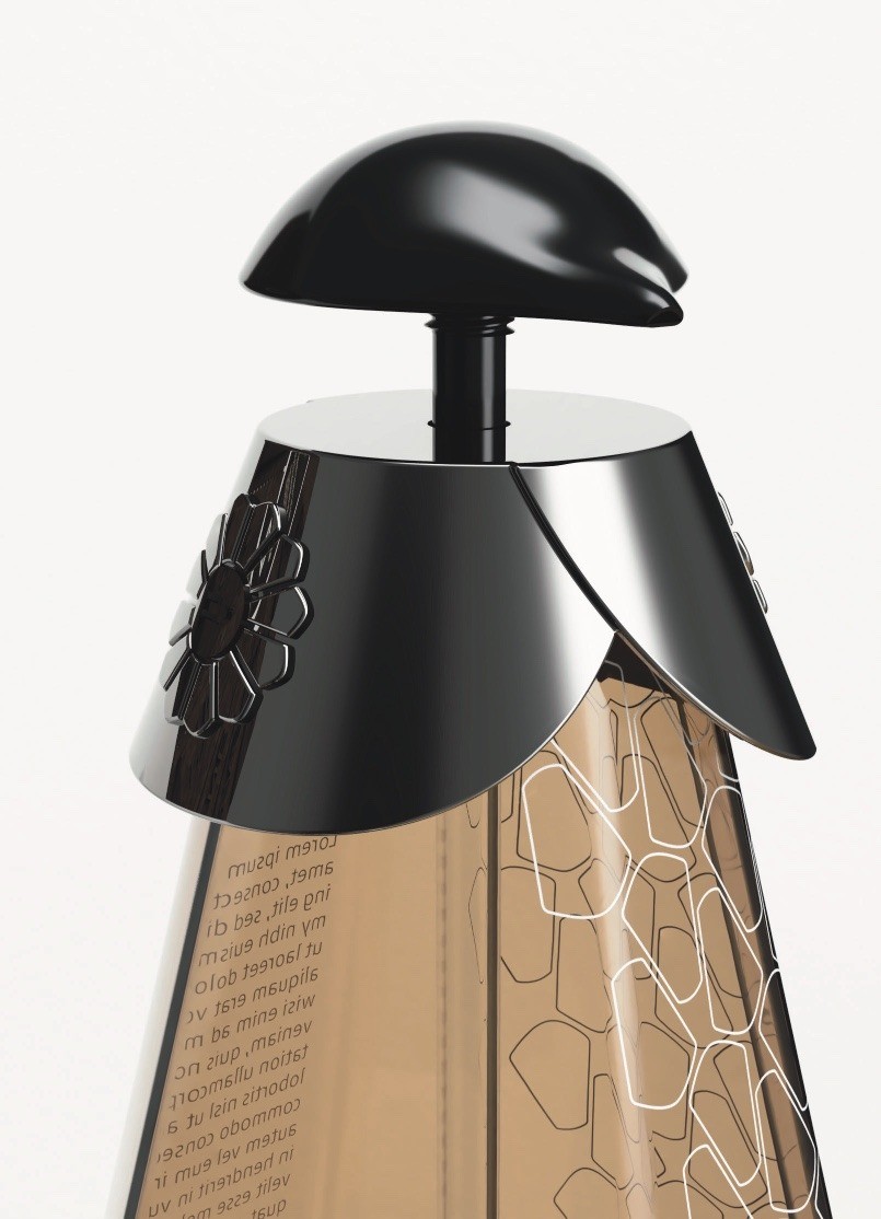
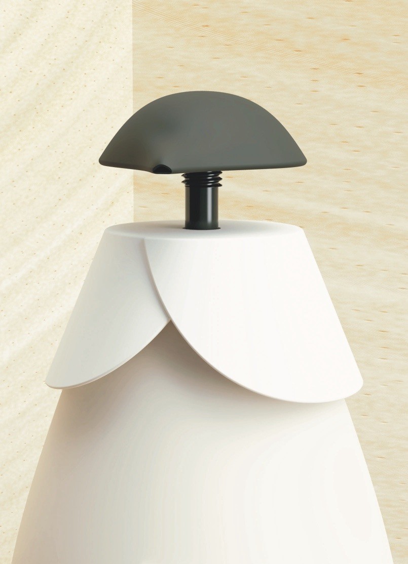
The properties of the pinecone that translated into my design can be observed through the use scenario. Each bottle of PYNE Hand Wash comes with a “refill seed,” a sachet made of egg carton-like recycled paper filled with the actual hand wash product in powder form. The user is then expected to pour the powder into the bottle, sort of like how the scales of a pinecone transport water to the stem, and mix this powder with water and create the product at home. This saves from the cost and carbon footprint of transporting heavy liquid toiletries. The refill seeds can also be purchased separately in discs of 12 seeds, resembling the PYNE logo. The material and form create a unique and sustainable branding opportunity as the seeds can be embossed with the logo without needing an ink print while the required legal information can be included on a single central label. Furthermore, the discs are stackable, thus saving on shelf space. The overall design of the refill seeds is similar across the variants, and only differ in color and label design. Another element common across the variants is the cap and pump system. The form is similar with minor changes in finish and color, reducing the mold cost as the same mold can be used repeatedly with different pigment pellets. The design language is supposed to emit feelings of protection, with the closure almost embracing the bottle as it fastens to the bottle neck. The screw motion of fastening the pump to the bottle also mimics the fractal structure of the pinecone, spiraling from top to bottom. The actuator is dome-shaped which besides ensuring an ergonomic design, differentiates the product from competitors as the dispenser pump is often overlooked in hand wash packaging design as a distinctive feature. Each PYNE Hand Wash variant comes in two sizes: 350 mL and 700 mL. While the smaller size bottle needs one refill seed, the bigger one needs two to make sure the concentration is the consistent. The refill seeds each contain 12 grams of product in powder form and the discs contain a total of 144 grams.
Overall, the entire concept is developed through the use of biomimicry focusing on the pinecone while the brand is created to appeal to an audience that values an experience constructed in its entirety from the moment of purchase all the way to the post-use scenario. The PYNE Hand Wash concept would be distinctive in the market not only for its design, but also for what it stands for, thus reshaping the conventional hand wash product category and the typical use scenario.
CREDIT
- Agency/Creative: Ömer Taha Döver
- Article Title: Pyne Hand Wash Packaging Design Concept by Ömer Taha Döver
- Organisation/Entity: Student
- Project Type: Packaging
- Project Status: Non Published
- Agency/Creative Country: Turkey
- Agency/Creative City: Istanbul
- Market Region: Global
- Project Deliverables: Packaging Design
- Format: Bottle
- Substrate: Plastic
- Industry: Health Care
- Keywords: WBDS Student Design Awards 2021/22
-
Credits:
Educational Institution: Istanbul Technical University
Educator's Name: Assist. Prof. Dr. Koray Gelmez


