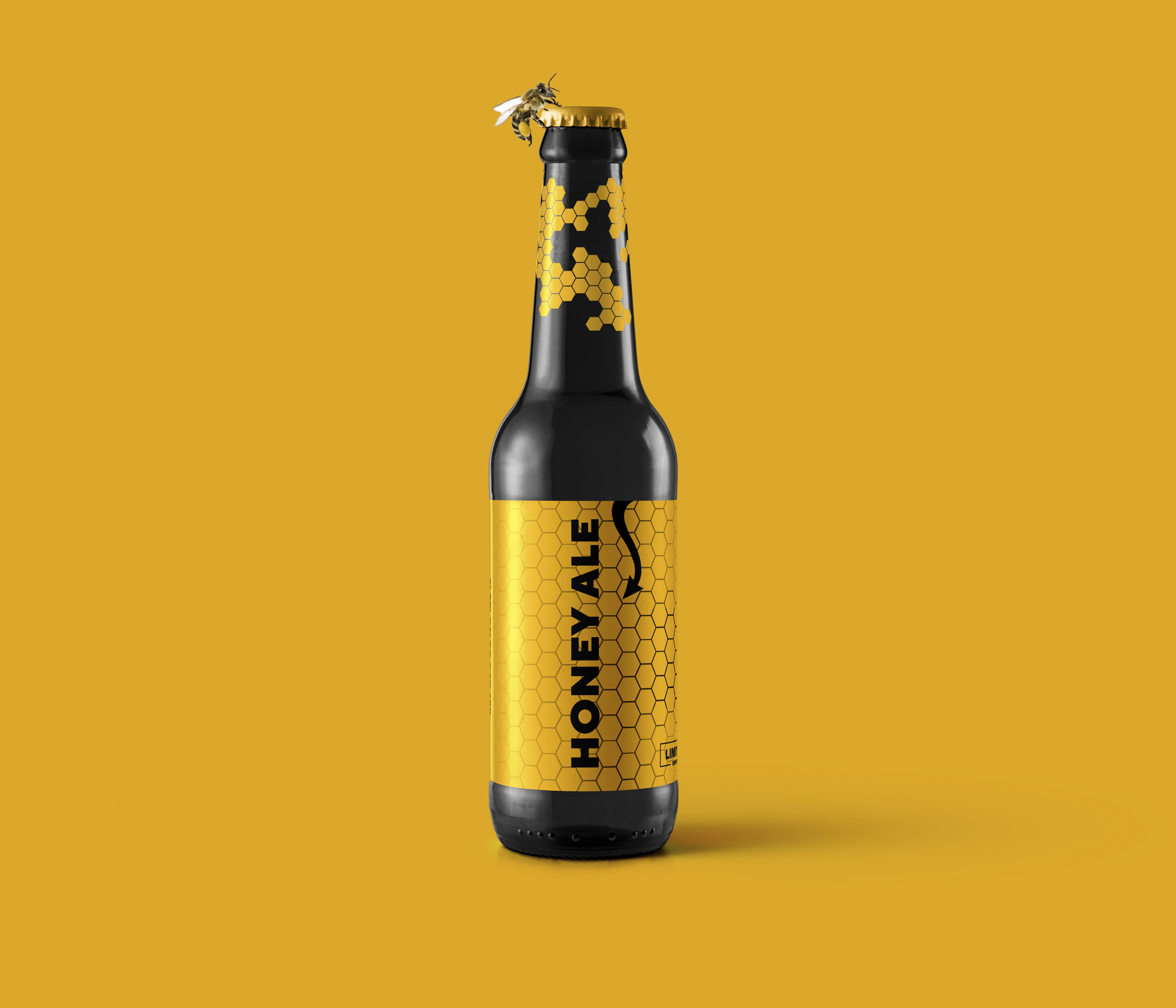
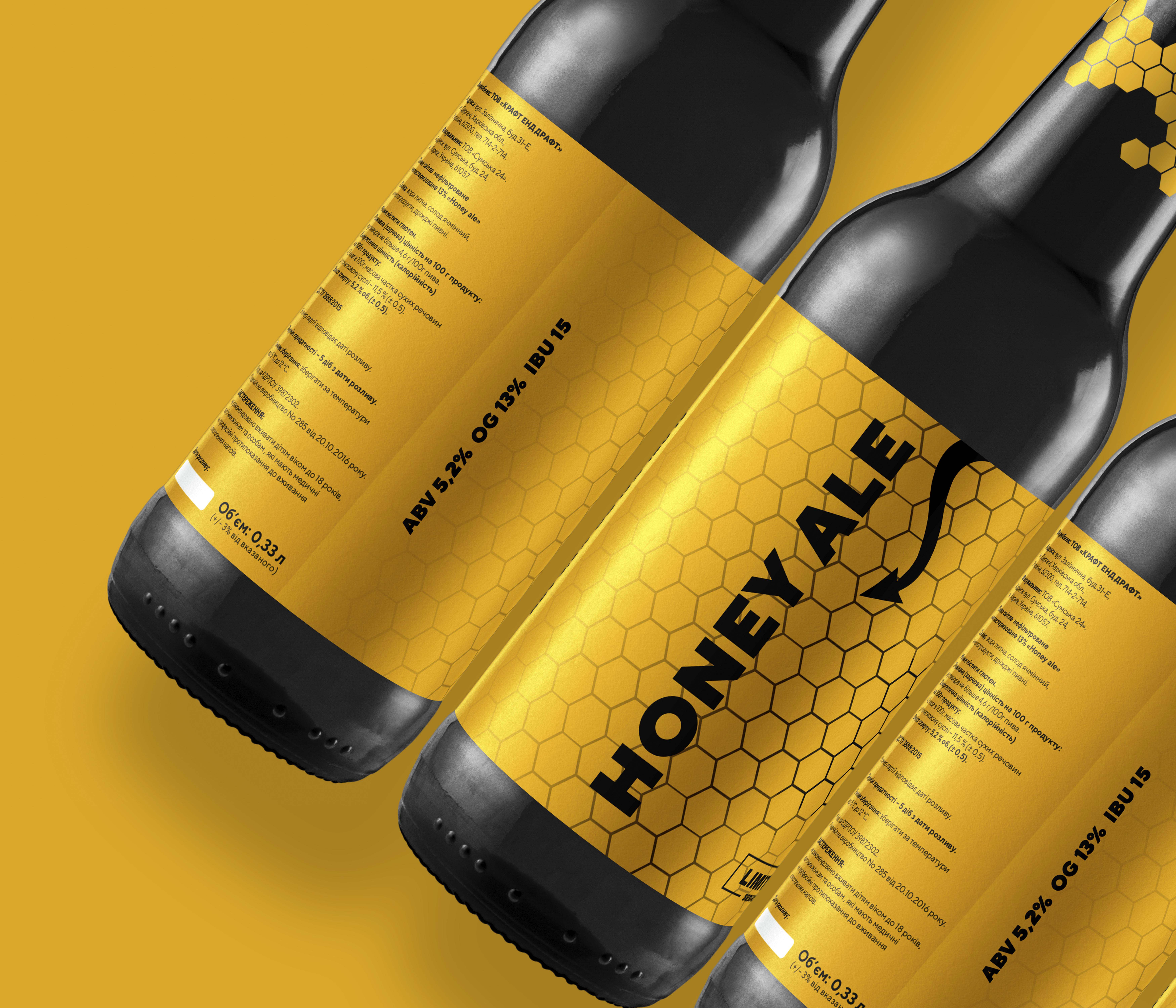
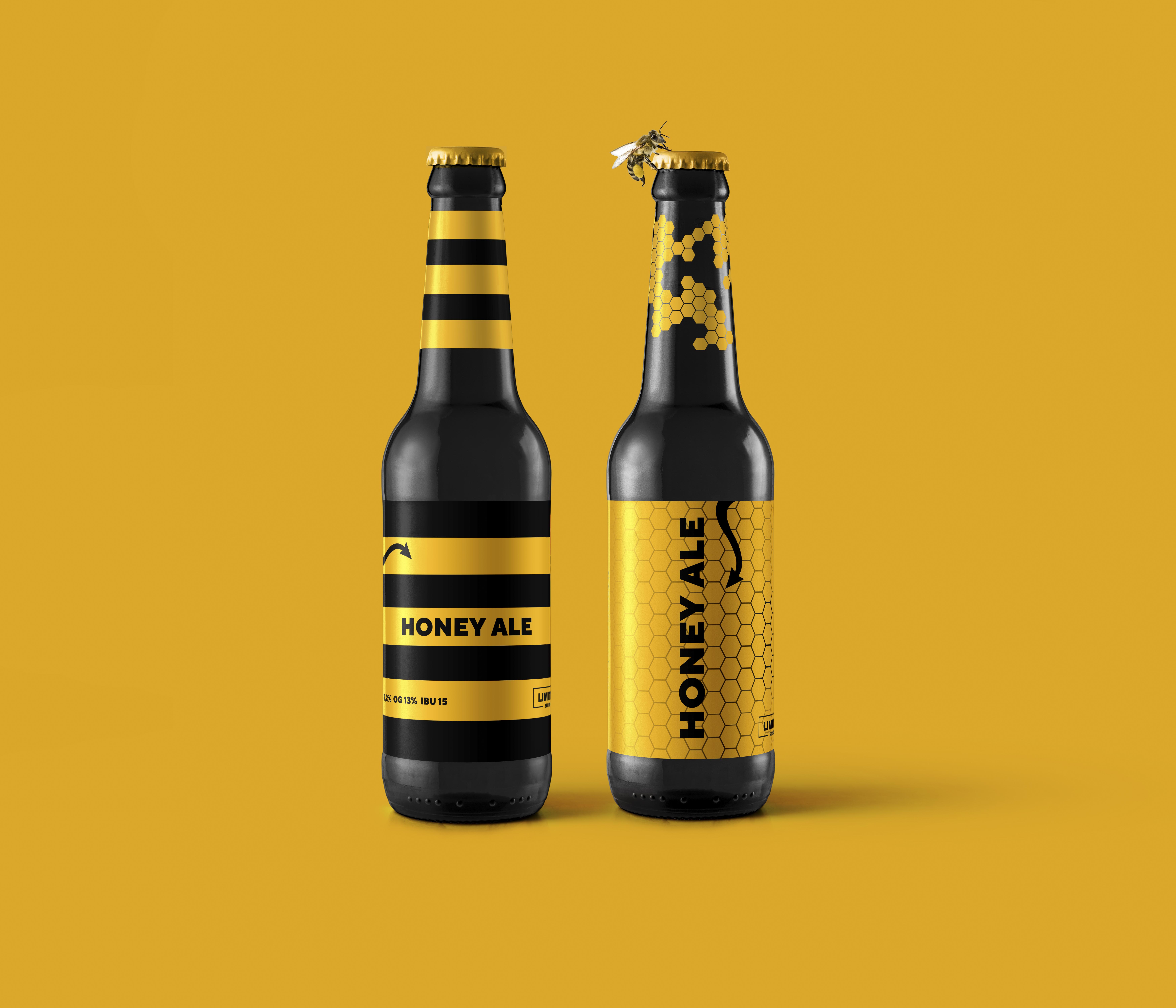
The bees invest a lot of labor and love to their honey. And the Red Cat’s brewers do the same with new beers. As it known, honeycomb is ideal figure to full the space without any voids. Our Honey Ale is full of taste, it’s body and mouthfeel are perfect – some flaws are excluded. This idea embodied in label’s design: shapely, well-formed lines of the honeycombs which are fit snugly and filled with sweet thick mass – bees do not mistaken. Our brewers too.
CREDIT
- Agency/Creative: Pavel Reznik
- Article Title: Pvel Reznik Creates New Beer Label Design for Red Cat Brewery in Ukraine
- Organisation/Entity: Agency, Published Commercial Design
- Project Type: Packaging
- Agency/Creative Country: Ukraine
- Market Region: Europe
- Project Deliverables: Branding, Graphic Design, Illustration, Packaging Design, Product Naming
- Format: Bottle
- Substrate: Glass Bottle
FEEDBACK
Relevance: Solution/idea in relation to brand, product or service
Implementation: Attention, detailing and finishing of final solution
Presentation: Text, visualisation and quality of the presentation


