PV chemical is a chemical import-export brand, formerly a division of the State Corporation. Established in 2012, with ten years of operation, this brand wants to renew its image to reaffirm its construction spirit and develop its identity into an image that fits the founder’s strong personality. After taking a hit from the effects of the Covid pandemic, Ms. Thuy – the founder, did not falter. Instead, fierce, full of energy, and with a renewed aspiration, she hopes to build a new image for the brand, bringing motivation to the staff after many difficulties.
Challenges
With its long history within the field, the brand has left a mark on the chemical industry market, so when coming to Tree, the founder of PVCHEM wishes to keep the brand name, while inheriting and developing a new image. It should bring a more modern, personal aesthetic, with the primary colors clearly shown and coherent, different from the old identity image.
Solutions
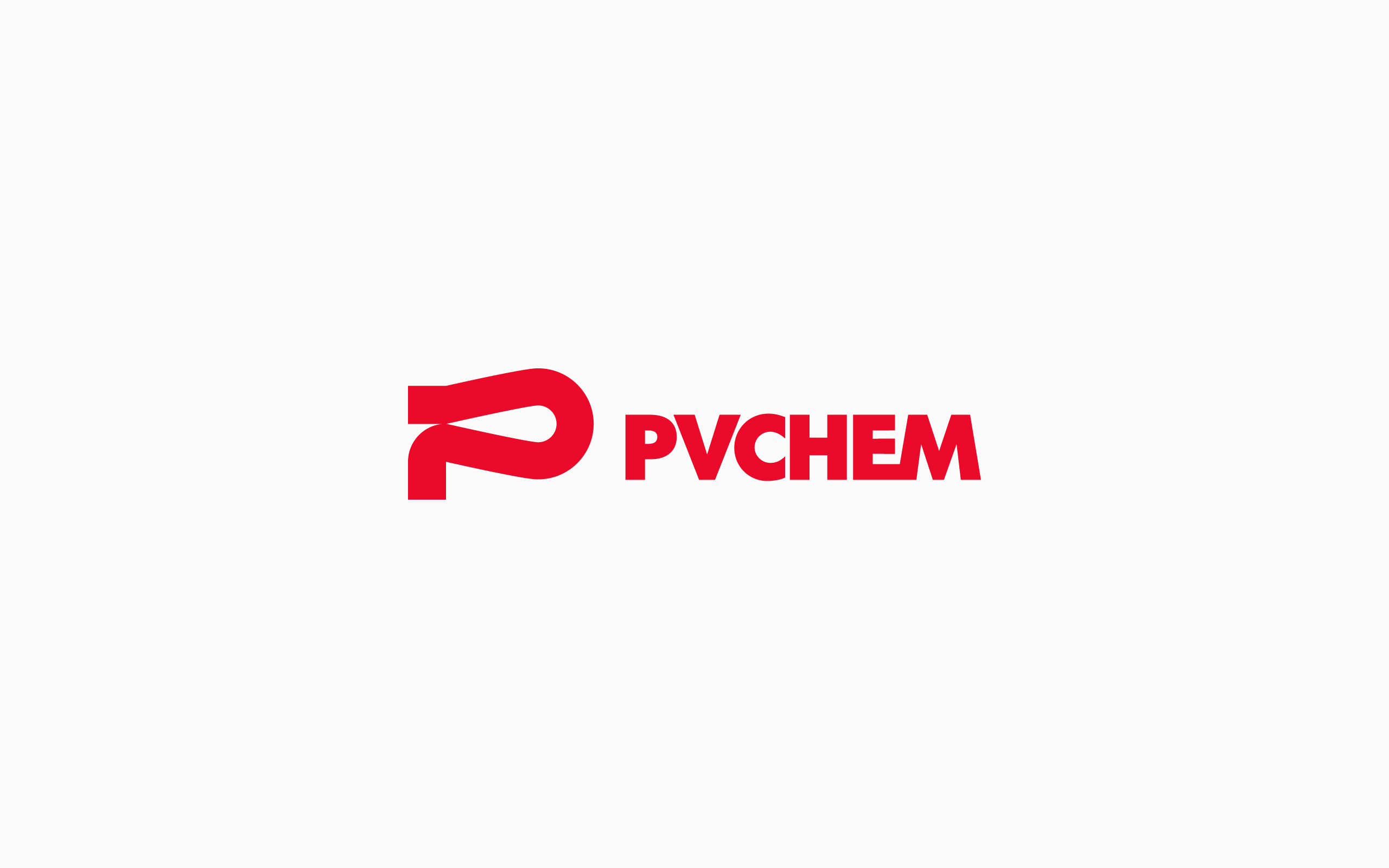
The inspiration for the logo came from the brand name “Phong Van” in which “Phong” means wind, and “Van” means cloud. The wind constantly moves, and where the wind blows, the clouds will follow. This image represents the constant development of the brand. Always moving forward forcefully and decisively. Along with this, Tree has developed a logo with hard and decisive strokes that further affirms the brand’s longevity. The symbol in the logo is a delicate combination of three letters “P, V, and C” (Phong Van Chemical) in many different forms and directions. Furthermore, when animated, the icon also represents the clouds flying in the wind, embracing the “drop of water” or “the drop of chemistry” – an industry characteristic. In another aspect, that “water drop” also acts as a “light ray” in the middle of the vast space. This “light ray” is PVCHEM, a brand with a burning passion that will never go out.
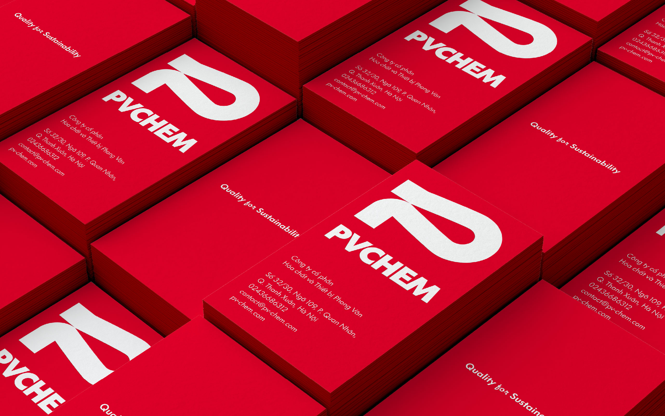
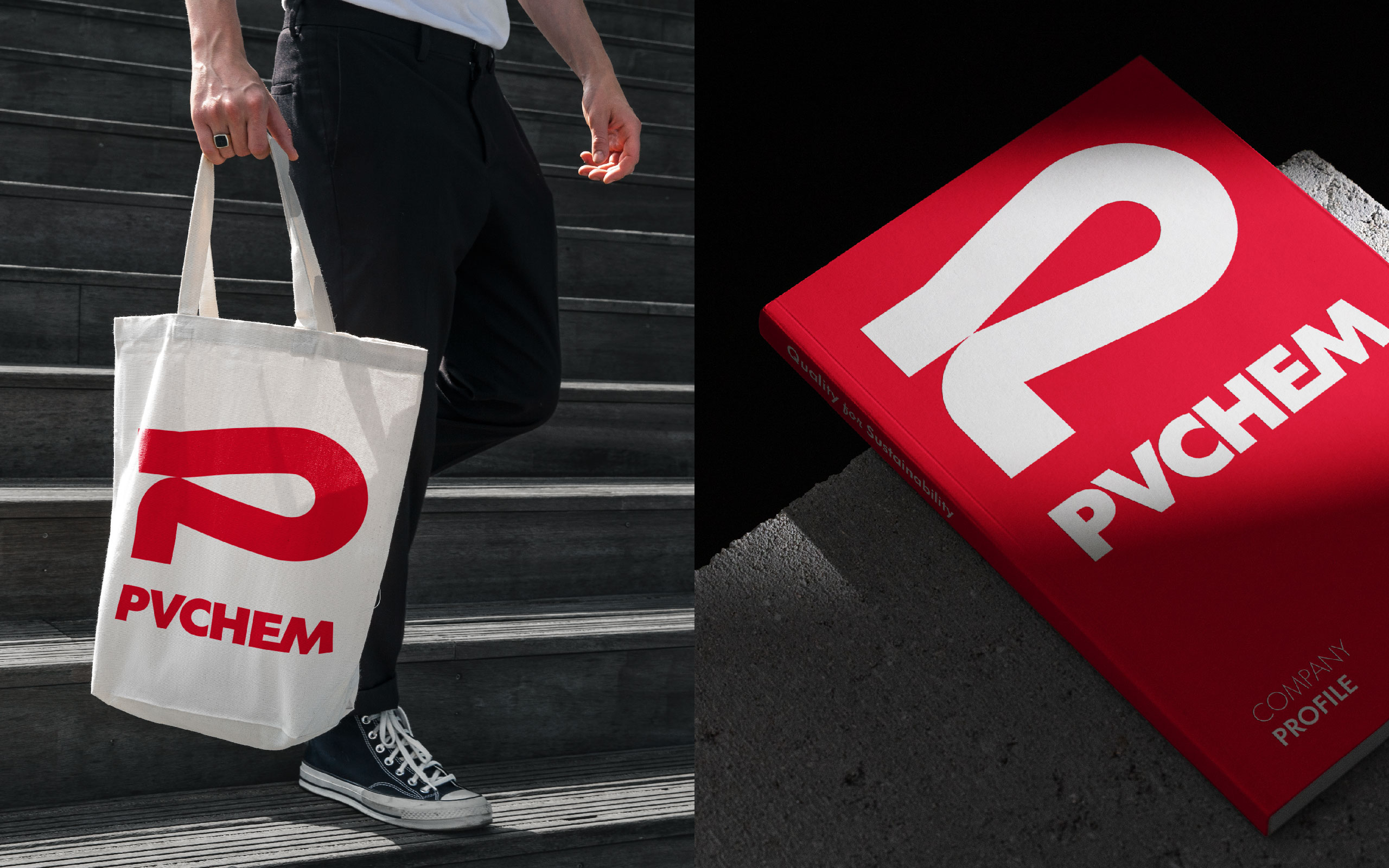
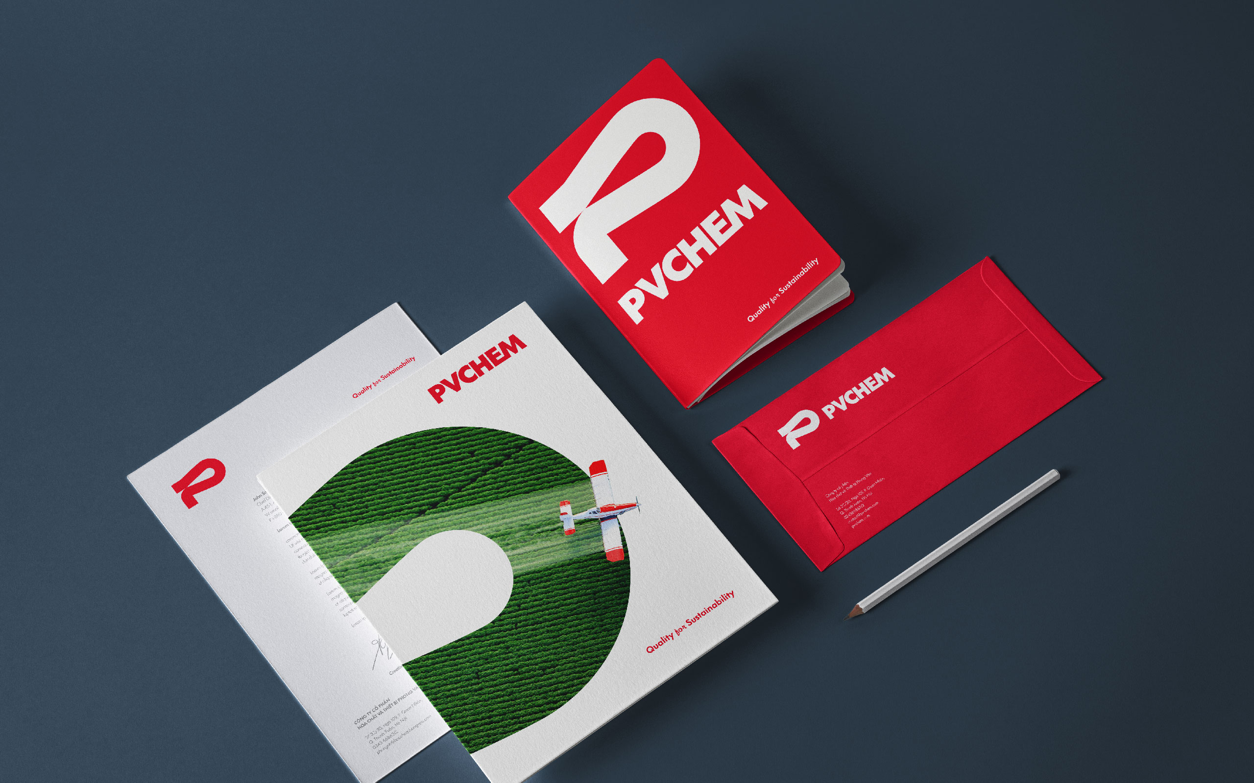
The previous color selection in the old logos was too diverse and did not have high recognition. So for this design, Tree focused on the dominant color red, emphasizing the fiery spirit and determination of the brand. Besides, red is also the color of enthusiasm, the willingness to create an impact, and delivers prestige and trust to the viewers.
Results
The rebranding project for PVCHEM in collaboration with Tree Creative was a roaring success. That results in the logo being minimalistic but containing many meanings that express the brand story, and characteristics. Refinement of the icon and colors further boost the brand recognition of the identity image, creating a solid impression that is attractive to the consumers.


CREDIT
- Agency/Creative: Tree Creative Agency
- Article Title: PVChem Brand Design By Tree Creative
- Organisation/Entity: Agency
- Project Type: Identity
- Project Status: Published
- Agency/Creative Country: Vietnam
- Agency/Creative City: Hanoi
- Market Region: Asia
- Project Deliverables: 2D Design
- Industry: Chemical
- Keywords: Chemical
-
Credits:
Agency: Tree Creative


