


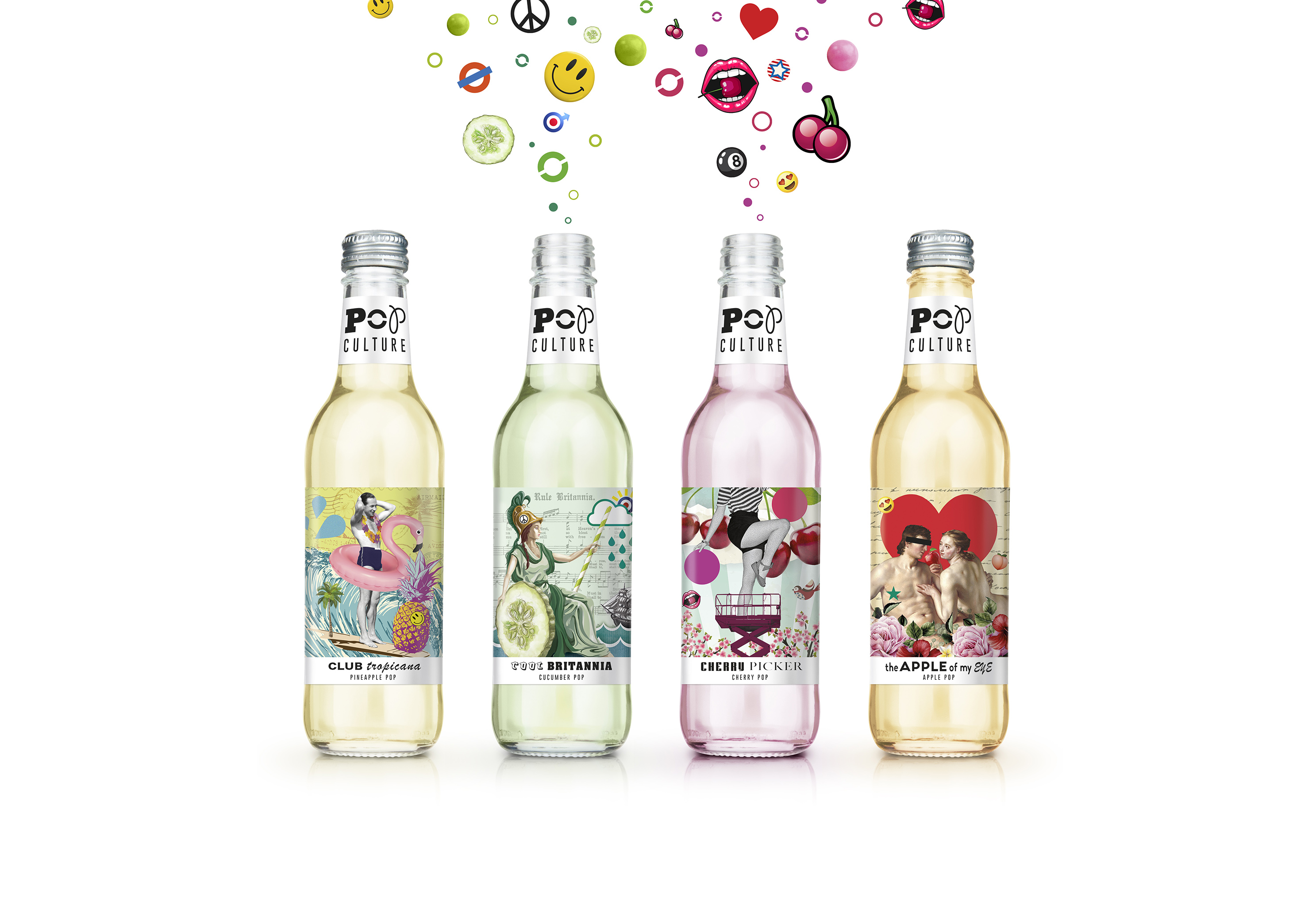
Brand creation project for a new range of premium, adult soft drinks that were intended for launch through fashionable, on-trade channels. The scope of work covered positioning, naming, identity, packaging, tone of voice, website, stationery and visual assets .Unfortunately for reasons outside of our control / role the project didn’t make it to the shelves.
The positioning focused around the notion of introducing a more grown up offer into the child-friendly soft drinks category and we described this idea as ‘Putting the culture into Pop and the POP into culture.’ This captured the new brand’s bold promise of adding some sophistication to the mainstream soft drinks market whilst also injecting some playfulness and joy into the average adult’s soft drinks repertoire.
To bring this concept to life, our creative inspiration naturally focused on the principals and execution of the Pop Art movement. Something that exhibits a playful and accessible aesthetic but which is also a clever commentary /reflection on the popular culture of the day. The Pop Culture name is a play on the word ‘pop’ as a term for soft drinks combined with a reference to the brand’s ambition to bring some grown up values to this category. The logo and supporting typographic approach is also rooted in the Pop theme of reuse/appropriation with eclectic characters randomly lifted and combined to assemble the logotype.
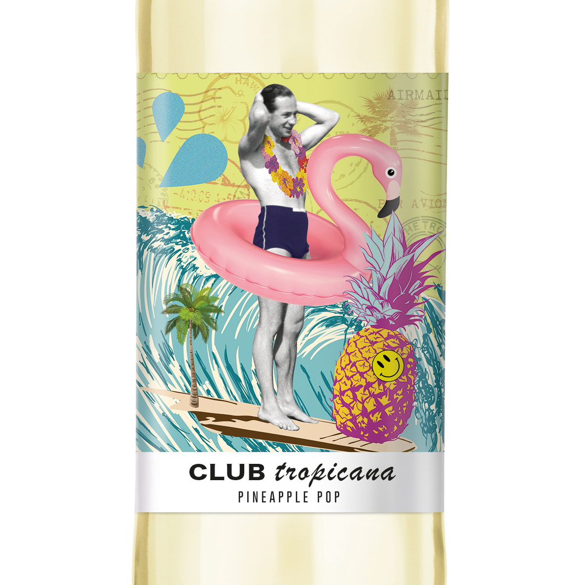
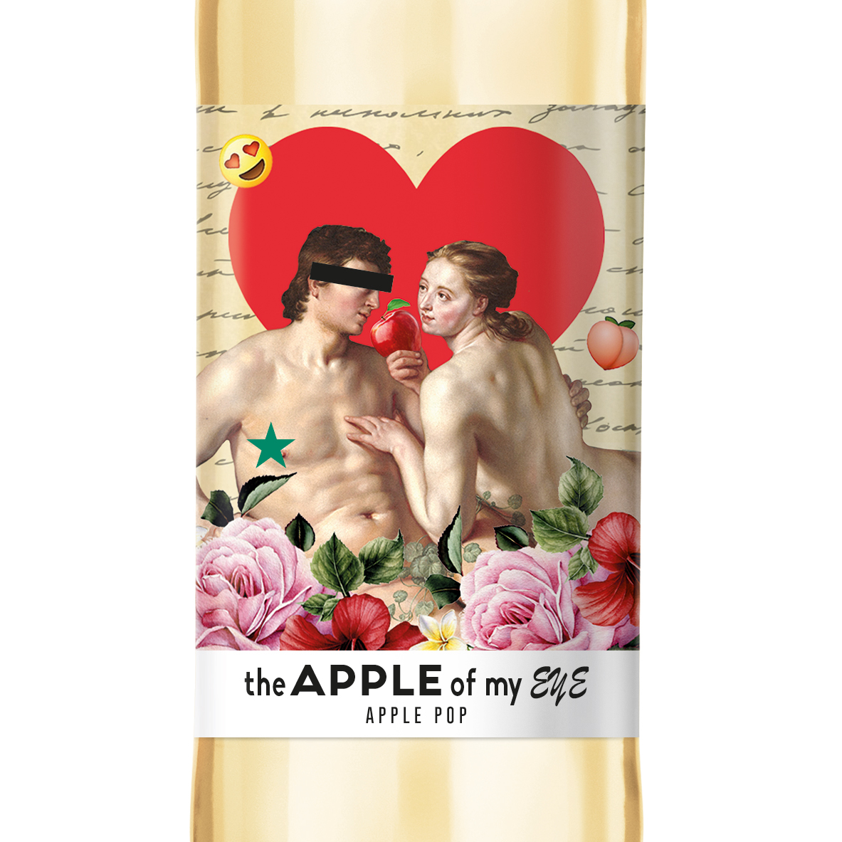
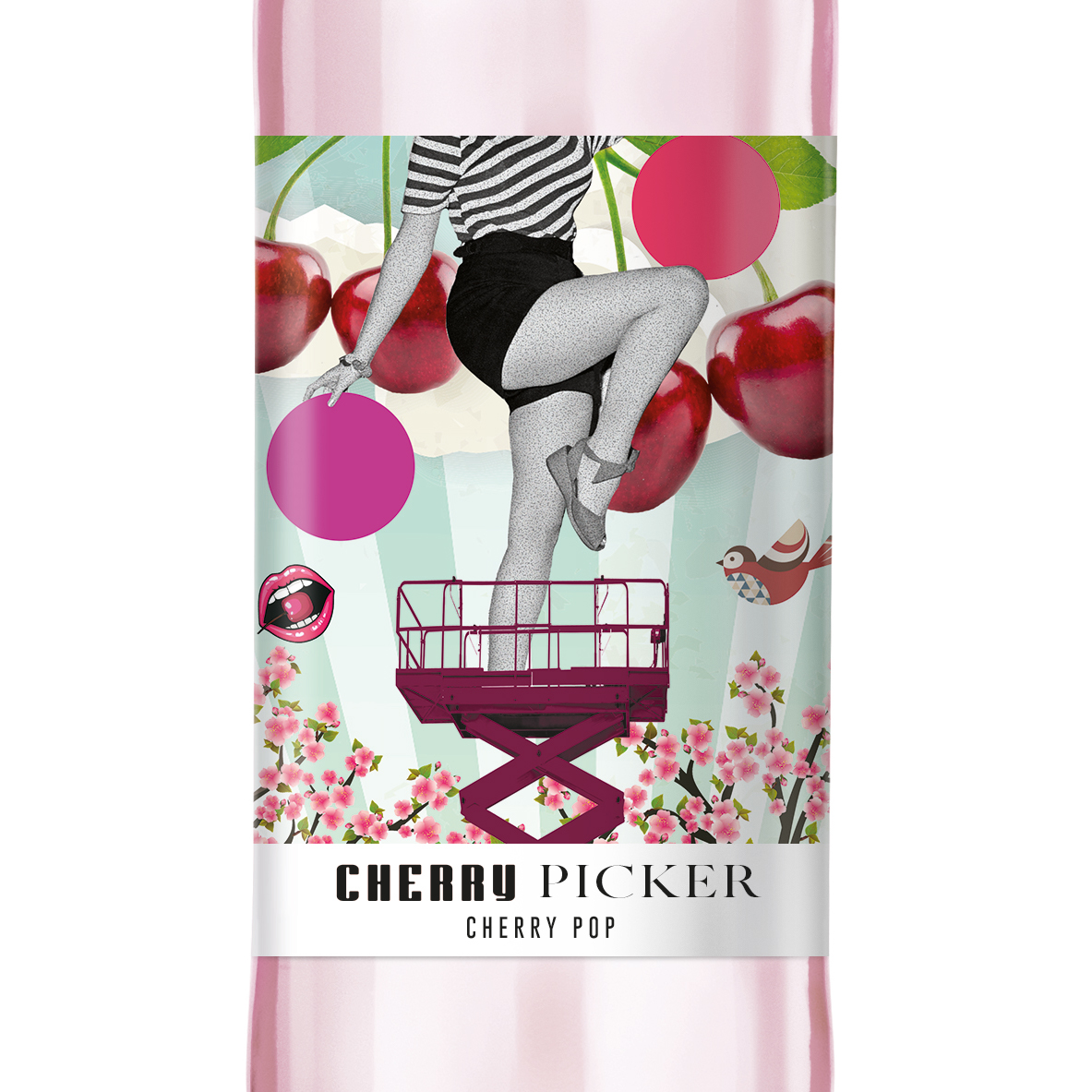
In the spirit of Pop, the visual identity sought to create individual themes and executions for each flavour variant using montages of ‘found’ imagery and ephemera held together through an attitude to visual style and concept and a consistent black and white, branded neck label on each.
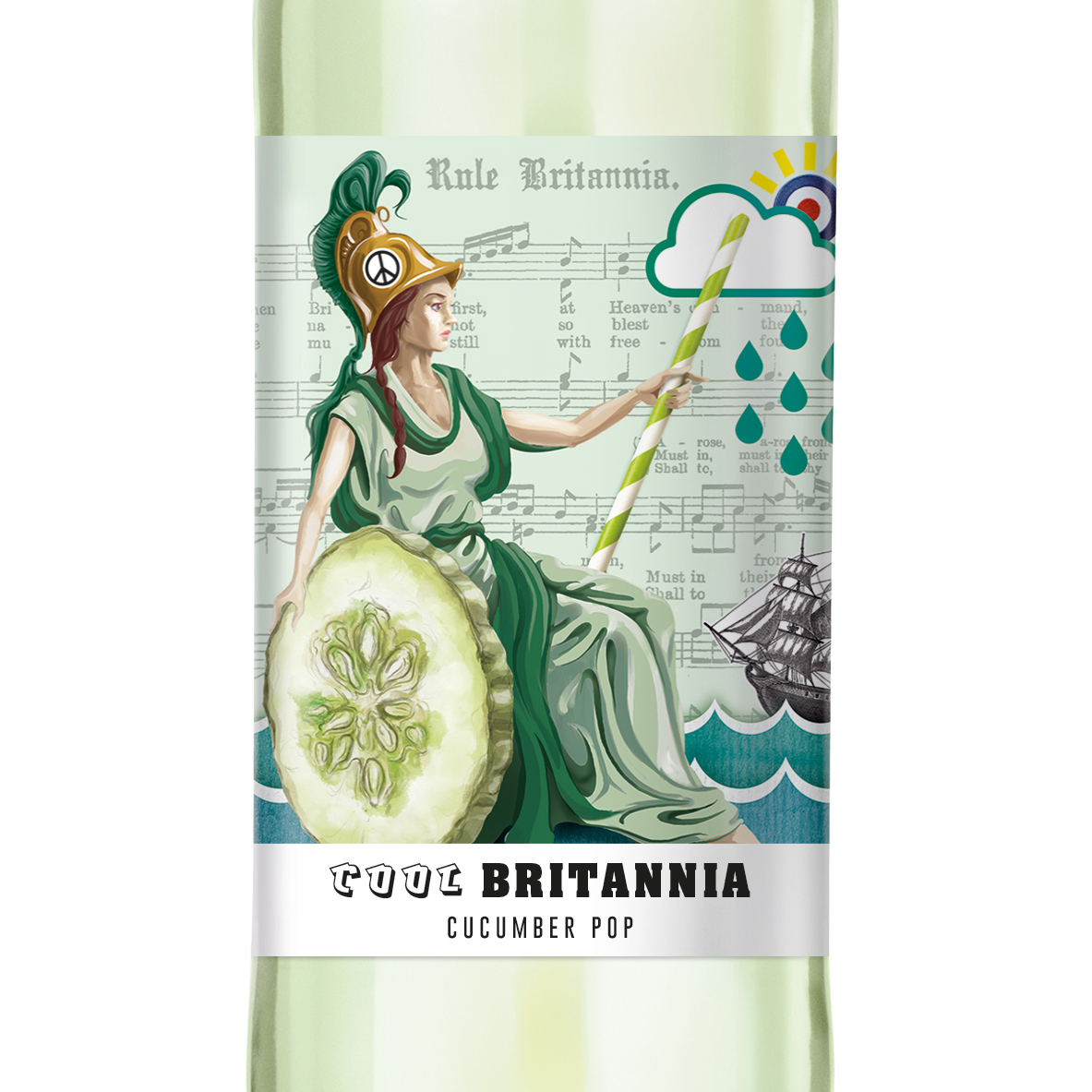
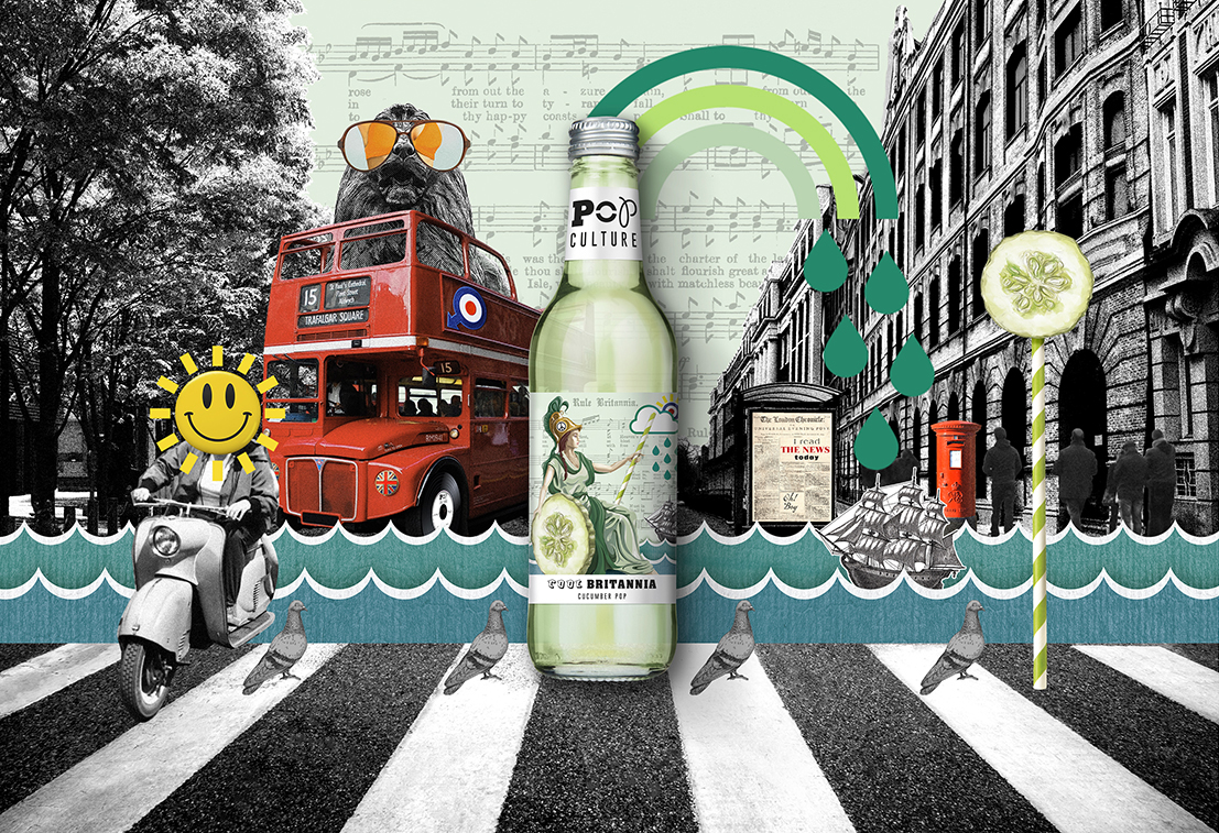
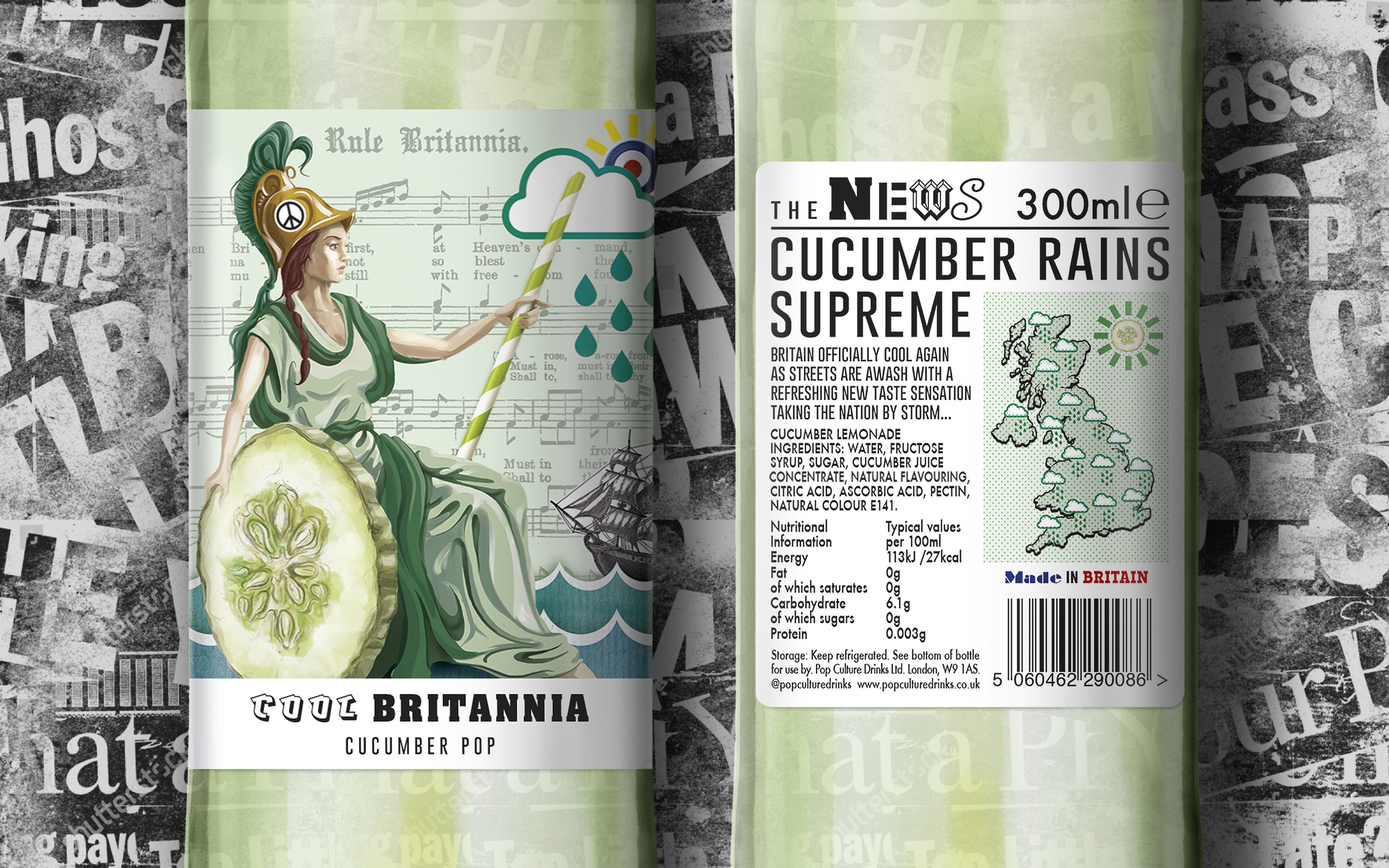
First to launch would have been the Cucumber lemonade with a hint of basil- offering a grown up twist to a classic lemonade. As the drink and the ingredients are of a traditionally British provenance, we appropriated the 60’s phrase ‘Cool Britannia’ as the product name and as the creative inspiration behind the label design. Using Britannia as the central motif we’ve included playful additions to her pose – the drinks straw, cucumber slices etc and introduced layers of detail to the illustration (such as the Rule Britannia sheet music used as the canvas) and popular symbols and iconography into the mix. The back labels continue the theme of surprise and subversion by reimagining the product information into a newsprint format- the perfect Pop medium for delivery of information.
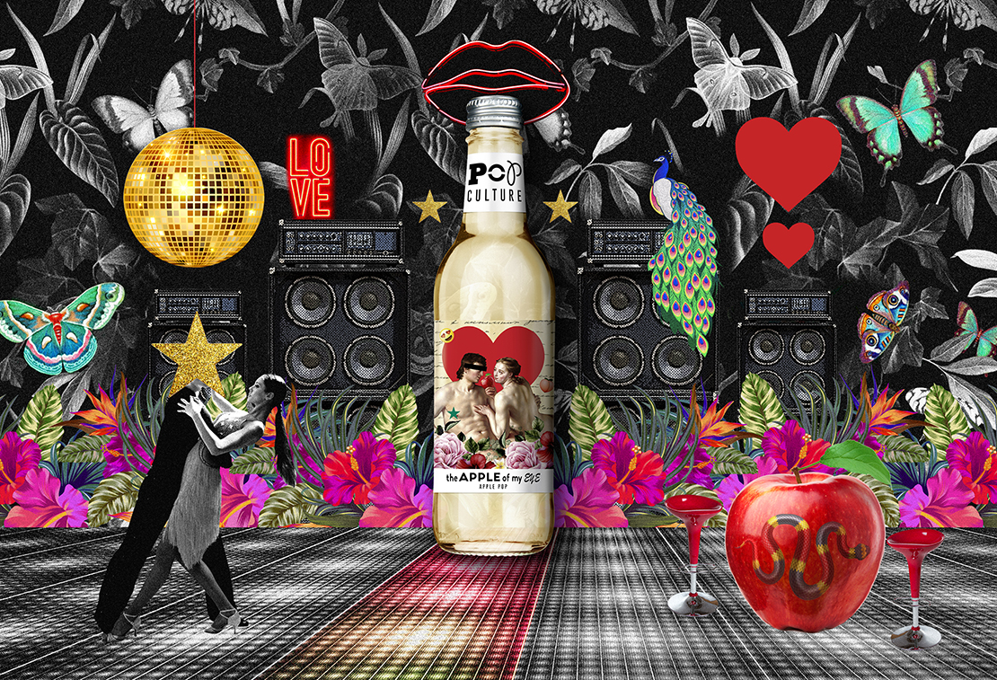
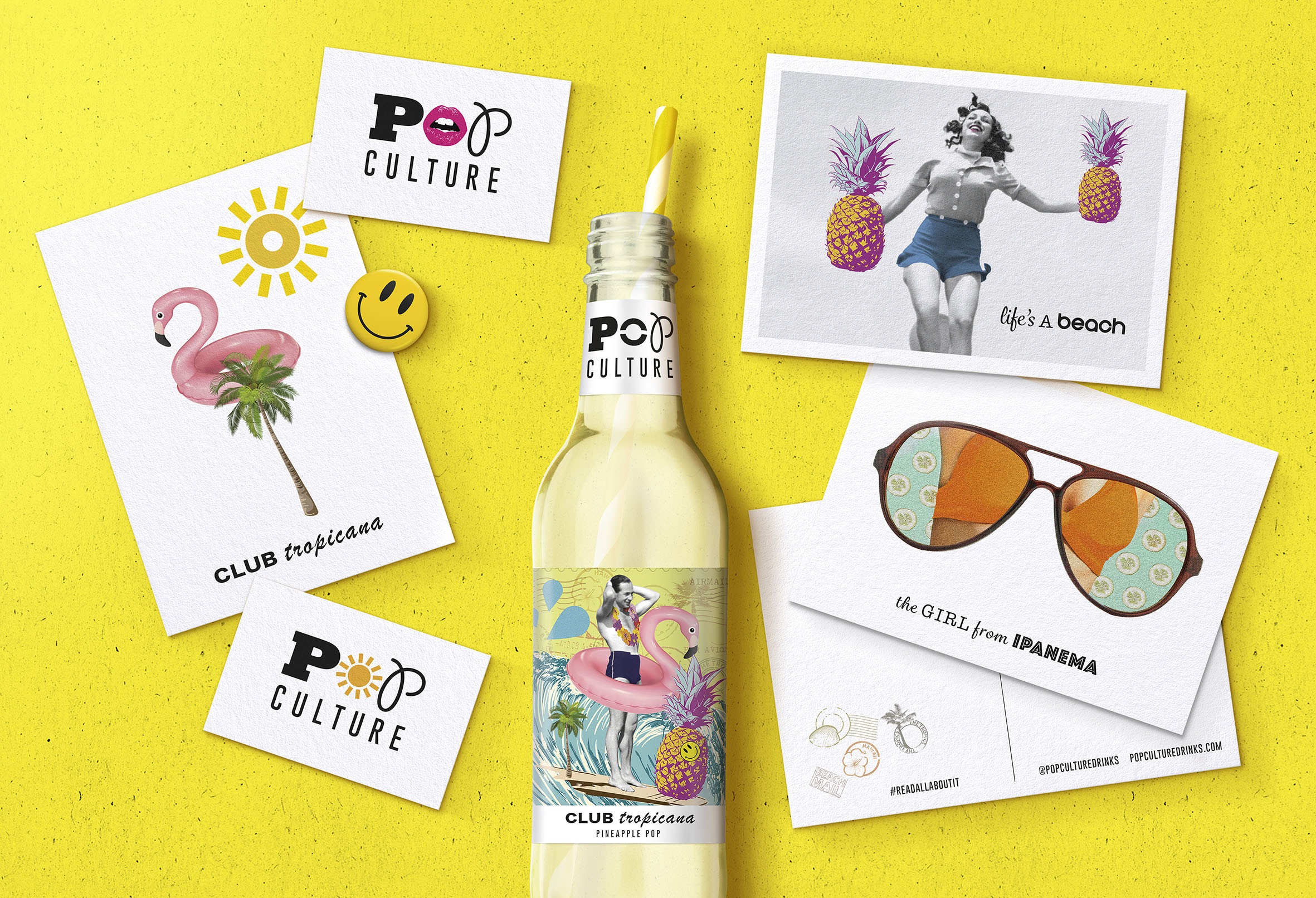
To build additional theatre and extend the product stories off pack, we also created product visuals / brand imagery which builds on the unique theme for each variant in a creative and engaging way.
CREDIT
- Agency/Creative: Afterhours studio
- Article Title: Putting the Culture Into Pop
- Organisation/Entity: Agency, Non Published Concept Design
- Project Type: Packaging
- Agency/Creative Country: United Kingdom
- Market Region: Europe
- Project Deliverables: Brand Architecture, Brand Creation, Brand Design, Brand Experience, Brand Guidelines, Brand Identity, Brand Naming, Brand Strategy, Brand World, Branding, Graphic Design, Identity System, Illustration, Packaging Design, Product Naming, Research, Tone of Voice
- Format: Bottle
- Substrate: Glass Bottle


