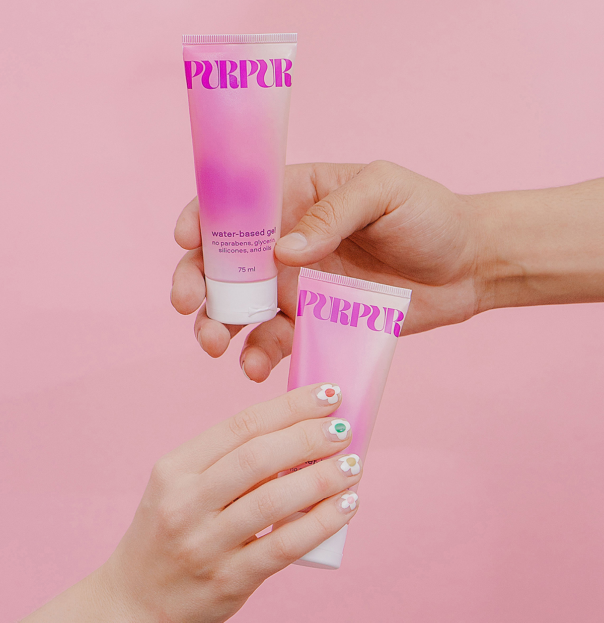
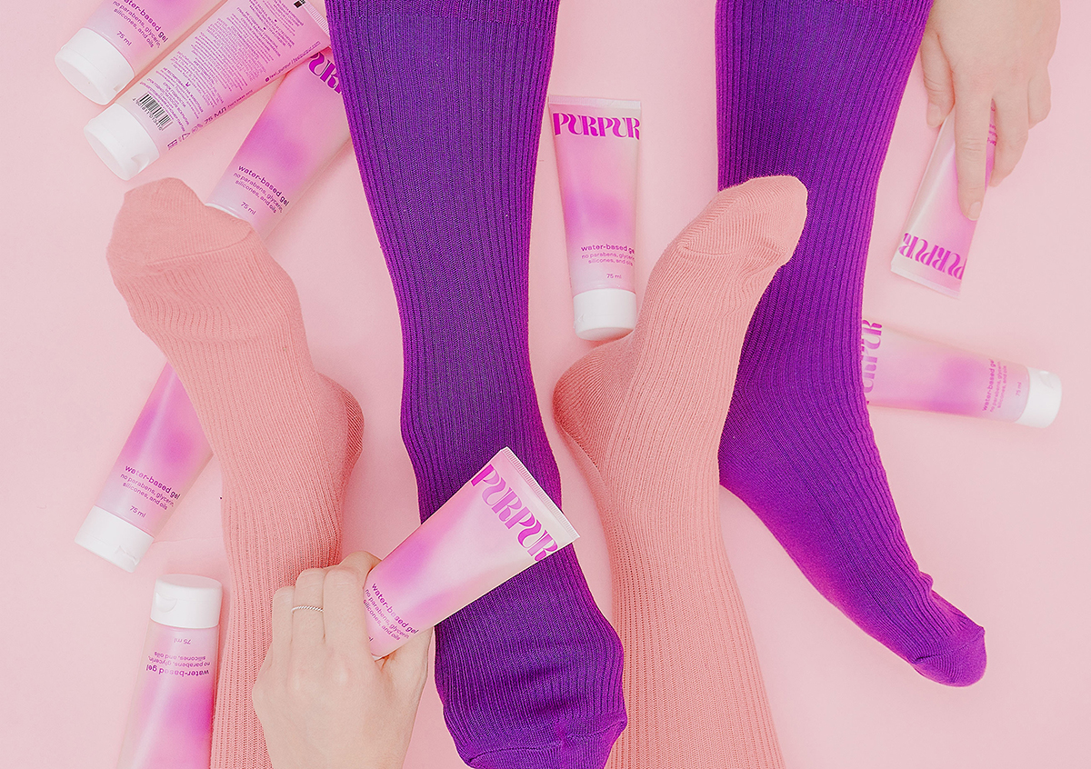
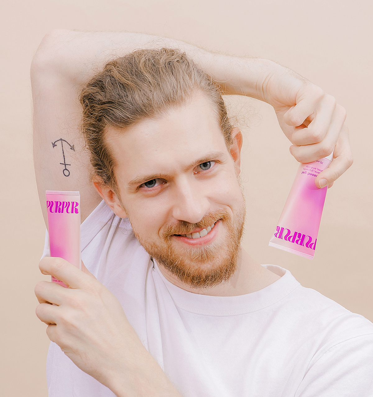
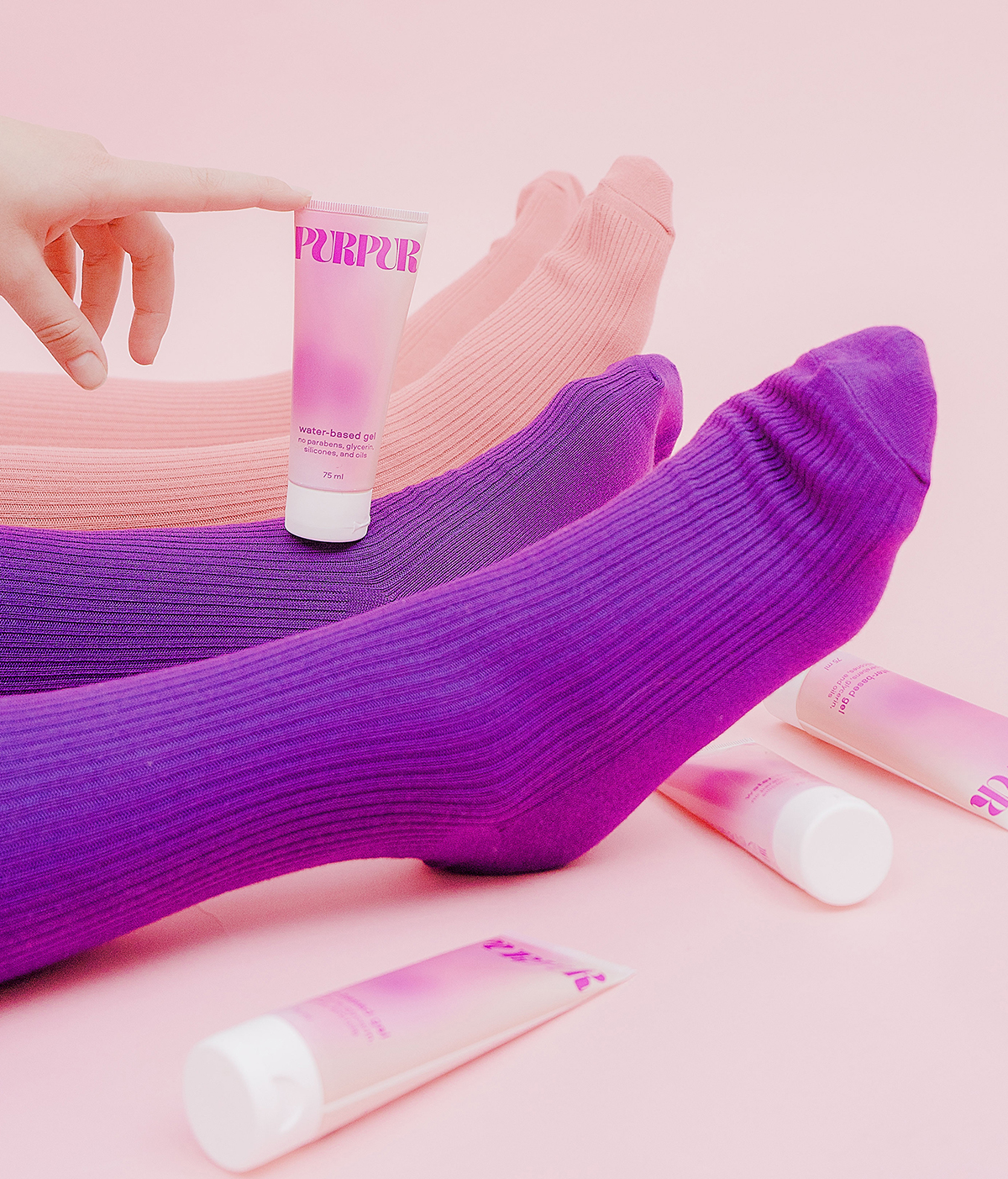
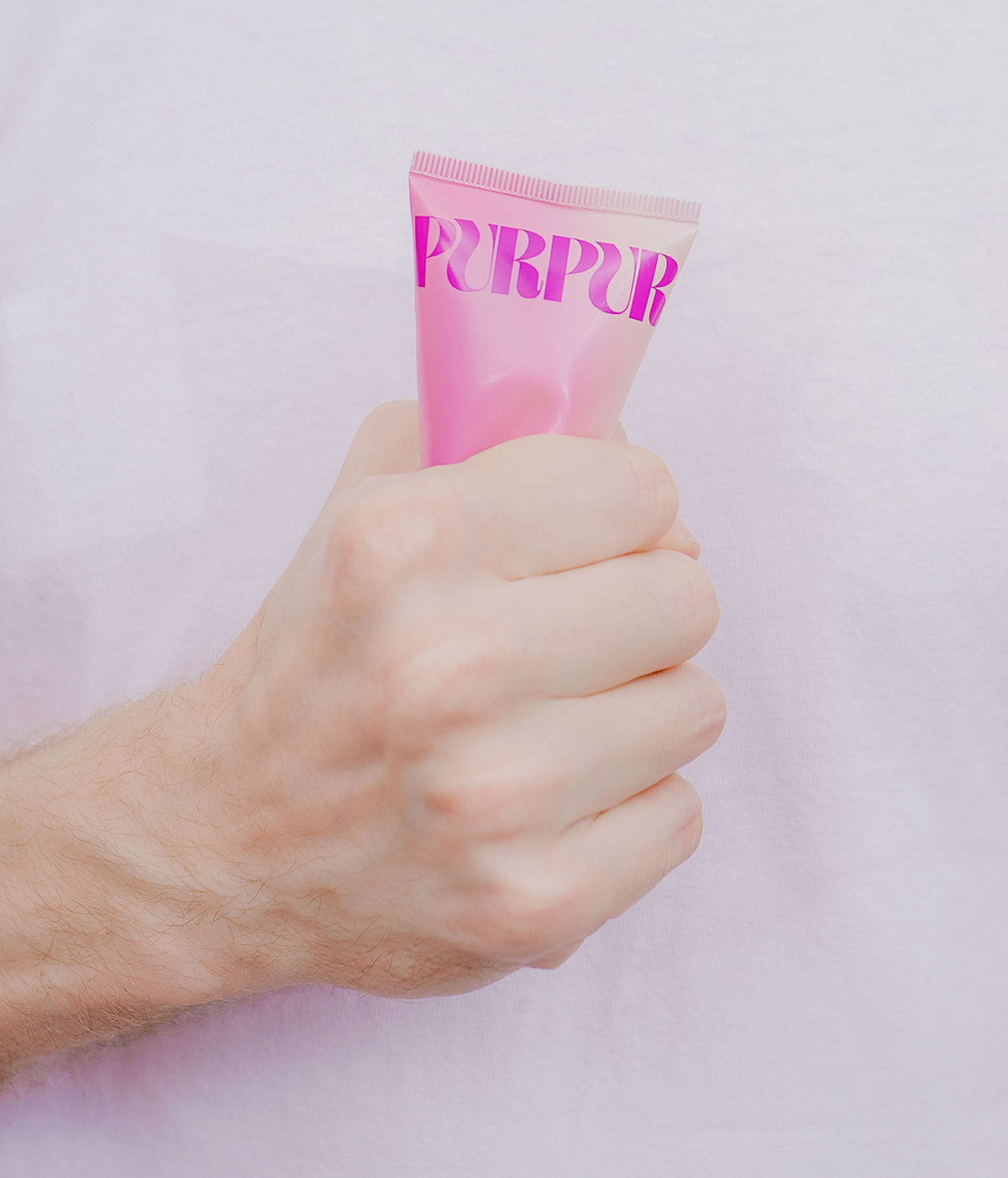
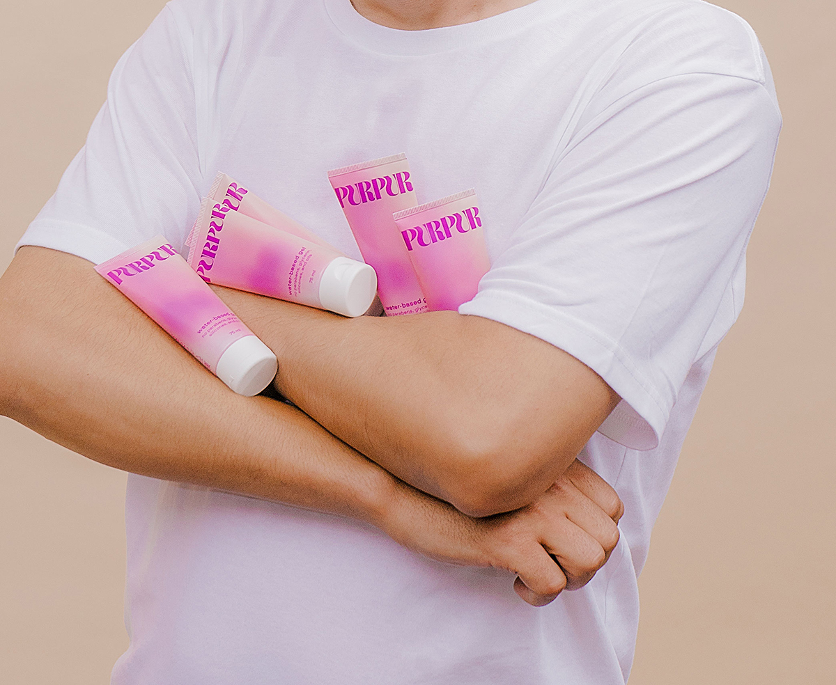
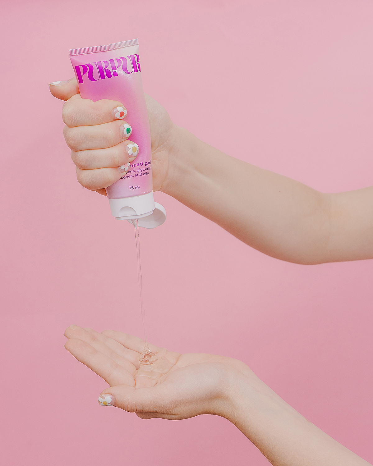
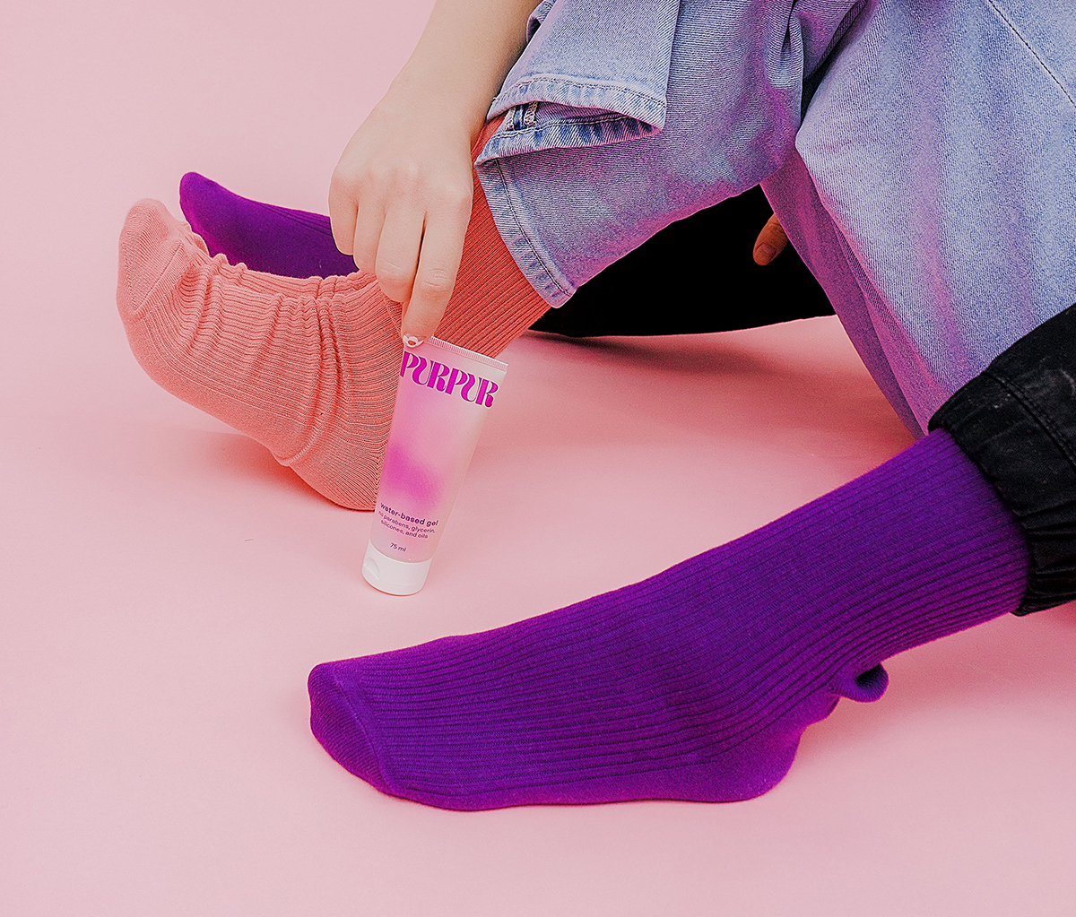
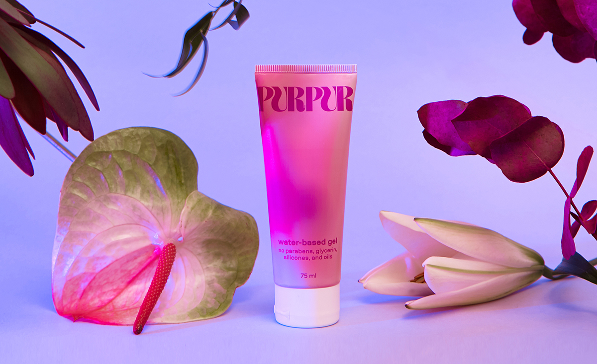
Purpur Lube is an universal water-based lubricant. Scent, stains, stickiness or shame free. Feels natural, and nothing else. Lube’s packaging design shouldn’t scream sex. Purpur Lube perfectly blends into your skincare shelves or doesn’t seem a stranger on your nightstand. The main idea of packaging design is a body heat map made in gradient. What’s more, behind these colorful spots everyone can see a body shape. Have a look and go play with your mind, yourself or your partners.

CREDIT
- Agency/Creative: Polina Zagumenova
- Article Title: Purpur Lube Packaging Design Designed by Polina Zagumenova
- Organisation/Entity: Freelance, Published Commercial Design
- Project Type: Packaging
- Agency/Creative Country: Russia
- Market Region: Global
- Project Deliverables: Branding, Graphic Design, Packaging Design, Tone of Voice
- Format: Tube
- Substrate: Plastic
FEEDBACK
Relevance: Solution/idea in relation to brand, product or service
Implementation: Attention, detailing and finishing of final solution
Presentation: Text, visualisation and quality of the presentation


