


Pureherd is a modern milk brand identity and packaging design project built around the belief that milk should be simple, honest, and easy to trust. In a category crowded with loud visuals, exaggerated health claims, and confusing product hierarchies, the objective was to create a brand that feels calm, transparent, and grounded both in how it looks and how it communicates.
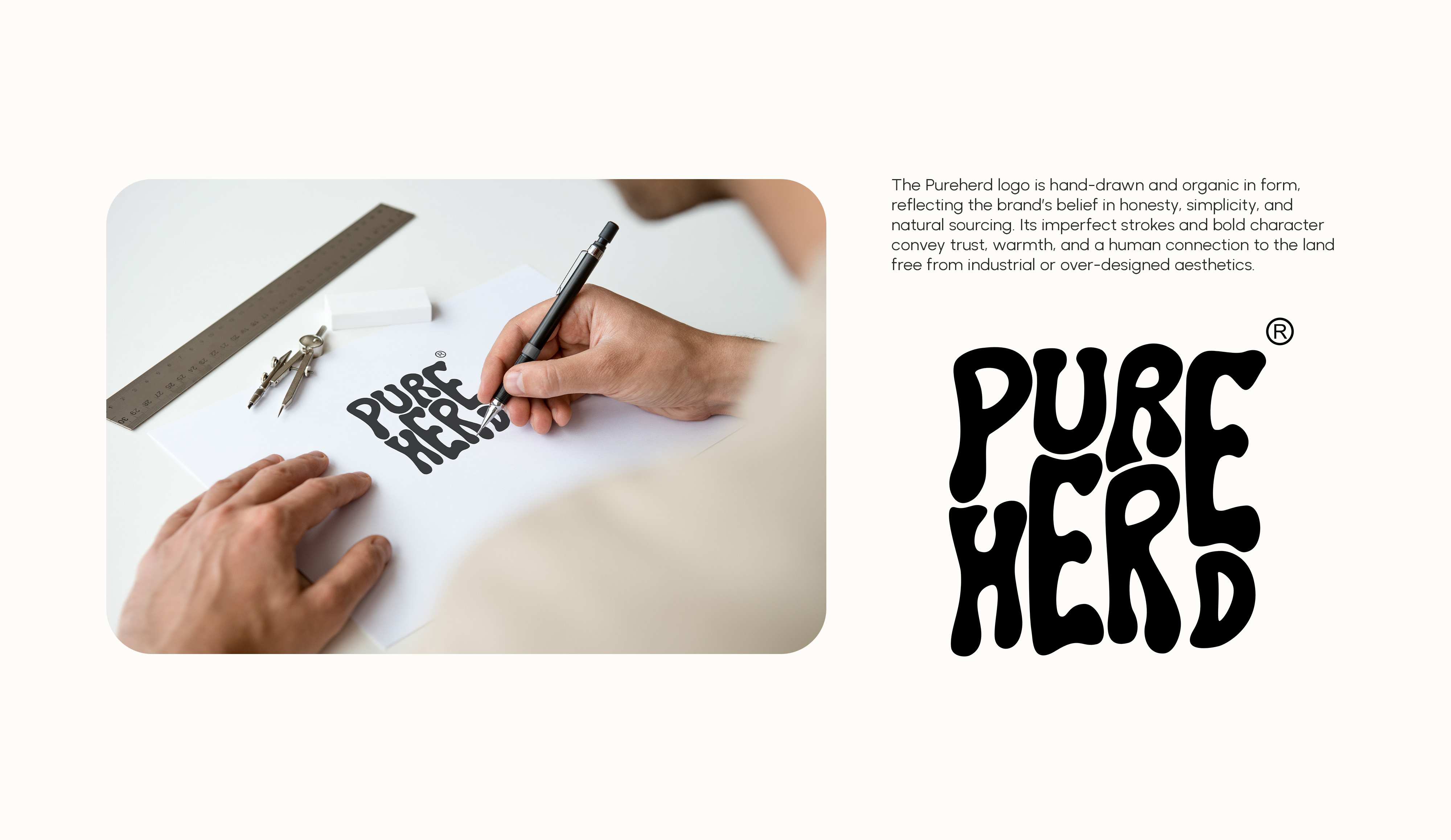
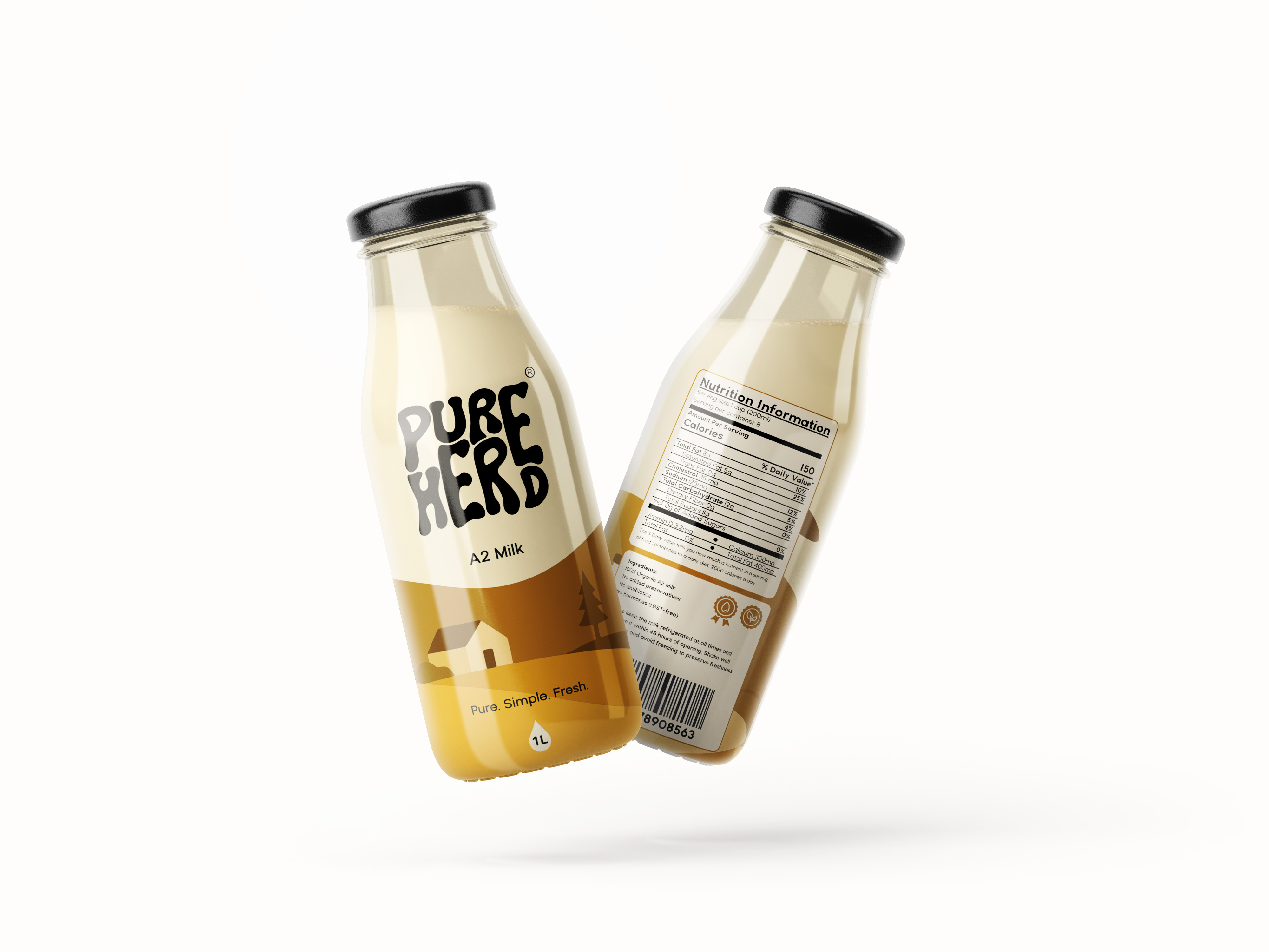
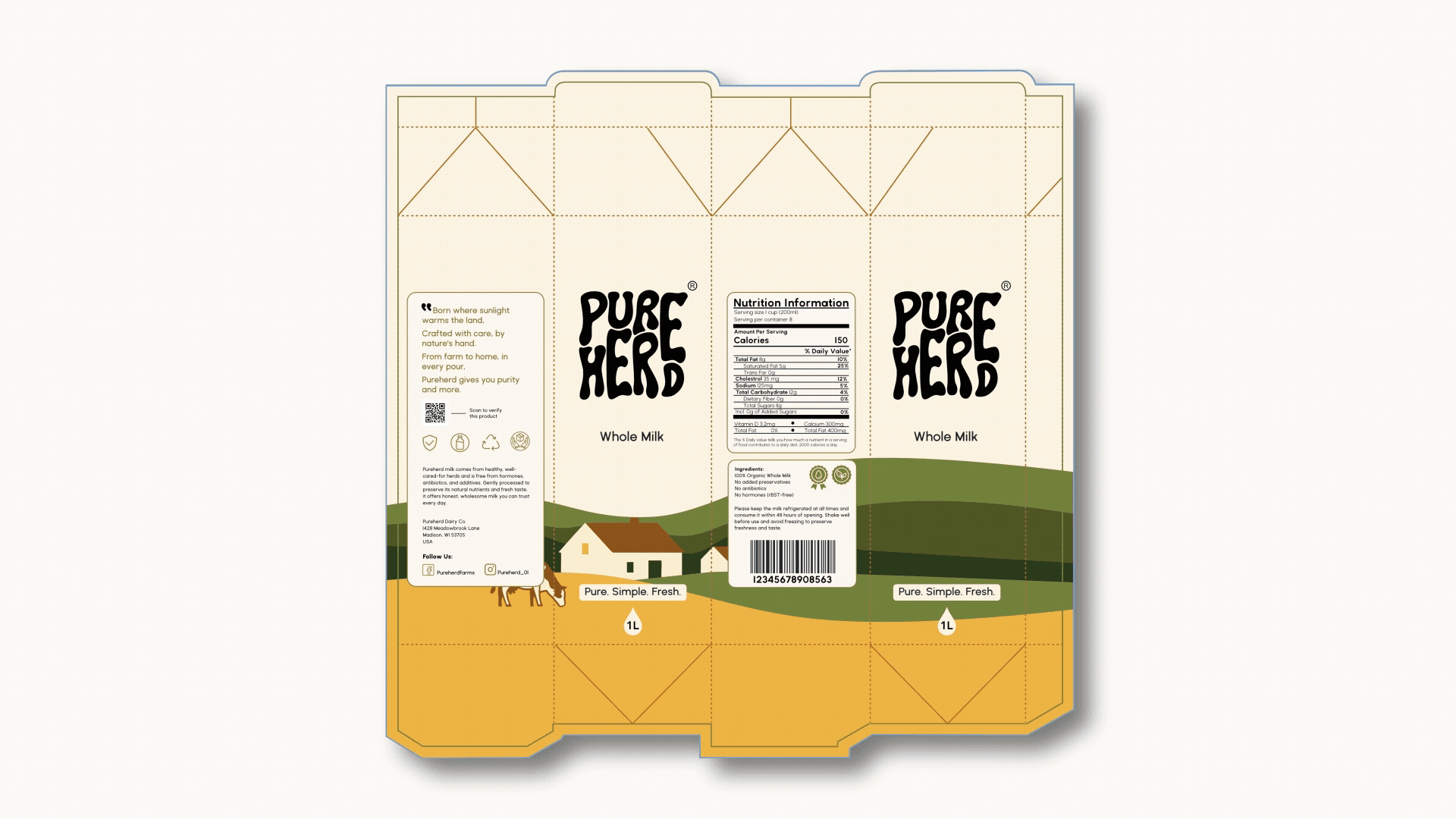
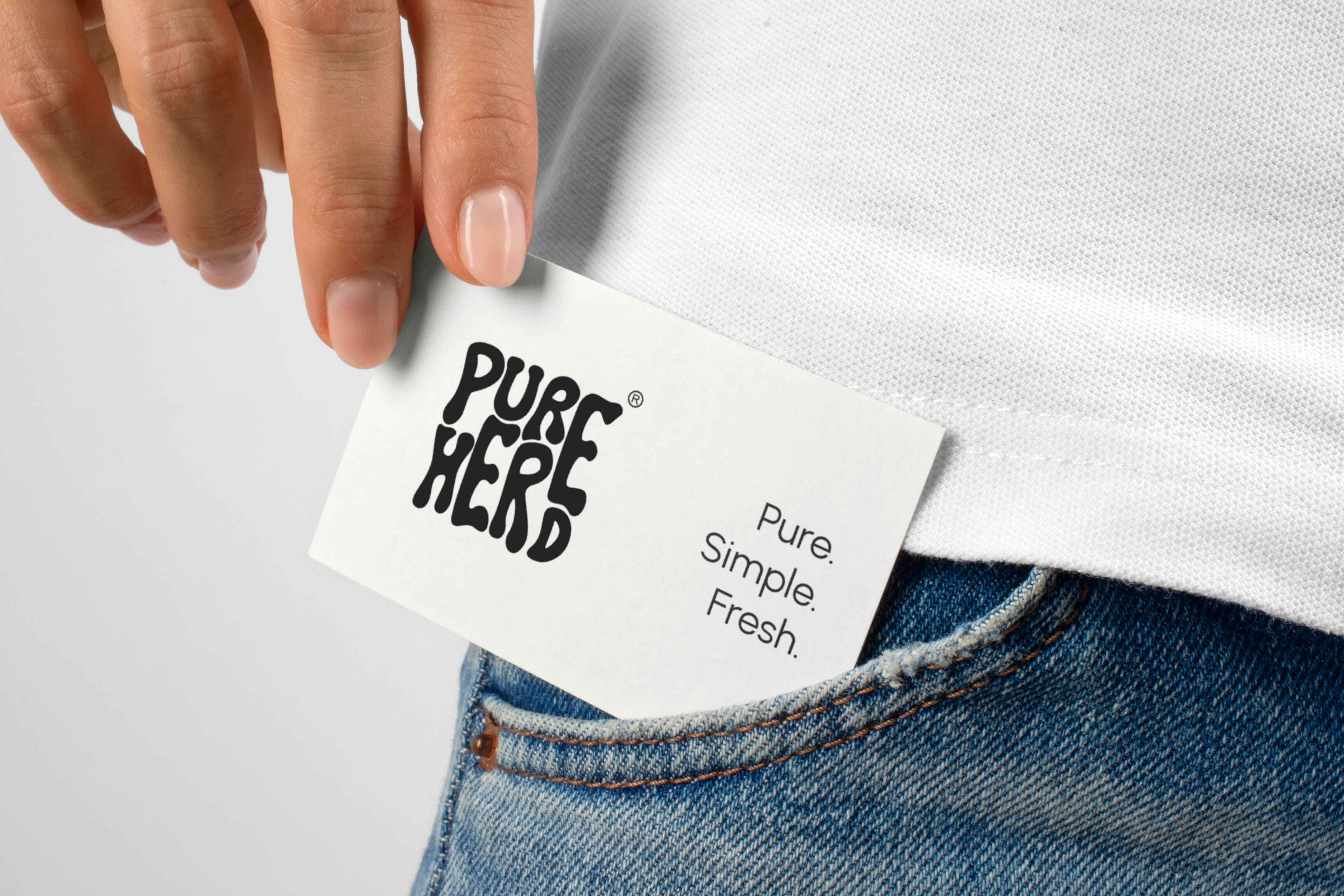
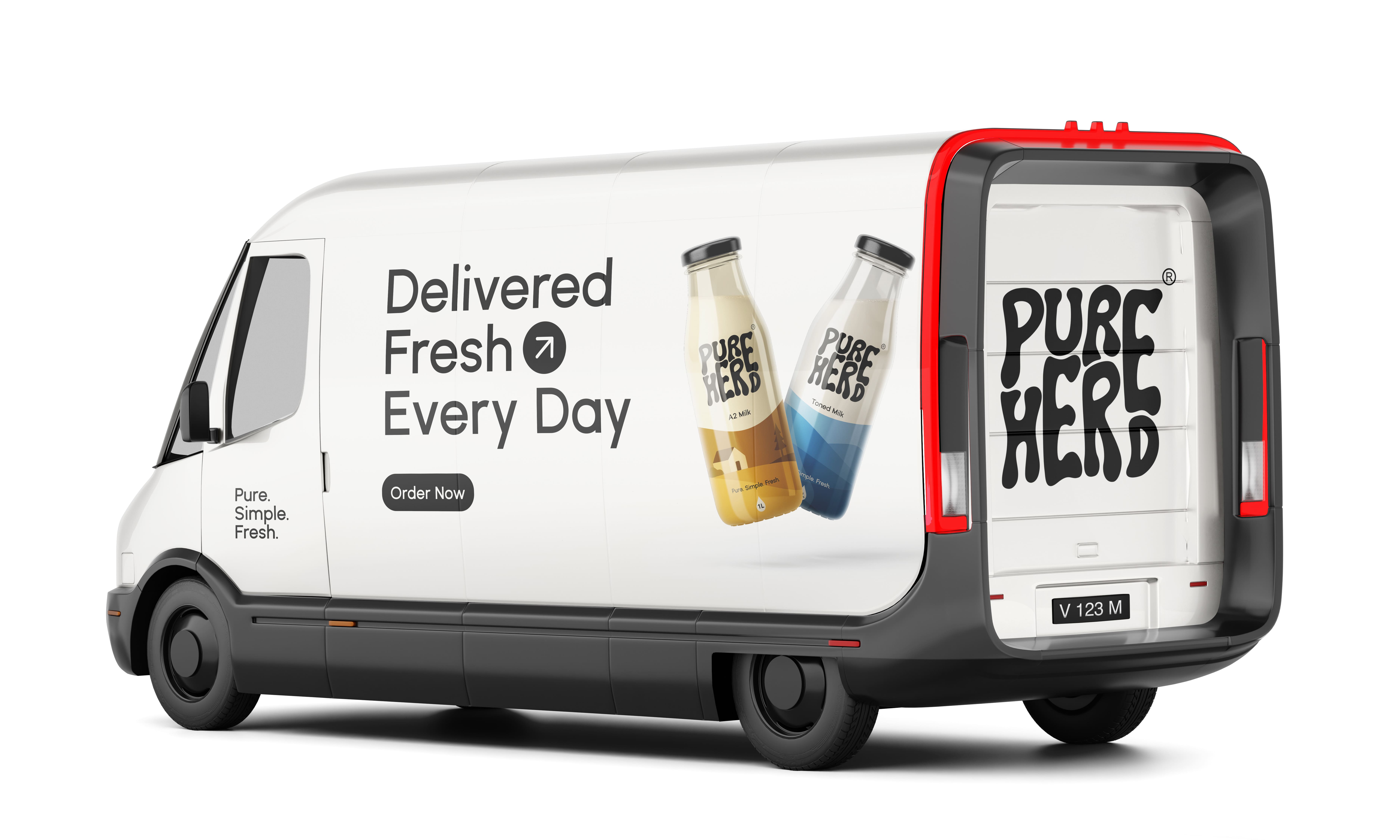
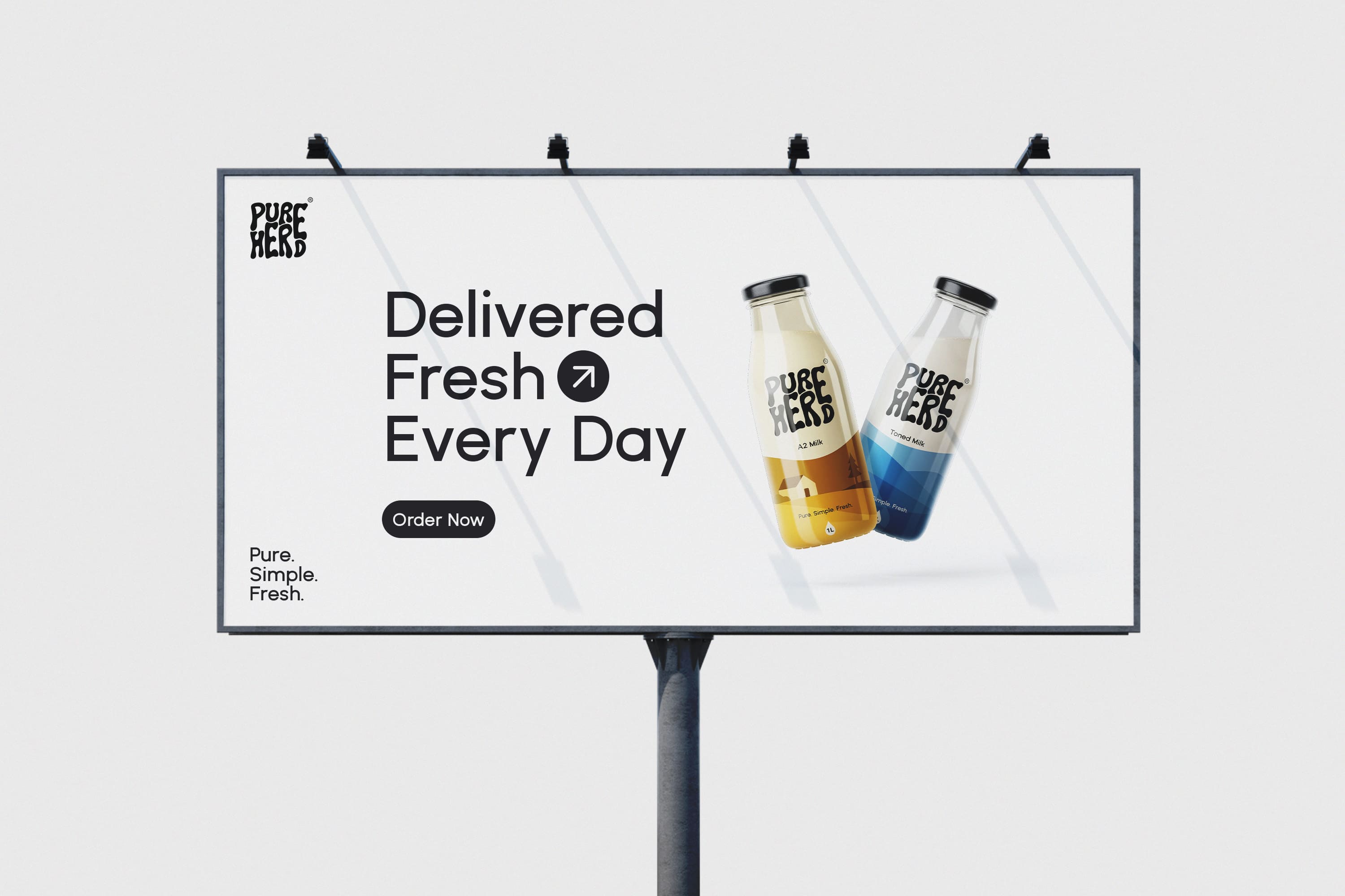
The brand identity is anchored by a hand-drawn logo, developed to introduce a human and organic character that reflects care, sourcing, and authenticity. The expressive nature of the logotype contrasts intentionally with the rest of the visual system, which remains clean, minimal, and structured. Supporting typography is kept neutral and legible, allowing information to be communicated clearly without visual clutter. This balance between character and restraint ensures the brand feels warm without becoming decorative.
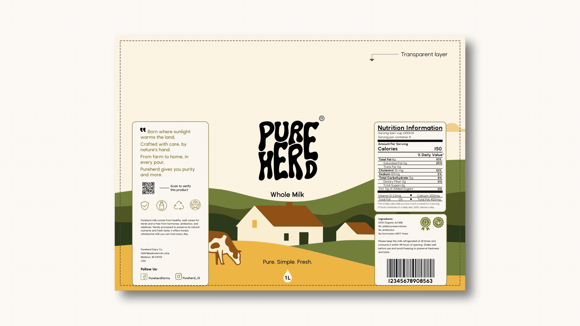
Illustrations play a subtle but important role in the system. Beginning as loose sketches and refined into simplified vector forms, they reference farm life and origin while maintaining consistency and scalability across applications. Details are reduced deliberately, keeping the focus on storytelling rather than ornamentation.
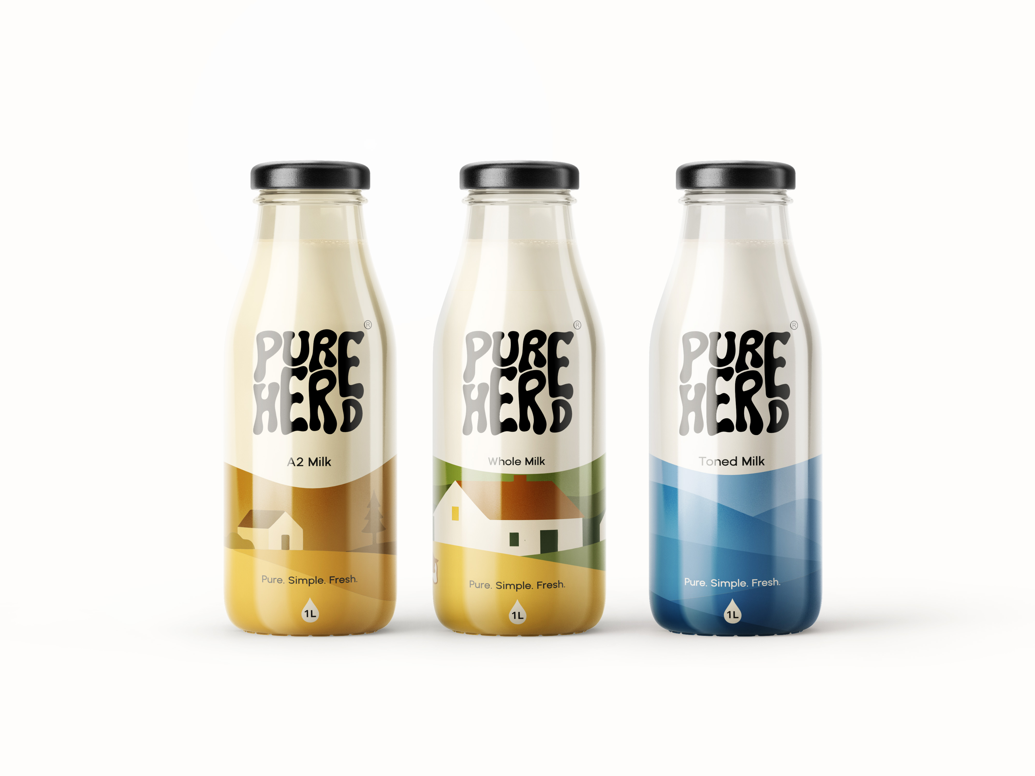
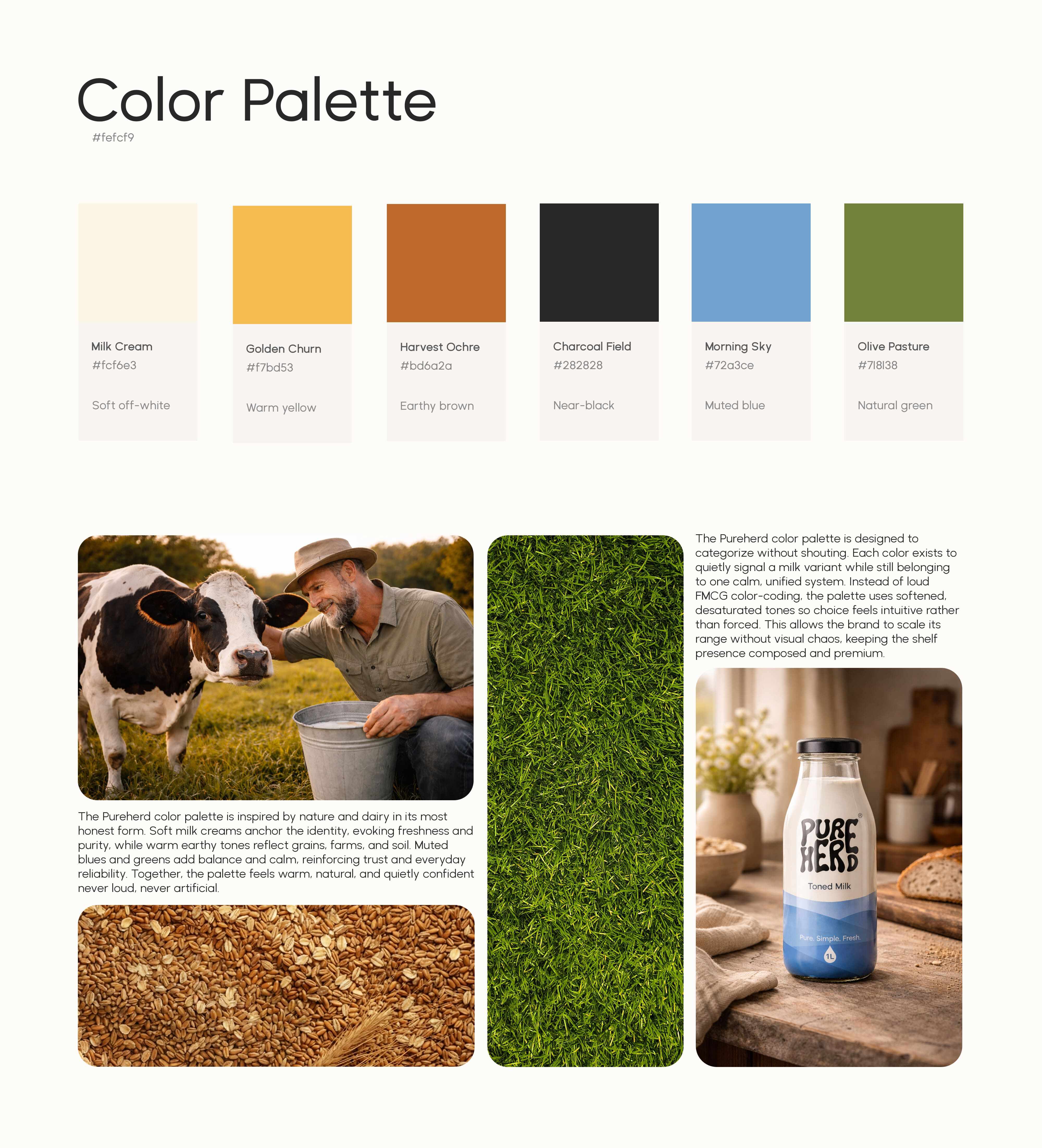
The color palette is functional and purposeful. Soft neutrals inspired by milk form the foundation, while earthy tones reference grains, land, and sourcing. Muted accent colors are used to differentiate products intuitively rather than aggressively, allowing the portfolio to remain cohesive while still being easy to navigate.
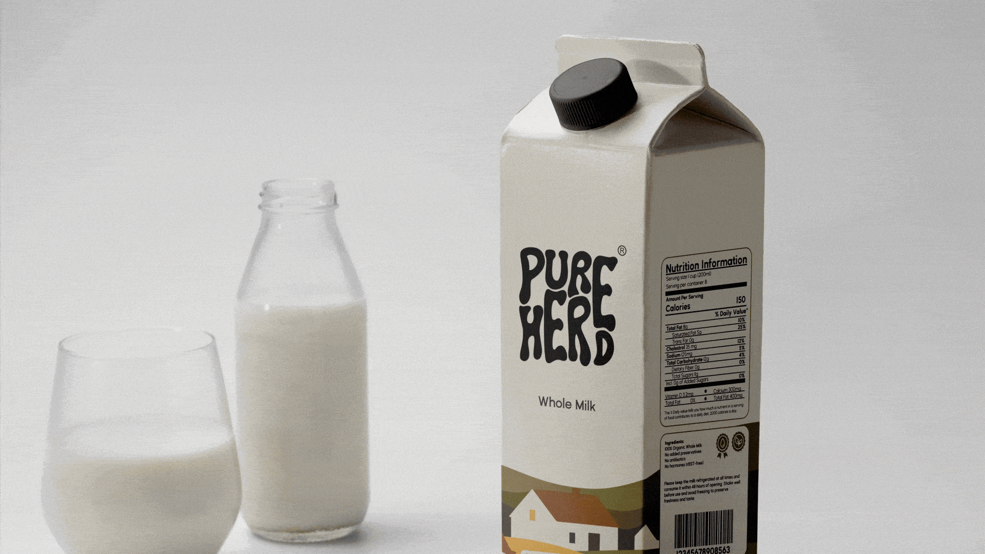
Pureherd’s product portfolio is intentionally minimal, consisting of A2 Milk, Whole Milk, and Toned Milk. Each variant is clearly positioned through hierarchy, color, and layout, ensuring consumers can quickly understand the difference without relying on excessive claims or complex explanations.
Packaging design spans glass bottles and milk cartons, developed to perform effectively across physical retail and digital platforms. Layouts prioritize clarity at a distance and readability up close, helping the brand stand out through restraint rather than noise. Every design decision from spacing to color usage supports trust, recognition, and long-term consistency.
Pureherd demonstrates how strategic branding, thoughtful visual identity, and minimal packaging design can elevate an everyday milk product into a confident, contemporary brand experience, one that values clarity over clutter and honesty over hype.
CREDIT
- Agency/Creative: Jupitr Studio
- Article Title: Pureherd Milk Brand Identity and Packaging by Jupitr Studio
- Organisation/Entity: Freelance
- Project Type: Identity
- Project Status: Published
- Agency/Creative Country: India
- Agency/Creative City: Hyderabad
- Market Region: Global
- Project Deliverables: Brand Identity, Packaging Design
- Industry: Food/Beverage
- Keywords: Brand Identity, Logo Design, Packaging Design
-
Credits:
Creative Director and Designer: Sabit Hazari


