


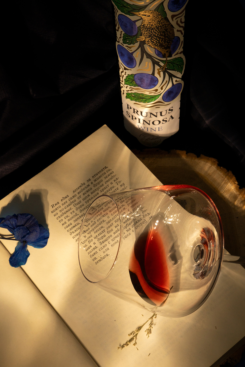
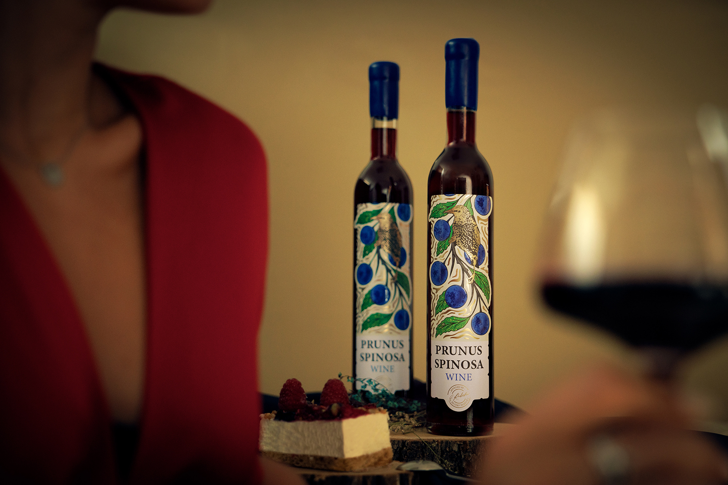
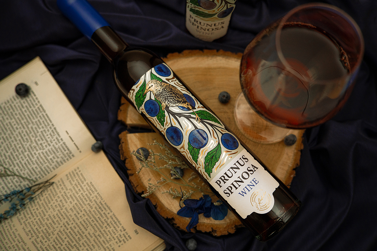
At the heart of this packaging design lies the concept of symbiosis—a poetic dialogue between the plant and animal worlds that reflects the authentic origin of Prunus Spinosa, a dessert fruit wine by Du Chef Radichev.
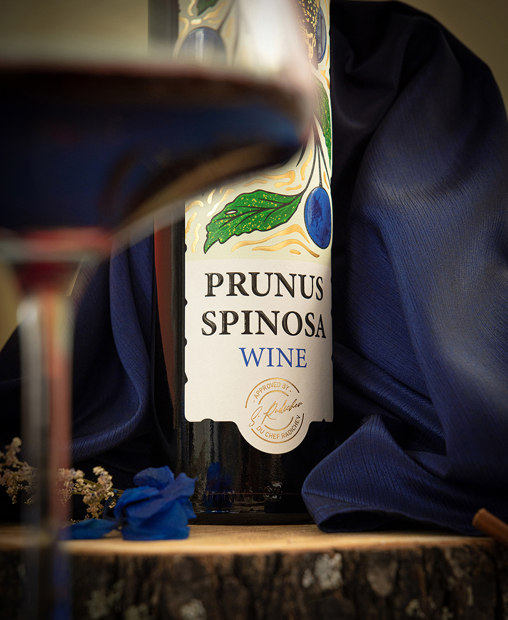
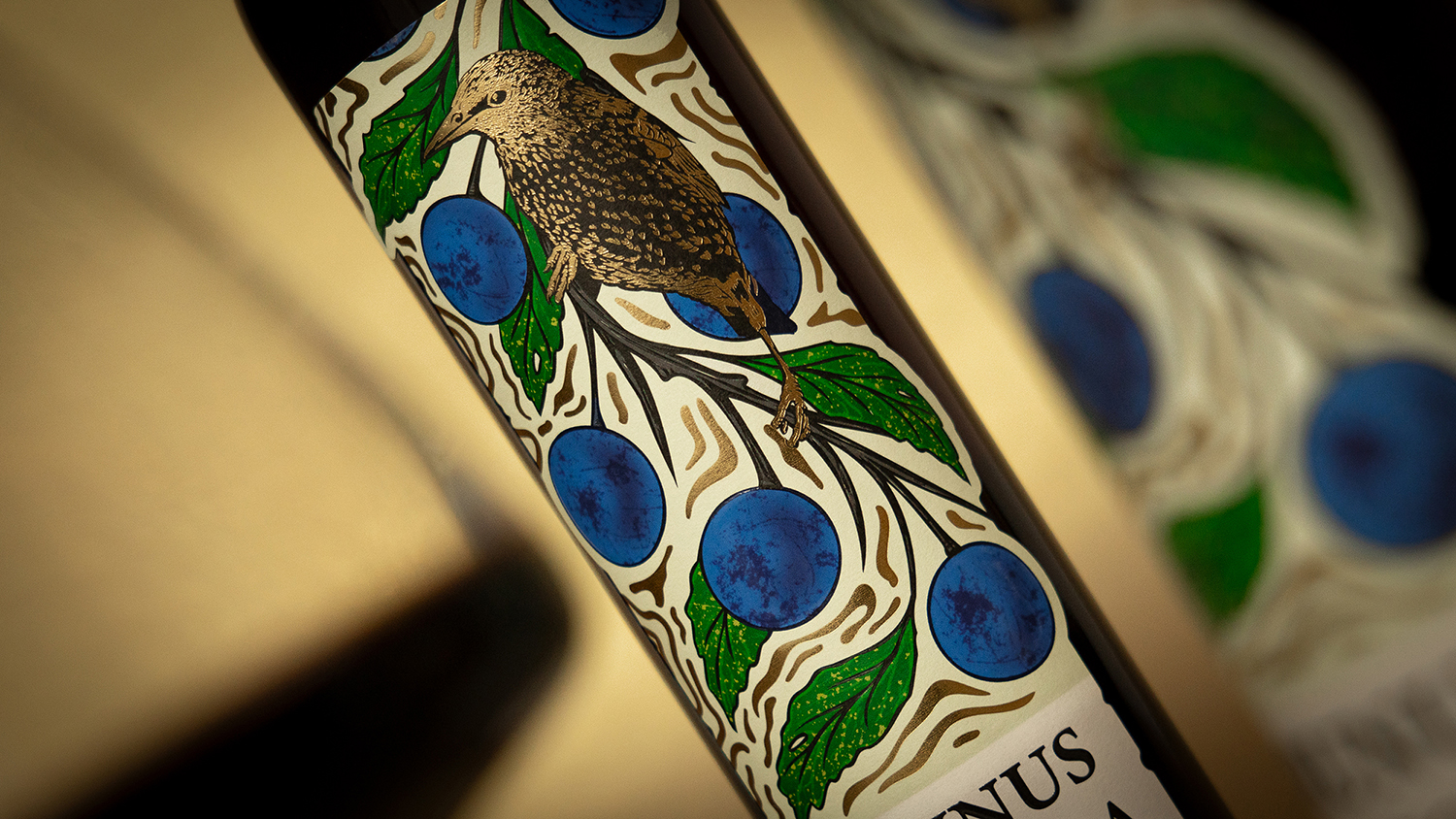
The label illustrates hand-drawn blackthorn branches in deep indigo, paired with the delicate figure of a blackbird, a native Bulgarian songbird. This bird was chosen for its symbolism: feeding on both insects and blackthorn berries, it embodies balance and interconnection within the ecosystem. Its presence adds vitality, narrative, and a sense of cultural belonging, linking the wine directly to nature.
Typography is refined and uncluttered, with the Latin name Prunus Spinosa serving as a focal point of authenticity. Gold foil accents highlight craftsmanship, while the illustrative style bridges tradition and modern artistry, offering a distinctive identity far removed from wine label clichés.
The choice of material further supports this vision:TINTORETTO H+O WS BARRIER -X AP1300 PET23, a textured, high-quality paper. Added finishing effects—selective tactile varnish, silk-screening, embossing, gold foil, and an artistic die-cut—bring depth and sophistication, transforming the bottle into an object of curiosity and desire.
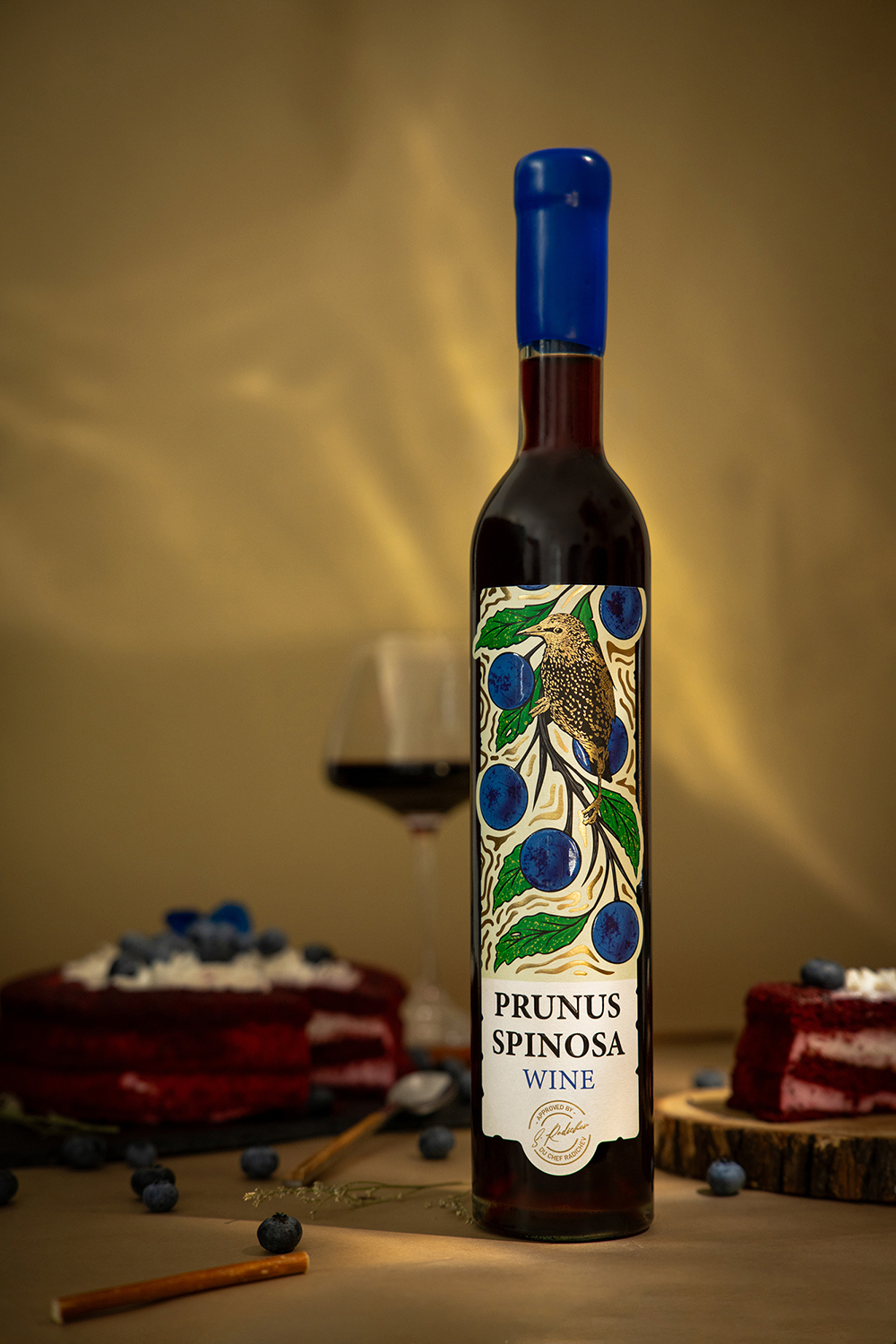
The objective is to position Prunus Spinosa as an artisanal wine that embodies authenticity, craftsmanship, and storytelling. The target audience includes wine enthusiasts and design-conscious consumers seeking originality, as well as international markets where Bulgarian biodiversity can be celebrated as a unique value.
More than a label, this packaging creates a sensory and emotional experience, uniting culture, taste, and artistry. The bottle becomes a canvas where nature and design converge, reinforcing the wine’s identity as both a premium product and a story worth sharing.
CREDIT
- Agency/Creative: Design Depot Ltd.
- Article Title: Prunus Spinosa Wine Label Design by Design Depot
- Organisation/Entity: Agency
- Project Type: Packaging
- Project Status: Published
- Agency/Creative Country: Bulgaria
- Agency/Creative City: Sofia
- Market Region: Europe
- Project Deliverables: Art, Brand Mark, Drawing, Label Design, Packaging Design
- Format: Bottle
- Industry: Food/Beverage
- Keywords: Wine label, wine
-
Credits:
Art direction: Dimitar Dimitrov
Illustrator: Ivo Stanev
Photographer: Nikol Butanska
Illustrator: Lora Asenova


