


Proteera – Bite Hard. Train Harder.
Proteera is not your ordinary protein bar — and it was never meant to be. This branding concept was created to challenge the tired, clinical, and overly polished image of most fitness and nutrition products. Where other brands play it safe with muted tones and minimal type, Proteera goes all-in with attitude, flavor, and personality.
The idea started with a question: What if a protein bar didn’t just fuel you — it dared you?
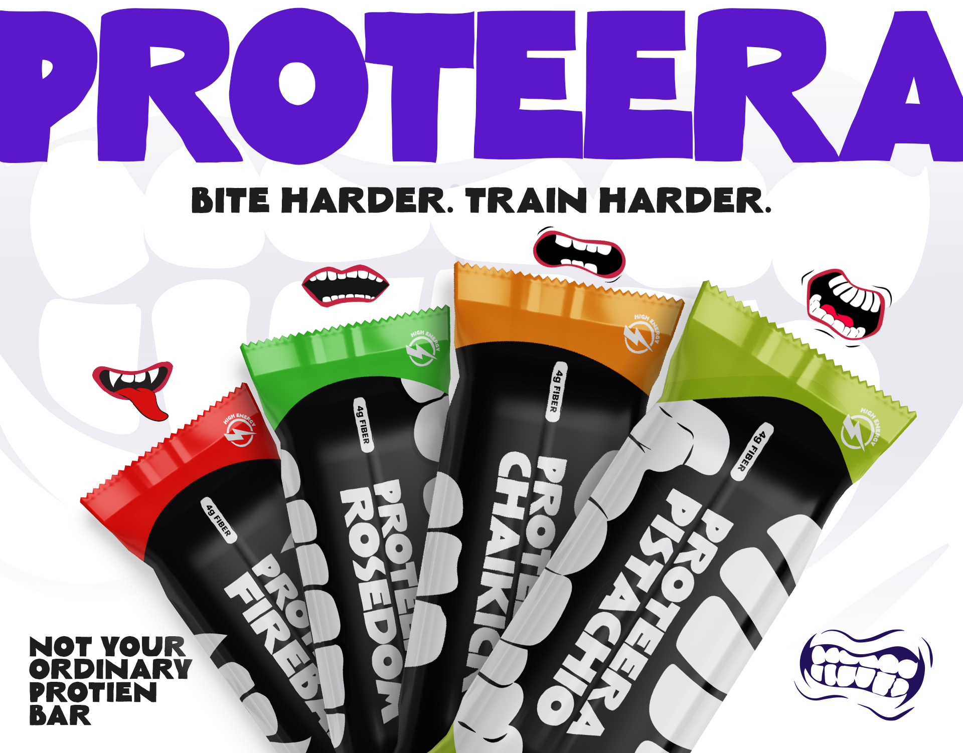
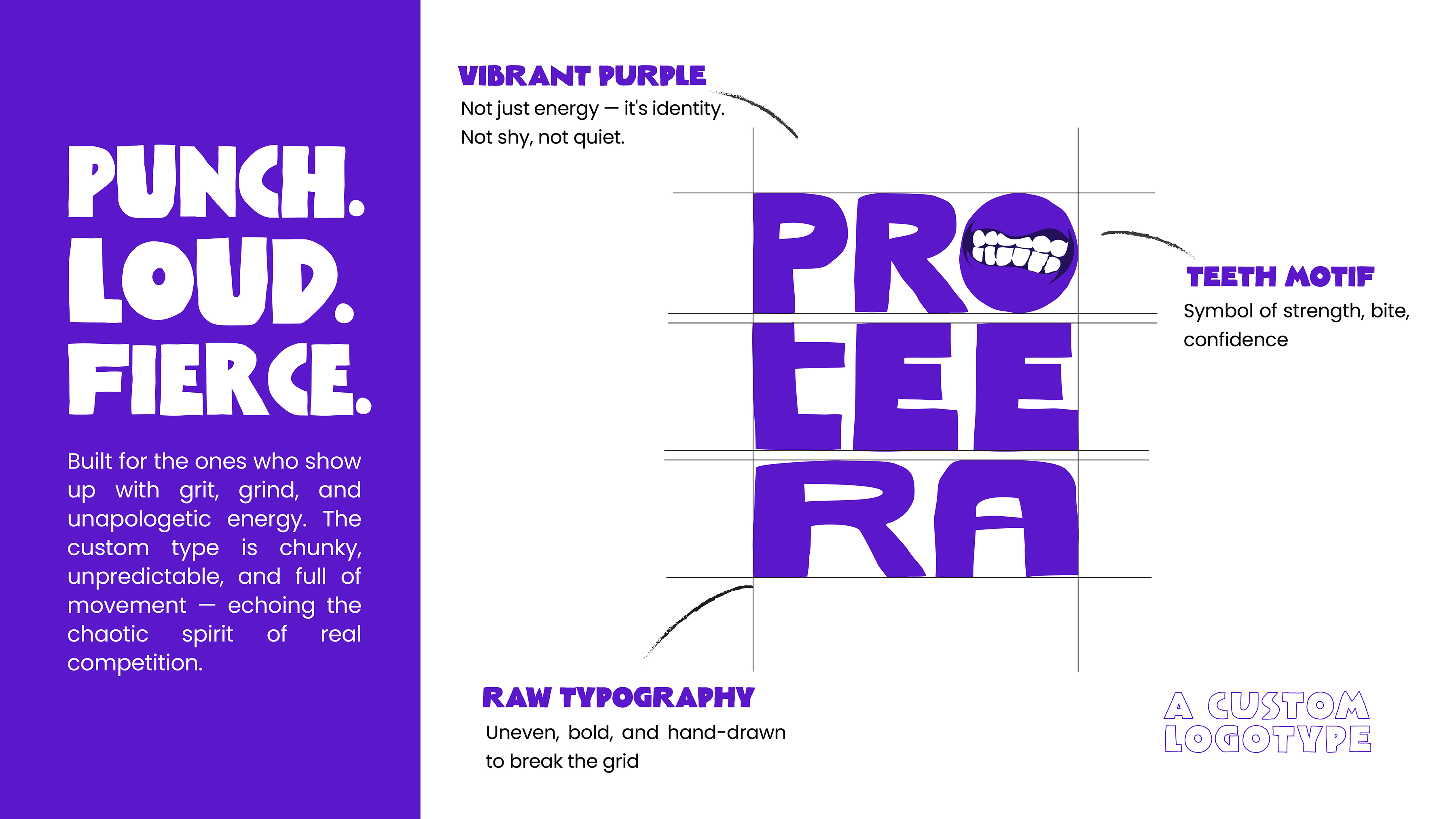
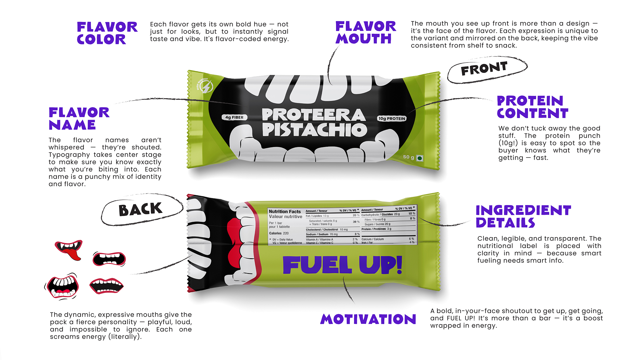
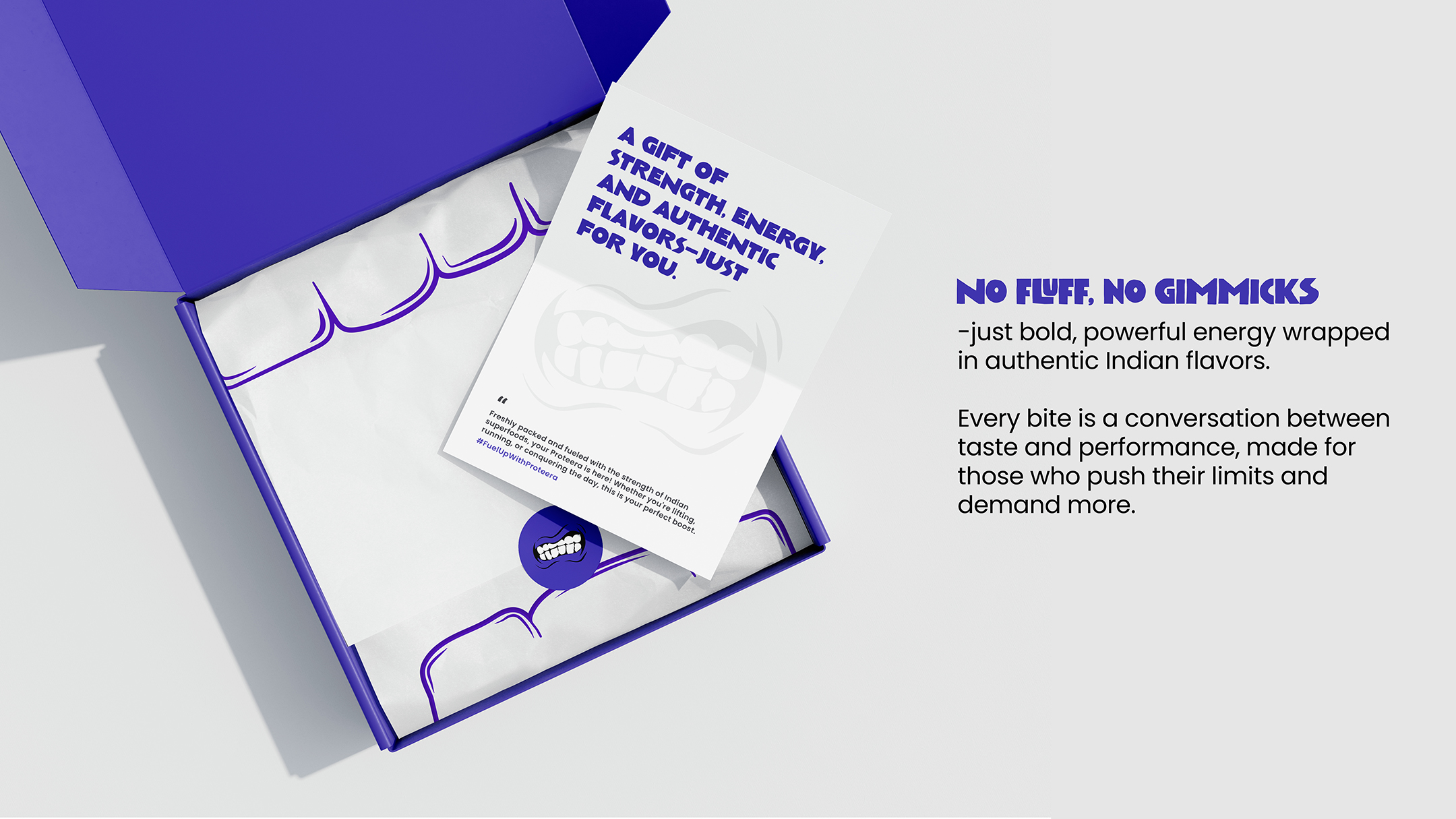
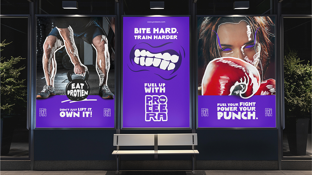
The result is a bold, expressive visual identity built around the concept of strength, energy, and individuality. The mouth became the core visual motif — loud, exaggerated, and animated to match each flavor’s personality. Whether it’s a fiery snarl or a cheeky grin, every “bite” reflects how the product should feel in your hand: powerful and full of flavor.
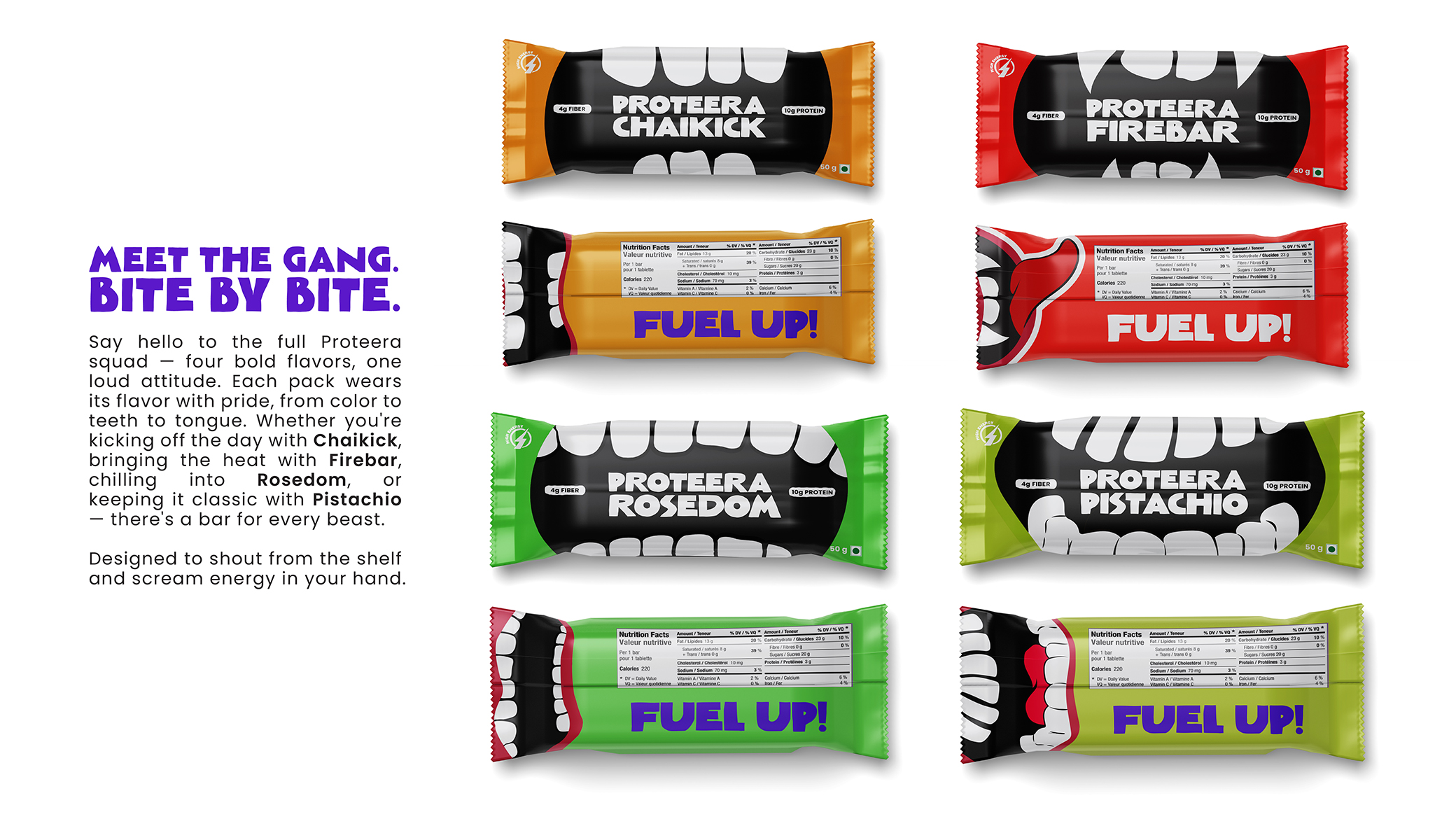
Each flavor is rooted in regional Indian ingredients like Saffron Pistachio, Turmeric Chai, Cardamom Rose, and Sweet Chilli — designed not only to stand out in taste but to challenge the global protein bar space with a cultural twist. The flavor names were reimagined with a fun, Gen Z-coded attitude: Proteera Pistachio, Chaikick, Firebar, and Rosedom — adding rhythm and personality across the product lineup.
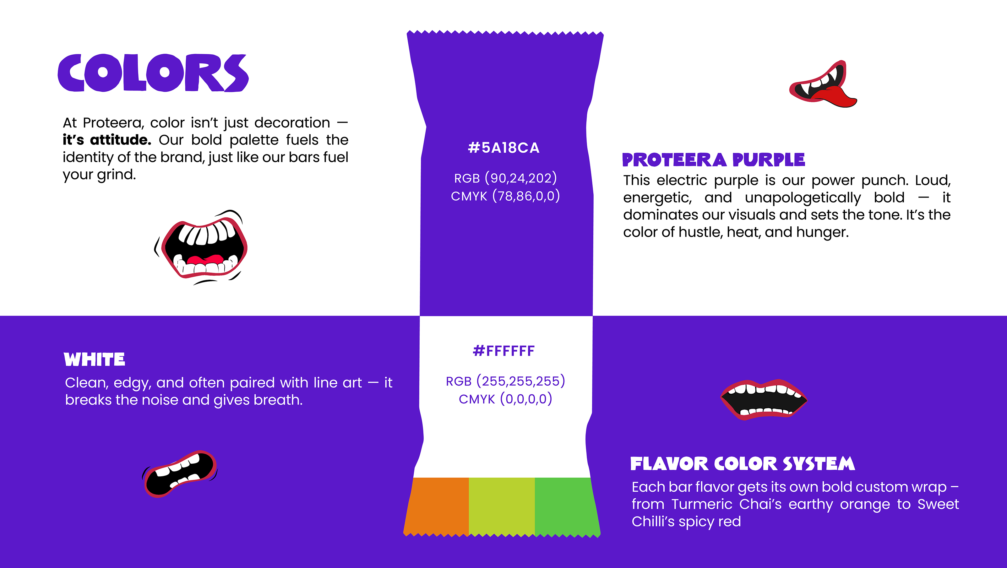
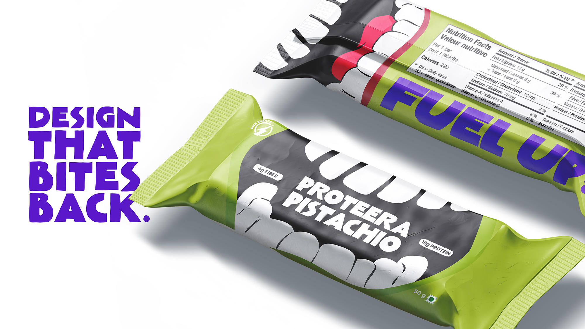
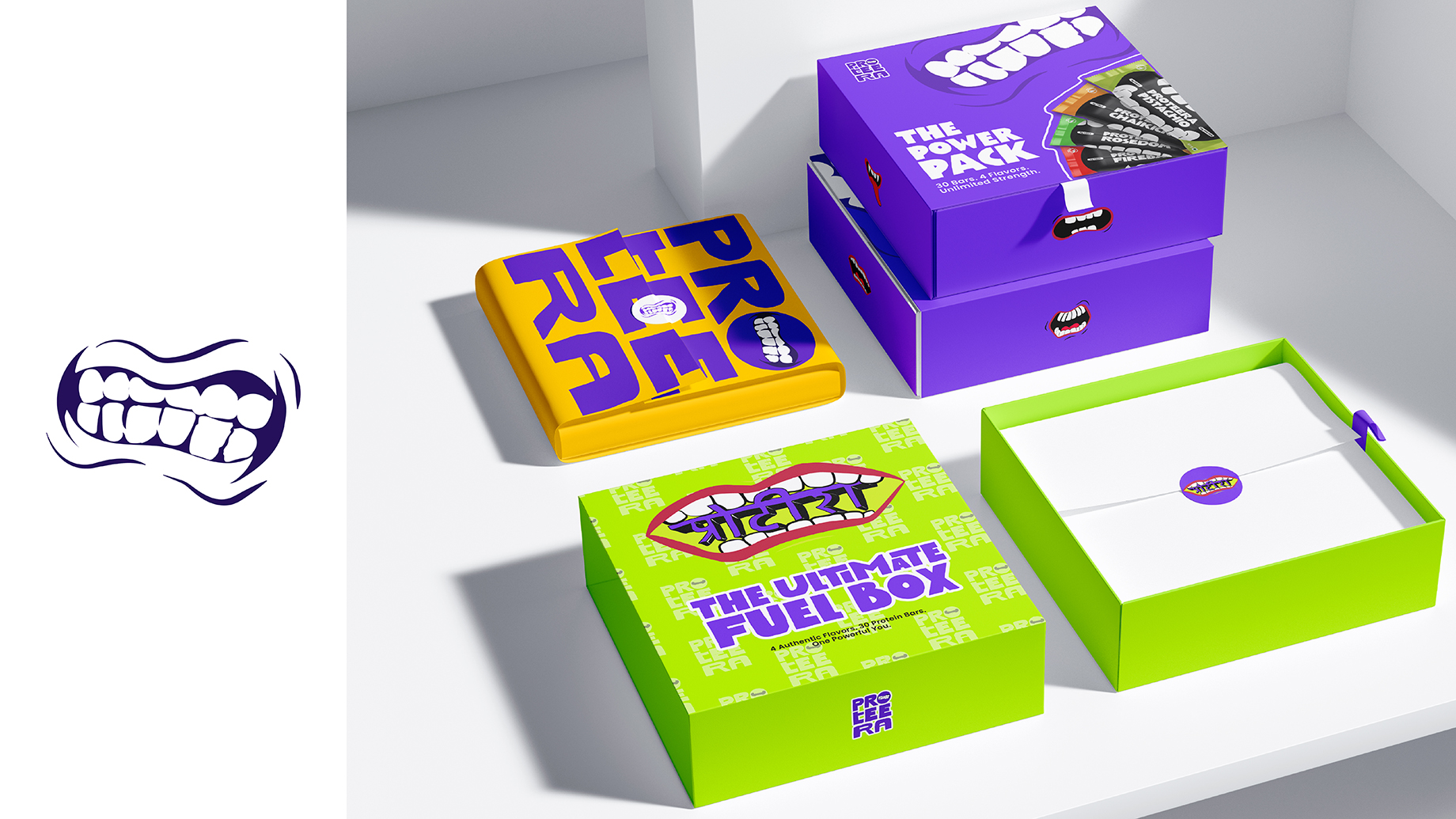
From packaging design to advertising mockups, every asset of Proteera screams consistency. Sharp, gritty typography (like Cultures Carnival), layered with structured modern type (Poppins), creates a balance between chaos and control. The color system is built with high contrast in mind: Proteera Purple leads the way, supported by vivid flavor-coded packs that pop off shelves and screens alike.
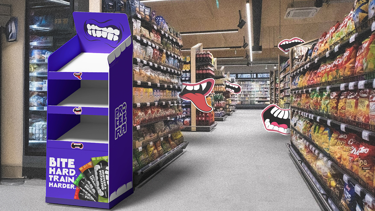
The campaign visuals — from billboards to retail stands — reinforce the brand’s challenger spirit. Copywriting plays a huge role too, with short, hard-hitting lines like “Bite Hard. Train Harder.”, “Not Your Ordinary Protein Bar,” and “Fuel Up. Freak Out.”
What makes Proteera unique isn’t just its visual boldness — it’s how every part of the design supports a loud, unapologetic brand voice. This isn’t a bar for the elite athlete or the casual snacker. It’s for the ones who show up sweaty, sore, and hungry for more — in the gym, on the field, or on the go.
In a world of “safe” wellness brands, Proteera bites back.
And it doesn’t say please.
CREDIT
- Agency/Creative: Devanand K S
- Article Title: Proteera: The Protein Bar That Bites Back by Devanand K S
- Organisation/Entity: Freelance
- Project Type: Identity
- Project Status: Published
- Agency/Creative Country: India
- Agency/Creative City: Kochi
- Market Region: Asia, Global
- Project Deliverables: Brand Creation, Brand Design, Brand Experience, Brand Guidelines, Brand Identity, Brand Mark, Brand Naming, Brand Strategy, Brand Tone of Voice, Branding, Creative Direction, Illustration, Logo Design, Packaging Design, Packaging Guidelines, Tone of Voice, Visualisation
- Industry: Food/Beverage
- Keywords: Branding, Visual Identity, Packaging Design, Logo Design, Brand Strategy, Graphic Design, Concept Branding, Consumer Packaged Goods, Protein Bar, Nutrition, Snack Packaging, Sports Nutrition, Functional Food, Food & Beverage, Bold Design, Loud Colors, Youthful Branding, Pop Culture Inspired, Expressive Design, Indian Flavours, Attitude-driven Branding, Fun & Funky Visuals, Gen Z, Street Vibes, Gym Culture, Playful Branding, Edgy Identity, Cultural Aesthetic, Fitness Lifestyle, Energetic, Aggressive Tone, Challenger Brand, Raw, Powerful, Emotion-led Branding
-
Credits:
Brand Designer: Devanand K S


