The industrial and commercial property market is stale and unexciting. There seemed to be a compromise on either quality of property matches or speed and efficiency of delivering relevant results. How do disrupt this? By leaning into a customer-first approach.
The challenge
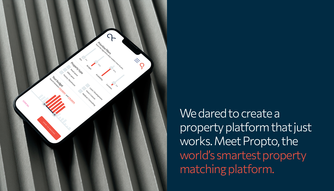
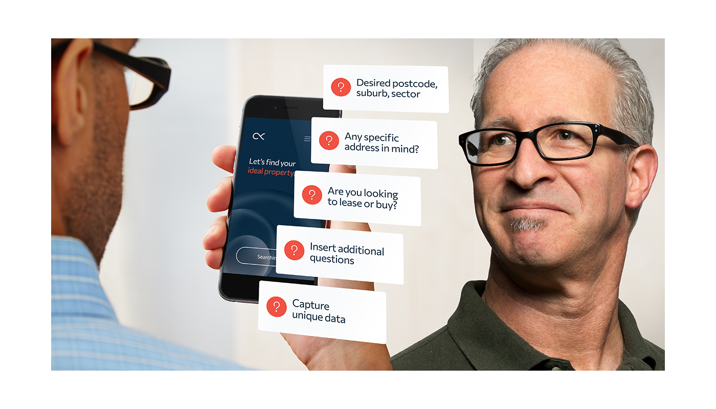
Propto recognised an opportunity for a change-driven player to come in and disrupt the market with it’s revolutionary online platform that can provide real-time, personalised property listings for tenants, buyers and tenant reps based on their preferences.
The solution
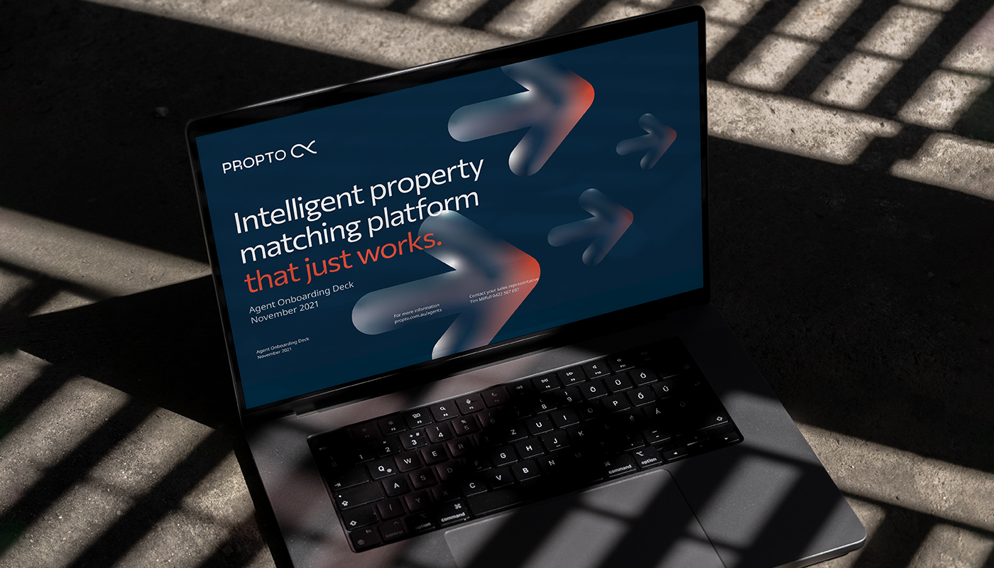
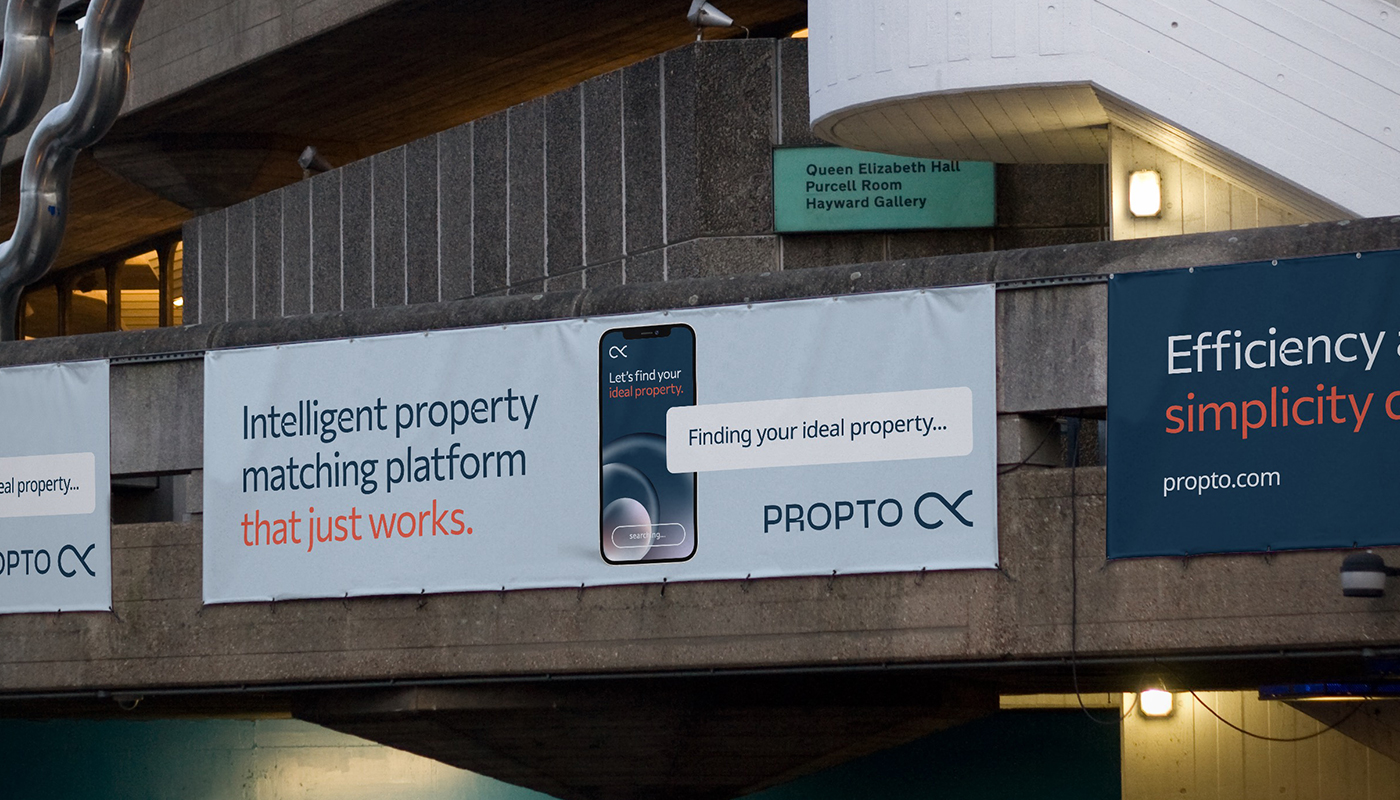
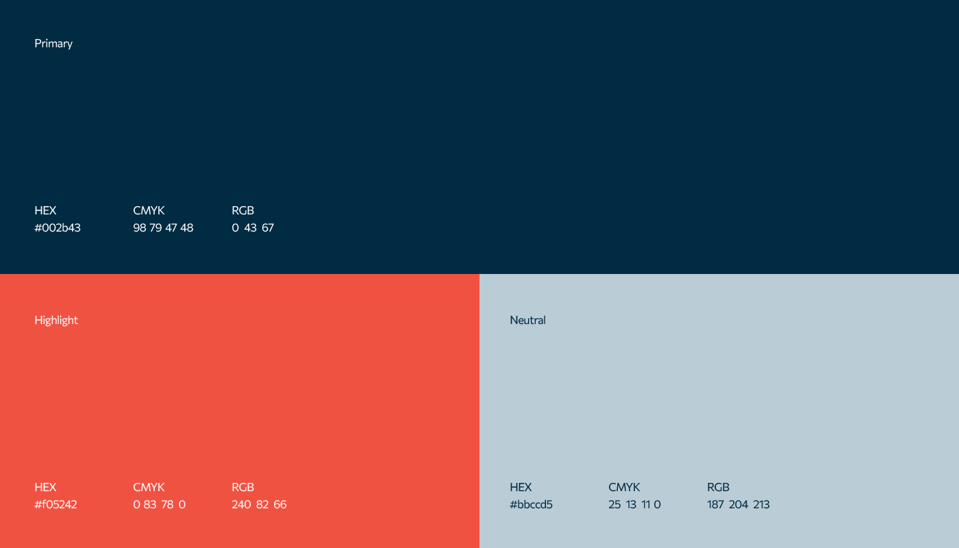
I worked with five partners at Propto to develop and deliver a holistic brand experience, including a visual identity and strategic framework that embodies the brand idea of ‘Infinite possibilities’. The identity amplifies the ambitions of the business and positions them as a change-driven innovator empowering customers’ achievement through autonomy, choice, and a very clever algorithm.
Embrace the infinite possibilities
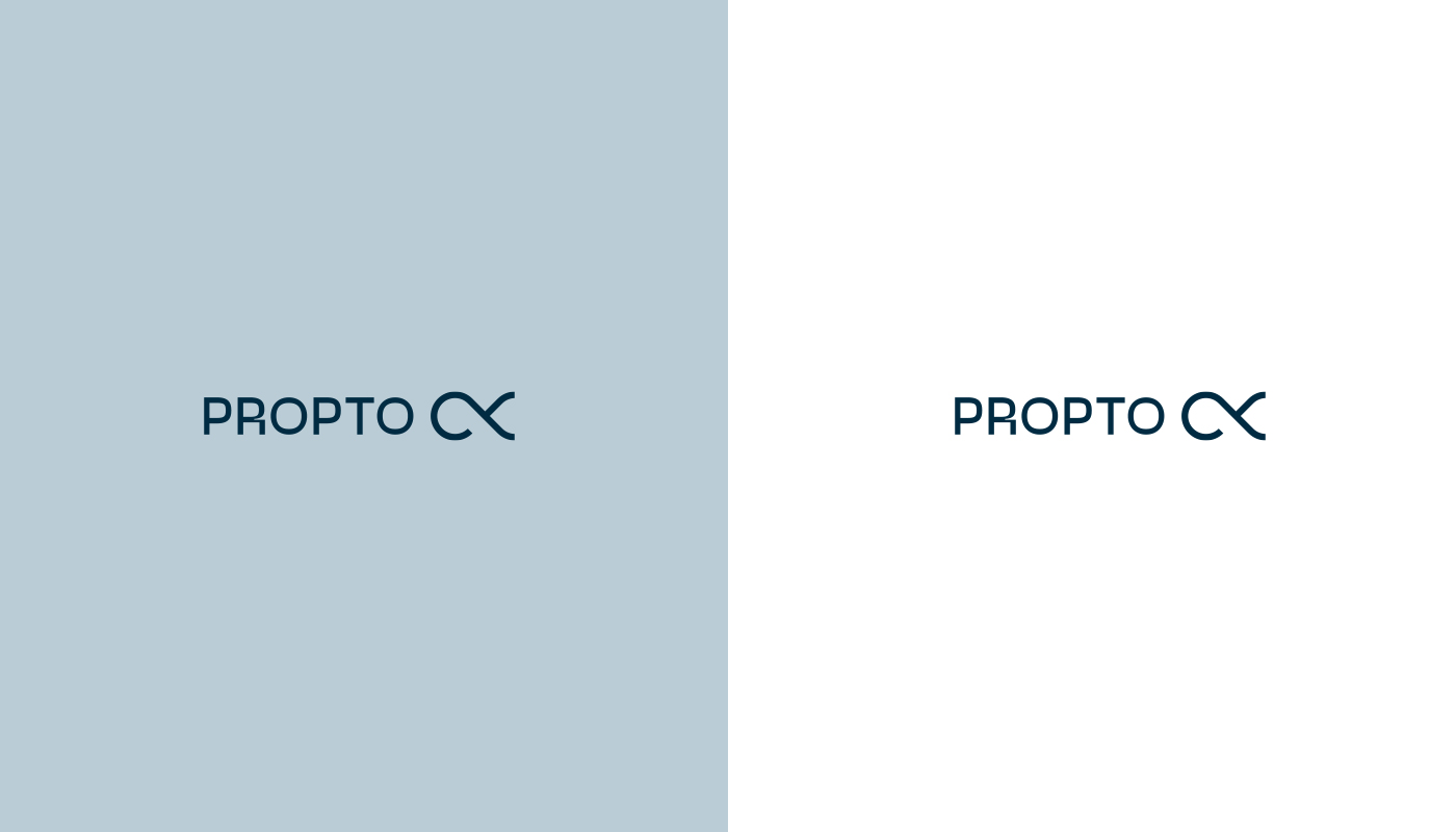
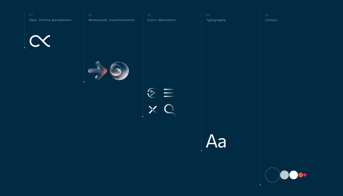
The logotype is derived from the ‘infinite possibilities’ brand idea, and references both the infinity symbol, as well as the ‘proportionate to’ symbol that also inspired the name. The entire visual language, including the icons and supporting graphics all extend on this idea of the infinite magical transformations and progress.
A strategic approach that is part science part magic.
While an entrepreneur may build a business, a brand is something that’s created by the customers and their experiences with it. And as customers, we all tend to gravitate towards businesses that understand us and our needs. I combine my methodical, process-driven approach developed over the last 20 years with a customer centric view, helping every business I work with to craft a brand of tomorrow.

CREDIT
- Agency/Creative: Studeo
- Article Title: Propto – Strategy and Visual Identity For a New Property Platform
- Organisation/Entity: Freelance
- Project Type: Identity
- Project Status: Published
- Agency/Creative Country: Australia
- Agency/Creative City: Brisbane
- Market Region: Oceania
- Project Deliverables: Brand Architecture, Brand Creation, Brand Design, Brand Experience, Brand Strategy, Icon Design, Identity System, Illustration, Logo Design, Research, Tone of Voice, User Experience, User Interaction, Web Design
- Industry: Real Estate
- Keywords: proptech, property, real estate, algorithm, property platform, real estate app, technology, branding, new brand
-
Credits:
Brand Strategy, Design: Ilya Lobanov


