Brand Origin: With more than a decade of experience in brokerage finding best deals and matching properties for buyers and renters. We find the market need of experienced real estate professional with an extensive number of managed listings, wide network of property owners, and property market expertise to guide the market throughout the selling, buying and renting process. So we put up Property Match Realty to
fill in the gap and institutionalise real estate professional brokerage in the Philippines to help and guide more people in buying the biggest investment of their lives and earn a seven-figure passive income through rentals and selling properties.
Brand Story: Property Match Realty is your real estate partner in finding matching properties by connecting you with motivated property owners with the best deals available in Metro Manila, Philippines. Taking all the overwhelming task of buying or selling a property and be guided by an experienced real estate professional until you find the best matching property for you.
Market Audience. Target Market: Mid – High end market Service Area : Metro Manila, Philippines Client Avatar: Buyers/Renters, ages 20-80 years old, looking to rent at 35K-500K/mo and buy 3M-300M properties in Metro Manila. Real Estate Investors, ages 20-80 years old, looking buy below market properties. Brokers/Agents, ages 20-80 y.old, servicing client rental budget 35K/mo above, buying budget 3M above.
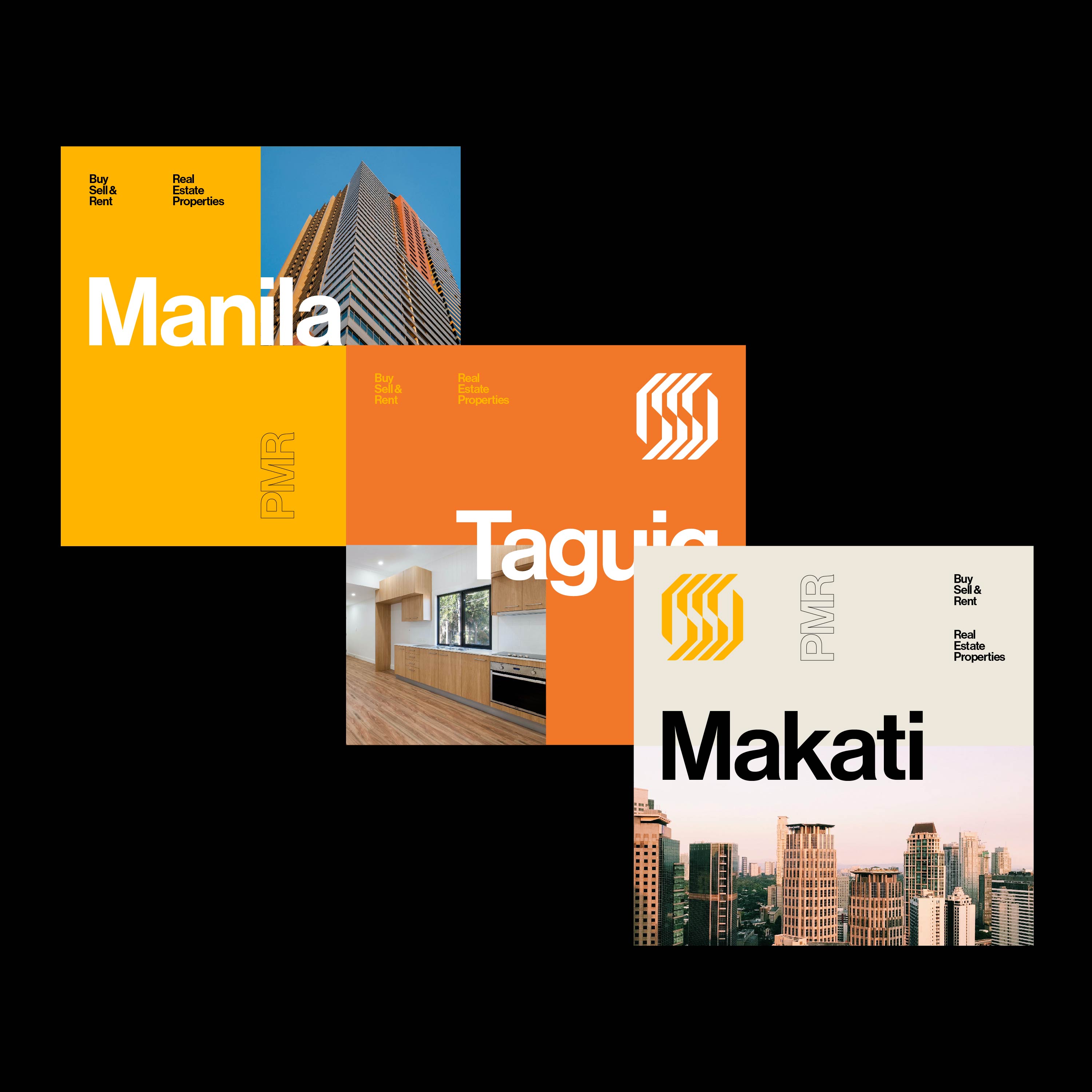
Brief and Task: The brief was to revamp their brand as they grow their business. The client wanted to have brand identity redesign – includes logo design, brand color palette and typeface. These will be applied to their website, social media and all of their physical materials and collaterals.
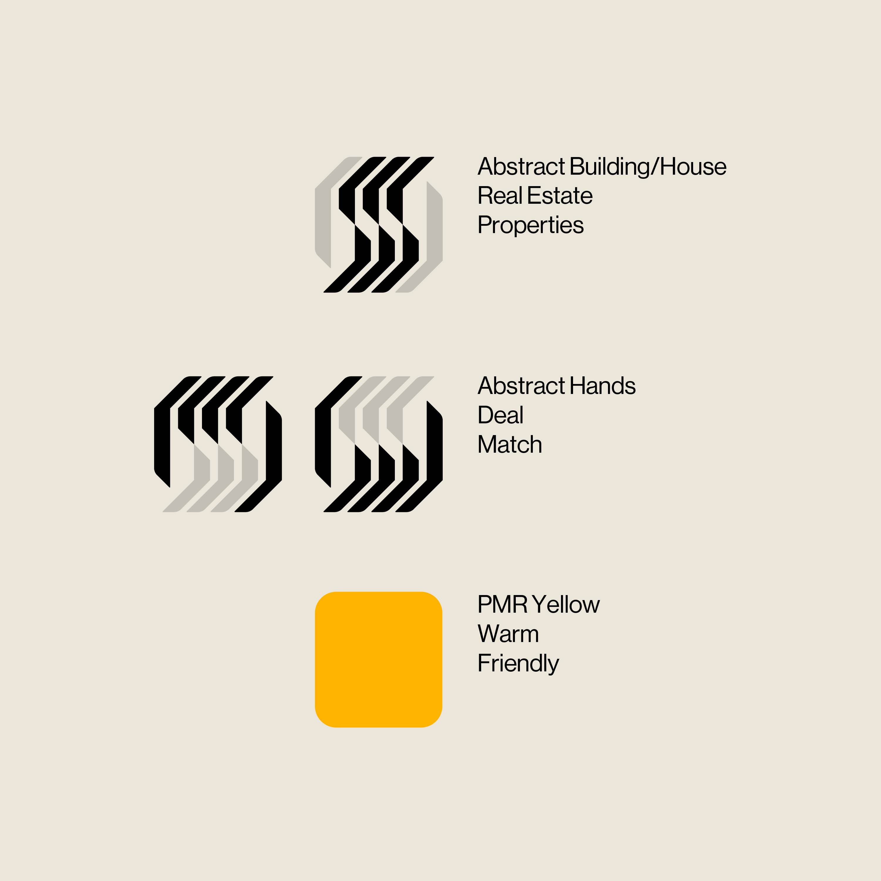
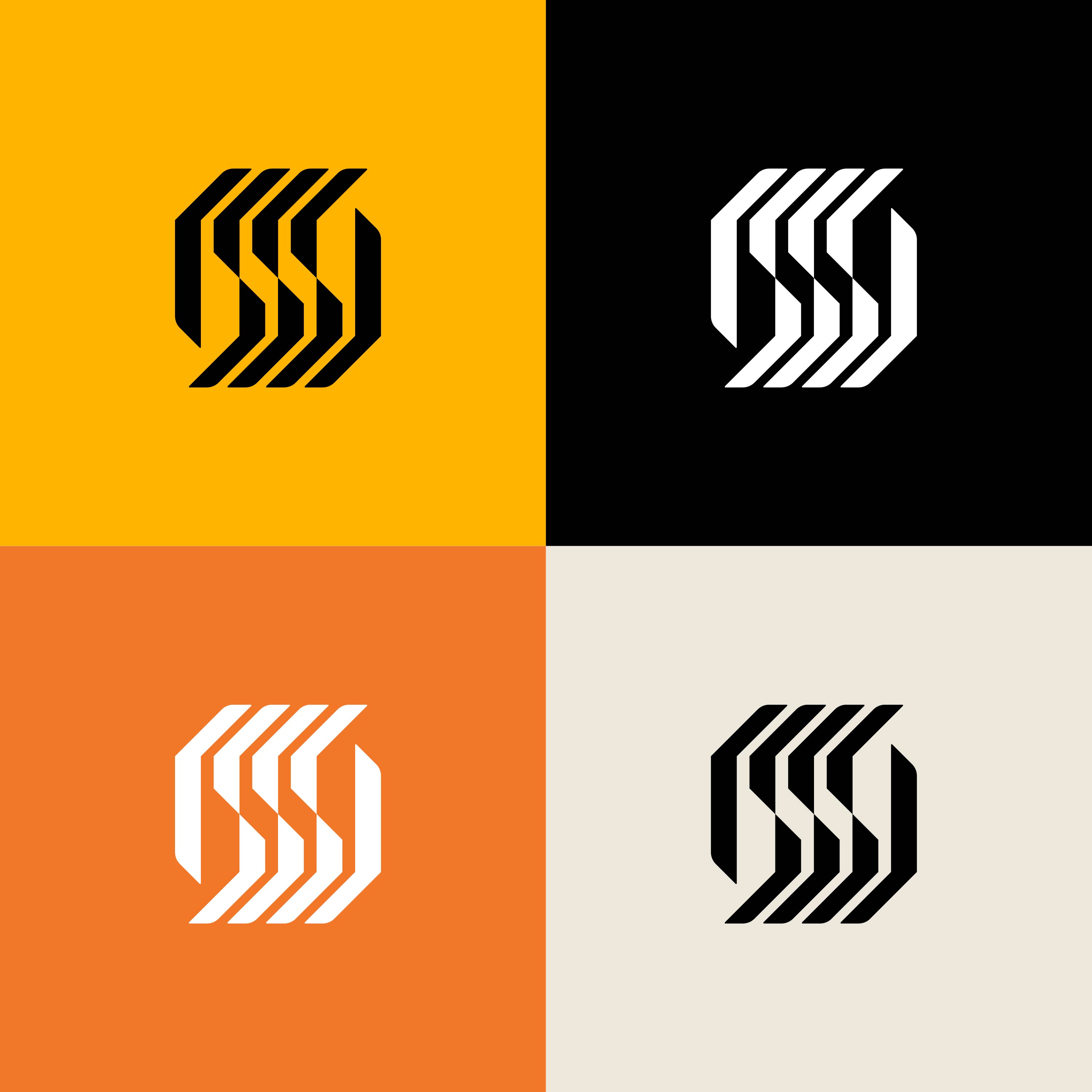
Key Strategic Decisions: The client gave me the total freedom in terms of the design direction. I specialised in modernist, mid-century logo design, which is timeless in terms of their look and usability. At the same time, it matches their overall brand message and story which is selling properties (houses, buildings and other commercial and residential spaces). These properties are long-term investments which customers can use several years or even decades in the future. Similar with the characteristics of modernist logos, they stand the test of time.
Design Process: I helped the client define their brand more through a brand questionnaire. The result plus their original brief helped me created a moodboard, which contains different modernist logo design directions. They were confident enough to put their trust on me and they gave me freedom to pick the direction that I want for this project, as long as it also hit their goals and messaging. After a month, we came up with a final logo. From there, I developed a colour palette and assigned a brand typeface.
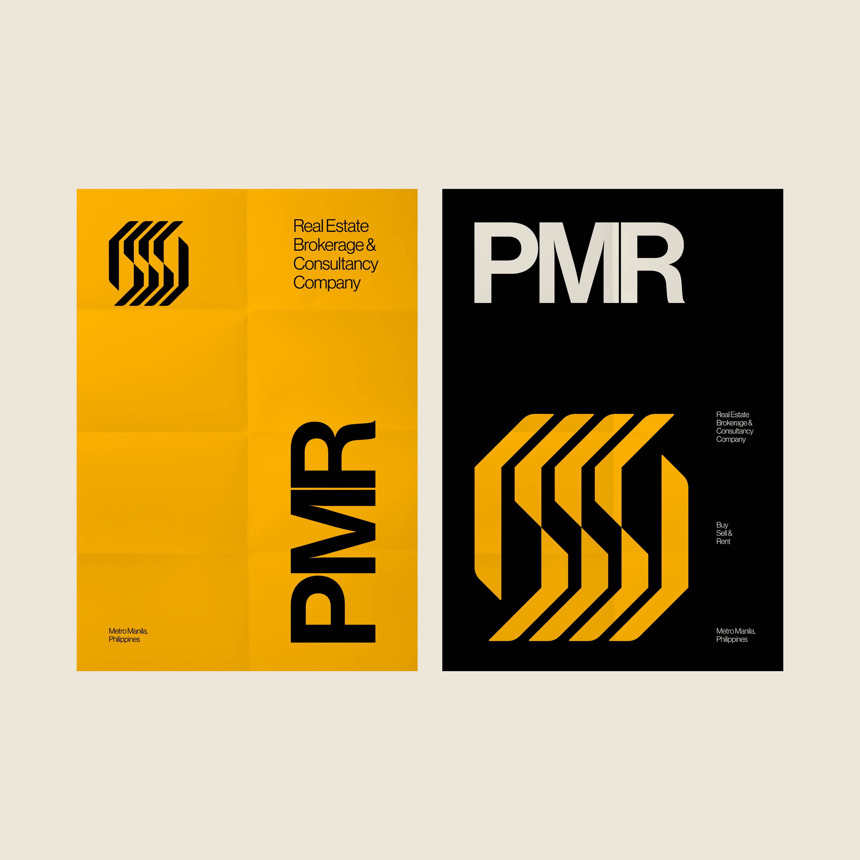
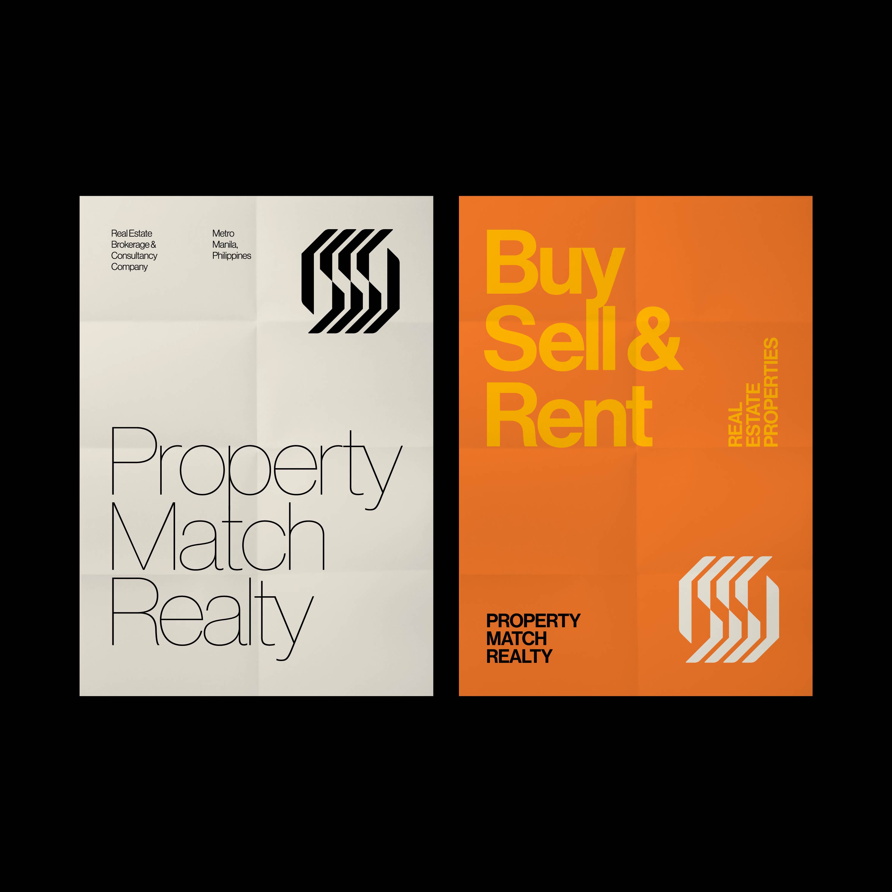
Deliverables: Logo design (primary, secondary), brand colour palette, brand typeface, and print & digital posters. Results of Work: The client was very satisfied and immediately used the logo on some of their applications.
CREDIT
- Agency/Creative: Jeth Torres
- Article Title: Property Realty Match Branding Designed by Jeth Torres
- Organisation/Entity: Freelance, Published Commercial Design
- Project Type: Identity
- Agency/Creative Country: Philippines
- Market Region: Asia
- Project Deliverables: Brand Identity, Brand Redesign, Brand Strategy, Graphic Design
- Industry: Real Estate
- Keywords: real estate, modernism, logo, philippines


