


Project Hum is the newest farm-to-table restaurant that comes with an intention of being more than just a restaurant. Focusing on sustainable, community-supported food choices and putting locally grown ingredients and their farmers into the spotlight, Project Hum needed a branding strategy that clearly reflected their unique brand purpose to the T.
The name, ‘Project Hum’ came from conversations about being more than just an eating joint, but instead an inclusive space that would keep growing with the movement. A name that would be reminiscent of a community that would keep on building a more holistic way of conversing around and consuming sustainable food.
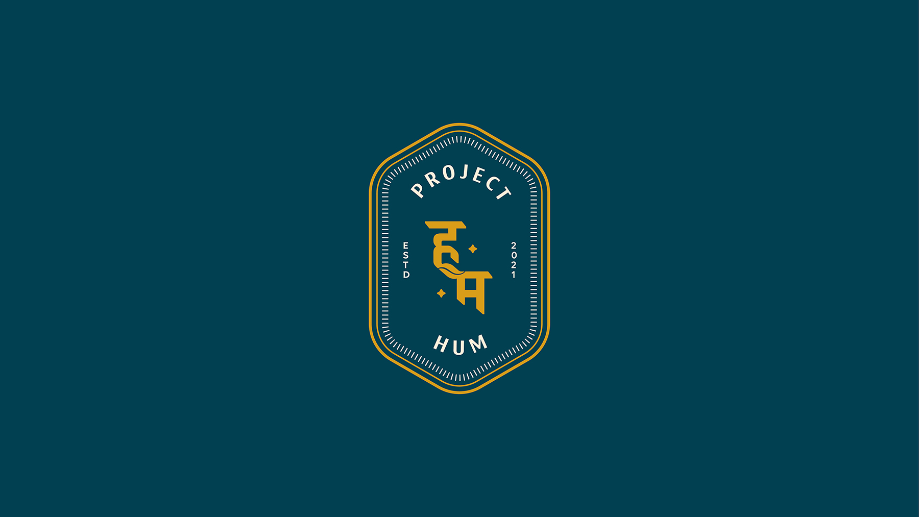
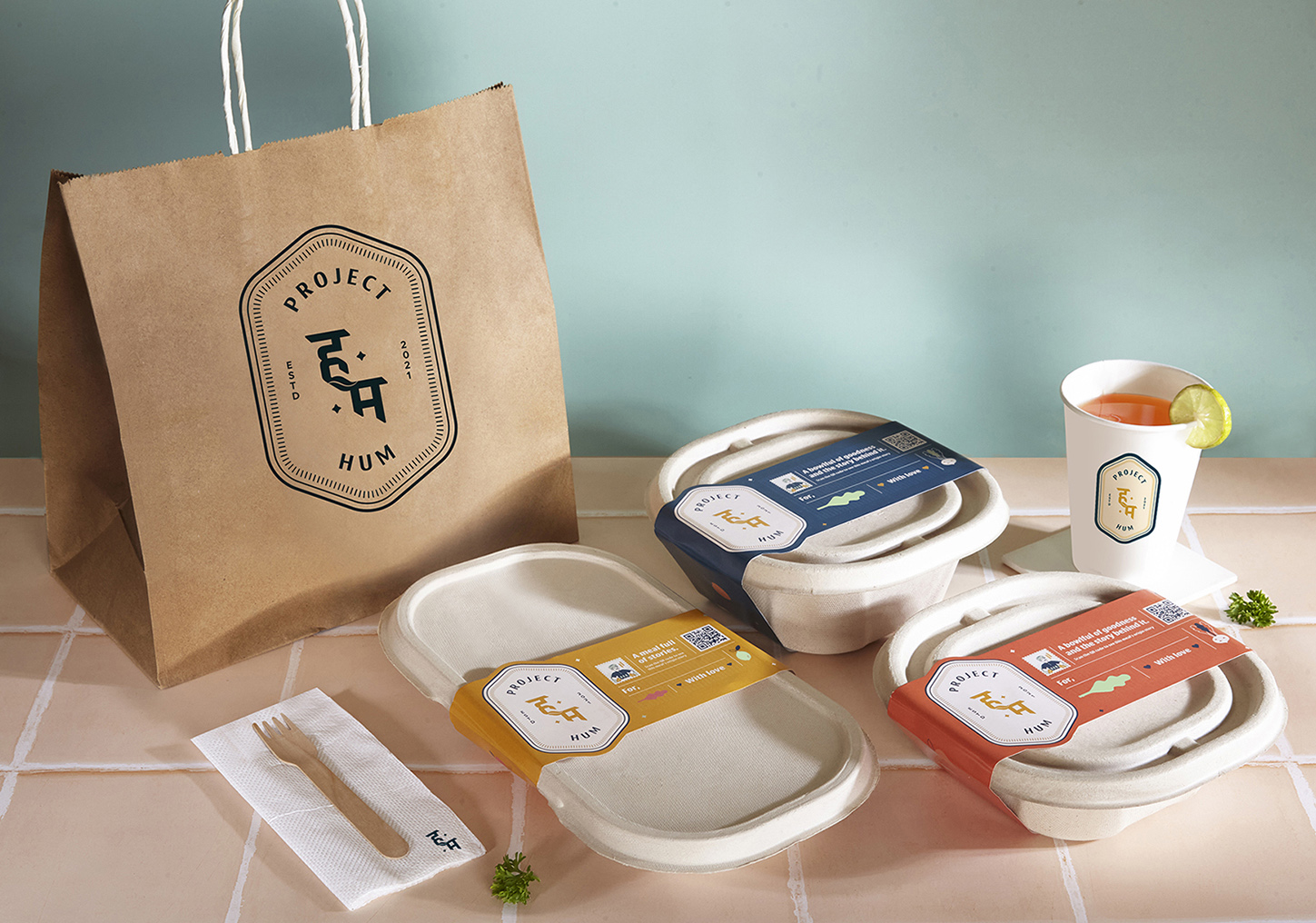
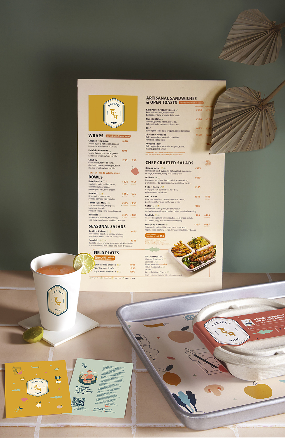
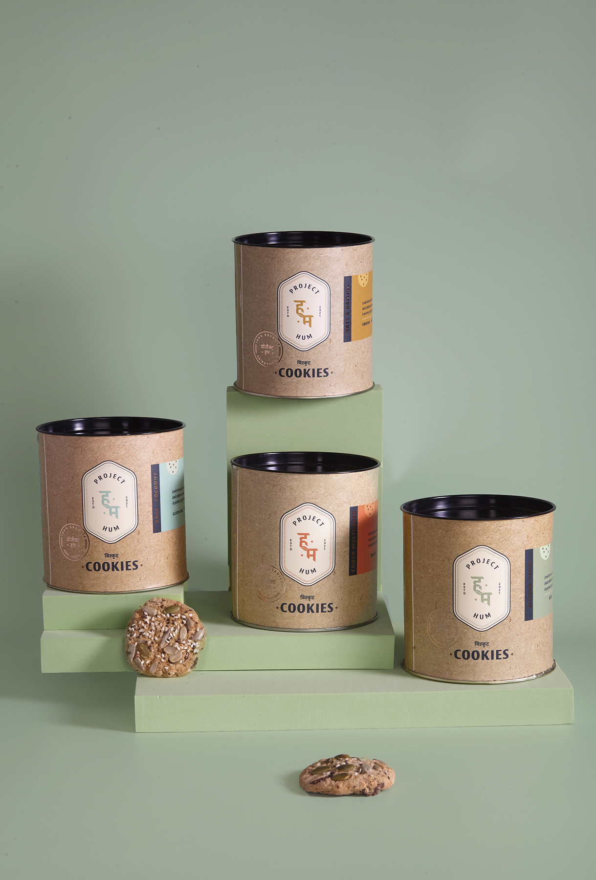
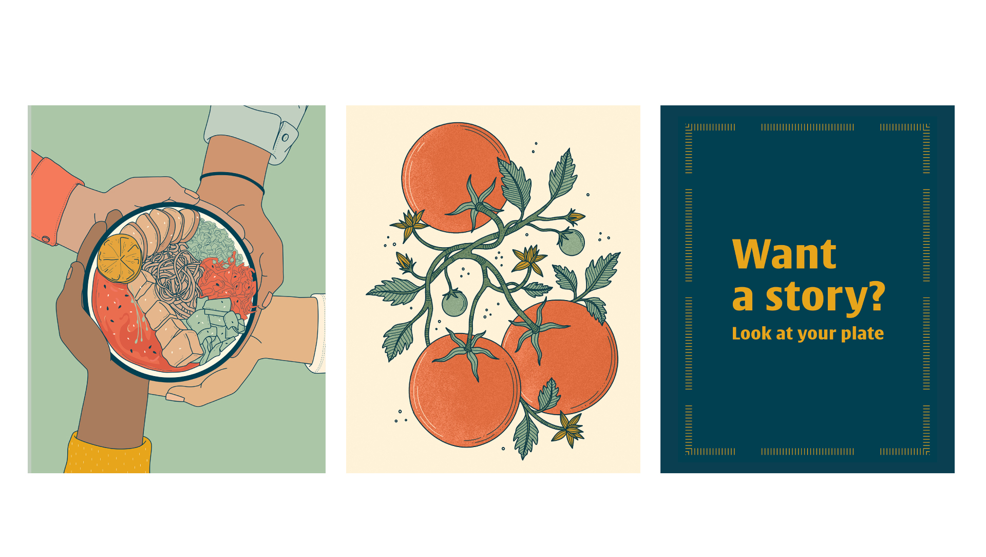
The branding followed suit, earthy colours like mustard, mint, peach, saffron and blue were the primary palette chosen.
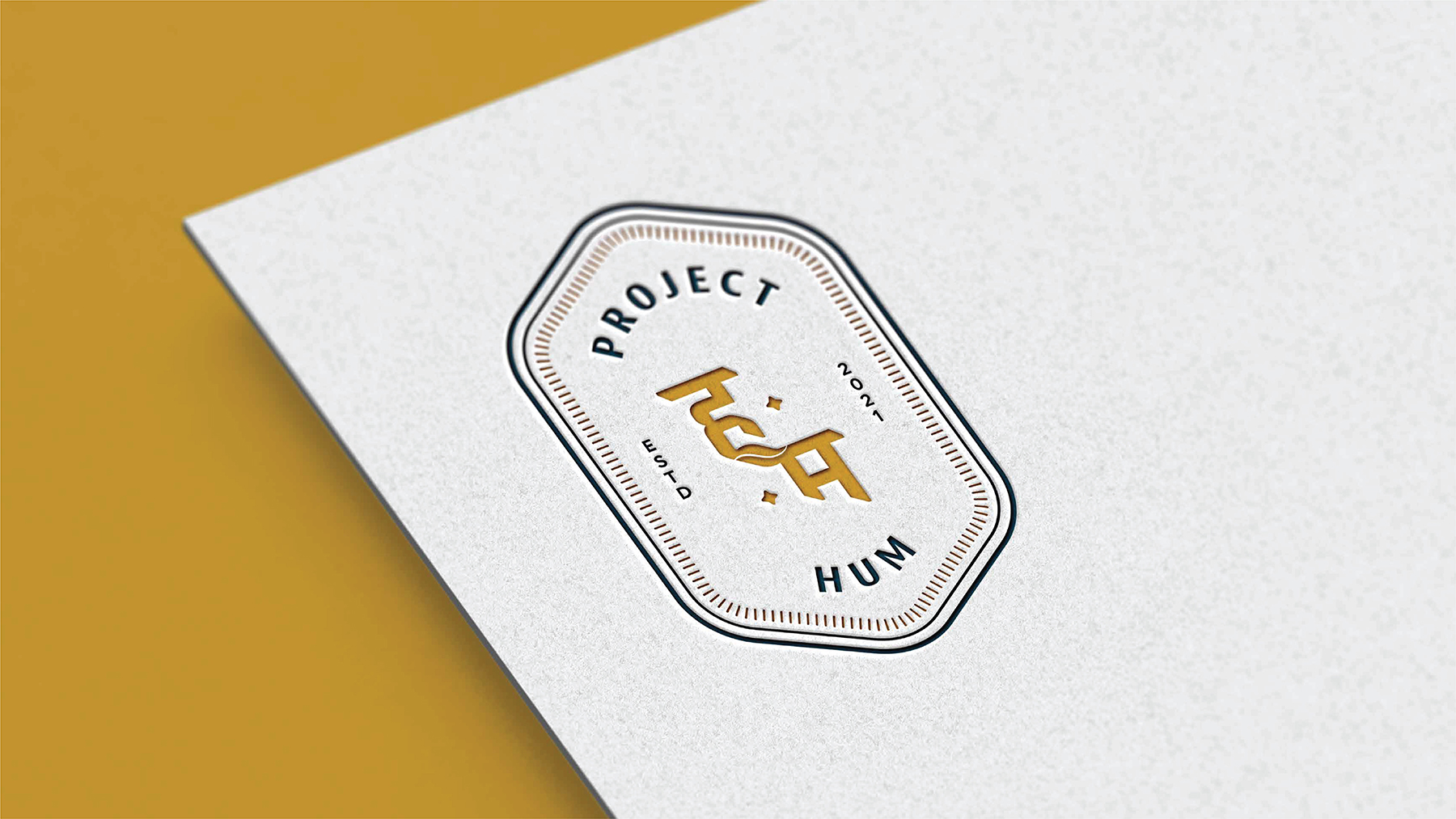
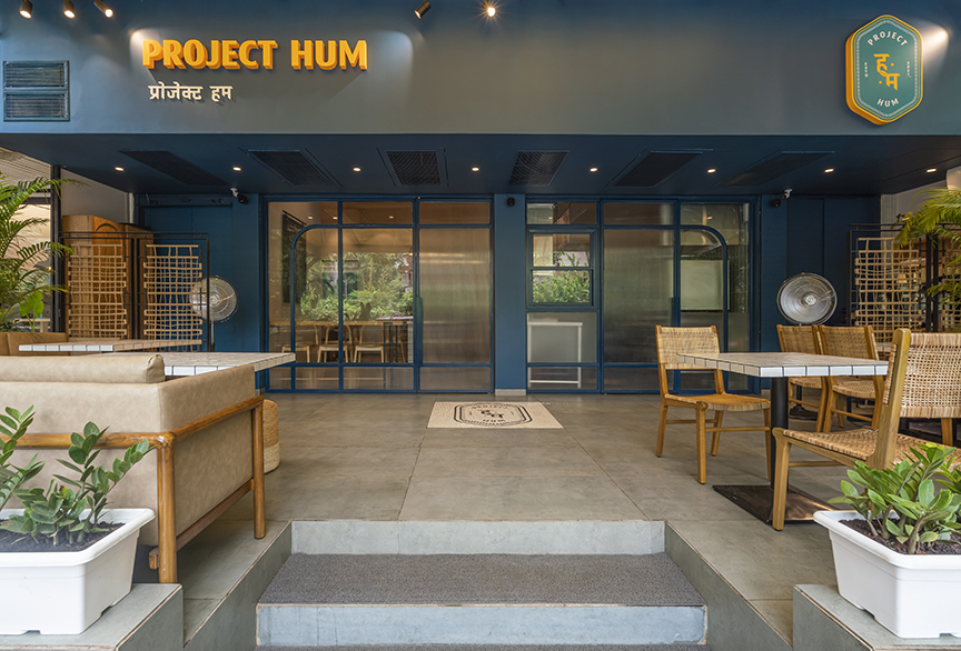
The brand logo design was evocative of a stamp, giving the air of authority, with Devanagari letters as the main element to showcasing the ground level of the network that goes into building the final plate of food we consume. A leaf connected the letters, symbolising how food is what connects people and communities together.
The clean, unpretentious typography celebrated the brand values of transparency, realness, and warmth.
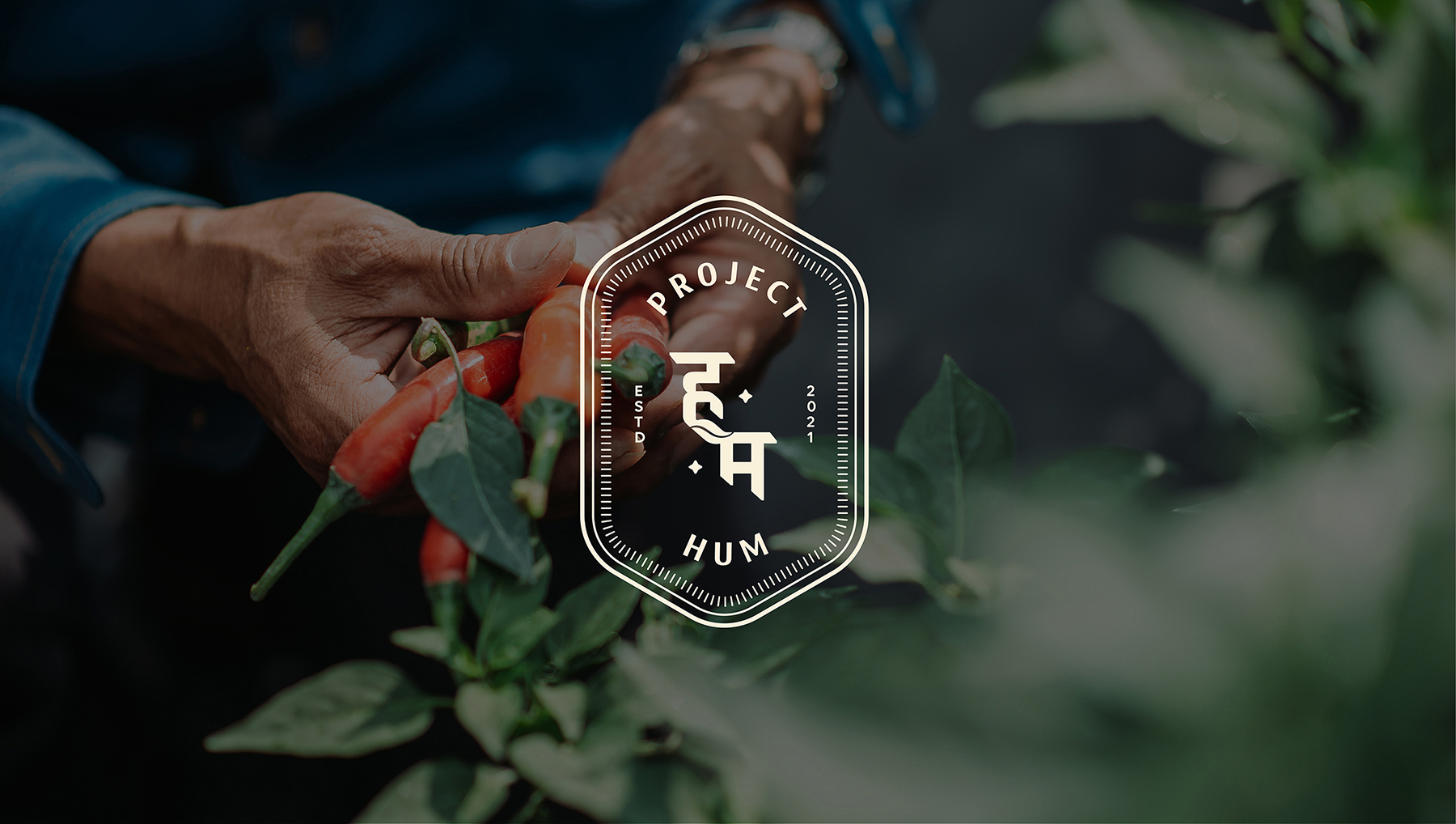
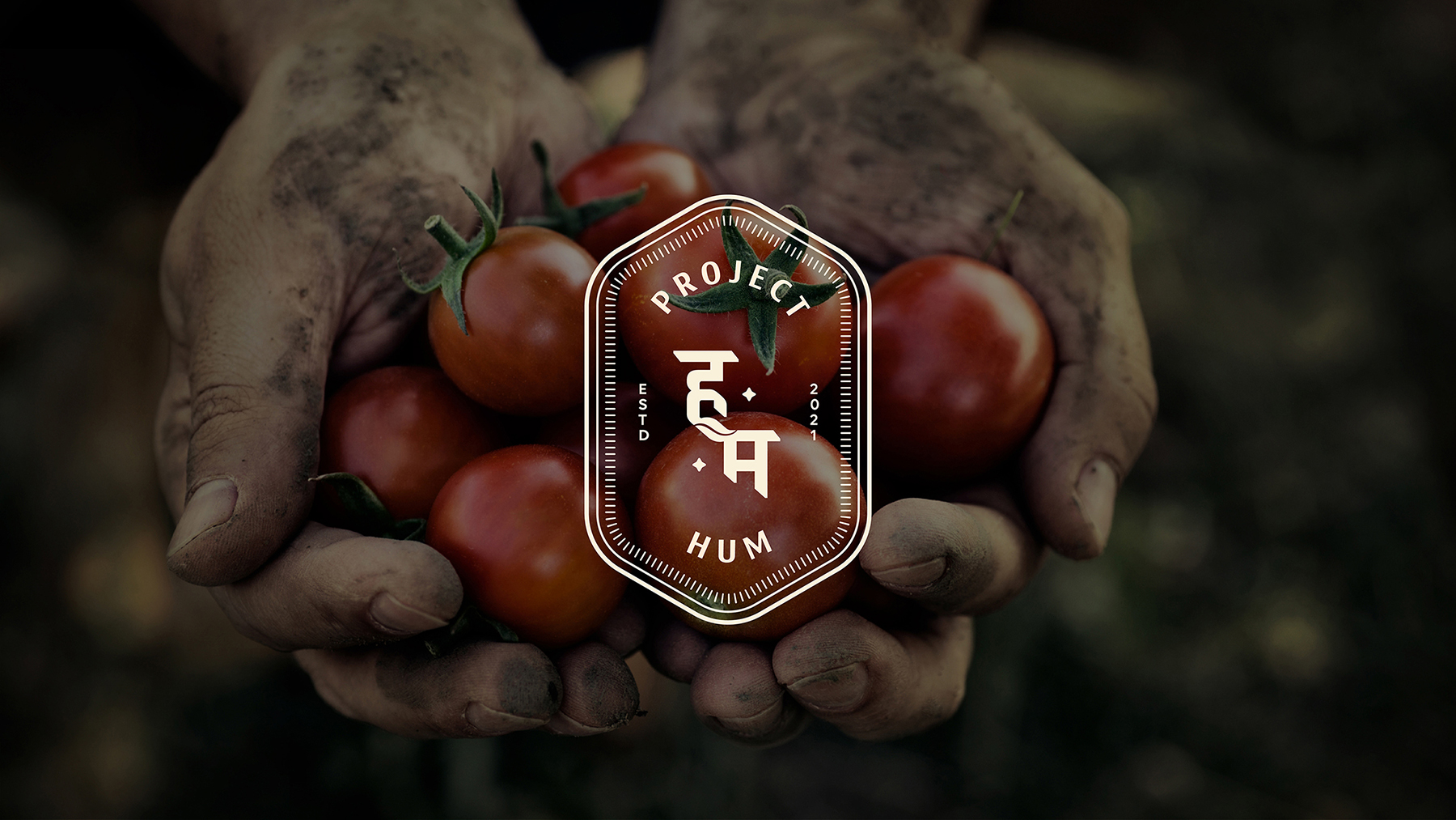
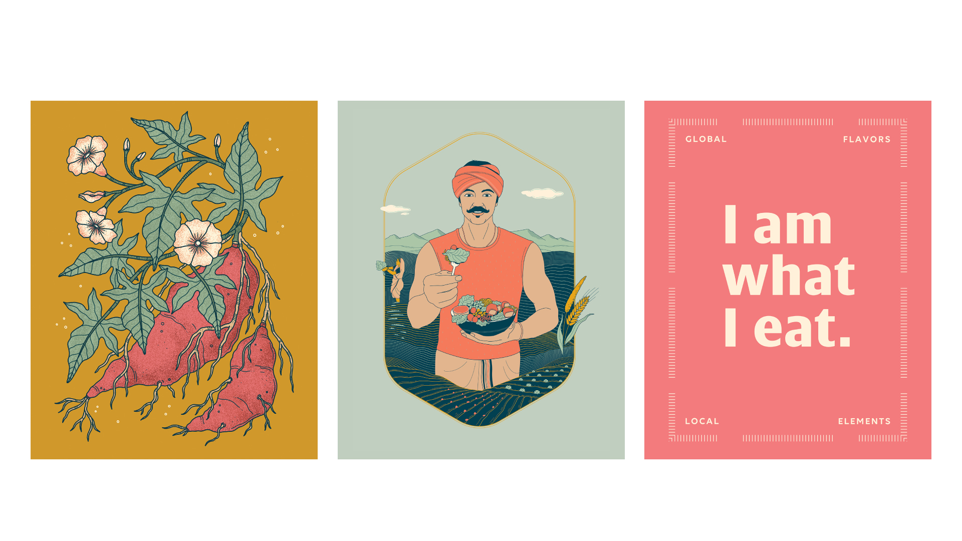
Illustrations were designed in a contemporary style, and we collaborated with artists to create murals, to bring alive the restaurant interiors. Visuals of locally sourced produce and the farmer were developed to bring forth the community and local story at the center of everything.
The branding for Project Hum extended to multiple collaterals from menus, merchandise, placemats, coasters, and packaging amongst others. The designs were kept clean and contemporary. The takeaway card had a QR code that when scanned would lead to the ingredient story and information on local farmers who did their bit in making the dish come alive.
We worked with Project Hum for their range of gluten free cookies which are full of goodness and wholesomeness. A perfect pick-me-up for every occasion!
CREDIT
- Agency/Creative: Popping Mustard
- Article Title: Project Hum’s Brand Design Celebrating Local Farmers and Sustainable Food
- Organisation/Entity: Agency
- Project Type: Identity
- Project Status: Published
- Agency/Creative Country: India
- Agency/Creative City: Mumbai
- Market Region: Asia
- Project Deliverables: Brand Creation, Brand Design, Branding, Graphic Design
- Industry: Hospitality
- Keywords: Farm to Fork Fat Casual Organic Restaurant
-
Credits:
Brand Strategy / Nomenclature / Branding & Identity Design: Team Popping Mustard
Copywriting: Sanjana Dora
Illustration Collaborator: Rohan Dahotre
Illustration Collaborator: Nikita Yawalkar
Client: Project Hum


