Studio Parr – Bodegas Neleman – Derrick Wines
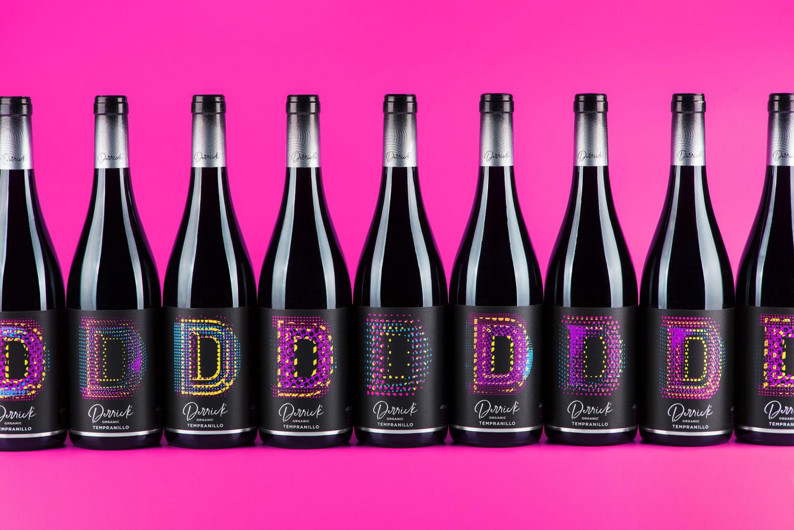
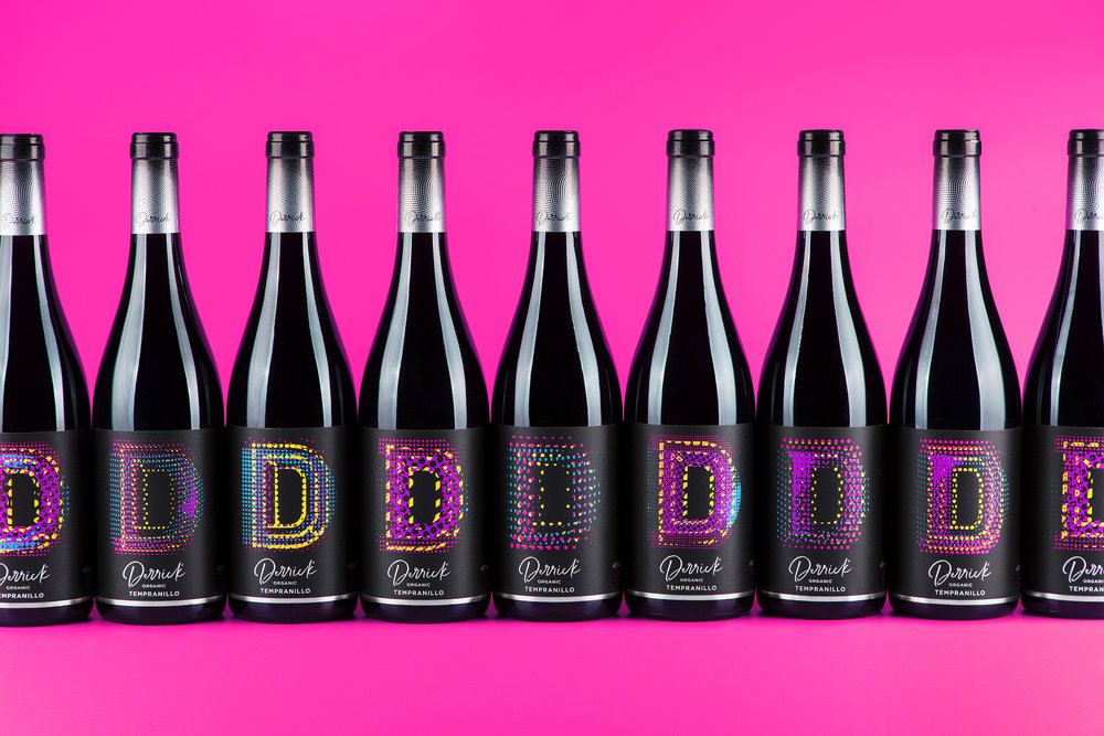
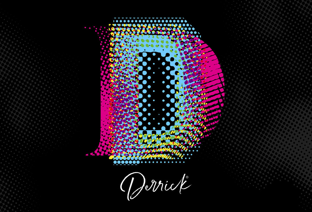
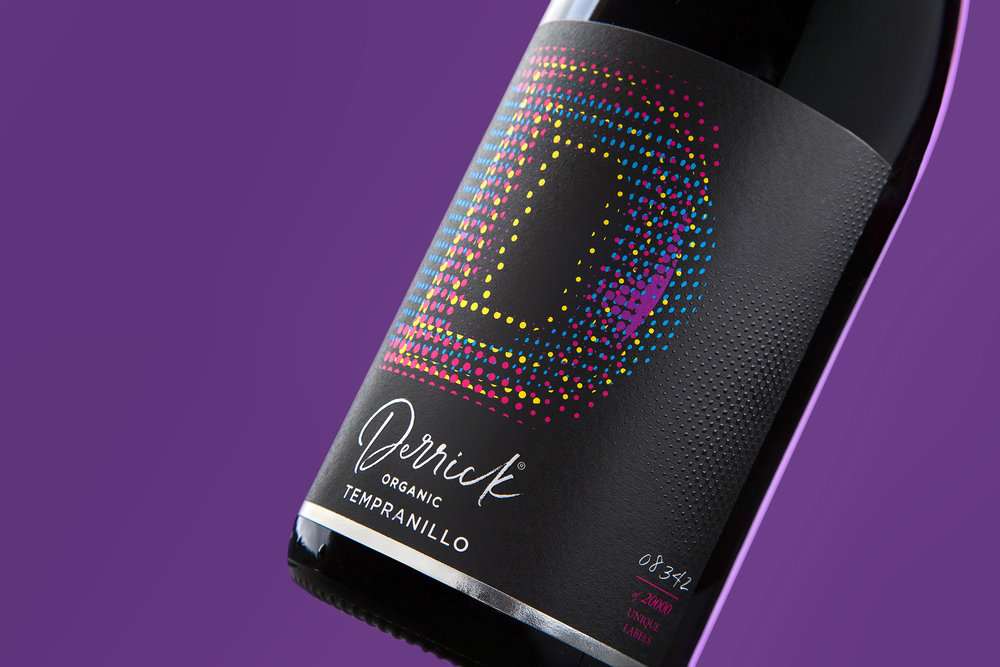
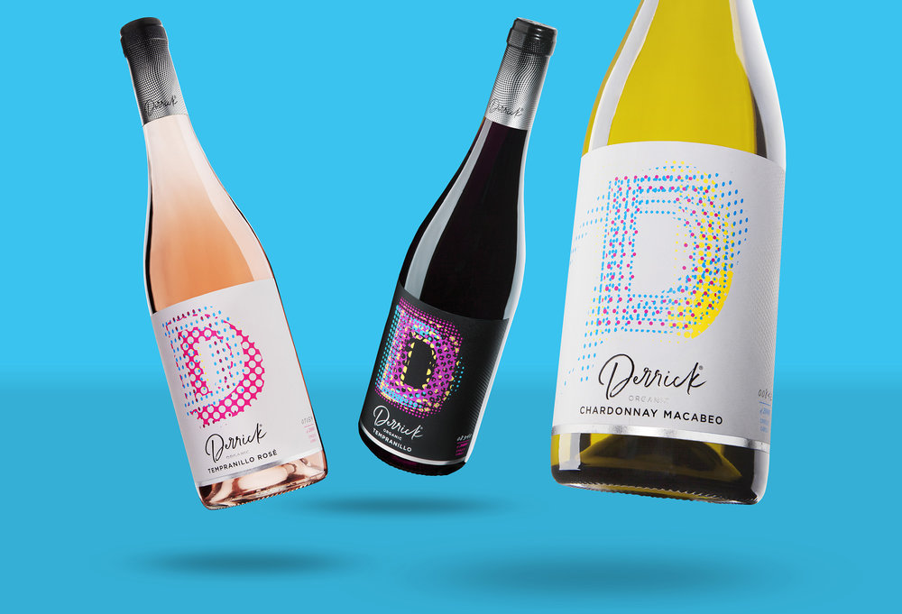
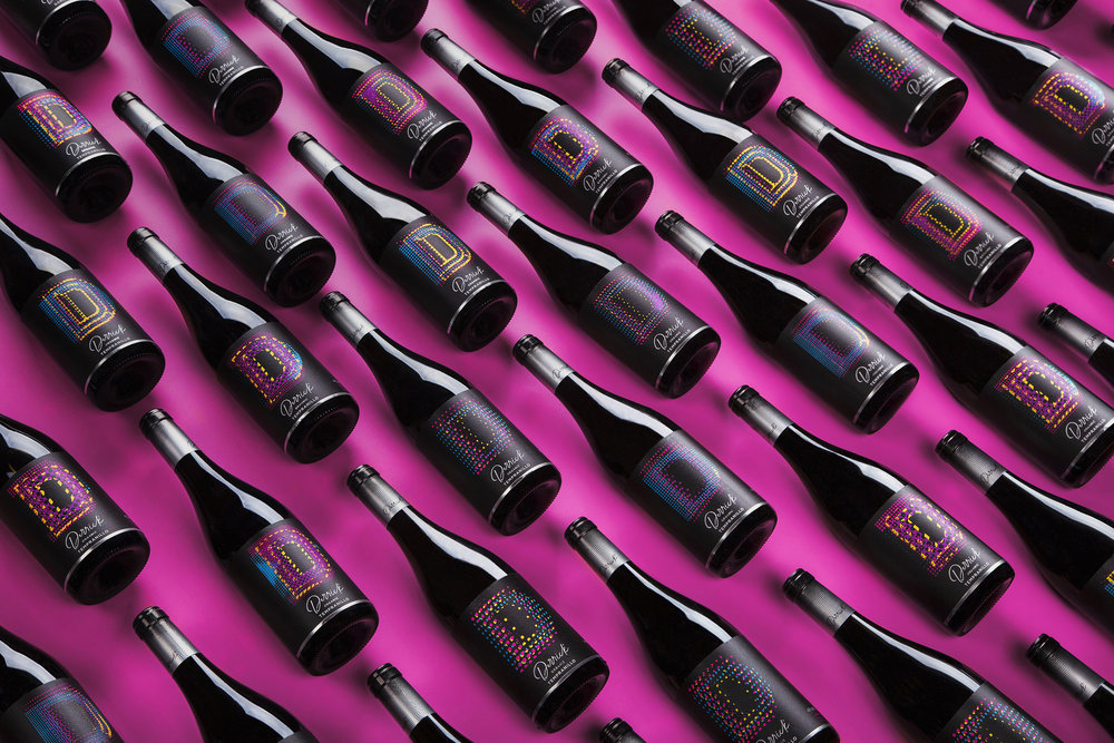
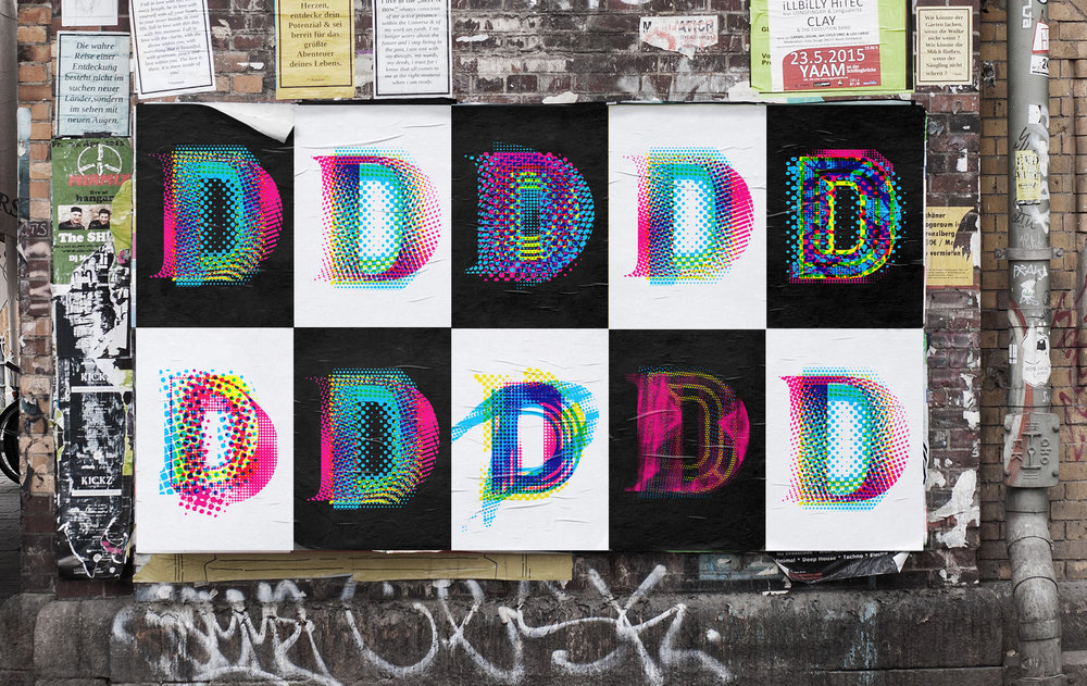
Project descriptionLeading Dutch wine maker and importer, Neleman, has begun to establish a significant presence in the Netherlands and wider global wine markets. In 2018, owner, entrepreneur and restless wine maverick Derrick Neleman spotted an opportunity for a new ‘disrupter’ brand targeted at younger wine drinkers in this growing, sector of the market. He wanted to create a different, more democratic, accessible, wine brand whose offer was not based on the traditional ‘stuffy’ stories of vineyards, provenance and history – but one of energy, dynamism, creativity and individualism. The brand is based on a proposition that speaks directly to a experience-seeking consumer: that everyone is unique and every wine drinking moment is different. So, reflecting this, is a wine presented and designed in a totally unique, different way.It seemed an appropriate way to honor this mould-breaking strategy by naming the wine Derrick, after the founder of Neleman. ==============The label design brief A design approach was needed that communicated distinctiveness not just from other brands – but from every single label on every Derrick-branded bottle. A label was required that is as unique as a fingerprint. As unique as each and every one of us. A device that expresses creativity and innovation.================The creative solutionStudio Parr developed a unique creative idea: if everyone, and every drinking occasion is different – so can every label design.The result is an iconic and innovative wine label, branded with a multi-layered/dimensional letter D with infinite variations in pattern. The technical challengesWorking closely with printers, Berkshire Labels, Studio Parr pushed the latest print technology to its limits to achieve complex patterns that are ultimately endless – thus creating a range of labels that are as unique and individual as the consumers. State-of the-art Hewlett Packard ‘mosaic’ software was experimented with and programmed to make these infinite possibilities come alive.Studio Parr layered the letter ‘D’ on quadruple plains in which the software can not only place a different texture within, but also change its colour, scale and rotation. Bringing this technology – together with beautiful print craft – has resulted in a visually striking, tactile, label that feels as good in the hand as it does on the shelf.
CREDIT
- Agency/Creative: Studio Parr
- Article Title: Project D | Drink Different
- Organisation/Entity: Agency, Published Commercial Design
- Project Type: Packaging
- Agency/Creative Country: United Kingdom
- Market Region: Multiple Regions
- Format: Bottle
- Substrate: Glass, Pulp Paper


