Task: Our task was to develop the label design for Professore rum. It had to attract attention and make the product distinguishable within its range. Conceptually, the design solution had to bring the product closer to the “premium” category. At the same time, it was important to win the trust of the medium-segment consumers, whom the product targets.
Product description: Professore is a blend of rums from the regions of the Dominican Republic, Jamaica, Panama, and Nicaragua, sold on the Czech market in the medium segment.
The brand story: This story was told to us by one of the blend-masters of the Professore rum: “Creating a new rum isn’t a joke, especially for a European. Central America is not easy to get around, and you need someone to guide you. My teacher and guide was Ruiz. A local guy, for whom rum was his whole life. In his fifties, he was surprisingly full of energy. Once, when we were working – tasting rums and trying to pick the best one, Ruiz began to talk, and I found out that he dropped out of school when he was ten. Hearing that, I told him: Ruiz, it doesn’t matter how many years you’ve spent at school. To me, you are a better teacher than most renowned professors. He laughed and said – Cuando el alumno está listo, aparece el maestro. When the student is ready, the teacher will appear. I remembered this story when we were creating a name for the new rum, and this is how Professore came to life. Cheers to Ruiz, the Professor!”
Solution: We analysed classical visual elements of the rum segment: marine motifs (ships, pirates, nautical symbols, sea navigation maps), décor and elements of Caribbean flora and fauna, the texture of the waxed paper, gold medals, and serif typography.
On the one hand, we had to comply with the traditional visual style of the rum segment, yet on the other, create a unique language, architecture, and concept for the new product.
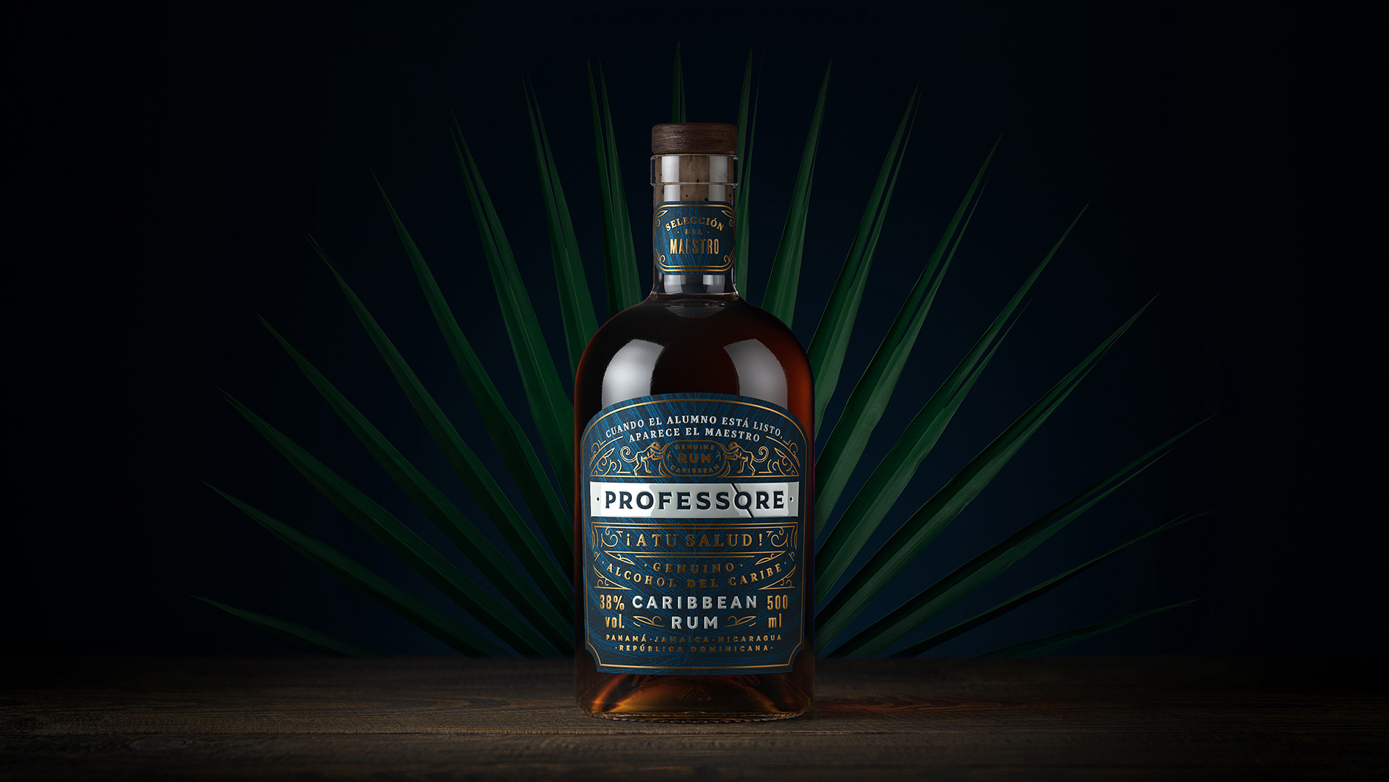
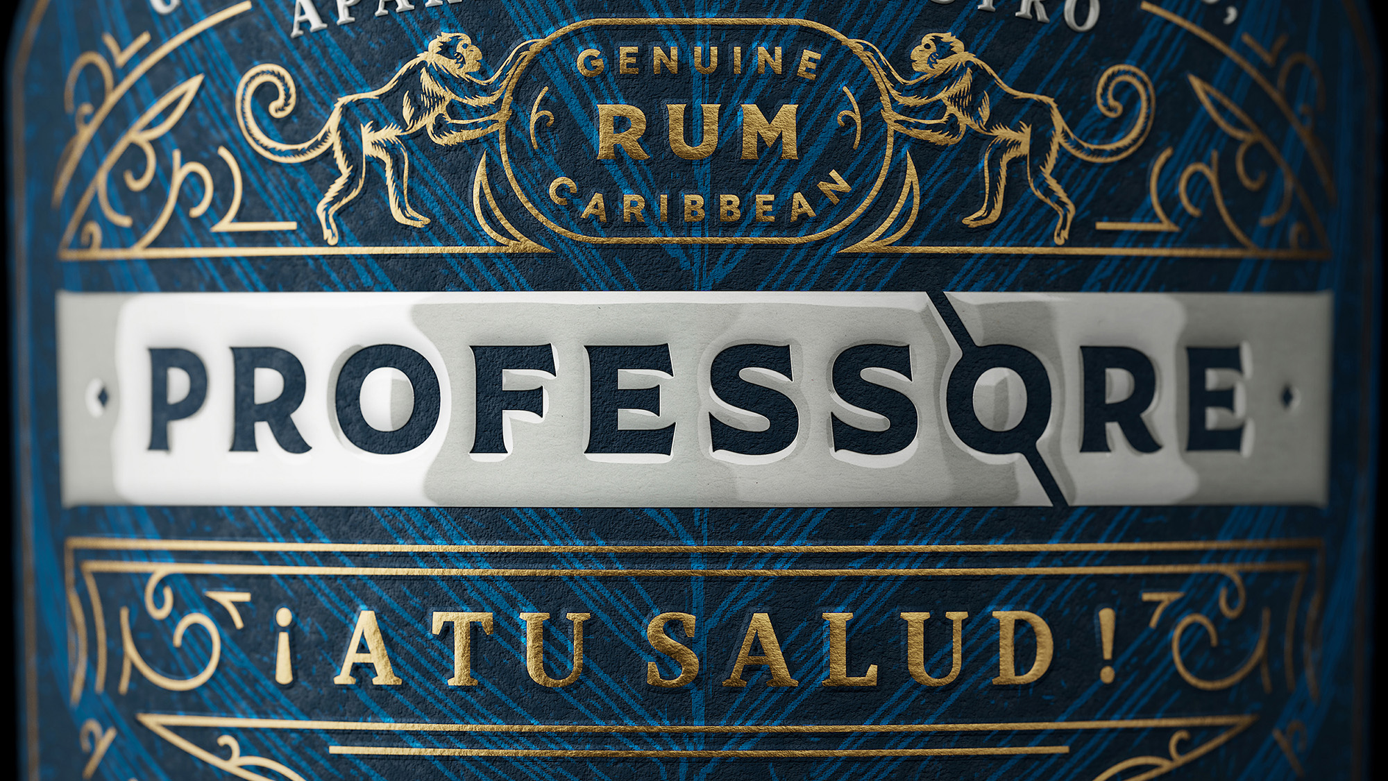
As the history of the brand illustrates, our product has a hero – energetic and experienced Ruiz. He achieved such a level of mastery at what he does, that he rightfully deserves the title of Professor. For every master, it is extremely important to leave a legacy, to ensure that their experience and knowledge are passed to future generations. While scientific minds record their legacy in academic volumes, “professor” Ruiz creates it with his own hands. His legacy is the taste of the unique blend of Caribbean rums; the taste that will be loved and remembered. Professore rum is his best book, his dissertation that deserves a good cover. This idea laid the foundation of the future label: the label/cover for the rum/scientific masterpiece of Professor Ruiz. We were inspired by vintage book covers and print productions on the Caribbean topic. The label combined several typographic compositions with conceptual texts to initiate communication with the customers.
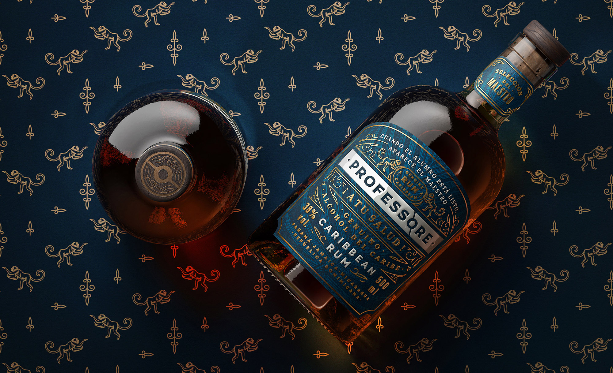
To keep up with the rum theme, we picked an image of a monkey – a frequent companion of pirates and sea wolves. Monkeys not only remind customers of southern countries; they also symbolize a light-hearted and ironic attitude to life. These are the qualities that our hero, Ruiz, also possesses. Considering the fact that the label is created in a reserved and structured style, the monkey image creates a contrast with the general mood, adding conceptual dynamism to it.
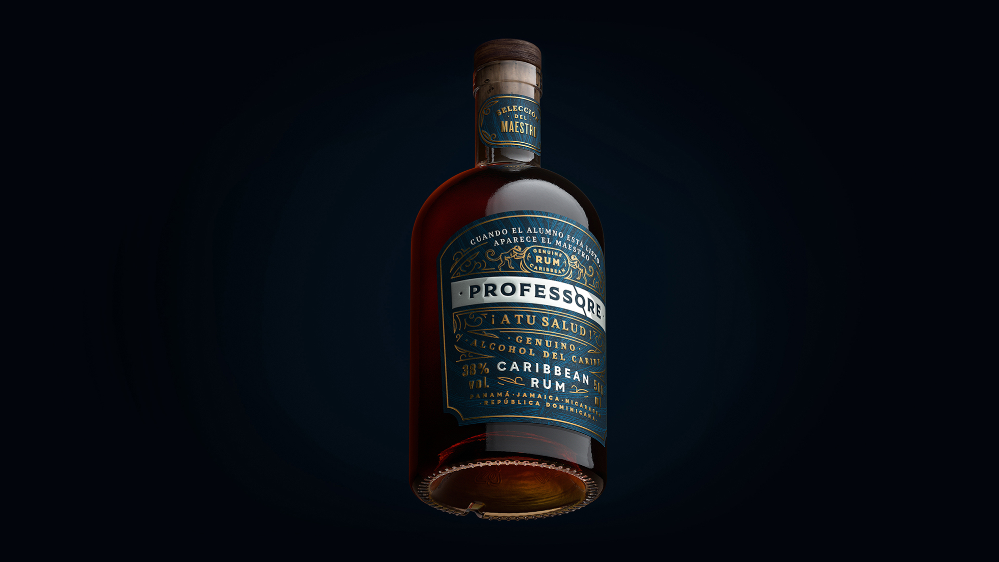
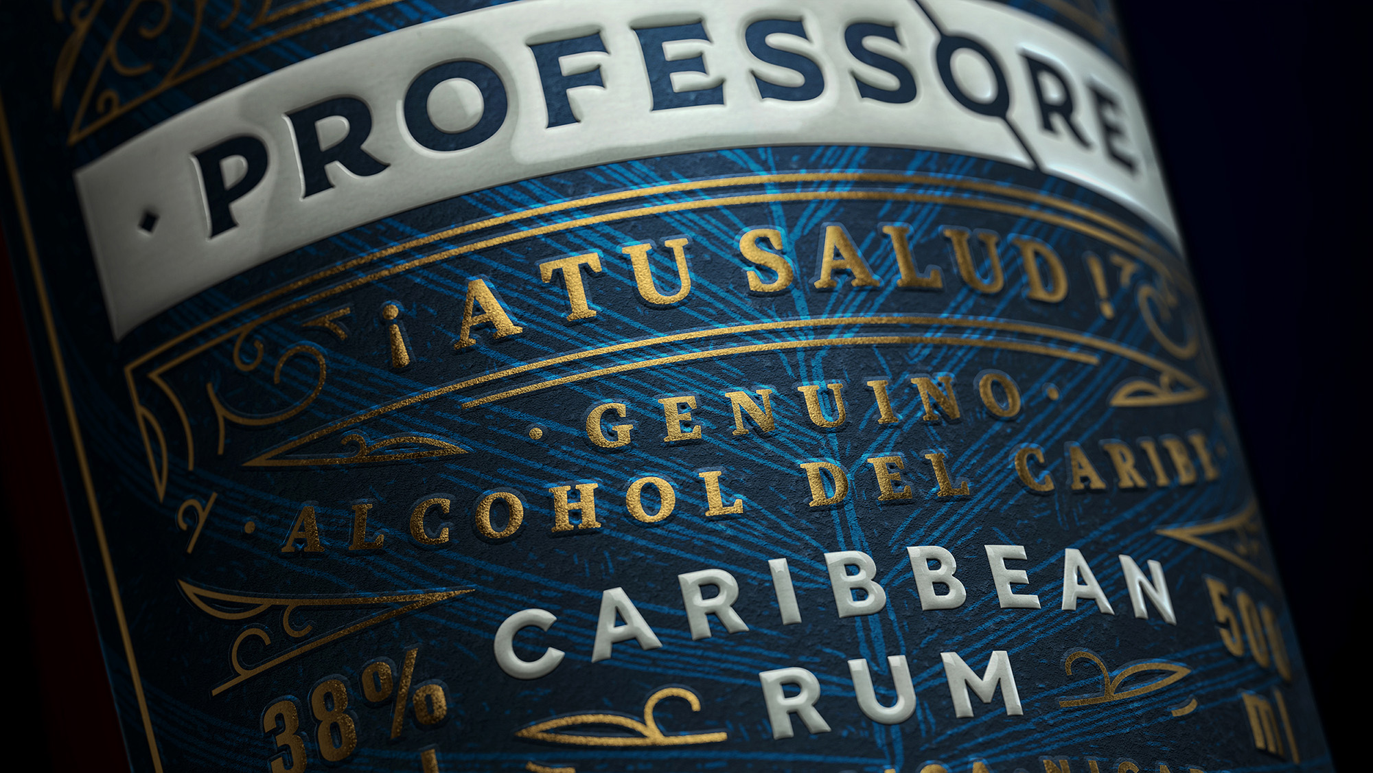
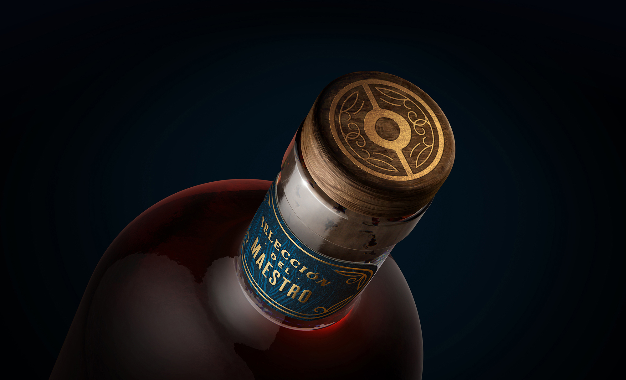
For the main label, we chose the dark-blue colour. It has long-established connotations with the scientific community, yet at the same time, it is the colour of the sea. The combination of the dark-blue satin background, golden emboss, and ember-coloured liquid of the rum creates a pleasant play of light, accentuating the rich flavour of the product and distinguishing it from its competitors.
Despite the abundance of details, the composition of the label is perceived as a unified and harmonious pattern. The solid cream line stretches horizontally through the whole composition, highlighting the name of the brand. The title is crafted in glossy varnish, while the rest of the label is printed matte.


CREDIT
- Agency/Creative: Amoth Studio
- Article Title: Professore Caribbean Rum Label Design by Amoth Studio
- Organisation/Entity: Agency
- Project Type: Packaging
- Project Status: Published
- Agency/Creative Country: Czech Republic
- Agency/Creative City: Prague
- Market Region: Europe
- Project Deliverables: Packaging Design
- Format: Bottle
- Substrate: Glass Bottle
- Industry: Food/Beverage
- Keywords: WBDS Agency Design Awards 2021/22
- Keywords: alcohol, spirits, rum, Caribbean, packaging, label design, professor, monkey
-
Credits:
Art Director: Sasha Sharavarau
Designer: Sasha Sharavarau
Illustrator: Tania Sharavarava
Printers: Robert u0160peciu00e1n
Visualiser: Anatoly Vynokurov
Client: St.Nicolaus


