


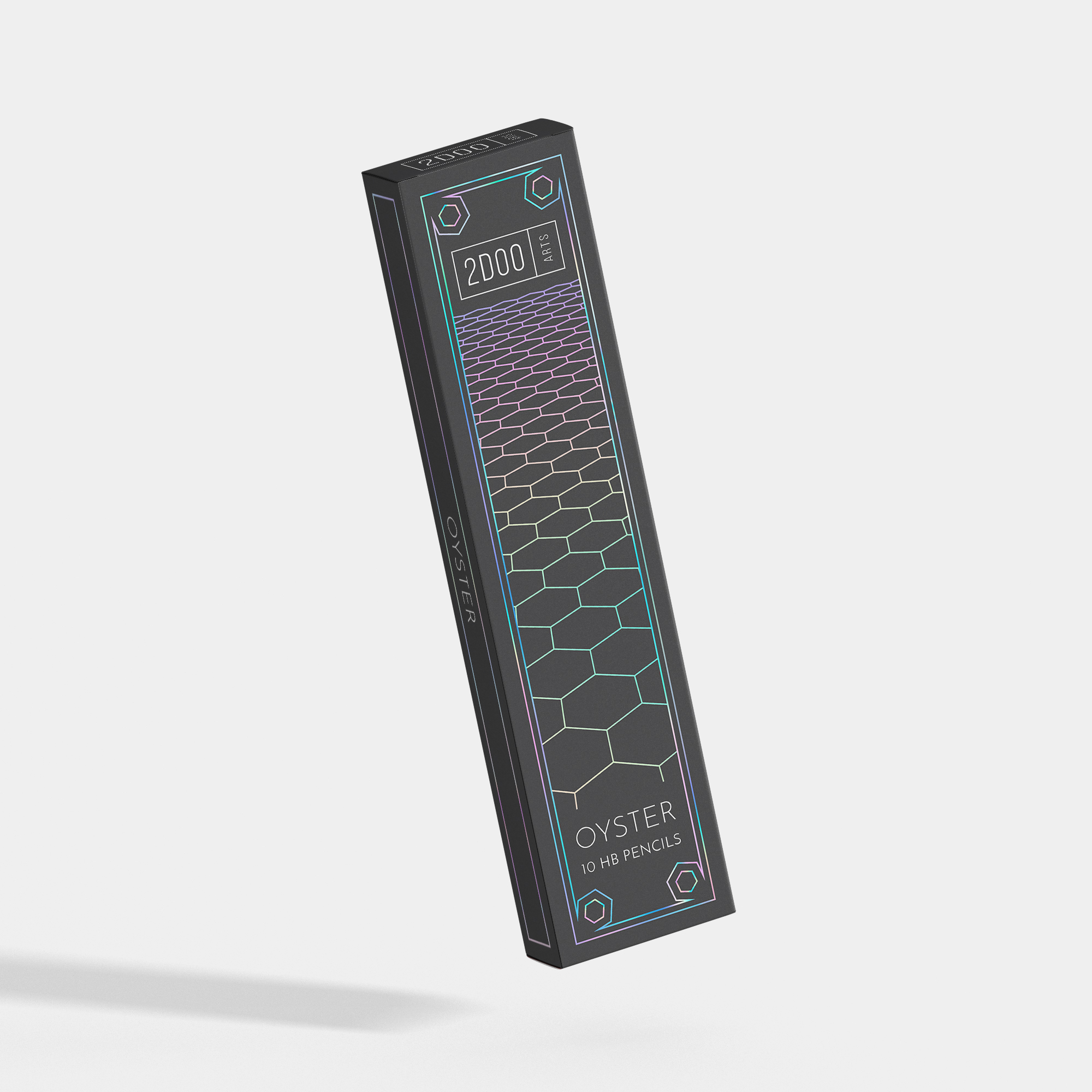
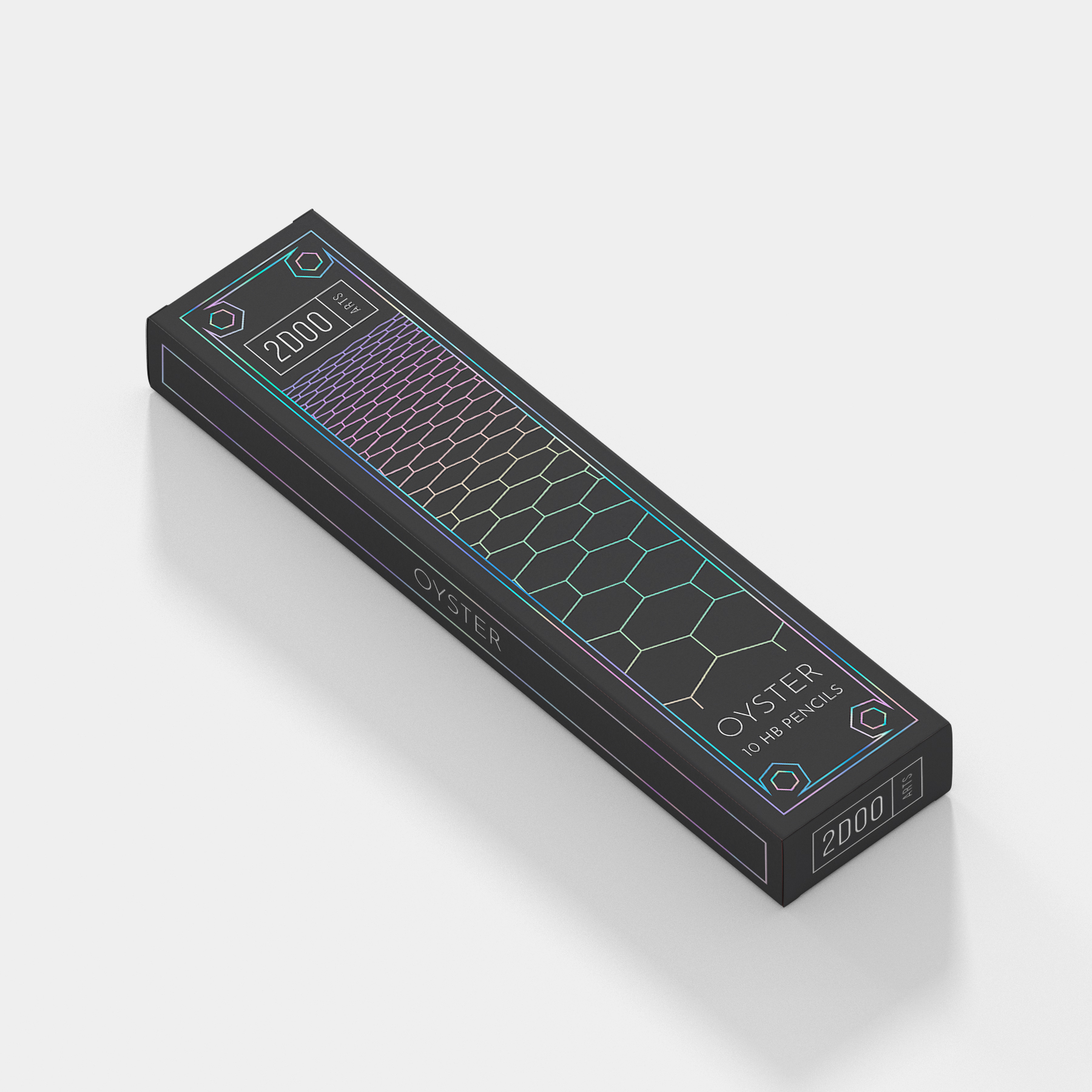
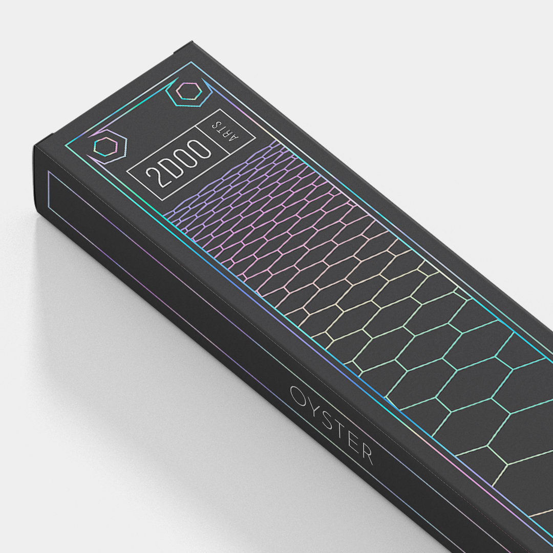
Drawing from the name ‘Oyster’ and the fact that oysters tend to have a pearlescent finish on the inner shell, the idea that the design could have a holographic foiling to it was conceptualised. The design itself is based off of the hexagonal structure of graphite, incorporating hexagons in the corners and having the entire chemical structure of graphite as the main focus of the design.
CREDIT
- Agency/Creative: Anvita Anagol
- Article Title: Product Revamp for Stationery Brand
- Organisation/Entity: Agency, Non Published Concept Design
- Project Type: Packaging
- Agency/Creative Country: India
- Market Region: Asia
- Project Deliverables: Brand Experience, Brand Redesign, Brand Strategy, Branding, Graphic Design, Packaging Design, Product Architecture, Research
- Format: Box
- Substrate: Pulp Board
FEEDBACK
Relevance: Solution/idea in relation to brand, product or service
Implementation: Attention, detailing and finishing of final solution
Presentation: Text, visualisation and quality of the presentation


