About: We are brother and sister. Since we were kids, we have been around olive trees, helping our dad picking olives during every harvest. The year 2012, when we were 21 and 25, marked the beginning of a great challenge. After our dad suddenly passed away, we were faced with a choice. Although we had already chosen different paths that were taking us away from the family business, we both decided to come back and take over the firm together.
We are small producers, therefore our choice is quality over quantity. Limited production allows us to take good care of every single olive tree. We personally work in every production phase, from cultivation, harvest and bottling, all the way to label design.
Our olive groves are located in the coastal city of Trieste, in north – eastern Italy, where the Mediterranean encounters Central Europe. This is among the most northern areas where the olive tree has a historical tradition, withstanding cold winters and strong winds.
Recently, we felt the need to give a new image to our brand, therefore we redesigned our bottle labels ourselves, giving a different personality to each olive oil, according to the taste.
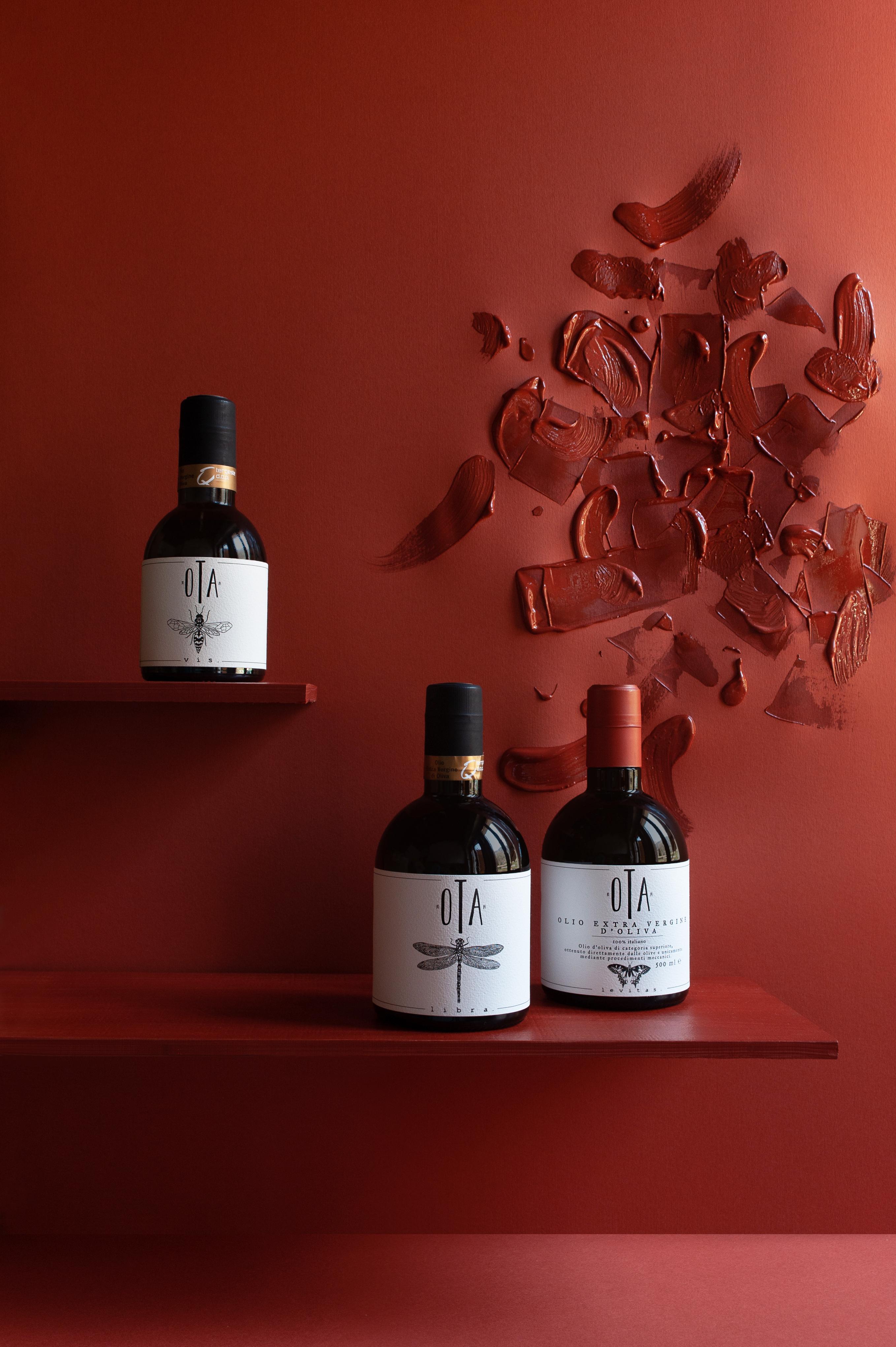
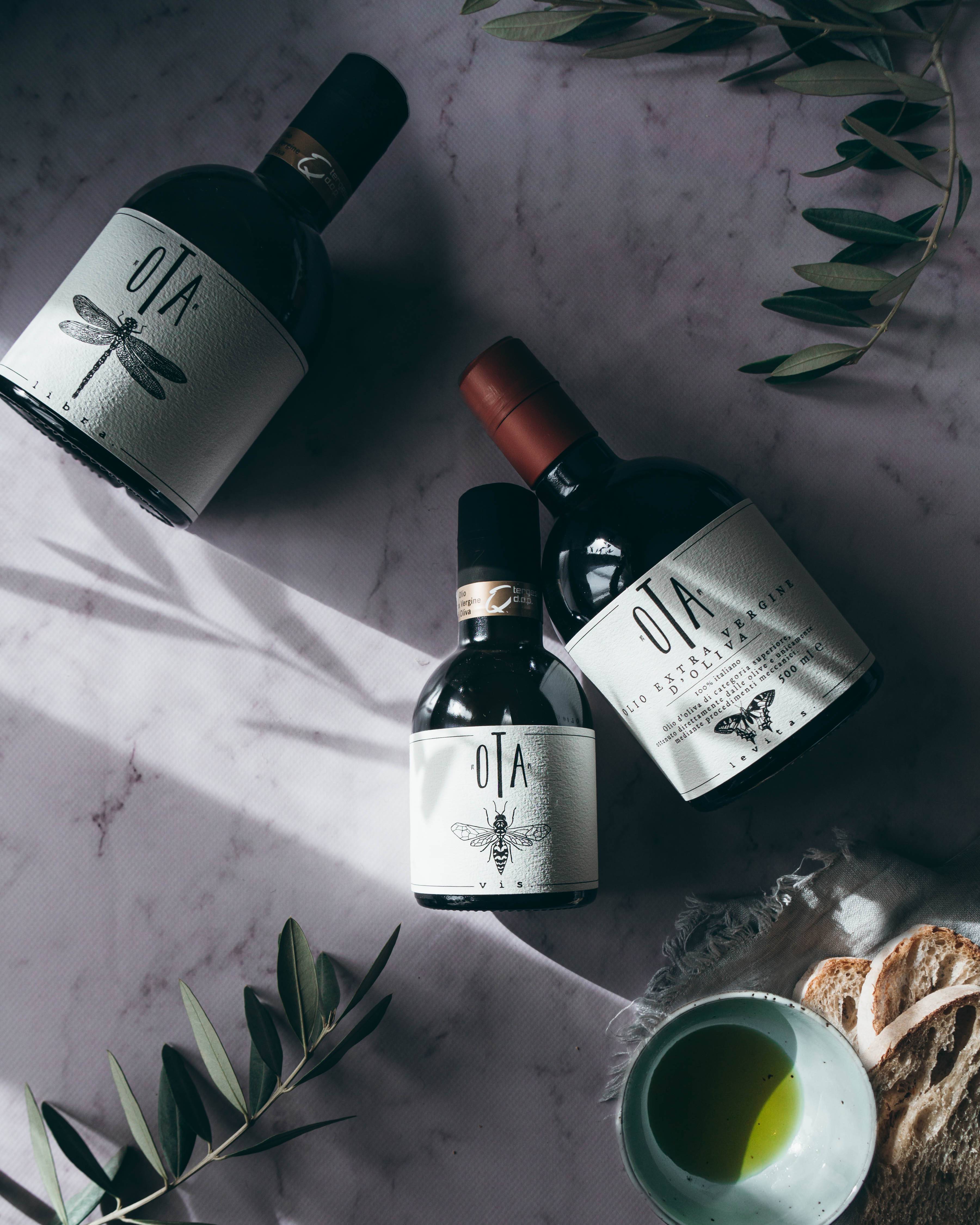
Packaging: We produce three kinds of extra virgin olive oil with different tastes and characteristics, from the most intense to the mildest. We created a label for each olive oil. The packaging consists glass bottles (250 ml or 500 ml) with paper labels.
Our olive oils are aimed at restaurants, delicatessen shops and concept stores, physical as well as online shops across Europe.
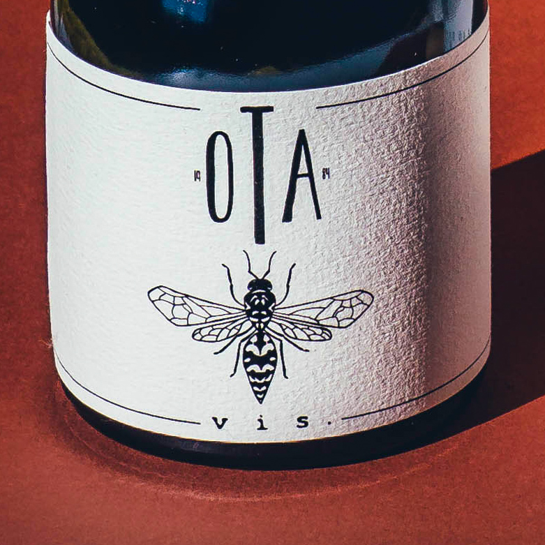
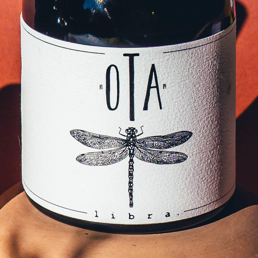
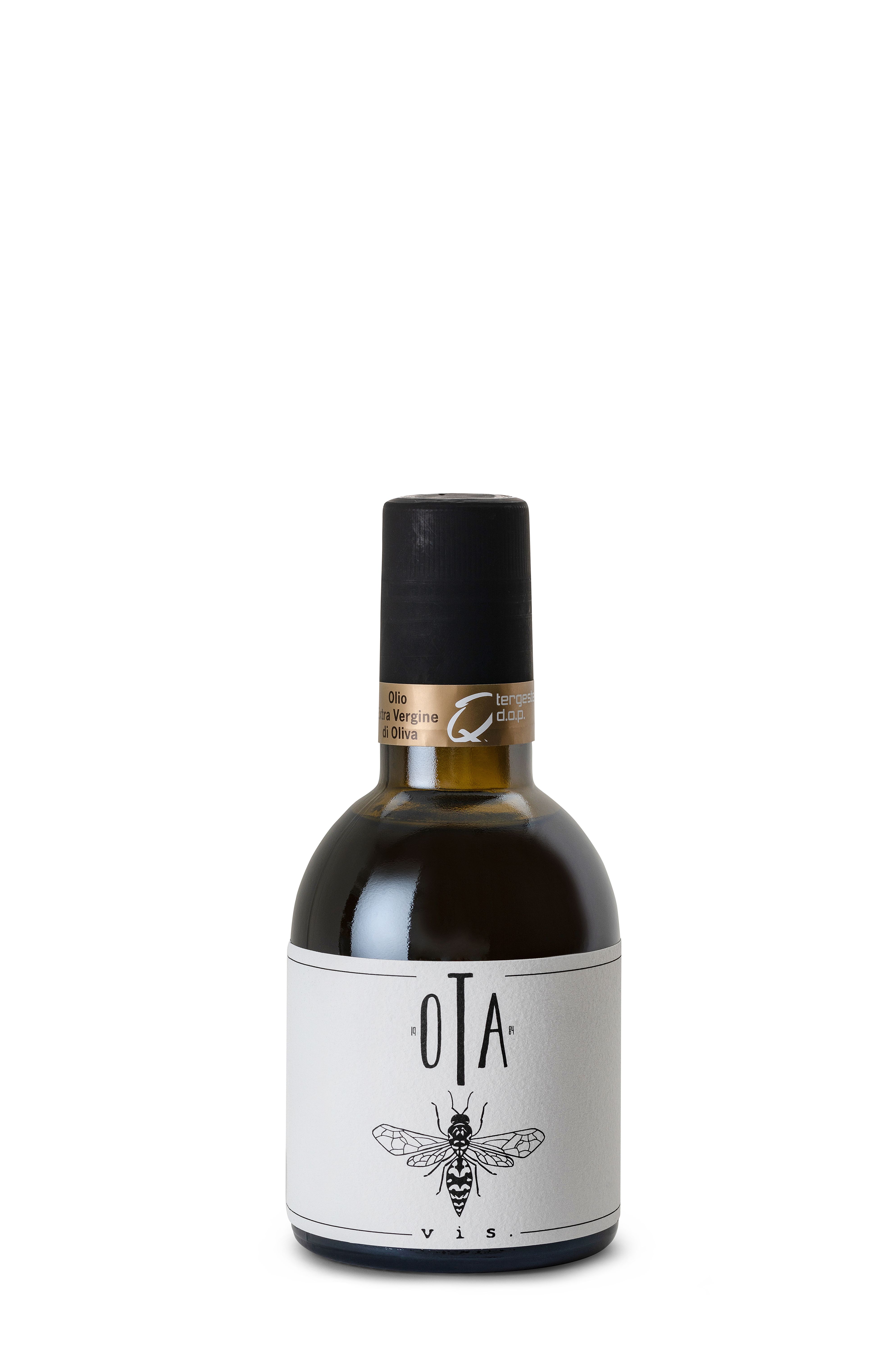
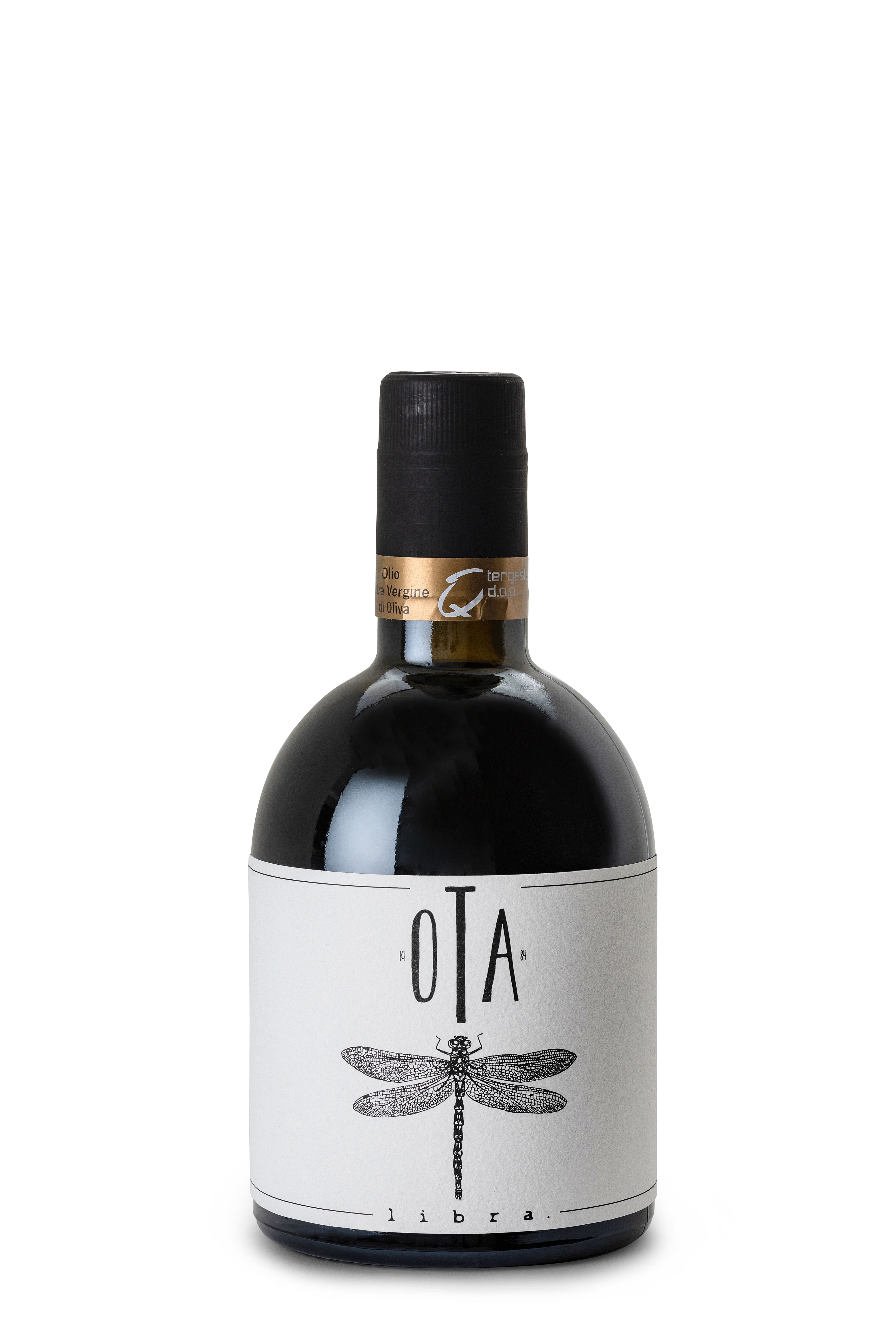
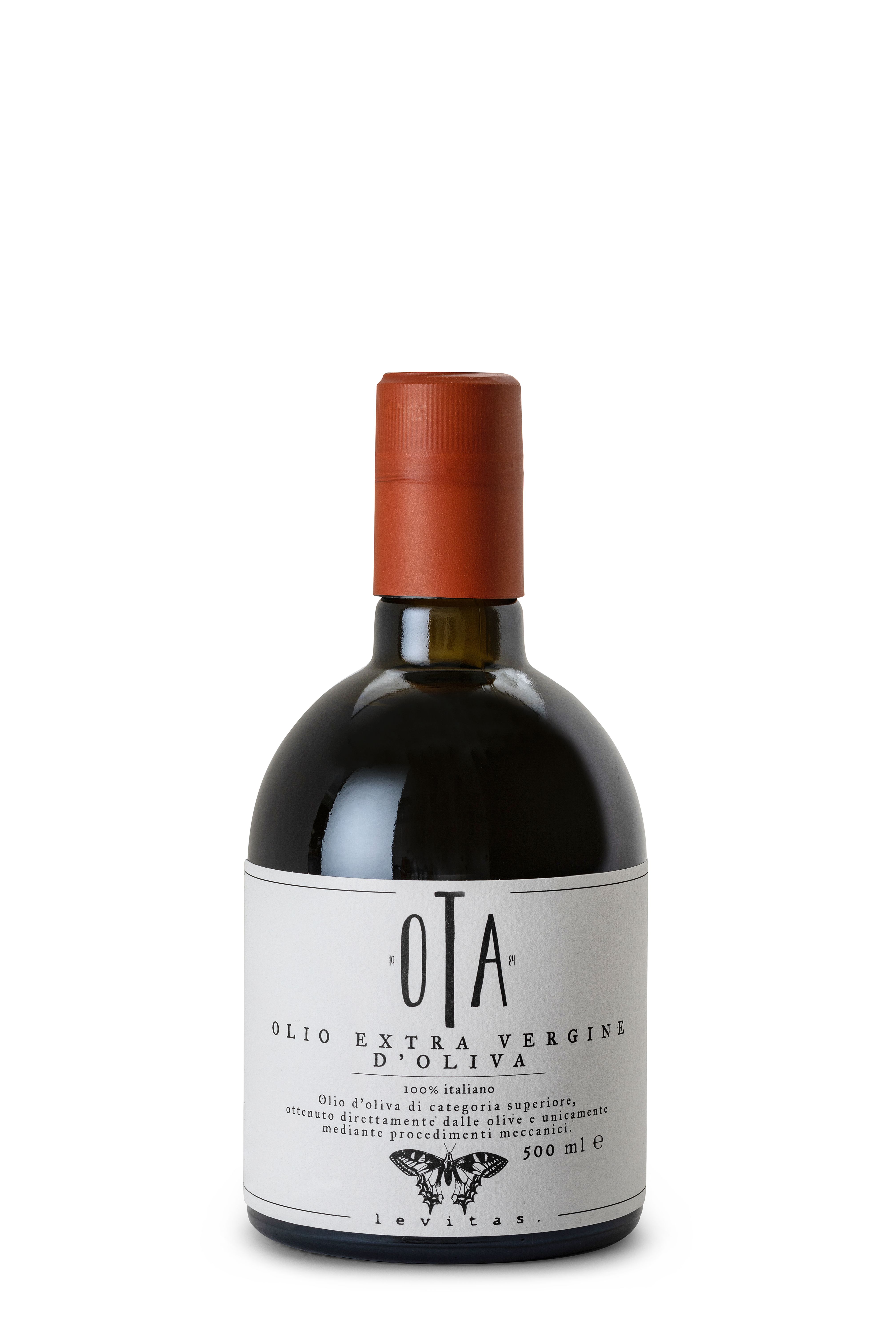
As for the choice of insects, our source of inspiration was the Val Rosandra nature reserve, close to our premises in Trieste, Italy. This area has one of Europe’s highest biodiversity levels. We wanted to celebrate this diversity through the choice of insects. Moreover, each insect portrays the character of each olive oil. The wasp, with its strong character, was chosen for the most intense olive oil, the dragonfly, symbol of equilibrium, was perfect for the most balanced oil and the butterfly matches the most delicate olive oil.
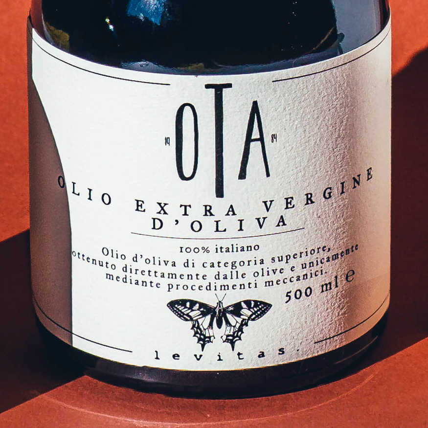
For our labels, we wanted thick and textured paper, so that it would remind of drawing paper sheets and would give an interesting feel when handling the bottle.
The insects are hand drawn. We chose to draw them as detailed as possible to give a feel of old naturalistic books. The same goes for the choice of fonts. Especially as regards the Levitas oil, for the choice and the placing of fonts we drew inspiration from old naturalistic book covers.
We also liked the symmetrical (jewel-like) shape of the insects, which has an interesting visual impact on a label, especially if all the elements are centred.
We mostly used black and white. The colour palette has been kept as simple as possible to give a clean image, since we are already playing with fonts and drawings. The only exception is the brick red Levitas top. With this choice, we wanted to mark a slight difference from the oils that have a Protected Designation of Origin certification (black top). We chose brick red for the Levitas top, because it has a lacquer wax effect that reminds of wax seals in old documents.
The date 1984 in the brand logo pays homage to the year in which the company was founded by our dad. In a way we wanted to keep a detail that would remind us of when and how it all started, even though the labels are now completely different than how they used to be.
The use of Latin names is linked to the presence of ancient Romans in our area. Indeed, local researchers found ancient documents form the Roman era describing olive oil production in our area. This fascinated us a lot, therefore we wanted to make a connection with this particular aspect.
Moreover, we wanted names that would be easy to pronounce and would convey a message. In our case, the names describe the intensity and taste of each olive oil (Vis as strength for the most intense olive oil, Libra as equilibrium for the balanced one, Levitas as lightness for the most delicate oil).
We find that the choice of the names and of one image for each type of olive oil helps the customers choose the right one for them, once we’ve explained the concept behind it. Also, it’s a great conversation starter when we approach new customers.
Products
Vis is Latin for strength. This olive oil, made of our most striking variety, Bianchera or Belica in the Slovene language, has an intense taste and a slightly pungent touch, perfect for enhancing stronger tastes. This native variety, appreciated since Ancient Roman times, owes its taste to our unique climate and soil. For the label, we chose a wasp to portray the oil’s strong character.
Libra is Latin for equilibrium. This olive oil is a perfect marriage between Bianchera’s strong character and Leccino’s gentle personality. For the label, we chose a dragonfly, the symbol of balance.
Levitas is Latin for lightness. This is our most gentle olive oil made with Leccino variety olives, perfect for enhancing delicate dishes. For the label, we chose a delicate butterfly.
CREDIT
- Agency/Creative: Ota Olive Oil
- Article Title: Product Naming and Packaging Design for Olive Oil Bottles
- Organisation/Entity: In-house, Published Commercial Design
- Project Type: Packaging
- Agency/Creative Country: Italy
- Market Region: Europe
- Project Deliverables: Graphic Design, Illustration, Packaging Design, Product Naming
- Format: Bottle
- Substrate: Glass Bottle


