Ruto design studio – Judy Pierre Cosmetics
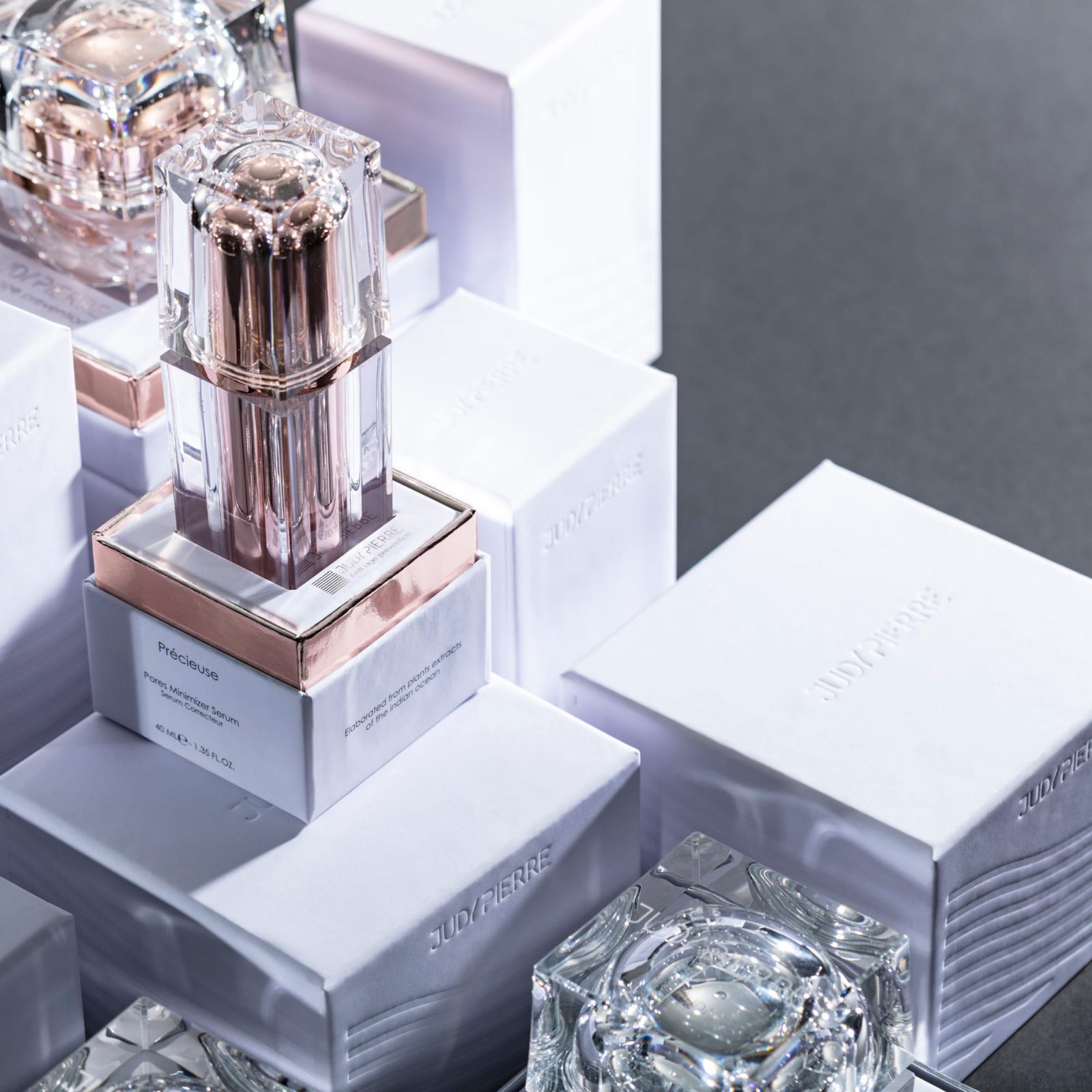
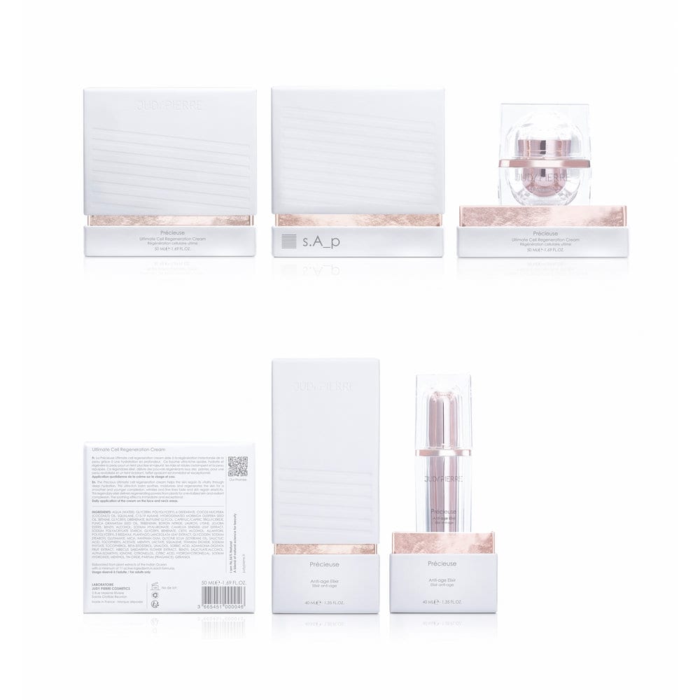
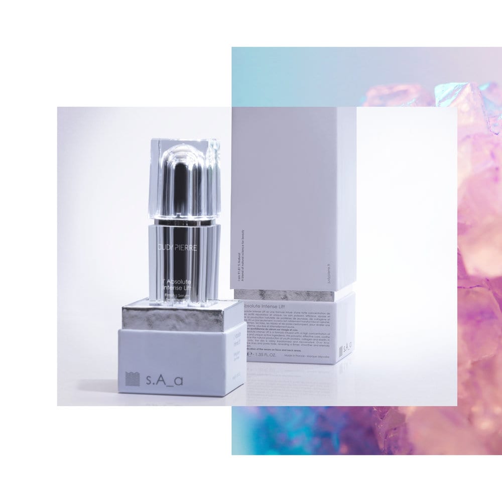
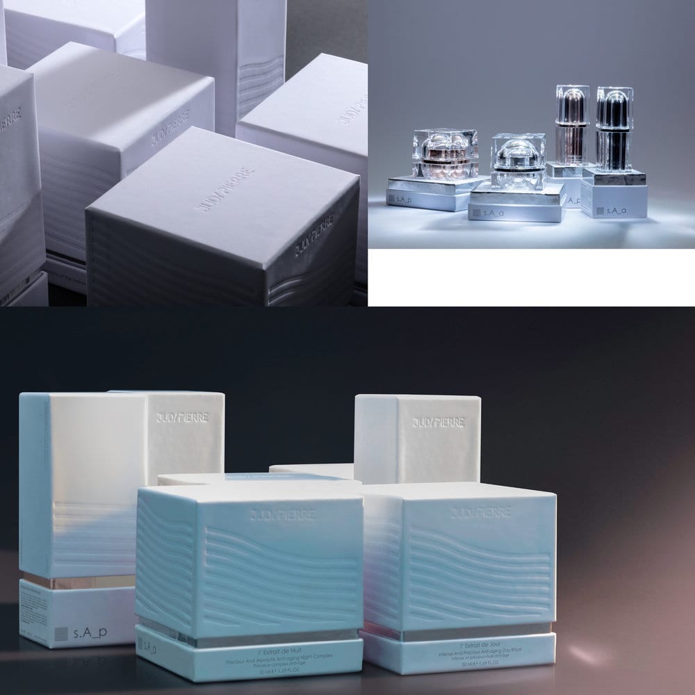
When we started working the identity of the products, we created a category separation system, always having in my mind that new products and categories will be added to the brand. Each category has its own symbol and colour.
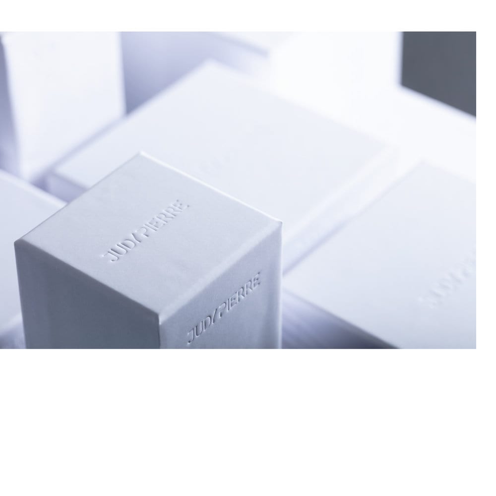
The containers we manage to get a highly reflective and refractive effect combined with beautiful colours, as a result we get a look like gem stones or diamonds as the light pass through. Working on the boxes we build a rigid “cell” for the “precious stones”. We wanted every woman holding the box in her hands to imagine her own skin and how the product will make it better. Something fresh and smooth, silky on touch and clean.



CREDIT
- Agency/Creative: Ruto design studio
- Article Title: Product Identity and Packaging Design for Luxury Cosmetics
- Organisation/Entity: Agency, Published Commercial Design
- Project Type: Packaging
- Agency/Creative Country: Greece
- Market Region: Multiple Regions
- Format: Bottle, Box, Jar
- Substrate: Plastic, Pulp Paper
FEEDBACK
Relevance: Solution/idea in relation to brand, product or service
Implementation: Attention, detailing and finishing of final solution
Presentation: Text, visualisation and quality of the presentation


