


Primeac is a consultancy specialized in the management of public resources, operating for over 15 years alongside small-town governments, primarily in the countryside of São Paulo. Throughout its history, it has built a strong reputation for turning plans into action — guiding municipalities in structuring, negotiating, and securing agreements and funding that make essential public works possible. Its mission is to transform ideas into concrete projects, delivering results that directly improve the daily lives of citizens and promote sustainable local development.
With a solid and conservative positioning, Primeac needed a visual identity that reflected the weight of its trajectory — one capable of conveying trust, professionalism, and institutional strength, while also standing out for its timelessness. The identity project was guided by principles of clarity and simplicity, avoiding unnecessary ornamentation and focusing on elements that communicate precision and authority.
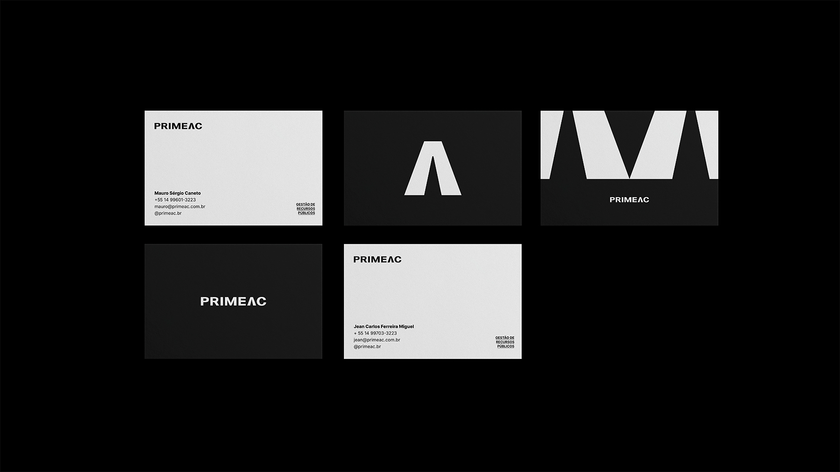
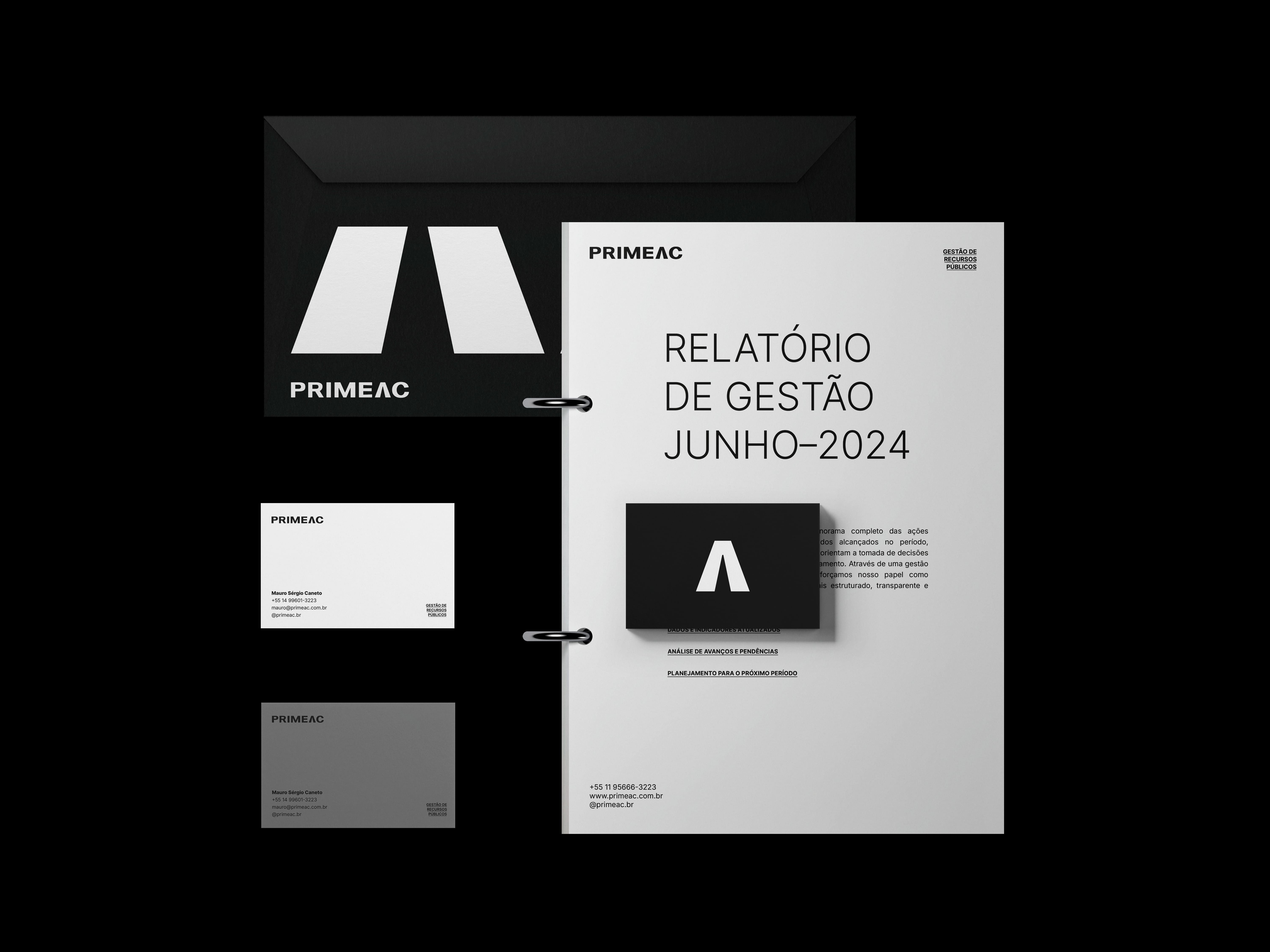
We developed a functional graphic system centered around a robust logotype and a distinctive symbol representing the “path to the future” of municipalities — a metaphor for guidance, progress, and forward-looking solutions. The aesthetic is minimalist, formal, and carefully balanced, projecting reliability without excess and ensuring adaptability across all applications, from formal documents to digital platforms.
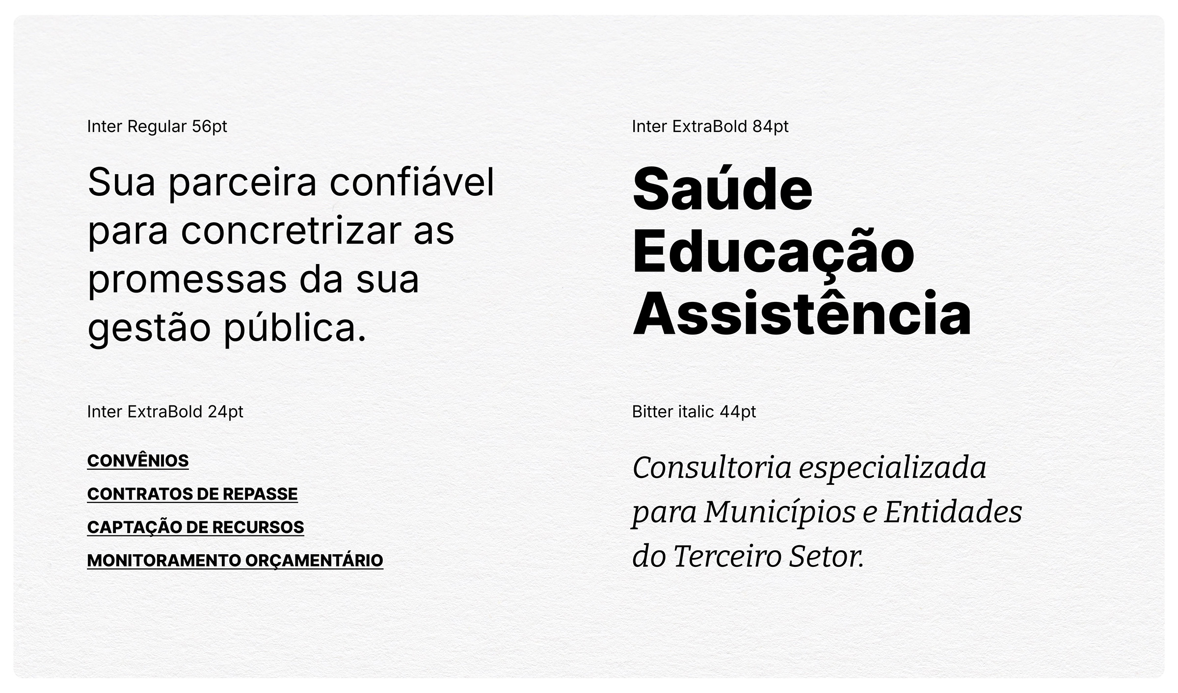
The absence of color in the identity was a deliberate and strategic decision, designed to reinforce sobriety and transparency — qualities that are non-negotiable in a sector where responsibility and seriousness must be evident at all times. Complementing this, the chosen typography — the freely available Inter and Bitter fonts — creates a visual hierarchy that blends modernity with tradition, giving technical content a voice marked by clarity, authority, and confidence. This combination results in a visual language that strengthens Primeac’s institutional presence and supports its role as a trusted partner in shaping the future of municipalities.


CREDIT
- Agency/Creative: Kaminski Studio
- Article Title: Primeac Visual Identity for a Consultancy by Rodrigo Kaminski
- Organisation/Entity: Freelance
- Project Type: Identity
- Project Status: Published
- Agency/Creative Country: Brazil
- Agency/Creative City: Gravataí
- Market Region: South America
- Project Deliverables: Brand Design, Brand Guidelines, Brand Identity, Branding
- Industry: Professional Services
- Keywords: branding, consultancy, consultoria, gestão pública, government, identidade visual, minimalist, monochrome, municipality, public management, visual identity
-
Credits:
Strategic Designer: Rodrigo Kaminski


