


About the project
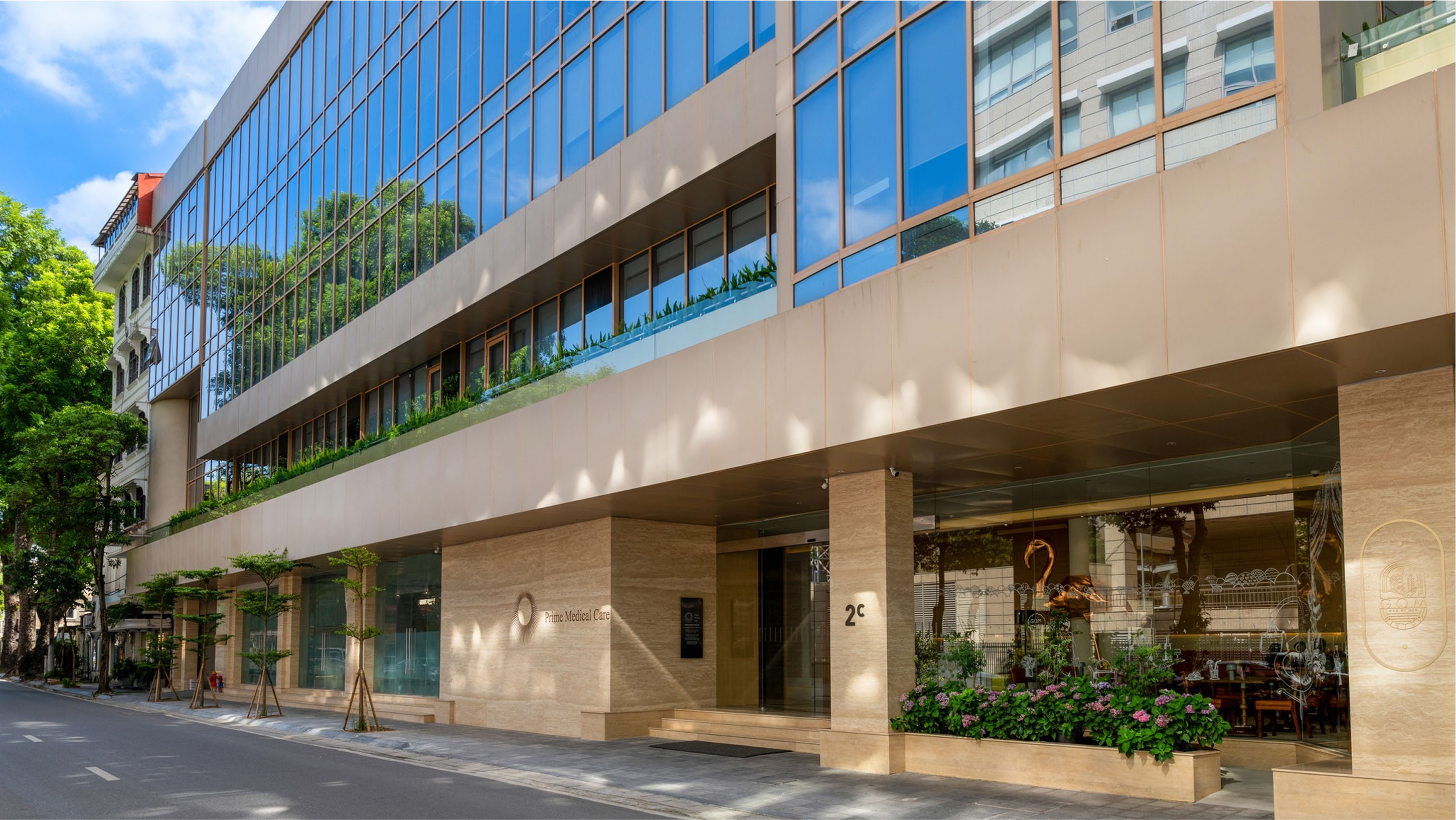
Prime medical care is a pioneering medical center in vietnam, operating under an exclusive membership-based health management club model. Here, members are guided through a lifelong, personalized, and comprehensive healthcare journey – with programs tailored to their individual health conditions, needs, and every stage of life.
More than just treatment, prime medical care offers a high-end medical ecosystem where each member gains access to international-standard healthcare services – from prevention and monitoring to intervention and recovery – all under the dedicated care of leading medical experts.
Our design strategy
Healthcare as a lifelong, premium relationship
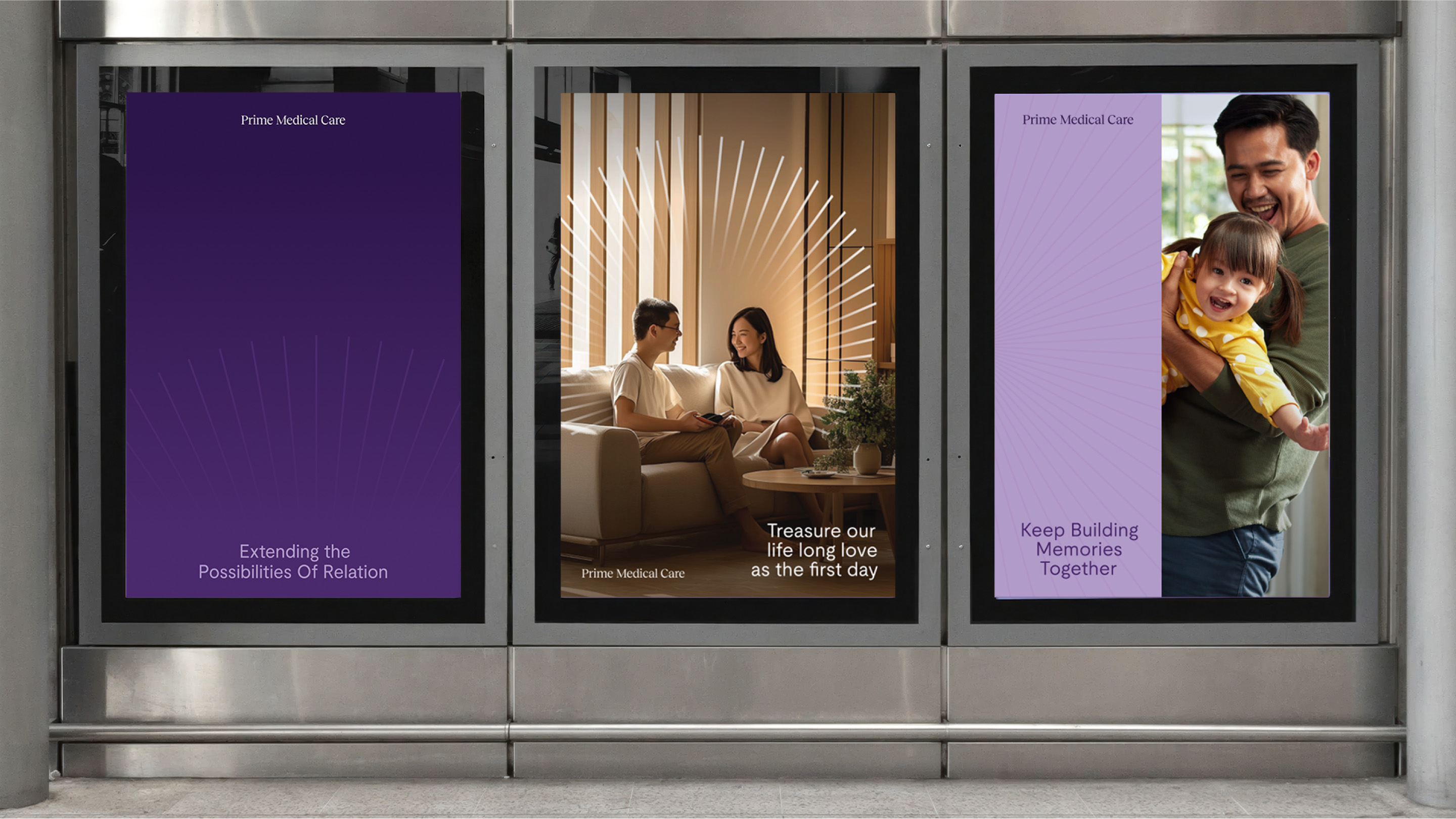
Prime medical care is not merely a medical center. It is positioned as a lifelong wellness companion, where members are not only cared for medically but are also emotionally connected through every phase of life. The design strategy focuses on emotional branding, crafting a visual experience that conveys trust, warmth, and structured expertise.
Brand archetype orientation
Archetype focus:
Prime medical care’s brand personality initially leans strongly toward the intellectual (semi-sage) archetype-projecting expertise, wisdom, and evidence-based care. This foundation is complemented by attributes of the caregiver (empathy, dedication) and the magician (transformation, healing potential).
Future shift:
As the brand evolves, there is a clear intention to elevate the caregiver’s role, strengthening emotional resonance and warmth throughout the experience. Simultaneously, the brand is set to embrace the magician’s archetype more fully unlocking innovation, transformation, and a sense of personal health empowerment for each member.
Core visual concept
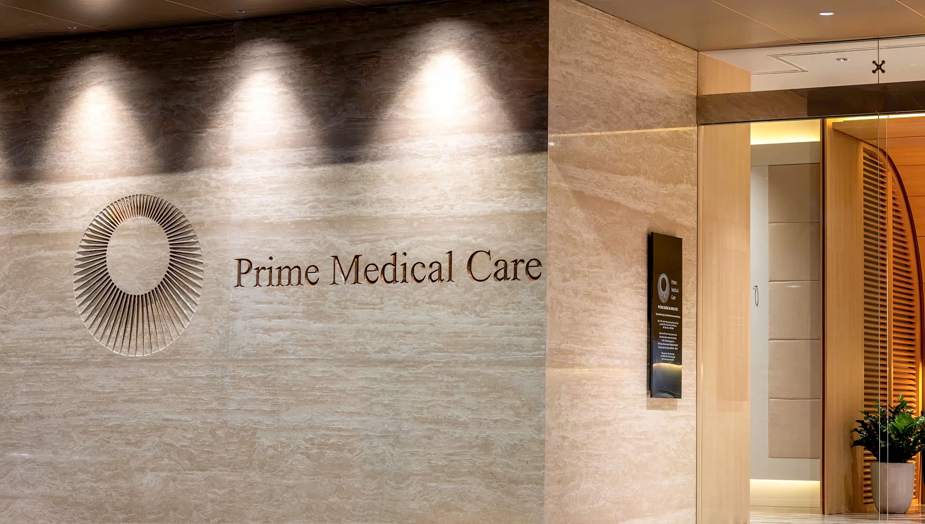
The radiant core
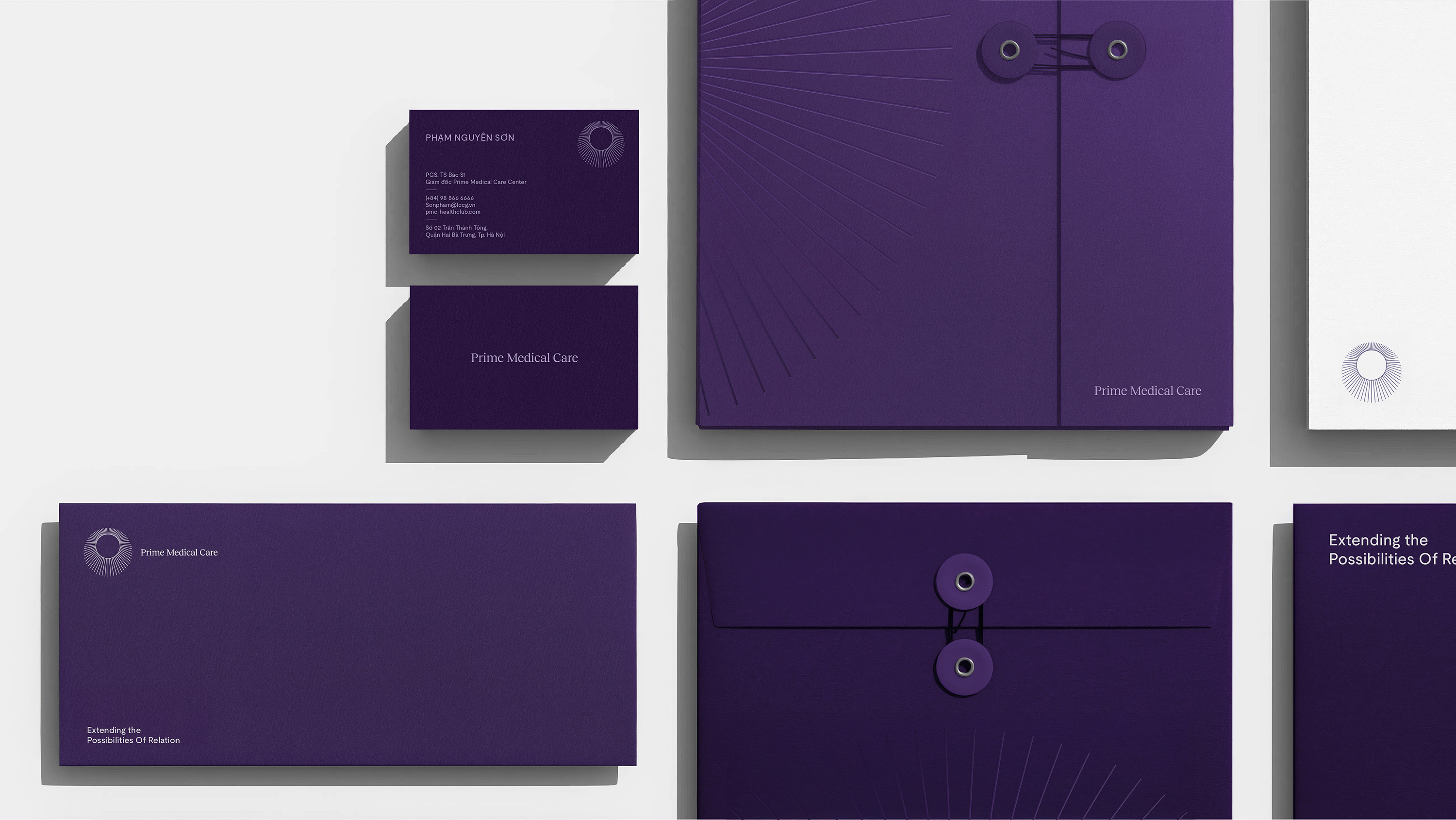
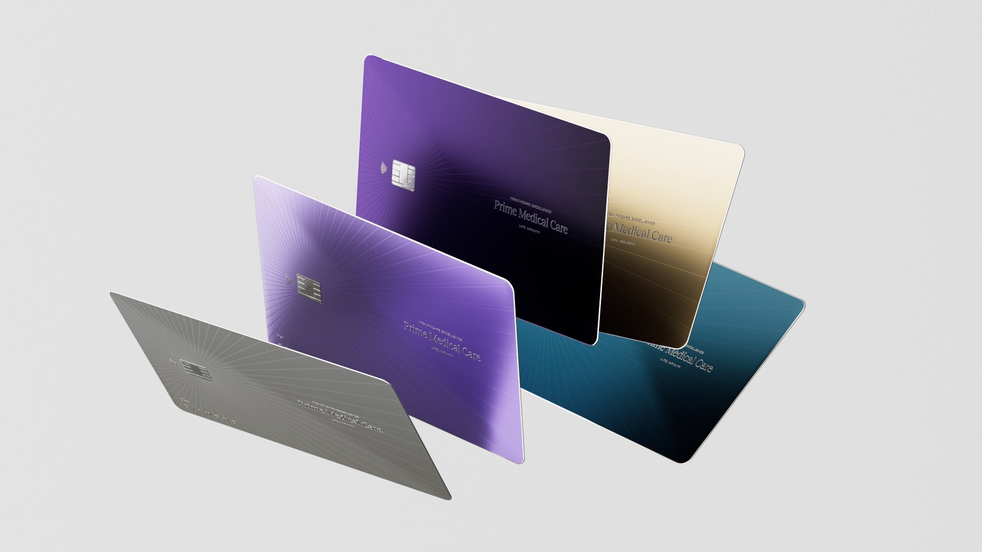
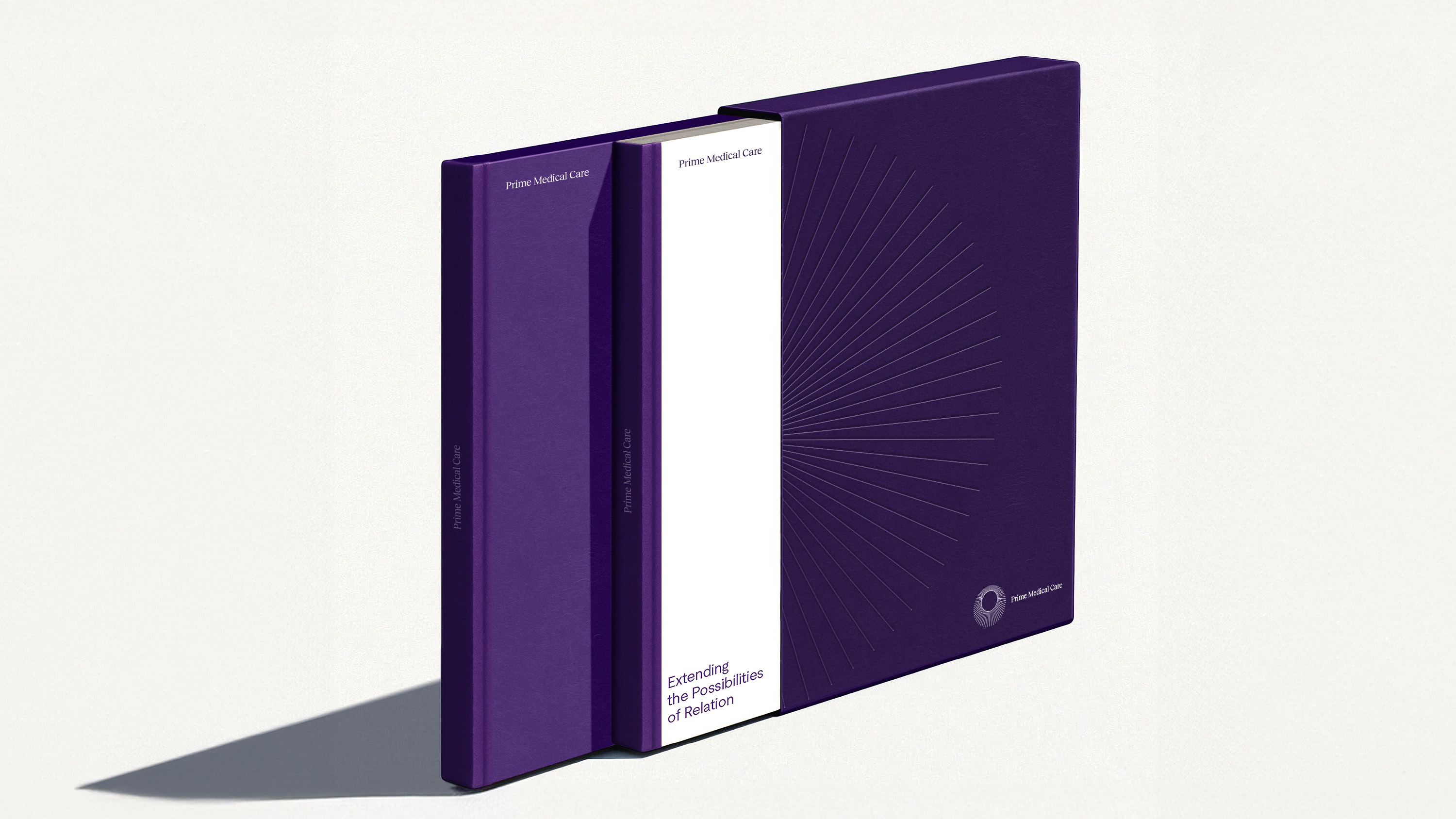
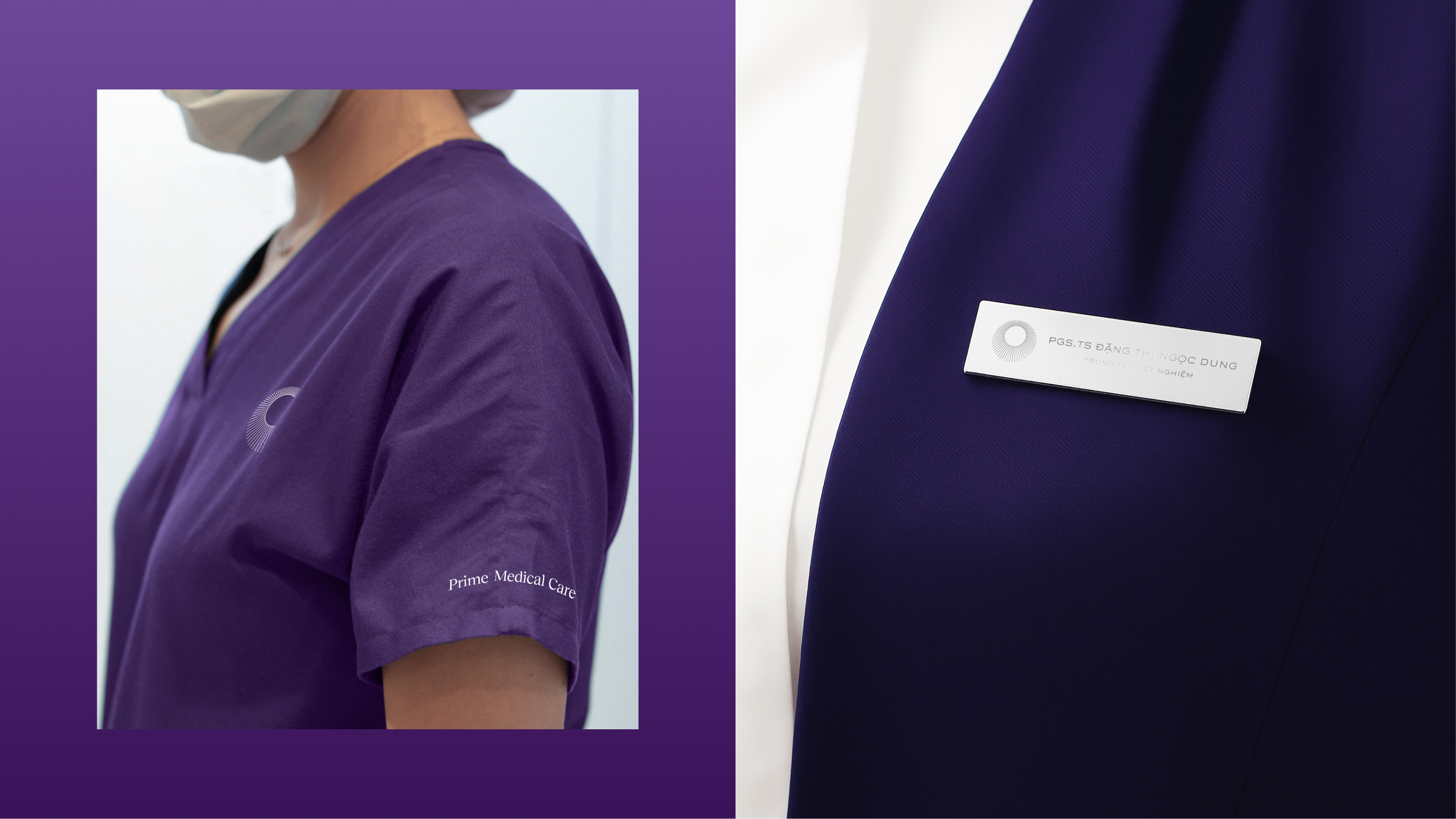
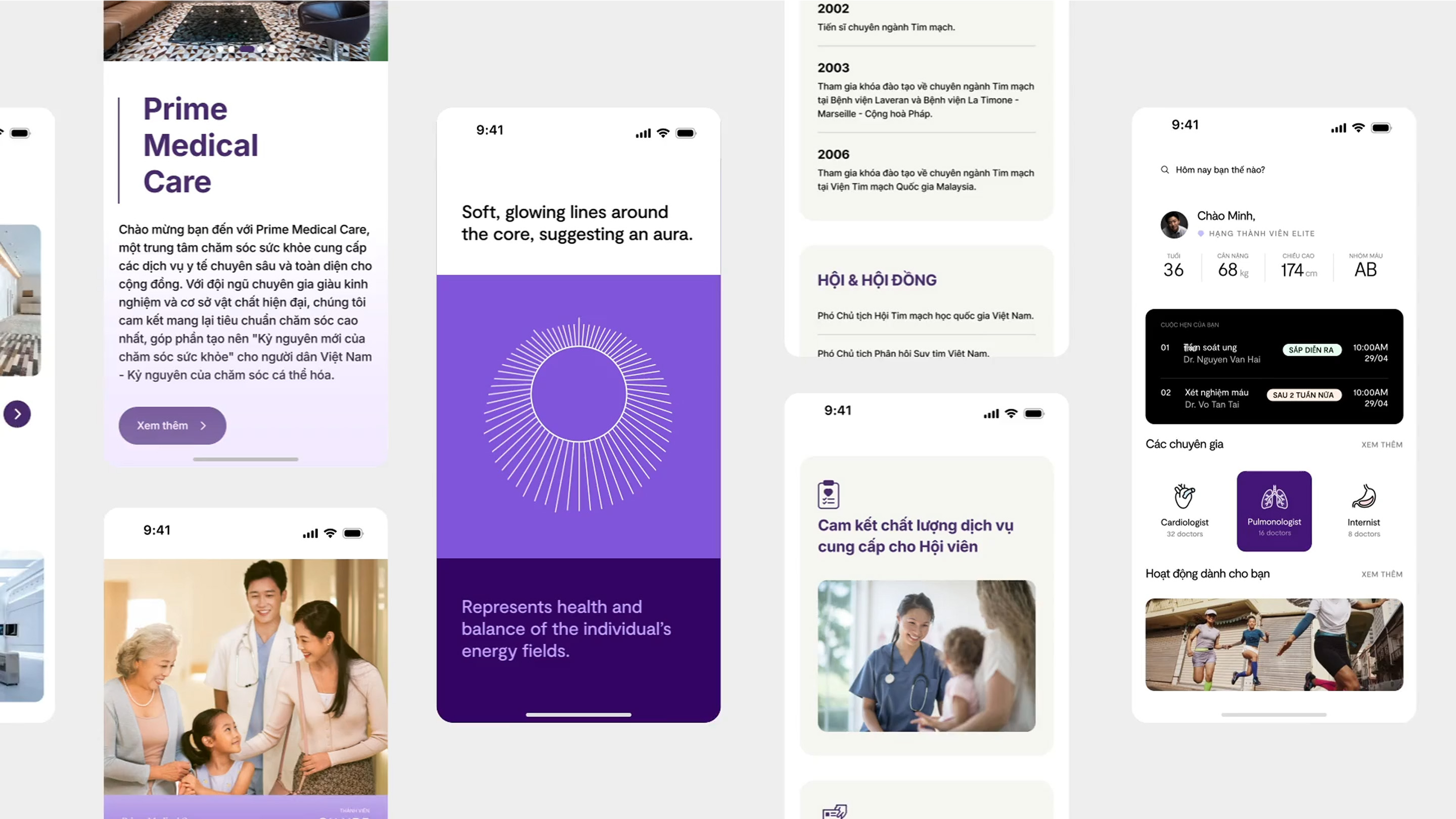
At the heart of prime medical care’s visual system lies the radiant aura symbol-a mark of vitality, balance, and optimal human energy. This symbol transcends logo use and becomes the central visual language, appearing consistently across signage, membership materials, folders, and communication assets.
This visual “burst” reflects pmc’s core philosophy:
“health is a flow of energy – connected, balanced, and nurtured over time.”
Visual identity system
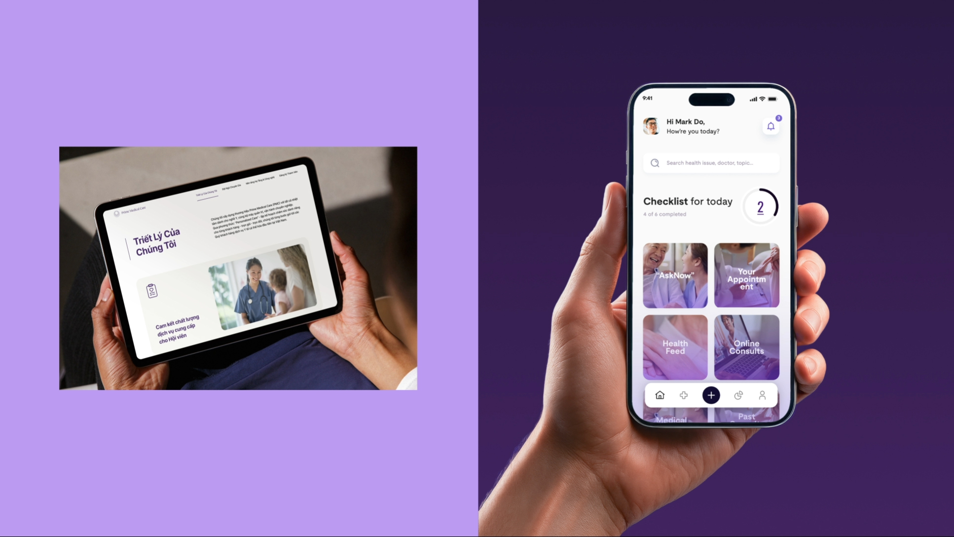
The visual identity system of prime medical care is purposefully designed to translate emotion into structure-crafting a seamless brand experience that feels personal, inspires trust, and communicates clinical excellence. At its core, the system is a manifestation of emotional branding, where every visual element exists not only to inform, but to reassure, comfort, and elevate.
CREDIT
- Agency/Creative: Line Collective
- Article Title: Prime Medical Care: Healthcare as a Lifelong, Premium Relationship
- Organisation/Entity: Agency
- Project Type: Identity
- Project Status: Published
- Agency/Creative Country: Vietnam
- Agency/Creative City: Ho Chi Minh City
- Market Region: Asia
- Project Deliverables: 2D Design, App Design, Brand Identity, Web Design
- Industry: Health Care
- Keywords: Health care, medical experts, premium service, medical branding, emotional branding
-
Credits:
Brand Strategy & Positioning By: C+P Consulting Asia & Dentsu Redder
Creative Director: Mark Do, Benny Ho
Design Team: Trg H Thien, Tam Thanh, Nhan Nhan, Pi Do, Duy Long
Showcase Designer: Si Tran, Xuan Ngoc, Alx Nguyen, Tham Nguyen
Motion Team: Phong Luong, Mai Chi Hien, Khang Van Nguyen, Sang Trinh
UX/UI Team: Mark Do Khanh Nimal


