


Our client is Tiffany Brown, 26 years of age, a self-made entrepreneur. She sells handcrafted decors out of recycled materials online and has her own YouTube channel where she teaches DIY projects. Tiffany is a very cheerful person who loves the outdoors. She takes an active role in practicing and promoting sustainable living. She is a health enthusiast and is committed to becoming the best version of herself.
Tiffany is very vulnerable to heartaches. You can say that she is used to having emotional roller coasters, and to overcome all that, she has developed a sweet tooth.
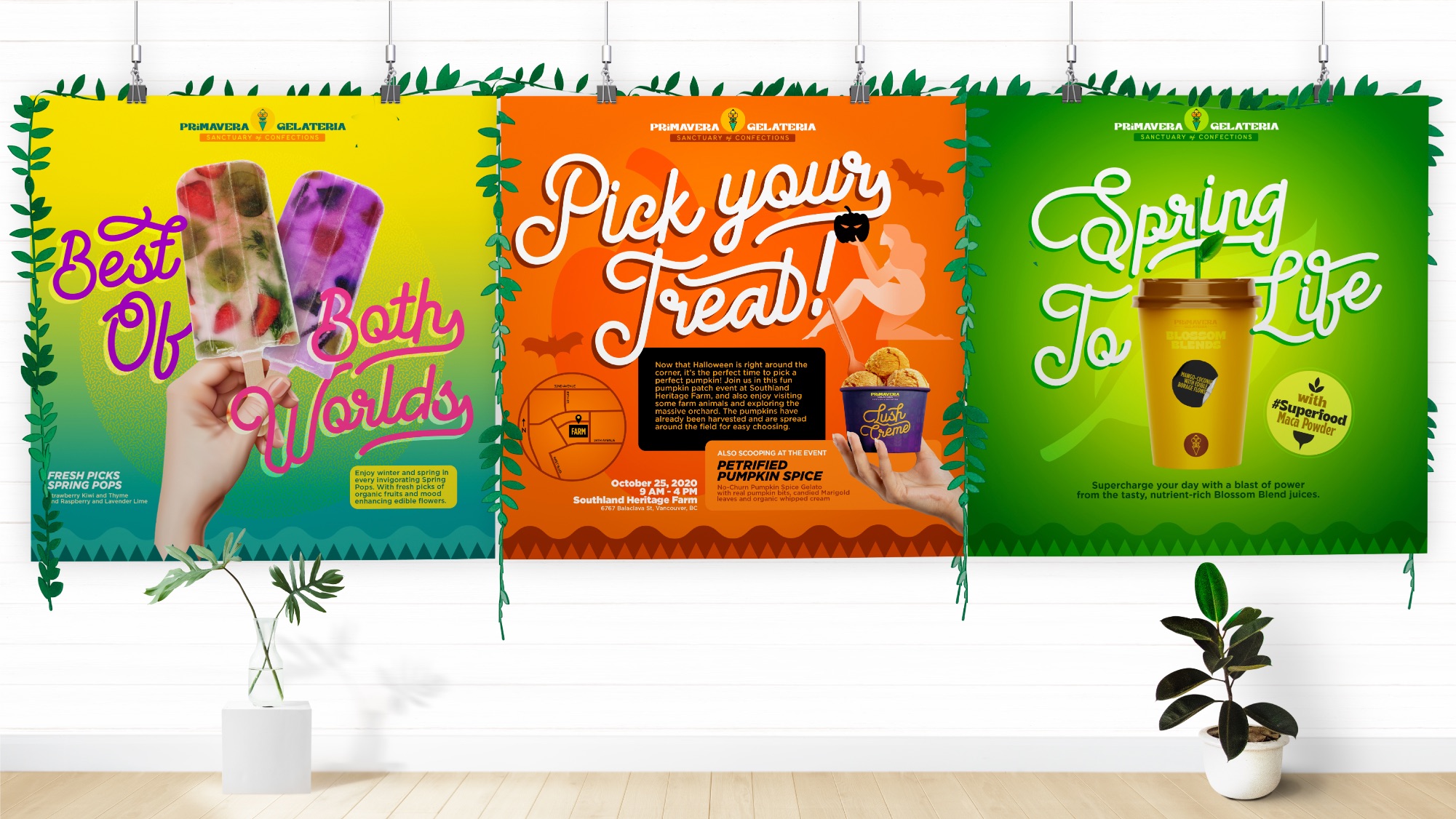
Primavera is a plant-based gelateria that caters to young professionals like Tiffany, who have devoted themselves to overall health and wellness. Despite the struggle and a few lapses on their path to turning vegan, they strive to find ways to nurture their selves without depriving their cravings.
Who does not love ice cream? Ice cream is one of our top guilty food pleasures, and it is sacred and simply irreplaceable. Ice cream and flowers are the unlikely tandem. Most people are still skeptical about adding flowers to their diet. The key challenge for this design project is how to make plant-based gelateria look as enticing as the classic ice cream we have grown to love as kids. The goal is to make consumers take the leap and indulge with Primavera handcrafted organic gelato to satisfy their cravings.
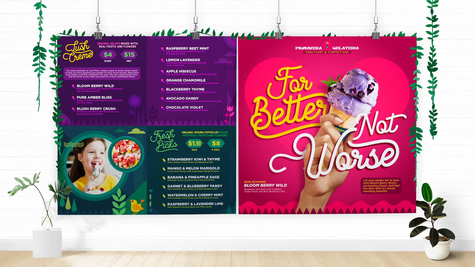
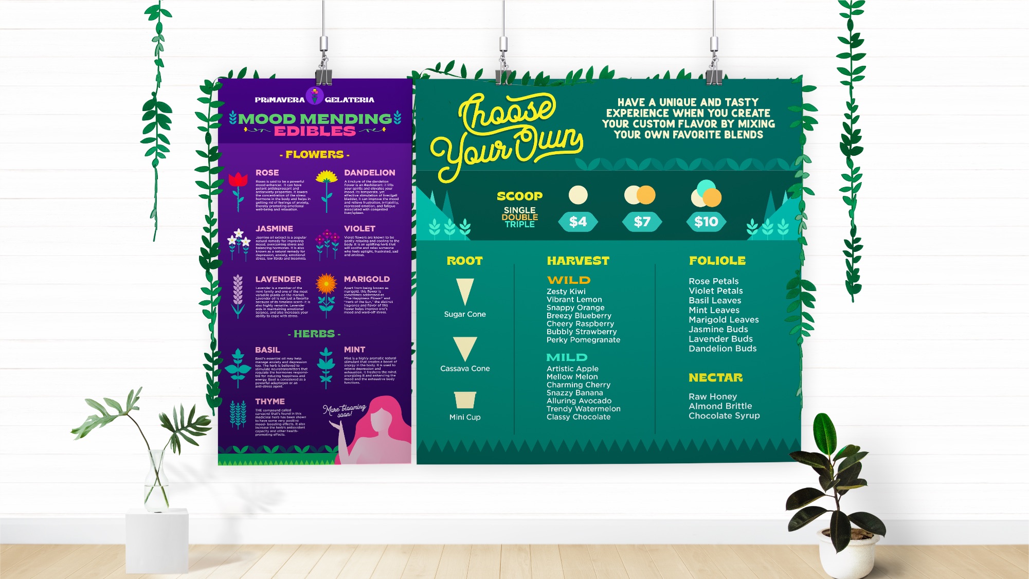
They say ice cream heals heartaches. Violets, rose petals and other edible flowers, Primavera’s key ingredient, literally alleviate pain and lessen the risk of heart ailments. Primavera Gelateria provides high potential health benefits with the same comfort minus the guilt. With informative packaging, it features its key ingredient’s mood-altering properties and overall health benefits. Primavera’s pursue is to provide an ideal place of recovery and escape from everyday emotional, social, and physical stress.
The brand concept is based upon Persephone, the Greek goddess of Spring and growth, who, at the same time, is the goddess queen of the underworld.
According to the story, Persephone spends half of the year in the underworld and the other half with the gods back atop. Her absence above brings forth winter, and when she comes back, vegetation flourishes, which implies the start of Spring. Her distinct characteristics as a goddess represent the frozen delights, and baked delicacies served in the gelateria.
Spring symbolizes newness that embodies Primavera’s objective of introducing a good kind of change that will stir you into a sweet and yet rewarding sustainable way of living.
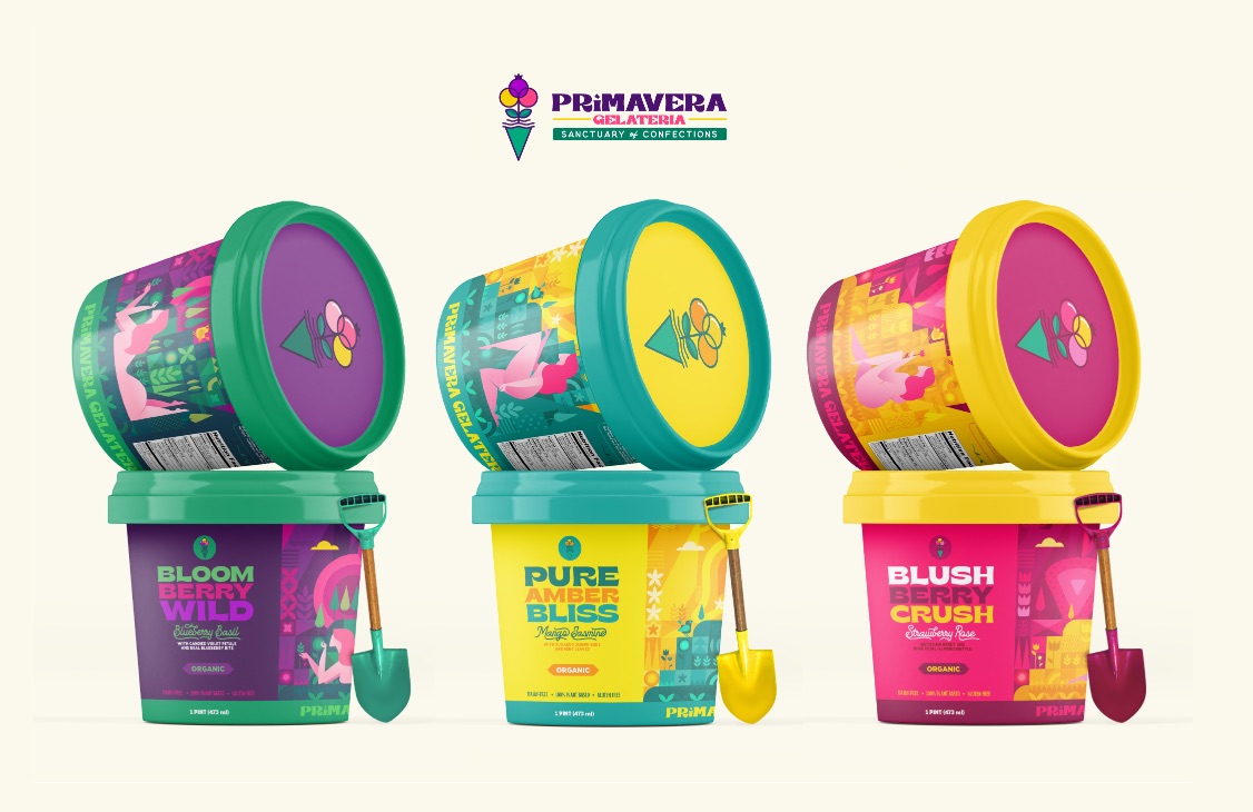
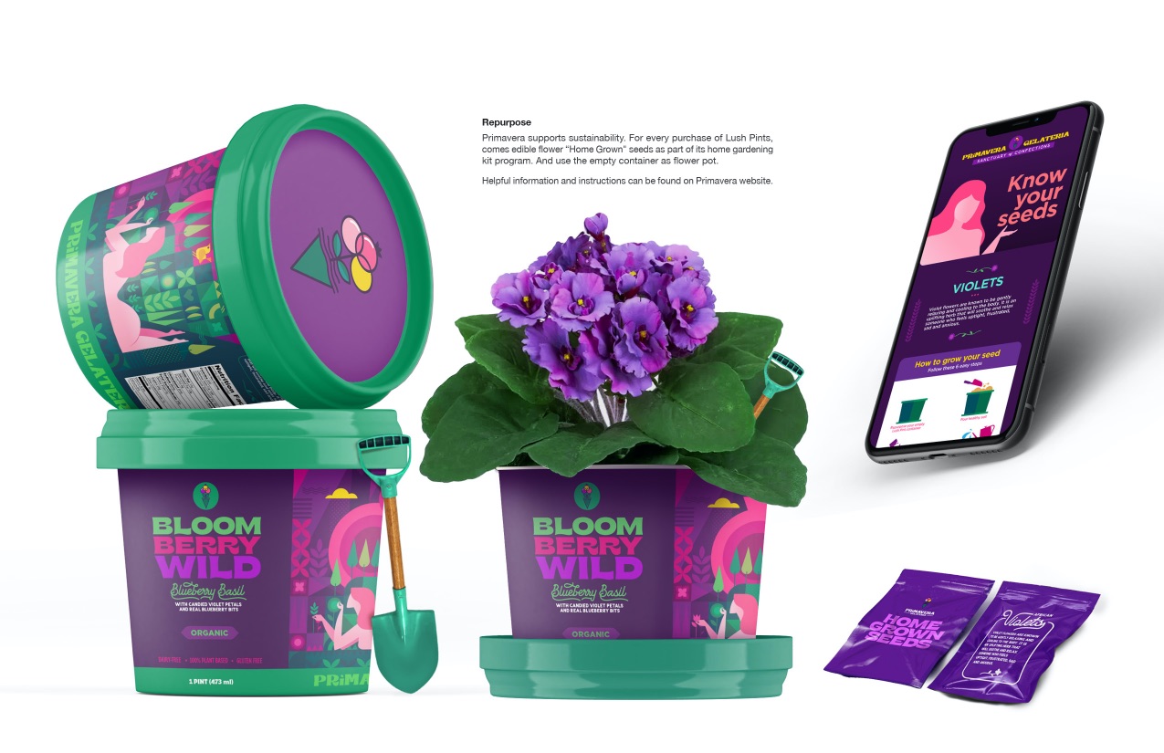
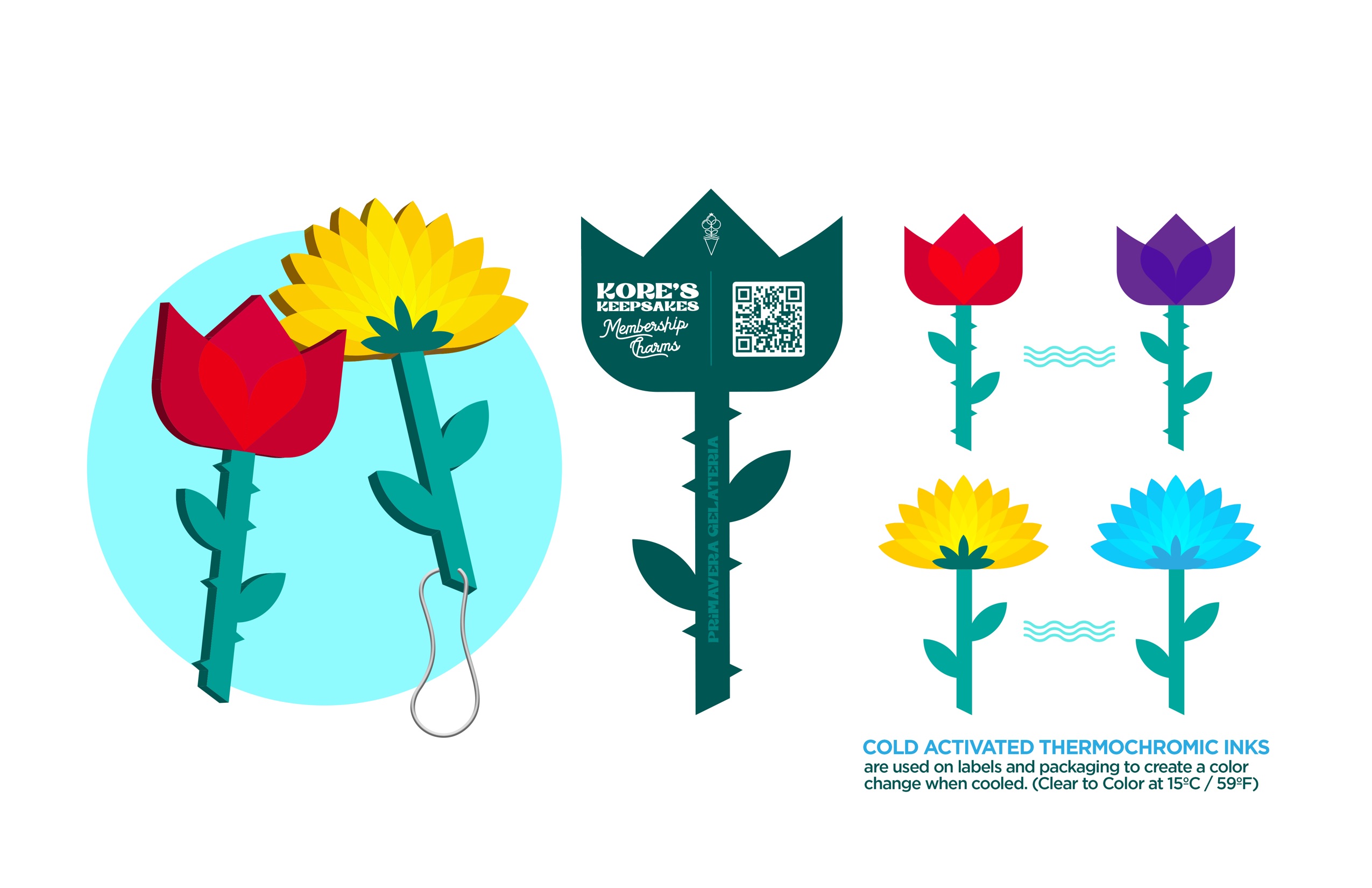
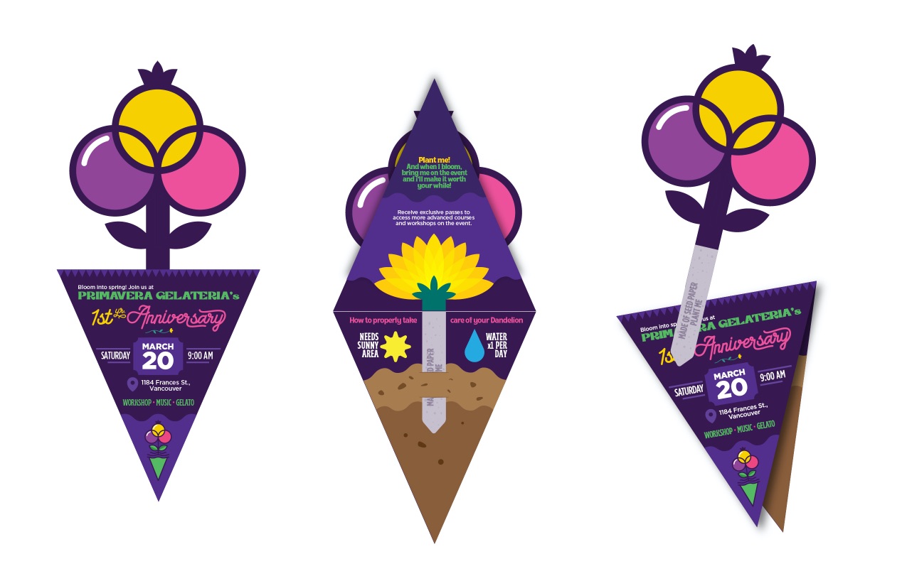
In line with Primavera’s campaign for wellness, Lush pints packaging is designed to be repurposed as a home gardening starter kit. For every purchase, there are edible flower “Home Grow” seeds that come with it. Not only that it promotes sustainability, but planting is also calming and therapeutic. Gardening can help relieve stress, overcome health conditions and improve mood.
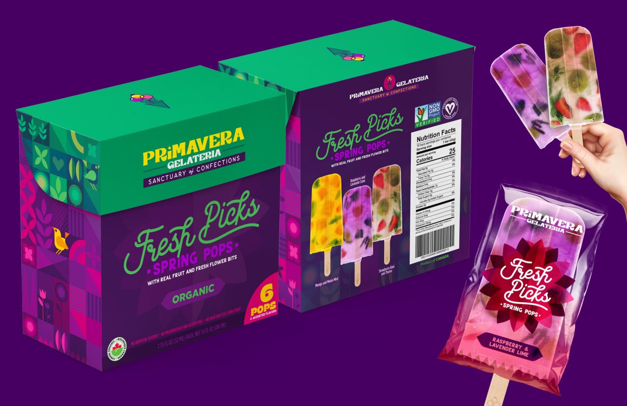
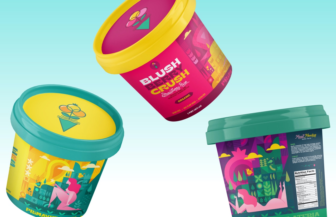
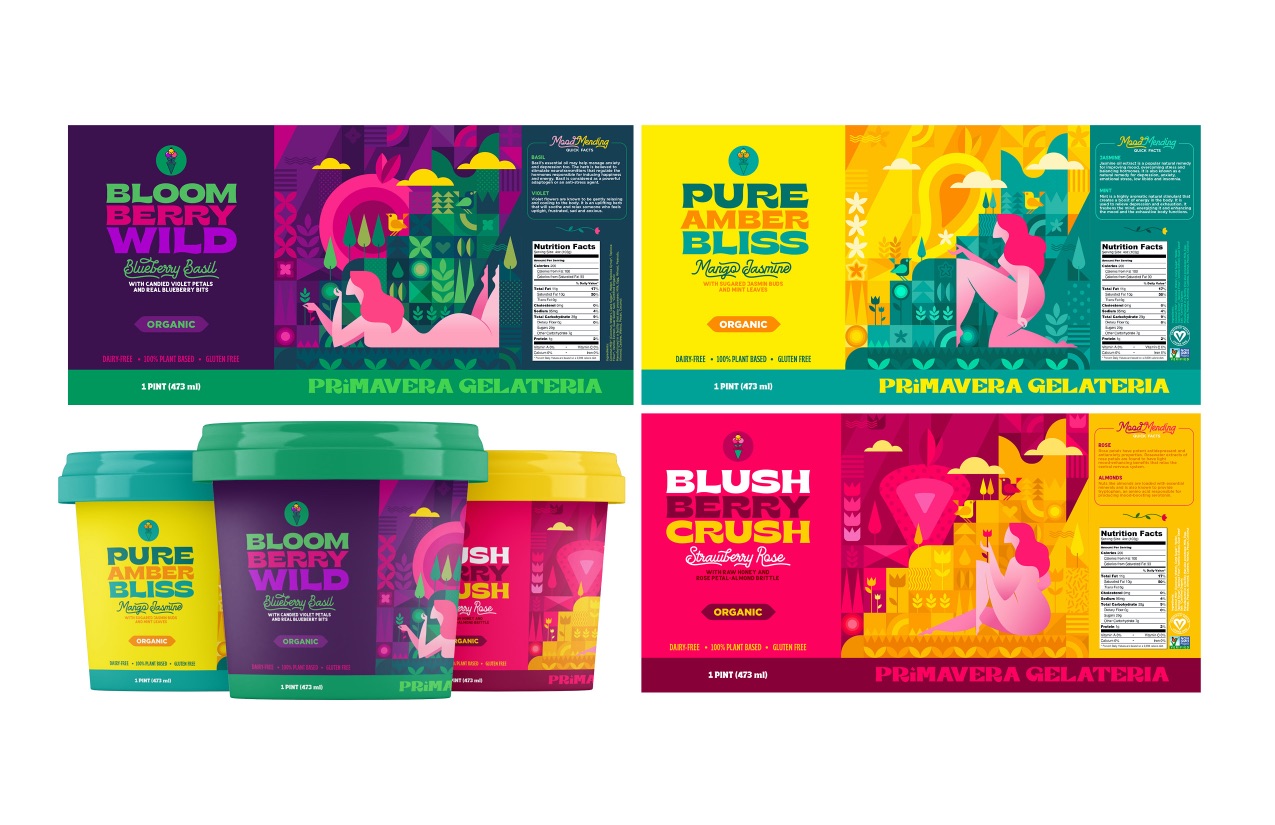
Wordplay on conceptual names for each variant solidifies the essence of the brand and reflects the fun vibe premise.
Smart use of dynamic colours is Primavera’s primary key design solution. Beautiful spring colours not only portray the brand concept but also reflect the promise of a healthier way of living full of vim and vigor.
The design direction drew inspiration from the flowerpot idea mixed with the beauty of geometric pattern design using an assemblage of basic shapes that creates a balance of colours and figures. Vibrant colours are used to match the tasty exotic new flavours derived from plants and flowers. The angular uniformity of geometric shapes and the harmony of exquisitely contrasting colours embody the unique food experience that provides sustenance brings happiness and tranquillity.
Through the use of bright chromatic colours, the design aims to communicate the brand’s fresh concept and capture attention and show shelf presence effectively.
CREDIT
- Agency/Creative: Mark Calulo
- Article Title: Primavera Gelateria – Sanctuary of Confections Brand Design Concept
- Organisation/Entity: Student
- Project Type: Identity
- Project Status: Non Published
- Agency/Creative Country: Canada
- Agency/Creative City: Surrey
- Market Region: North America
- Project Deliverables: Brand Creation, Graphic Design, Packaging Design
- Industry: Food/Beverage
- Keywords: WBDS Awards, Student
-
Credits:
Educational Institution: LaSalle College Vancouver
Educator's Name: Anne Ahmad


