


Context: After more than 20 years of existence, the independent real estate development company Priams had reached a turning point. Founded in Annecy, the company had started growing nationally with offices in Lyon, Marseille, and soon Paris. This fundamental shift led Priams and its sister companies to reconsider their branding. Hymn was called in to accompany Priams in this transformation and help redefine the company’s core values, particularly in regard to sustainability. For this modern-day real estate developer, the concept of sustainability was two-fold: it needed to be reflected on an environmental level but it also needed to embody the longevity and high quality of the company’s constructions.
Challenge: We embraced the challenge of creating a strong new brand identity for Priams. Competitive benchmarking needed to be carried out and the property developer’s graphic design needed a future-forward approach that worked on a national scale. This new visual universe needed to be organically built around the essence of the company, which needed to be minutely redefined. Another specificity of this project included revisiting the company’s sister brands, which had sprung up and multiplied in a swirl of inconsistent visual identities and logos. We were further challenged to integrate Priams’ core values of sustainability and family inheritance, which often includes properties that are handed down from one generation to another.
Solution: Using Hymn’s trusted formula, and in close collaboration with Priams, we developed a new brand architecture for the company that is designed to grow hand in hand with the company itself. This included an updated brand manifesto and an all-encompassing new visual identity, which helped the real estate developer shift its focus to national growth and sustainability company wide.
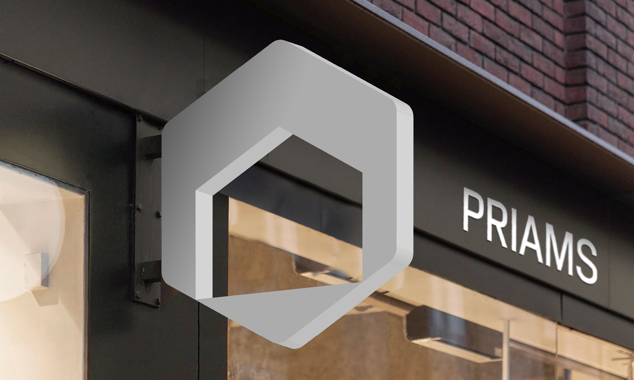
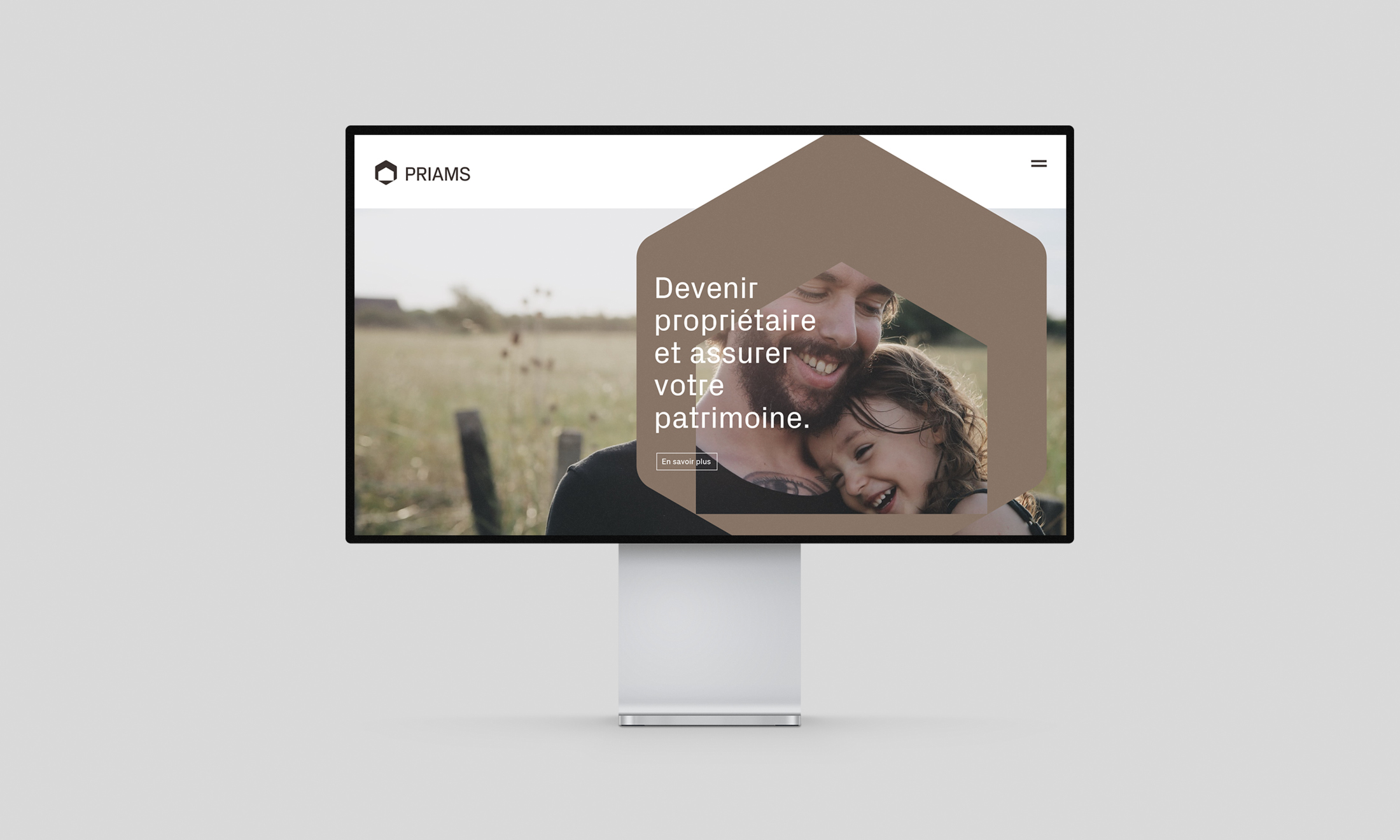
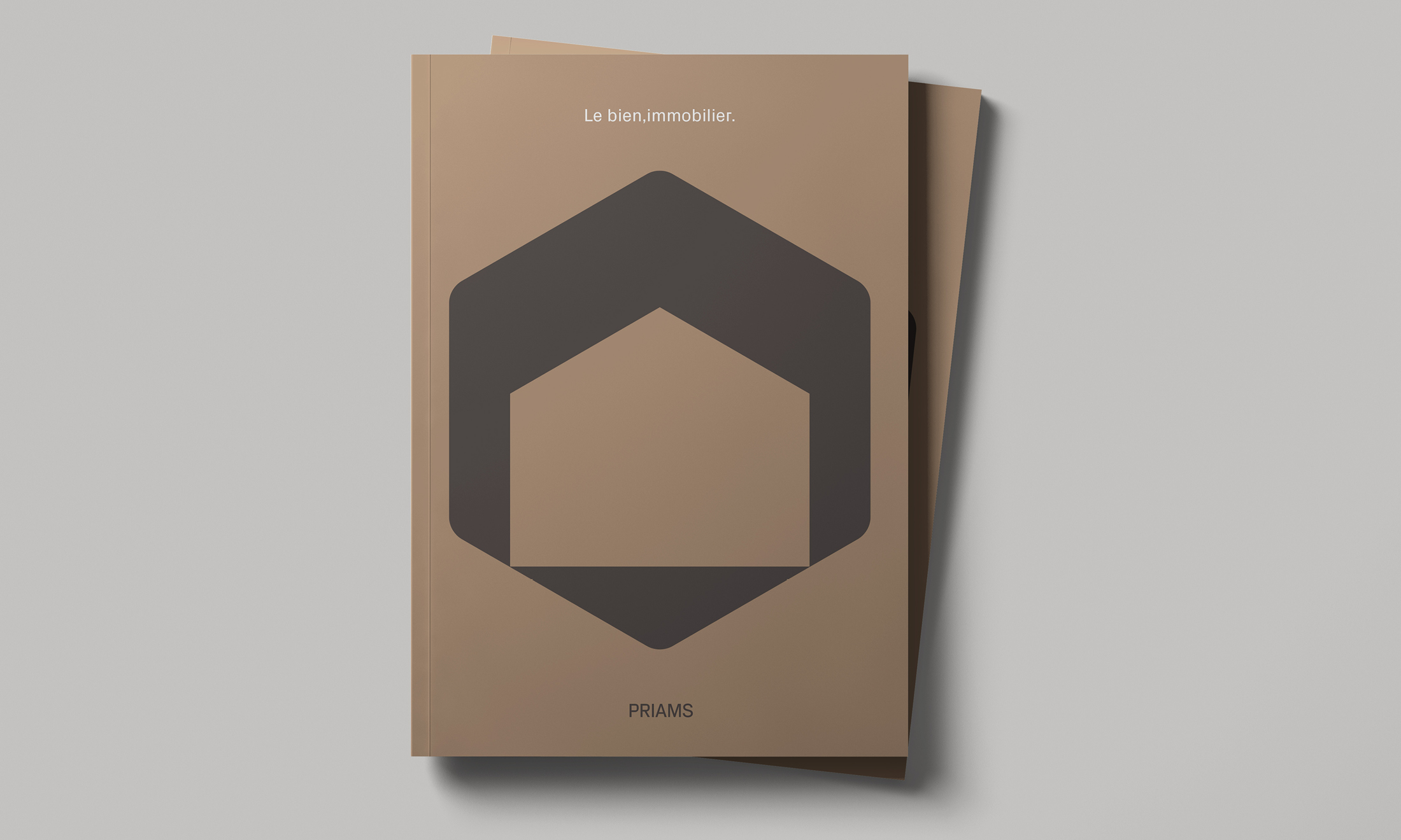
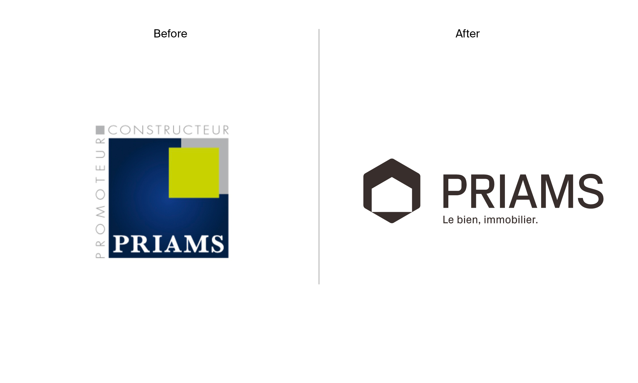
Strong and recognisable, the logo created by Hymn blends a hexagon, which embodies perfection, the spirit of work (like the cell of a beehive), and the concept of France itself, with the silhouette of a house, which represents not only Priams’ constructions, but also the concepts of family, security, and inheritance. The contrast found in the logo’s rounded and angular edges is also reflected in the selected typeface, while the colour palette was inspired by some of nature’s everlasting colours as an expression of sustainability. The powerful logo and harmonized colour palette created a set of visual guidelines for unifying the parent company with its sister brands, products, and service offerings.
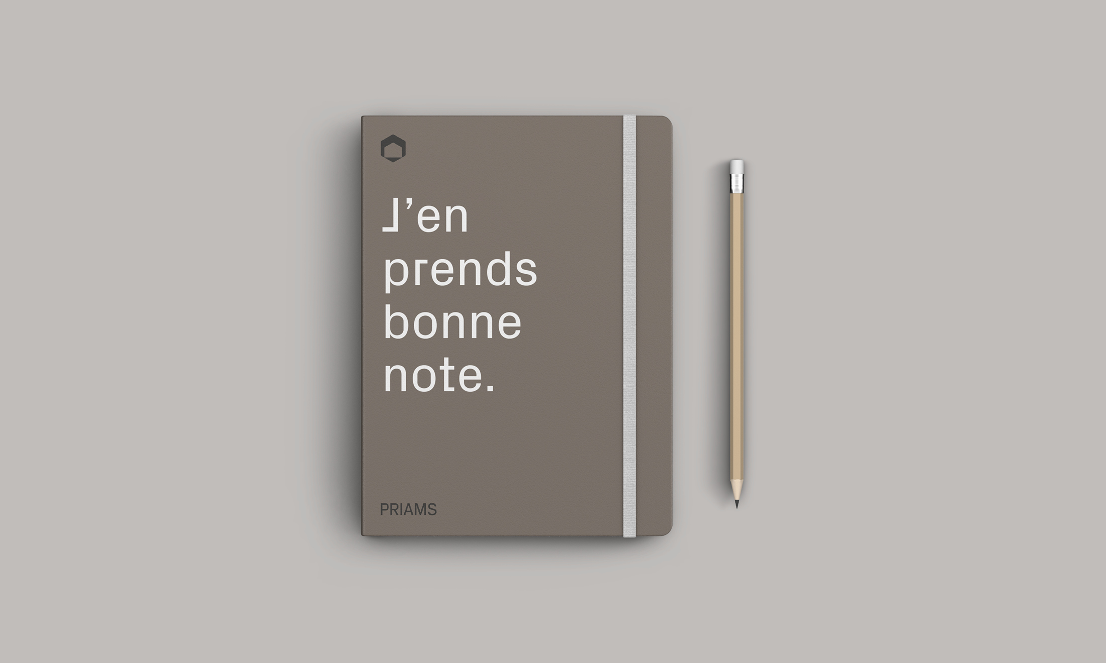
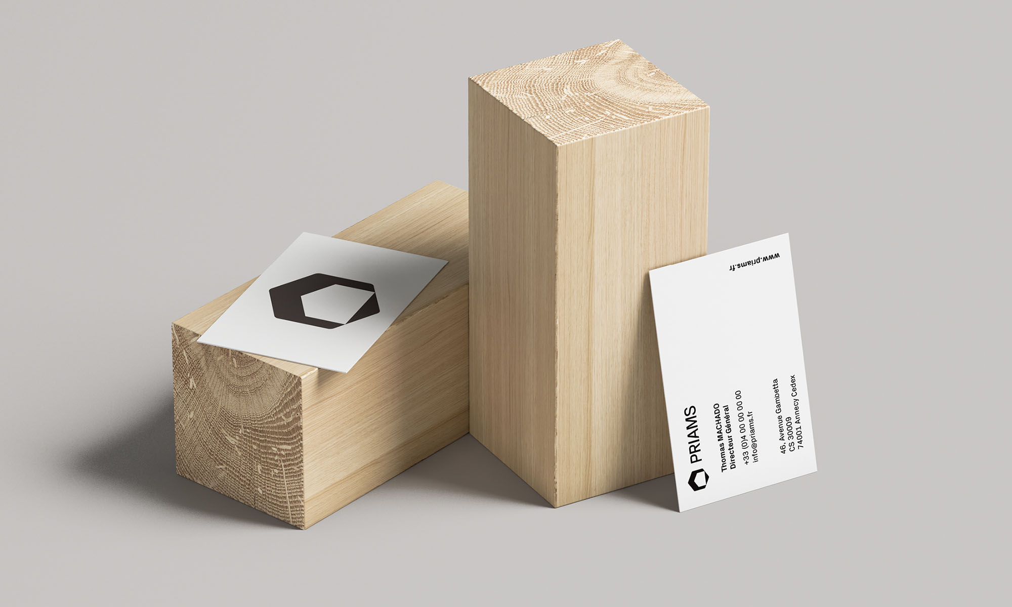
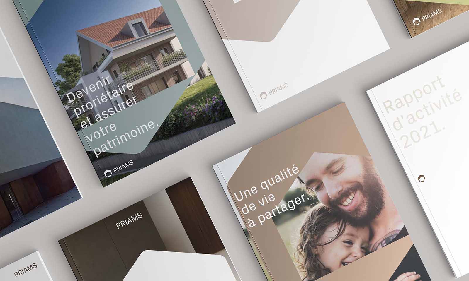
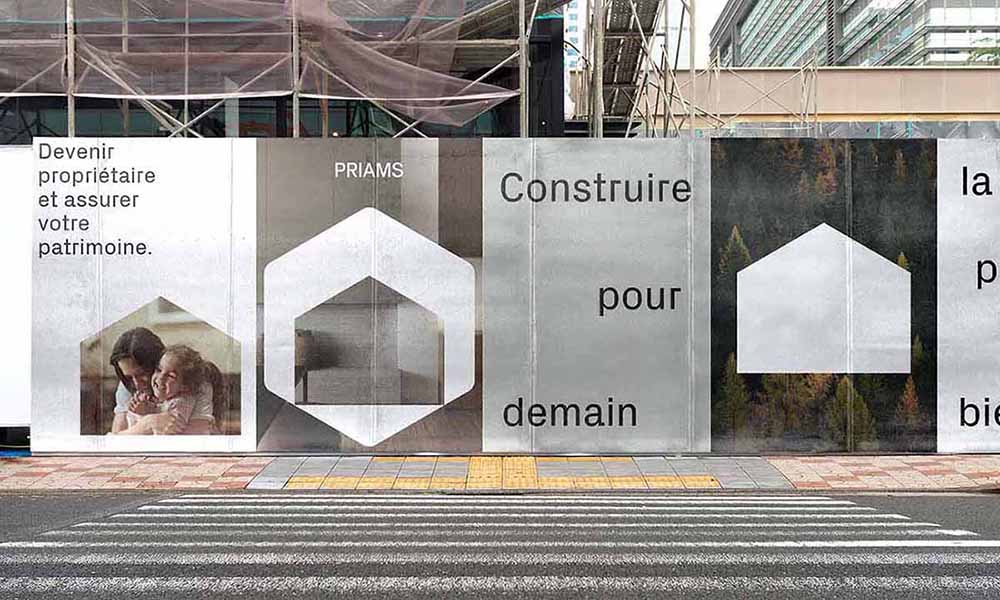
The new brand signature in French, “le bien, immobilier”, is minimalist yet powerful. The comma adds emphasis on “le bien”, which can be translated to mean “good,” “well-being,” “property,” or “something of value” in French, a unique play on words that covers both personal and familial well-being, while touching on concepts of property and sustainable construction. The graphic identity created by Hymn was brought to life digitally for the website, in print, and as signage for the interior and exterior of all Priams agencies and offices.

CREDIT
- Agency/Creative: Hymn Design
- Article Title: Priams Rebranded by Hymn Design
- Organisation/Entity: Agency, Published Commercial Design
- Project Type: Identity
- Agency/Creative Country: Switzerland
- Market Region: Europe
- Project Deliverables: Brand Architecture, Brand Design, Brand Guidelines, Brand Identity, Brand Naming, Brand Redesign, Brand Refinement, Brand Strategy, Brand World, Branding, Graphic Design, Identity System, Rebranding, Research, Retail Brand Design, Tone of Voice
- Industry: Real Estate
- Keywords: Real Estate, France, Strategy, Brand Architecture, Naming, Brand Identity, Printed Collaterals, Web Design, Signage Design, Environmental Design Motion Design


