Core Motif: The Empowering Dot – The project centres around the reinterpretation of a dot symbol from the old logo. This dot becomes a central visual motif representing the company’s untapped potential and growth. This motif embodies the core values of innovation, strength, and adaptability that the manufacturing industry can offer.
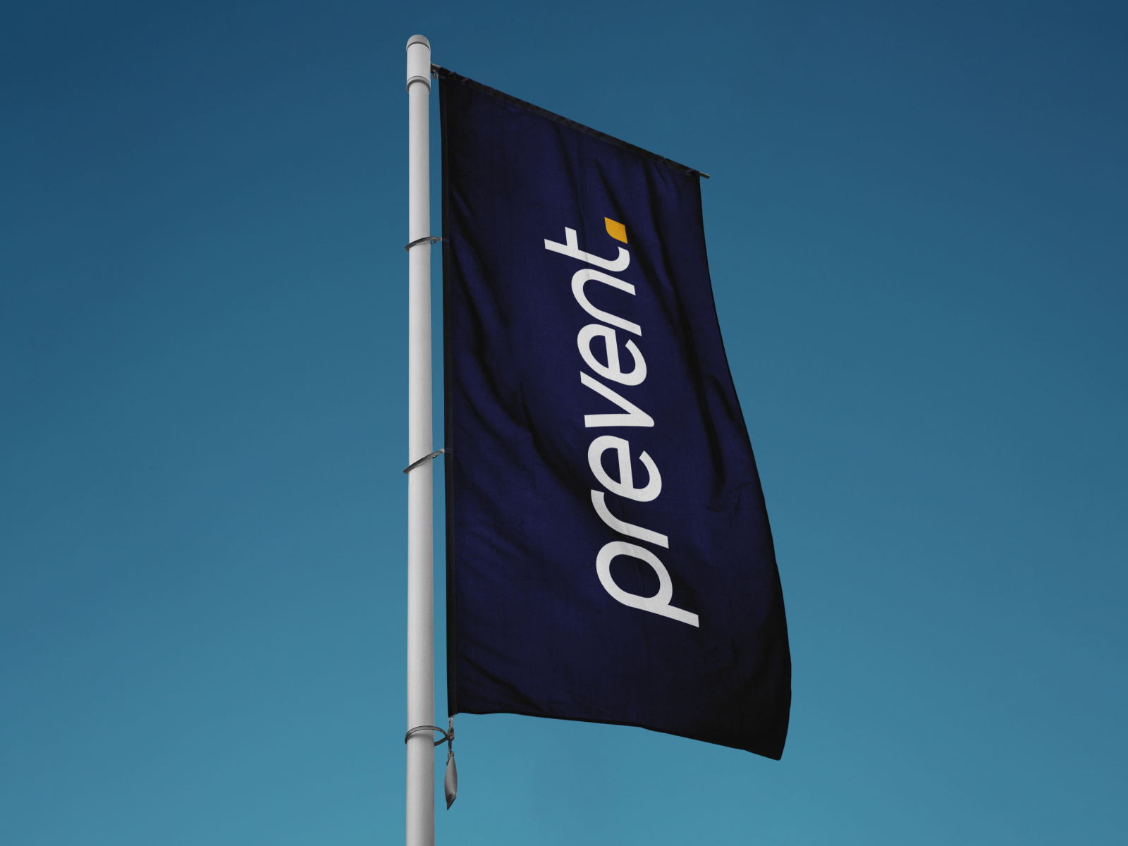
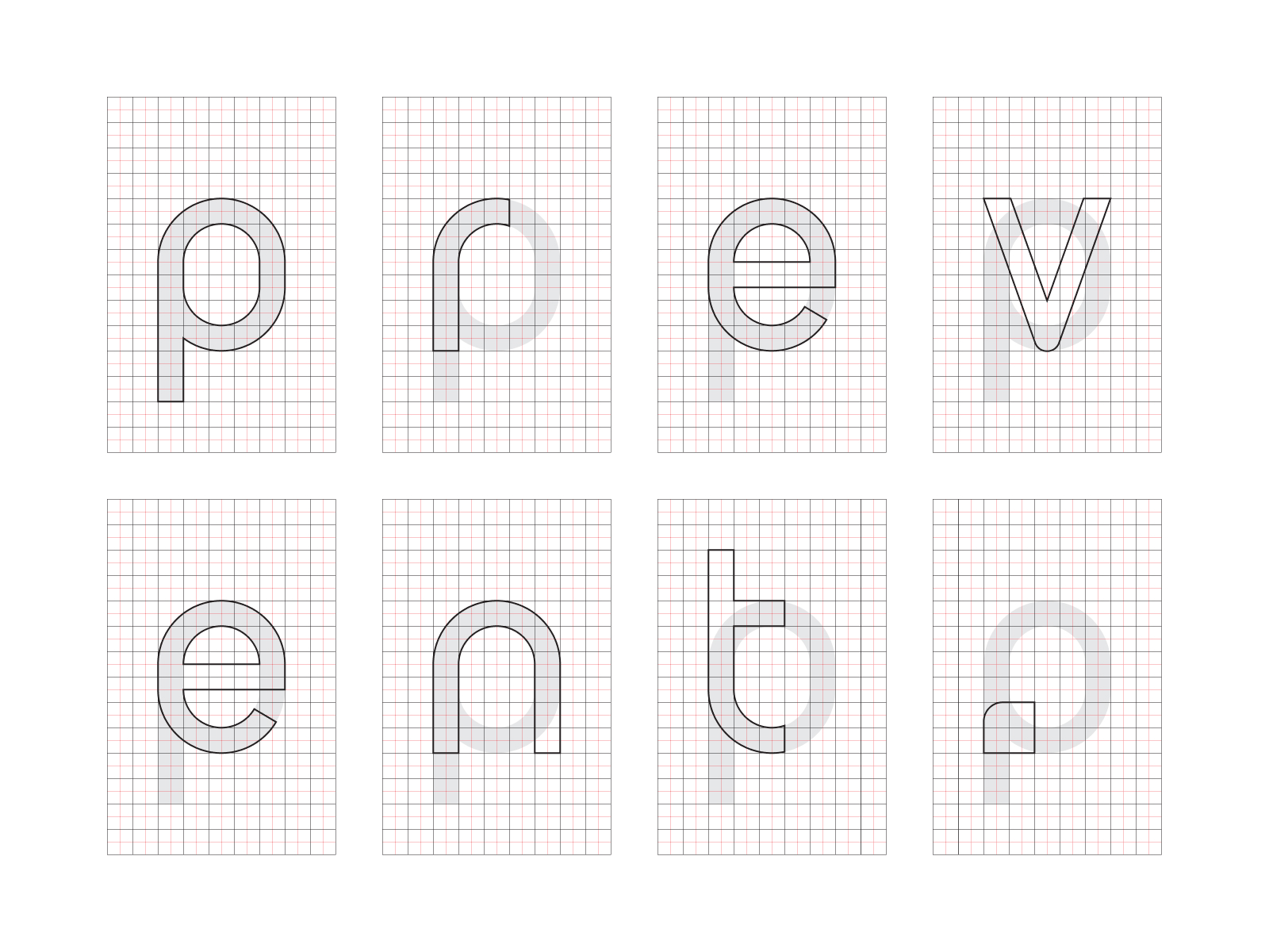
Typography: Grid-Based Typeface – A new typeface is created specifically for the rebranding. Each letter is carefully crafted within a grid, ensuring optimal proportions and aesthetics. This typeface reflects precision and meticulous attention to detail, highlighting Prevent’s commitment to excellence in its products and services.
Colour Palette: Vibrancy and Sophistication – The colour palette is chosen to infuse vibrancy and sophistication into Prevent’s visual identity. Bold and dynamic colors are used to attract the attention of younger generations and evoke a sense of modernity. The colour choices symbolise innovation and the company’s forward-thinking approach.
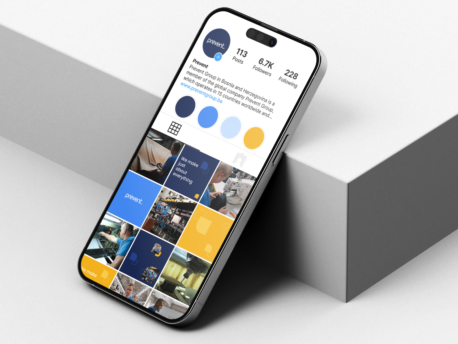
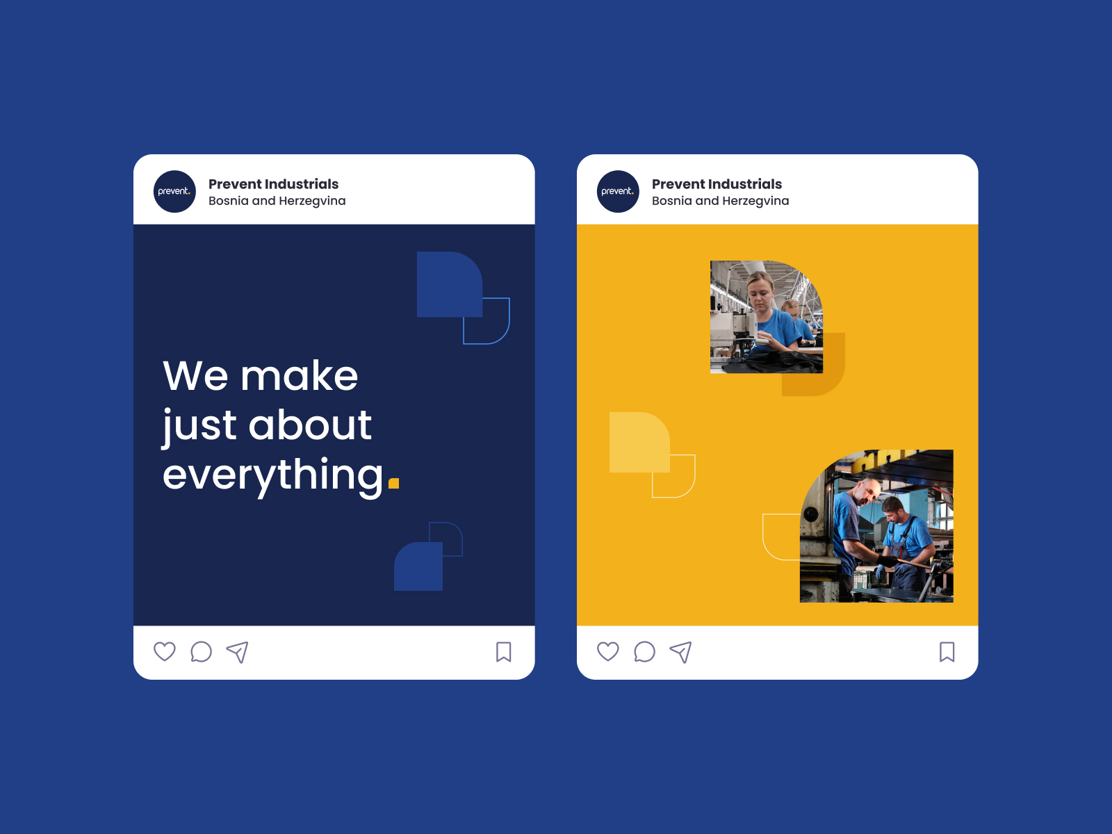
Elements of Visual Communication: Versatile Applications – The dot motif is applied across a range of visual communication elements, showcasing its versatility and adaptability. From patterns to business card shapes, web elements, and social media graphics, the dot motif unifies Prevent’s brand identity across various platforms.
Industry Representation: Beyond the Surface – The rebranding effort aims to challenge common perceptions of the manufacturing industry. By applying the dot motif to various materials like leather, wood, and metal, Prevent showcases its ability to bring innovation and excellence to even the most traditional sectors.
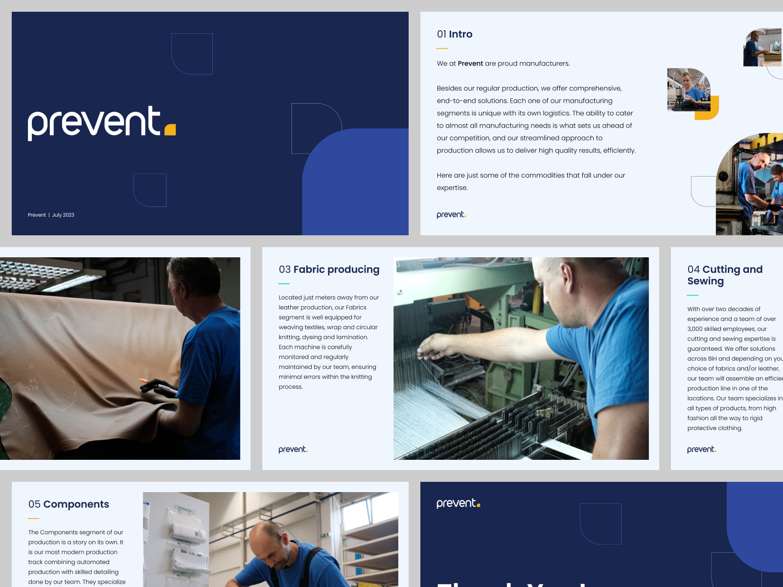
Presentations and Templates: Consistency and Professionalism – New presentation templates are developed to maintain a consistent and professional brand image. These templates incorporate the new typeface, colour palette, and dot motif, ensuring that every communication from Prevent reflects the reimagined brand identity.
Final Renderings: A Glimpse of the Future – The project concludes with a series of final renderings that provide a sneak peek into the visual transformation. These renderings demonstrate how the dot motif is seamlessly integrated into various design elements, creating a cohesive and impactful brand identity.
In summary, the “Prevent Rebranding” project seeks to breathe new life into the manufacturing industry’s image by leveraging the power of design. The dot motif, grid-based typography, vibrant colors, and versatile applications work together to communicate Prevent’s commitment to innovation and growth. The rebranding signifies a new chapter for Prevent, where tradition meets modernity, and potential is harnessed across diverse industries.



CREDIT
- Agency/Creative: Sanjin Halilovic
- Article Title: Prevent Industrial Rebranding
- Organisation/Entity: Creative
- Project Type: Identity
- Project Status: Published
- Agency/Creative Country: Bosnia and Herzegovina
- Agency/Creative City: Sarajevo
- Market Region: Europe
- Project Deliverables: Art Direction, Brand Design, Brand Identity, Logo Design, Rebranding
- Industry: Manufacturing
- Keywords: Prevent Bosnia and Herzegovina Industry Manufacturing Rebranding
-
Credits:
Art Direction: Sanjin Halilovic


