


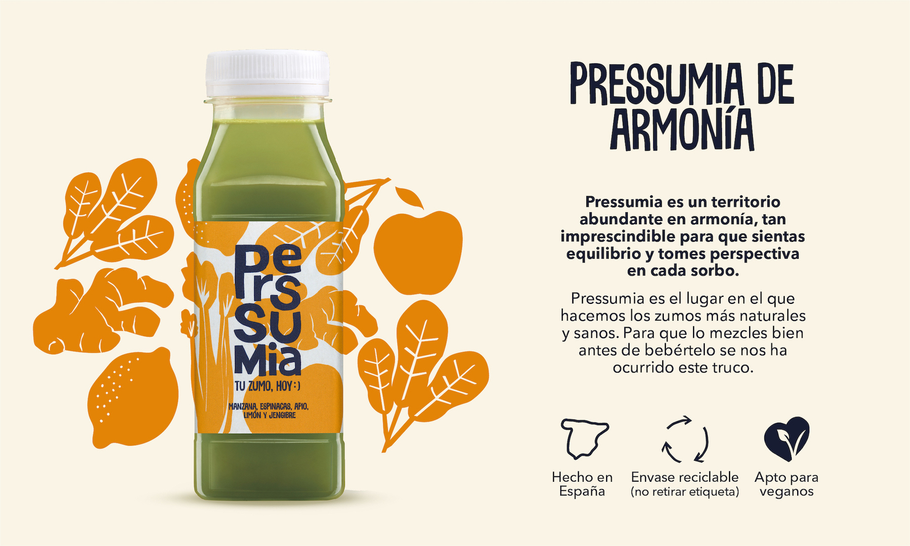
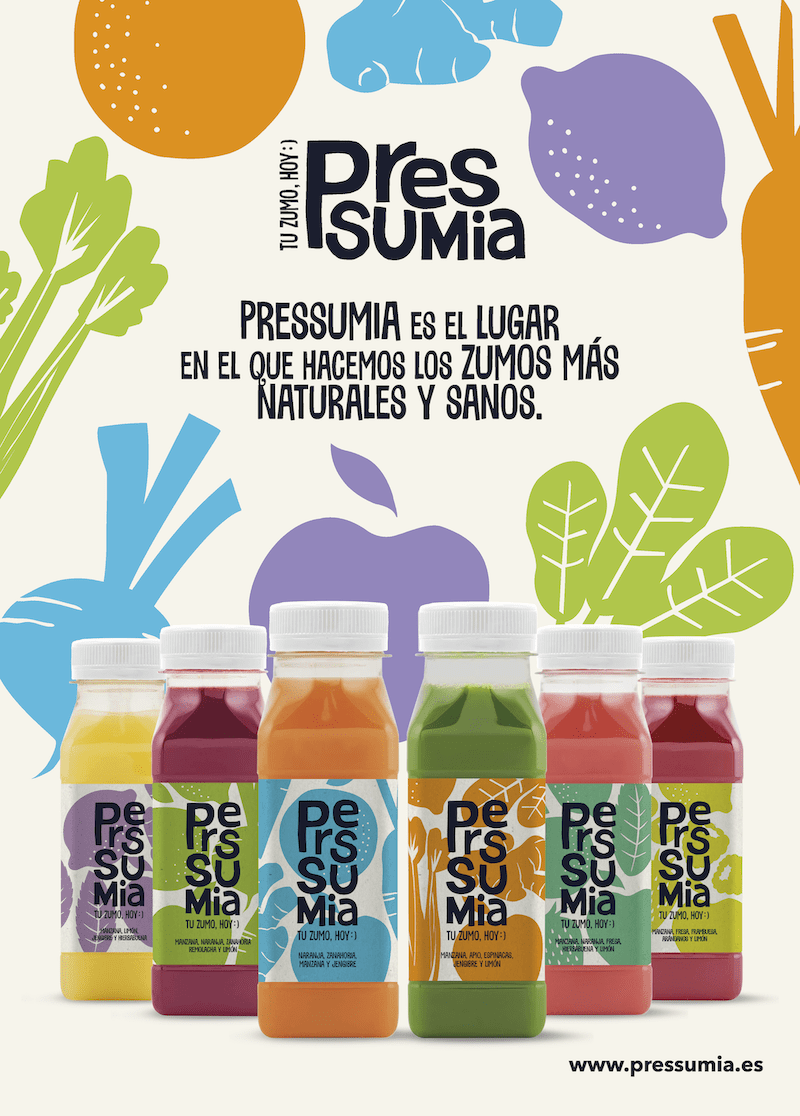
Summary: Pressumia is the place where the most natural and healthy juices are made. A fertile land of creativity, happiness, energy, harmony, trust, attraction, vitality, and imagination. All the flavour of fruit and vegetables from the nearby orchards and crops, picked at precisely the right time, processed in their workrooms to bring you the best fruit and vegetable juices you can find. People are investing in personal health like never before. The global welfare economy is growing at almost twice the rate of the global economy. We are increasingly concerned about our health and what we consume, at a time when we are constantly seeking instant gratification. Every 5 minutes there seems to be a new fad, treatment, exercise, healthy meal, or app related to well-being. With this purpose, TSMGO participates in the creation of a new brand equipped with an imagery that infuses and envelops each of its manifestations. From the naming, to the brand, to taking it to a captivating packaging that stands out on the shelf, attracting attention at first sight to encourage purchase. Pressumia is a fresh, mocking, almost irreverent call to challenge the big boys, because looking after yourself has its rewards as well as a certain degree of madness. Simple but very natural and cheerful shapes that reflect a synthetic realism which contrasts with the colour of the juices themselves.
Objectives: To create a convincing, stand-out brand with potential, to provide an imagery linked to the world of fruit and vegetables with a traditional craftsman’s touch and to project brand personality and create a tone and style that is recognisable in its manifestations.
Proposal: The name carries a provocative element – a double “s” – which boldly and confidently encourages us to try the different varieties. A sort of minimalist craft in which the elements combined convey sobriety and universality in a synthetic yet disruptive way.
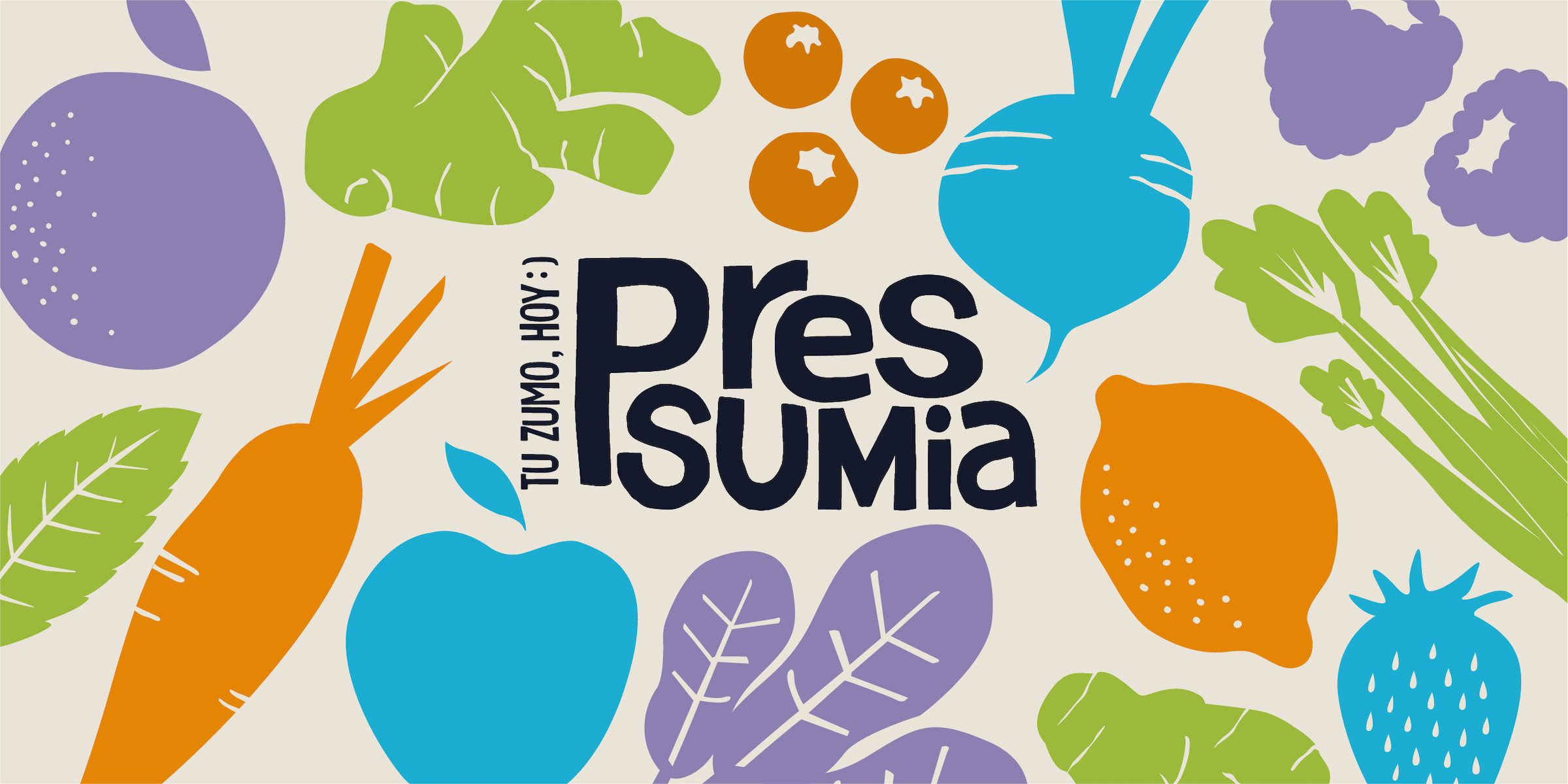
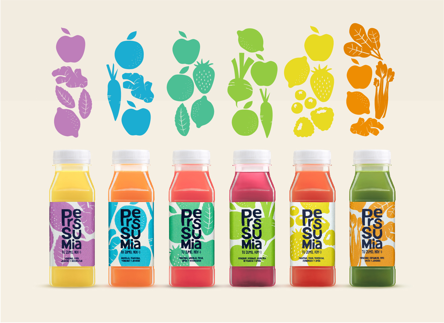
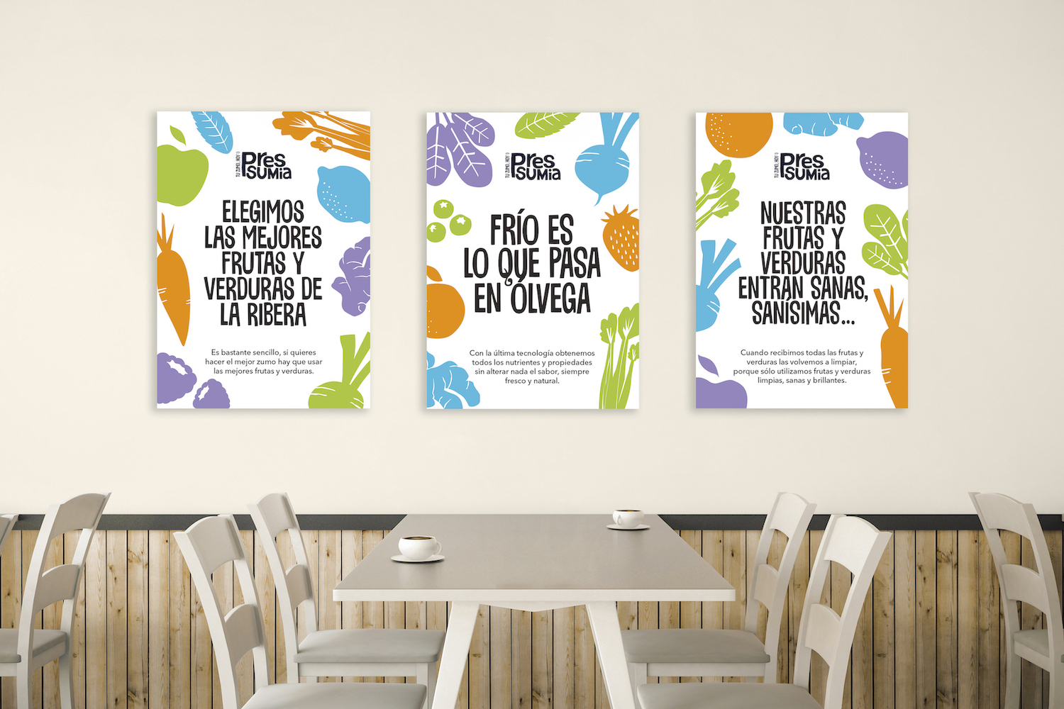
Graphic Solution: The configuration of the brand itself as a cartoon block explores playing with the difference in sizes and proportions – lending a great deal of personality to the ensemble. We accompany it with a claim that underlines the value of freshness as a clear consumption lever and emphasises closeness and proximity with the language used. All the packaging and brand activation elements are full of references, allusions and plays on words. We created a brand universe based on the fruits themselves, which we show in a very ingenious way and which, in the inverse colour of the juice, take on a presence in the packaging. Continuing along the same lines as with the typeface, we created an iconography with clear handmade reminiscences, reducing the representation of the vegetables to the minimum expression, while keeping them easily recognisable.
The very lively colour palette plays an important role in the silhouettes; creating a interplay of complements with the colours of the juices that make them more striking, thus obtaining the maximum possible contrast. In addition, we invite the consumer to interact with the brand: having them turn the juice upside down and unconsciously shake it in order to read the texts and the brand storytelling.
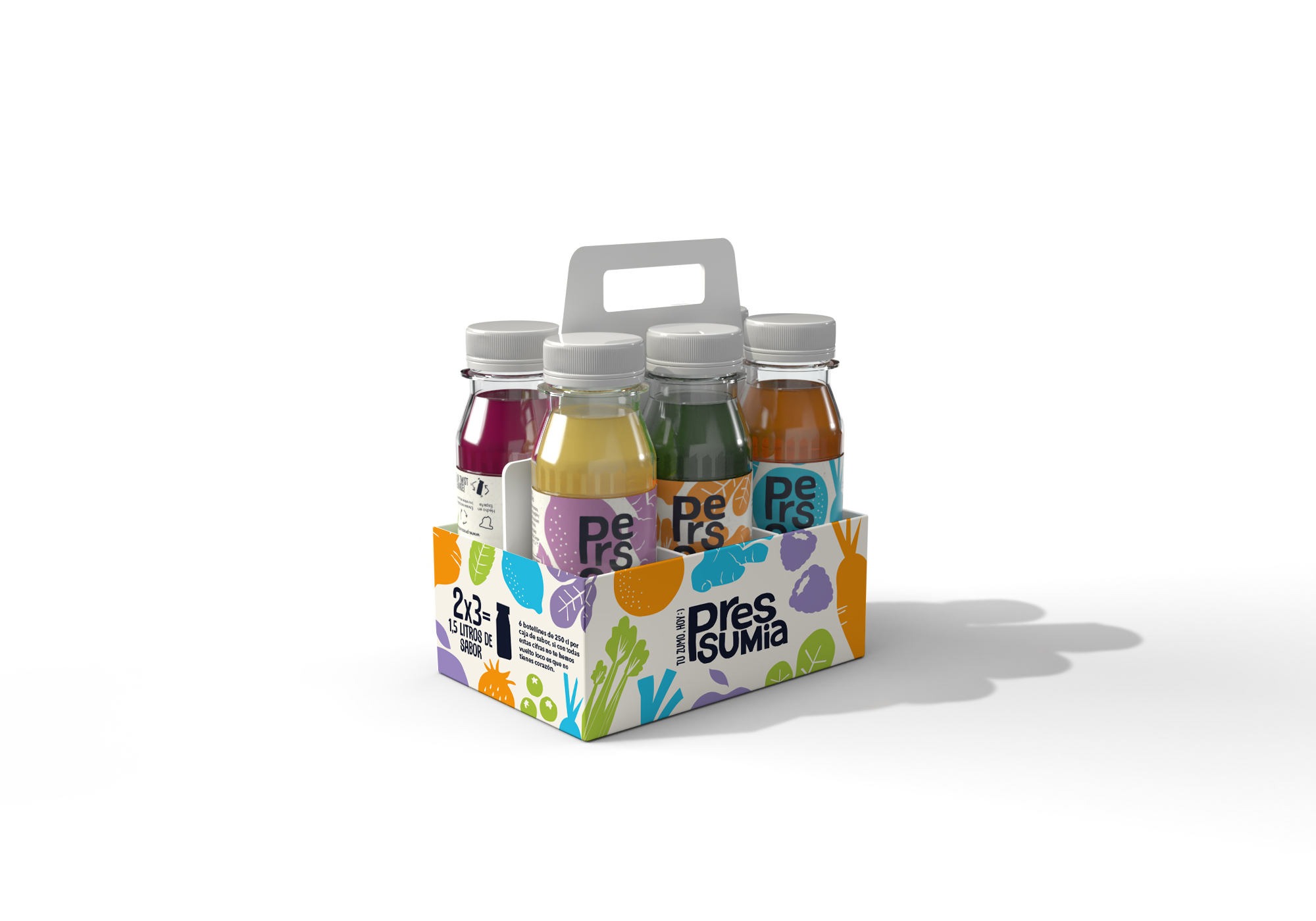
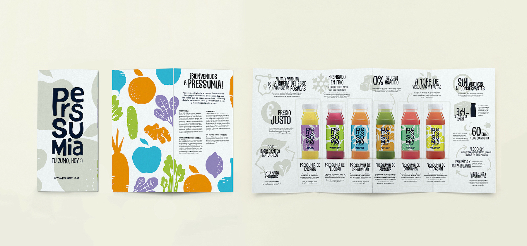
Production: The brand is represented in elements of clear Kraft influence, with the clear objective of underpinning the naturalness of the process: corporate stationery, sales folders…The juice is packaged in a 250cc bottle in recycled PET and wrapped in a polypropylene label that can be fully recycled without separation from the packaging.
CREDIT
- Agency/Creative: TSMGO | The show must go on
- Article Title: Pressumia – A Haven Full of Good Fruit and Vegetables
- Organisation/Entity: Agency, Published Commercial Design
- Project Type: Packaging
- Agency/Creative Country: Spain
- Market Region: Europe
- Project Deliverables: Brand Creation, Brand Identity, Brand Strategy, Branding, Graphic Design, Packaging Design, Product Architecture, Product Naming, Tone of Voice
- Format: Bottle
- Substrate: Plastic


