![]()
Cre8tive Pixels – NAHLA Raw Organic Ethiopian Honey
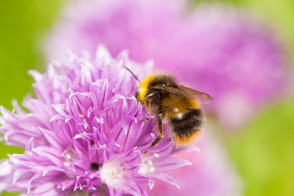
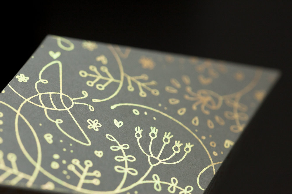
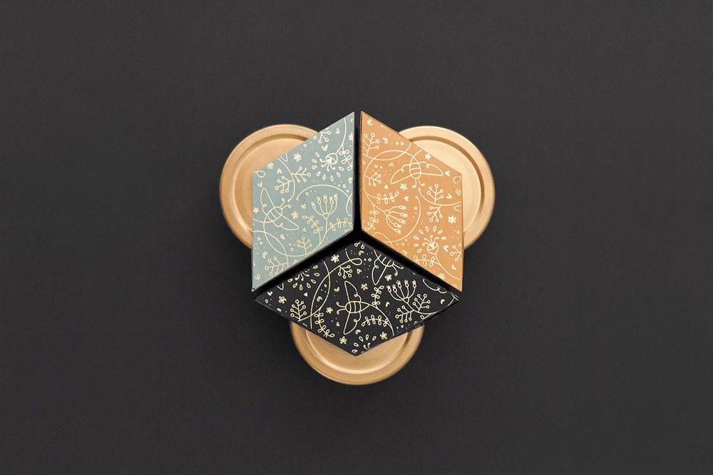
“Nahla, is an Arabic name that reportedly means “honeybee” or “thirst-quenching”. The central premise of the logomark was to combine elegance with fluidity and movement. The logotype is hence, inspired by the dancing movement of the honey bee and her flight path while she works. The packaging design reflects the luxury, premium product that is Nahla Raw Ethiopian Organic Honey. The unique rhombus shaped boxes tessellate to create the iconic hexagonal honeycomb shape when combined. All images were shot as part of the marketing campaign including the macro shots of the honey bees which were key in providing inspiration for this branding project.”
![]()

![]()
![]()
![]()
![]()
![]()

![]()
![]()
![]()
![]()
![]()
![]()
![]()
![]()
![]()
![]()
![]()

CREDIT
- Agency/Creative: Cre8tive Pixels
- Article Title: Premium Raw Organic Ethiopian Honey Branding and Packaging Design
- Organisation/Entity: Agency Promotional / Self Published
- Project Type: Packaging
- Agency/Creative Country: United Kingdom
- Market Region: Europe
- Format: Jar
- Substrate: Glass
FEEDBACK
Relevance: Solution/idea in relation to brand, product or service
Implementation: Attention, detailing and finishing of final solution
Presentation: Text, visualisation and quality of the presentation


