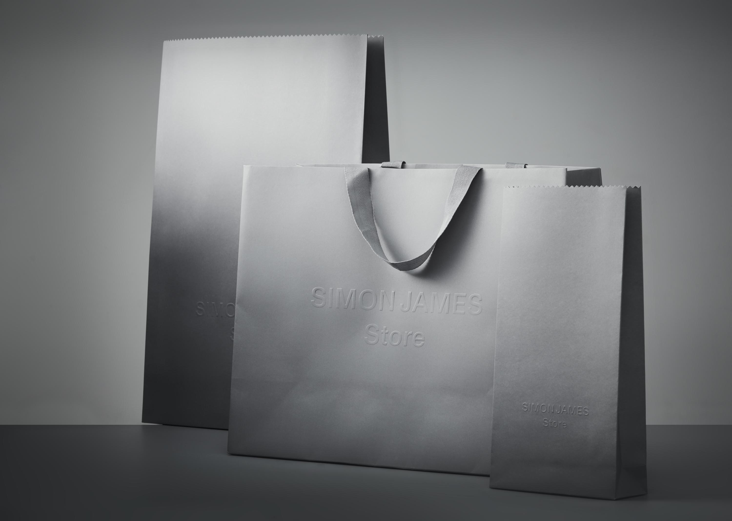
Through honest materials, a desire for simplicity, and lasting craftsmanship, Simon James celebrates the spaces we spend time in. Working closely in collaboration with Auckland-based design studio, Fount—via, PORTER was recently tasked with producing a new retail packaging concept to align with a new branding direction for design house Simon James.
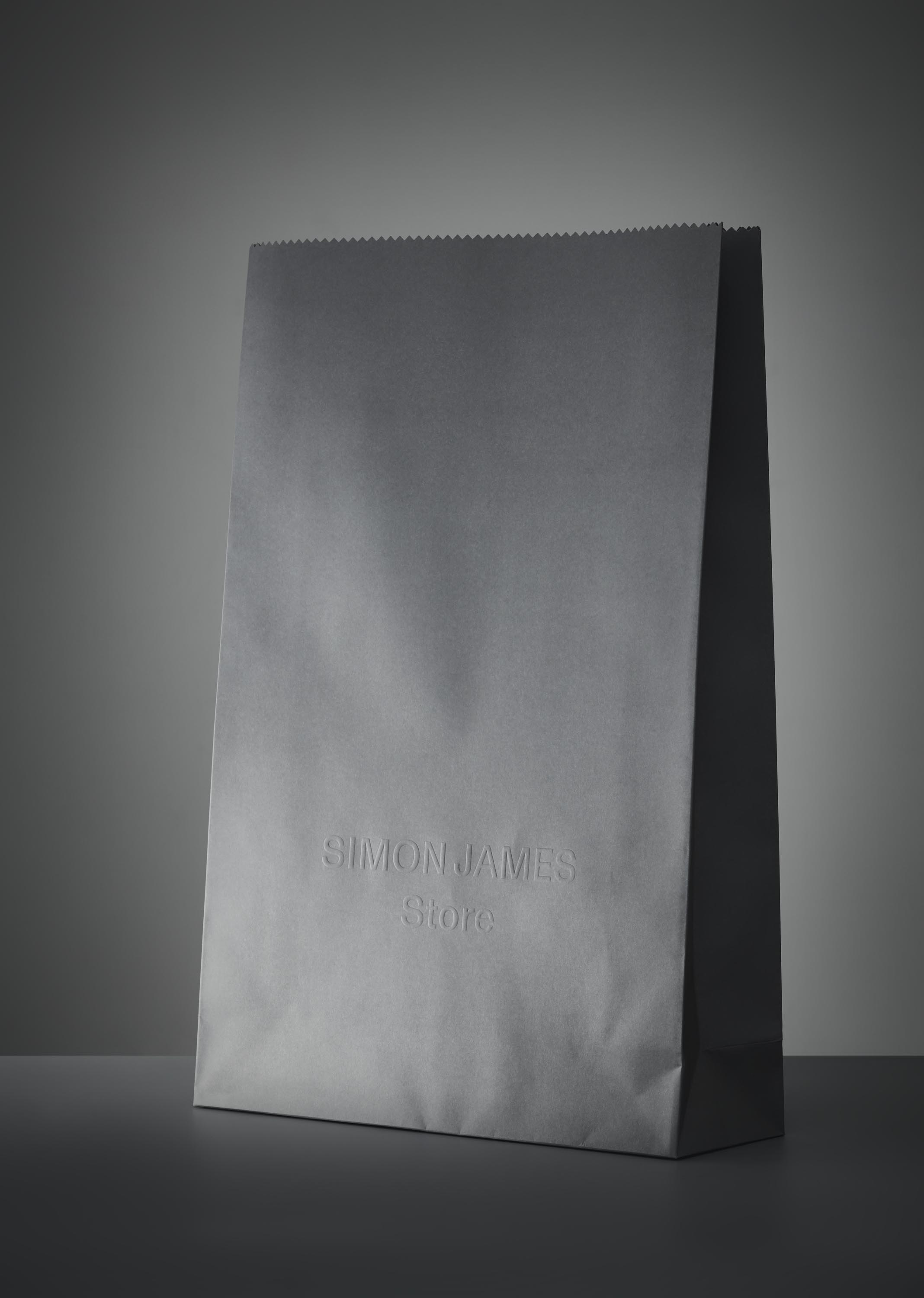
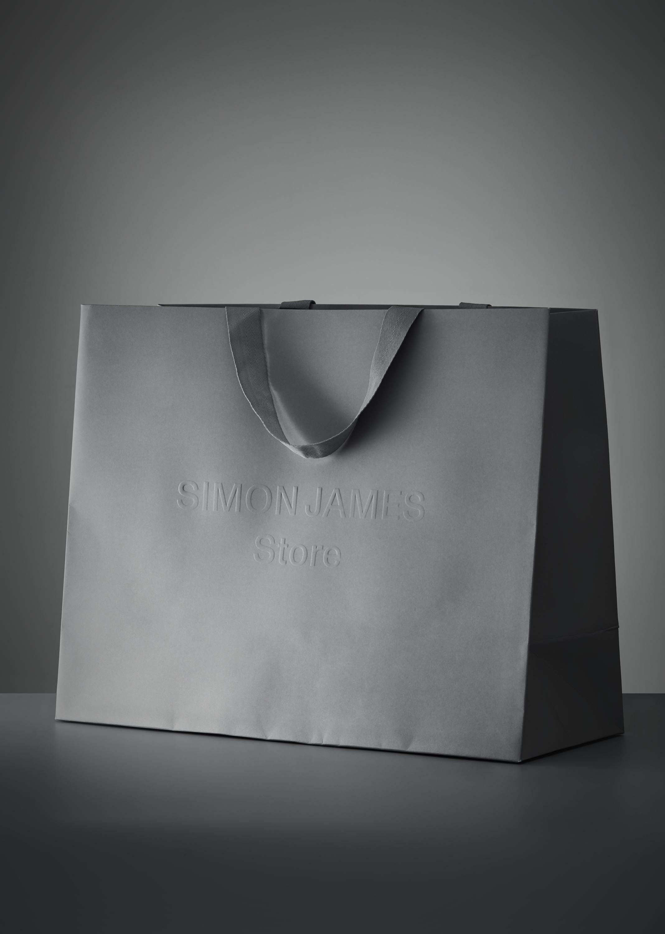
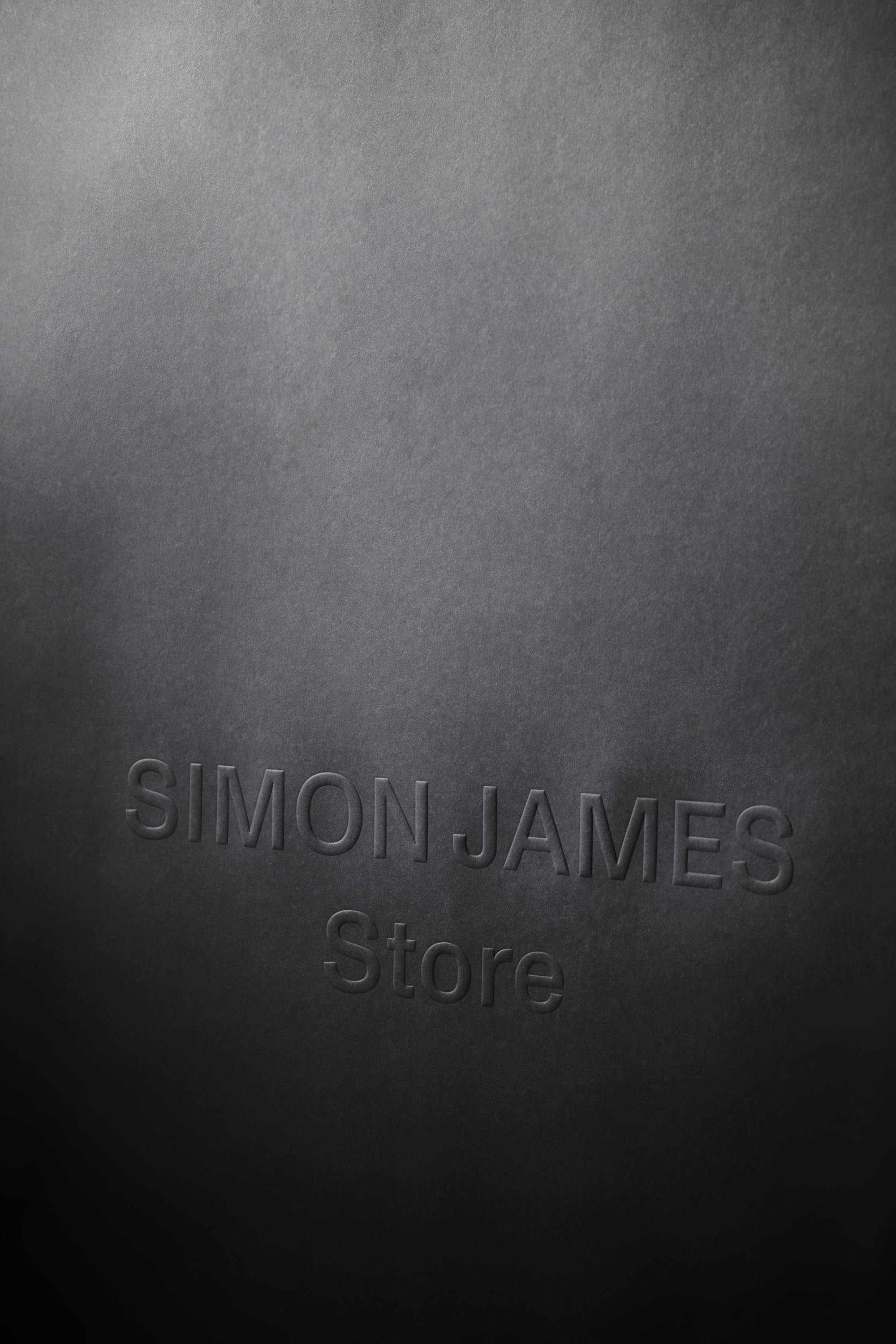
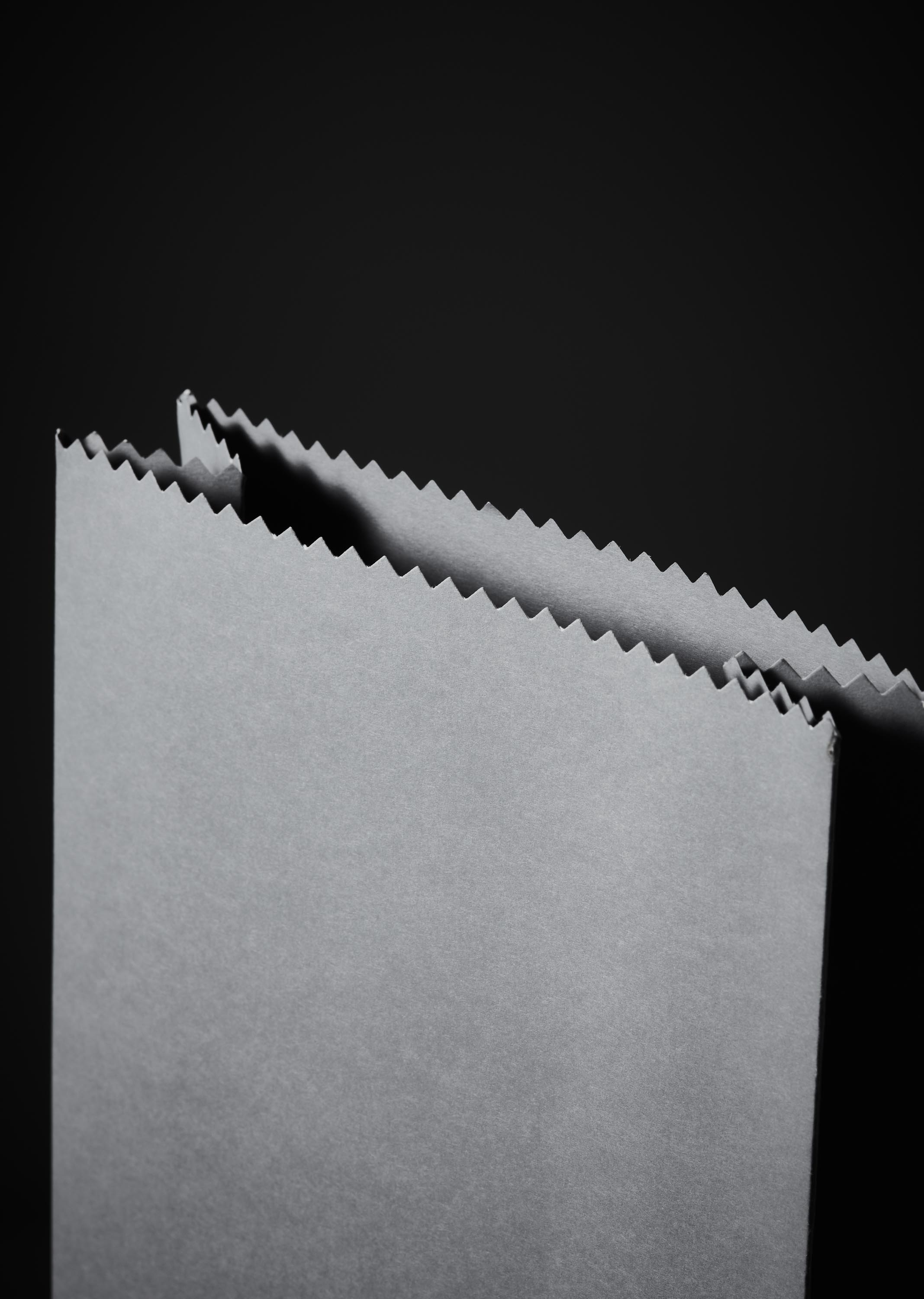
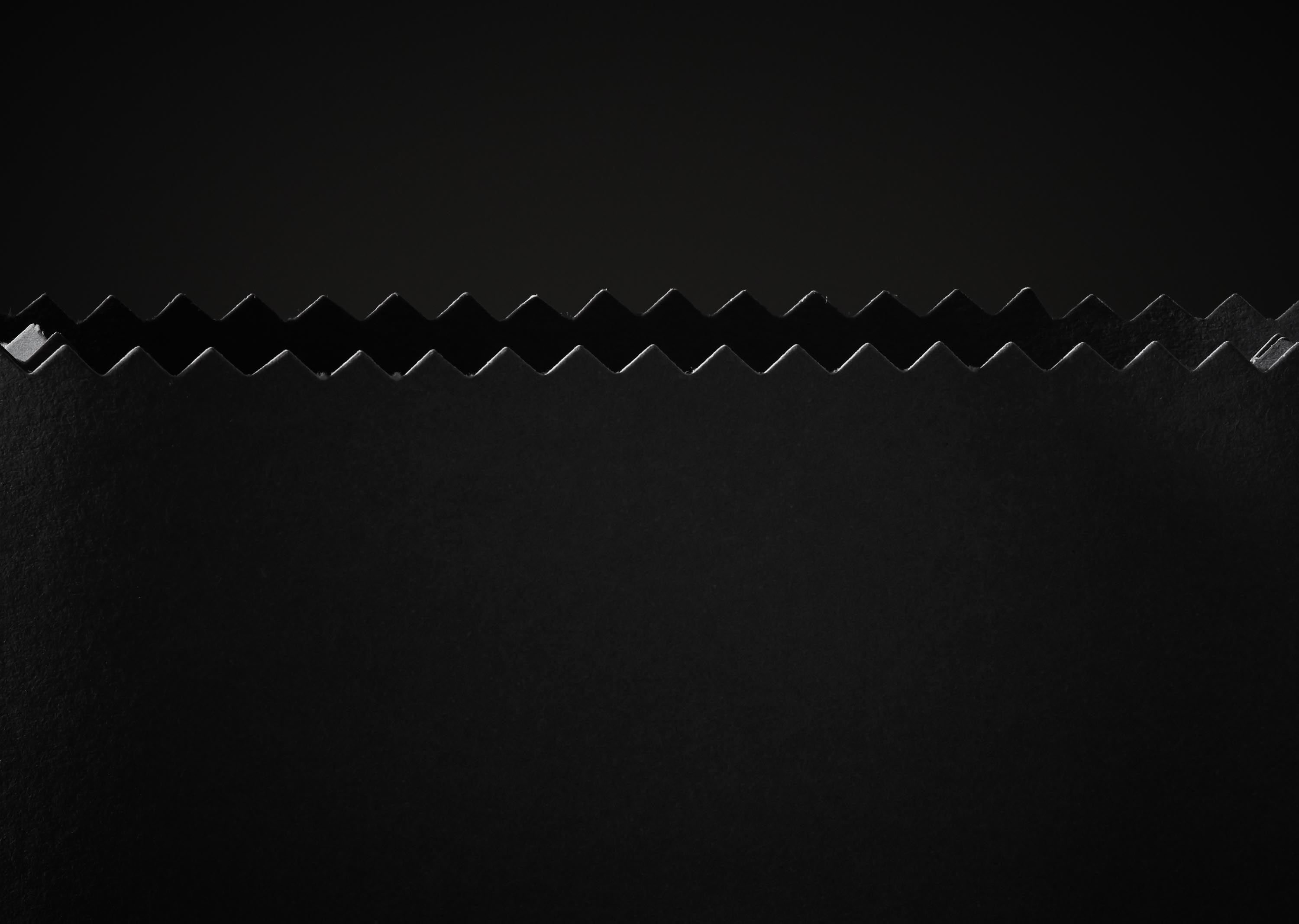
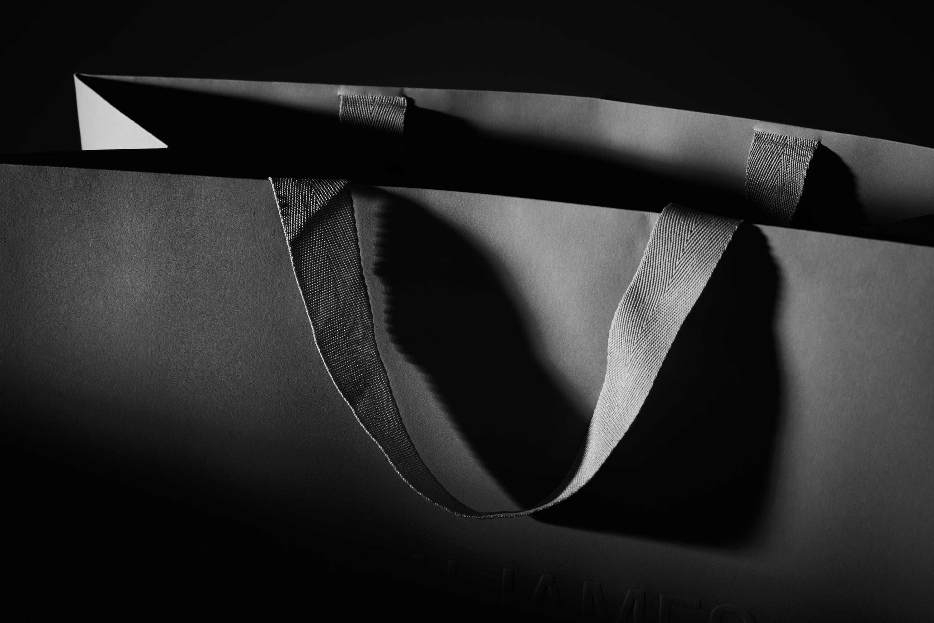
Created for a brand inspired by simplicity and craftsmanship, material specification was supremely important to this project. A 320GSM Pop’Set paper was selected: a smooth, uncoated stock that proved the perfect vehicle for a crisp, blind embossed logo. A custom-dyed, textile handle was the finishing touch on the larger paper carry bag in this three-piece suite, while a serrated edge cuts a fine form in the design of the smaller retail bags. Like the humble paper bag of yesteryear, the detail is simple but plays to the strengths of this premium paper (which by the way, is crafted from 30% recycled post-consumer waste). Like many of the treasures found in the Simon James showroom, we think the beauty is its simplicity. Less, as they say, is more.
CREDIT
- Agency/Creative: PORTER Packaging
- Article Title: Premium Packaging Suite for Design House Simon James Designed by Porter Packaging
- Organisation/Entity: Agency, Published Commercial Design
- Project Type: Packaging
- Agency/Creative Country: New Zealand
- Market Region: Oceania
- Project Deliverables: Brand Architecture, Brand Strategy, Brand World, Packaging Design
- Format: Bag
- Substrate: Fabric, Pulp Paper


