Here’s the text with all instances of “TIMELESS” replaced by “Timeless”*:
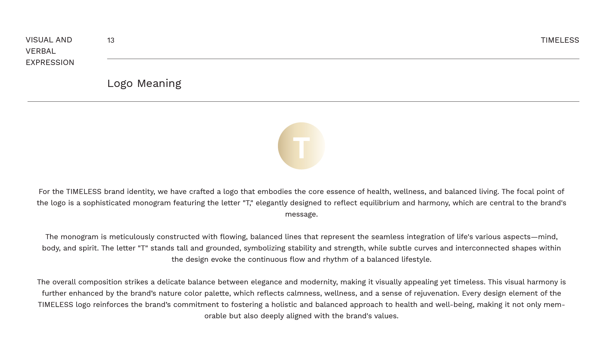
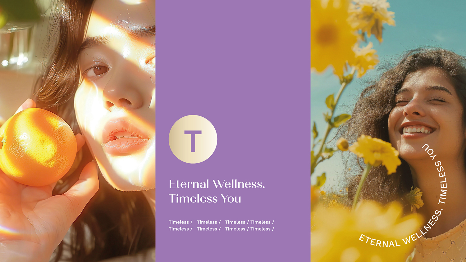
The Timeless* brand identity is a testament to our dedication to creating a visual representation that encapsulates the essence of health, wellness, and balanced living. At the heart of this identity lies a thoughtfully crafted logo, a sophisticated emblem that mirrors the brand’s foundational principles. The centerpiece of the logo is an elegant monogram featuring the letter “T,” which is meticulously designed to convey the ideals of equilibrium, harmony, and holistic well-being—values that resonate deeply with the Timeless* philosophy.
The monogram design showcases a masterful blend of art and meaning. Every detail is deliberate, with flowing, balanced lines that symbolize the seamless integration of life’s diverse aspects: mind, body, and spirit. The letter “T” itself is depicted as tall and grounded, embodying qualities of stability, strength, and resilience. These traits are essential for cultivating a balanced lifestyle, which lies at the heart of the Timeless* ethos. The symmetrical design of the monogram reinforces this balance, creating a visual narrative of interconnectedness and unity.
Subtle curves and interconnected shapes within the monogram’s structure evoke a sense of continuous flow and rhythm, which are hallmarks of a harmonious existence. This design choice signifies the perpetual motion of life and the importance of maintaining equilibrium amidst life’s inevitable fluctuations. The interplay of these elements reflects a commitment to fostering not just physical health but also mental and spiritual well-being. The overall composition of the monogram strikes a delicate balance between elegance and modernity, making it both visually captivating and timeless—a perfect reflection of the brand’s enduring values.
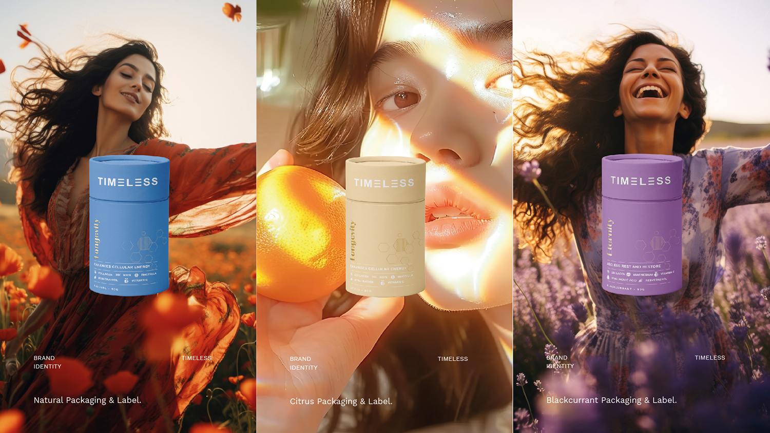
The color palette chosen for the Timeless* brand further amplifies its message of wellness and rejuvenation. Drawing inspiration from nature, the palette incorporates soothing hues that evoke a sense of calm, renewal, and vitality. Soft greens, muted blues, and earthy tones work in harmony to create a visual experience that is both serene and invigorating. These colors are intentionally selected to establish an emotional connection with the audience, reinforcing the brand’s dedication to holistic health and well-being. They serve as a gentle reminder of the healing power of nature and its integral role in achieving balance.
The design elements of the Timeless* logo work cohesively to create a powerful and memorable visual identity. The font choice complements the monogram by exuding sophistication and approachability. It is clean, modern, and understated, allowing the monogram to take center stage while adding to the overall aesthetic appeal. The typography, combined with the monogram and color palette, creates a unified and distinctive identity that stands out in the wellness industry. It is not merely a logo; it is a visual embodiment of the brand’s mission to inspire individuals to embrace a lifestyle of balance and well-being.
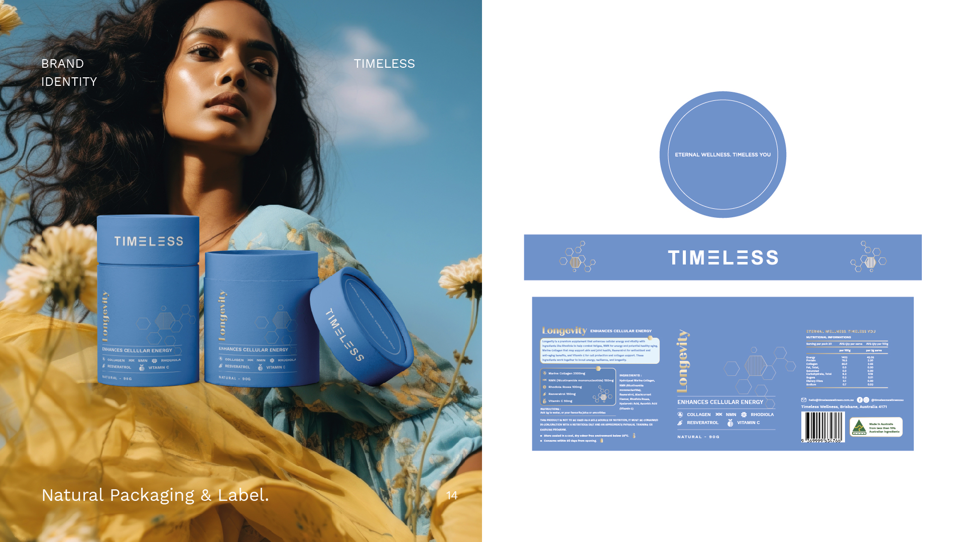
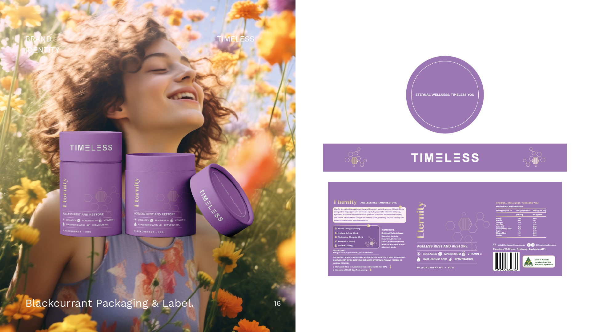
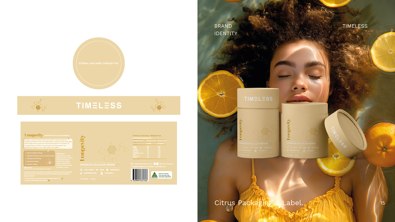
The logo’s versatility is another key aspect of its design. It is adaptable across various mediums, from digital platforms to print materials, ensuring that the brand’s message remains consistent and impactful regardless of where it is displayed. Whether on product packaging, marketing collateral, or digital advertisements, the Timeless* logo maintains its integrity and effectiveness. This adaptability reflects the brand’s dynamic nature and its ability to resonate with diverse audiences.
In addition to its aesthetic qualities, the Timeless* logo is imbued with layers of meaning that deepen its connection with the audience. The tall and grounded “T” not only symbolizes stability but also serves as a metaphor for personal growth and resilience. Just as the letter stands firm and upright, the brand encourages individuals to cultivate inner strength and embrace challenges with confidence. The subtle curves within the monogram represent life’s natural ebb and flow, reminding us that balance is not about perfection but about navigating life’s rhythms with grace and mindfulness.
The integration of these symbolic elements ensures that the logo is not just a visual mark but a representation of the values and aspirations that define the Timeless* brand. It serves as a beacon for those seeking a holistic approach to health and well-being, guiding them towards a lifestyle that prioritizes balance in all aspects of life. By incorporating these deeper meanings, the logo becomes a tool for storytelling, allowing the brand to communicate its mission and vision effectively.
The Timeless* brand identity extends beyond the logo to encompass a broader visual language that aligns with its core values. This includes the careful selection of supporting graphics, patterns, and textures that echo the themes of balance and harmony. Organic shapes and fluid patterns are often employed to create a sense of movement and interconnectedness, reinforcing the idea of seamless integration. These design elements are used consistently across all brand touchpoints to create a cohesive and immersive experience for the audience.
Photography and imagery also play a crucial role in the Timeless* brand identity. Visuals featuring natural landscapes, serene environments, and moments of mindfulness are chosen to complement the logo and color palette. These images evoke feelings of tranquility and inspiration, aligning with the brand’s commitment to promoting a balanced and healthy lifestyle. By incorporating these visual elements, Timeless* creates a holistic brand experience that resonates with its audience on both an emotional and aesthetic level.
The brand’s messaging and tone of voice further reinforce its identity. Timeless* communicates with its audience in a way that is warm, encouraging, and empowering. The language used in marketing materials and communications reflects the brand’s values, emphasizing the importance of self-care, mindfulness, and personal growth. This consistent messaging ensures that every interaction with the brand leaves a lasting impression, fostering trust and loyalty among its audience.
The development of the Timeless* logo and brand identity involved a deep understanding of the target audience and their aspirations. Timeless* is designed for individuals who value a holistic approach to health and well-being, seeking not just physical fitness but also mental and emotional harmony. The logo serves as a visual representation of this lifestyle, resonating with those who aspire to live a balanced and fulfilling life. By aligning the design with the needs and desires of its audience, Timeless* has created a brand identity that is both meaningful and impactful.
In conclusion, the Timeless* logo is more than just a symbol; it is a reflection of the brand’s soul. Through its elegant monogram, harmonious design, and thoughtful use of color, the logo captures the essence of balance and well-being that defines the Timeless* philosophy. Every design element, from the flowing lines to the grounded “T,” tells a story of integration, stability, and resilience. Supported by a cohesive visual language and consistent messaging, the logo becomes a powerful tool for communicating the brand’s mission and values. It is a timeless representation of health, wellness, and the pursuit of a balanced life, making it a cornerstone of the Timeless* brand identity.


CREDIT
- Agency/Creative: Jaherat Design
- Article Title: Premium Branding & Packaging Design for Timeless Wellness Brand by Jaherat Design
- Organisation/Entity: Agency
- Project Type: Packaging
- Project Status: Published
- Agency/Creative Country: India
- Agency/Creative City: Ahmedabad
- Market Region: Oceania
- Project Deliverables: Brand Identity, Brand Strategy, Branding, Logo Design, Packaging Design
- Format: Tube
- Industry: Health Care
- Keywords: healthcare, wellness, Australia brand
-
Credits:
Branding Designer: Sachin Nimbark


