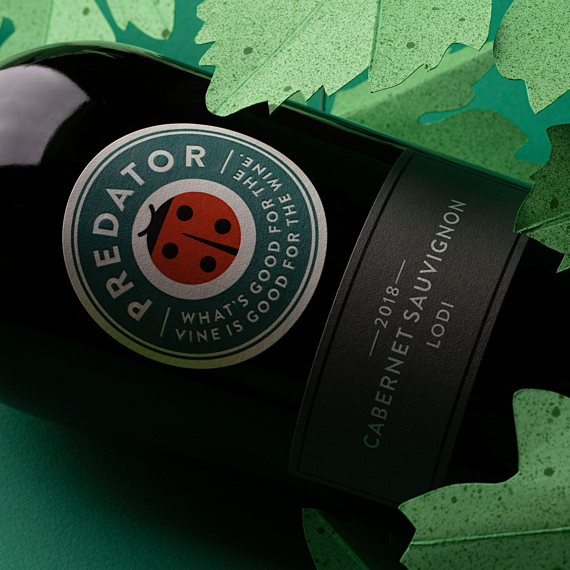
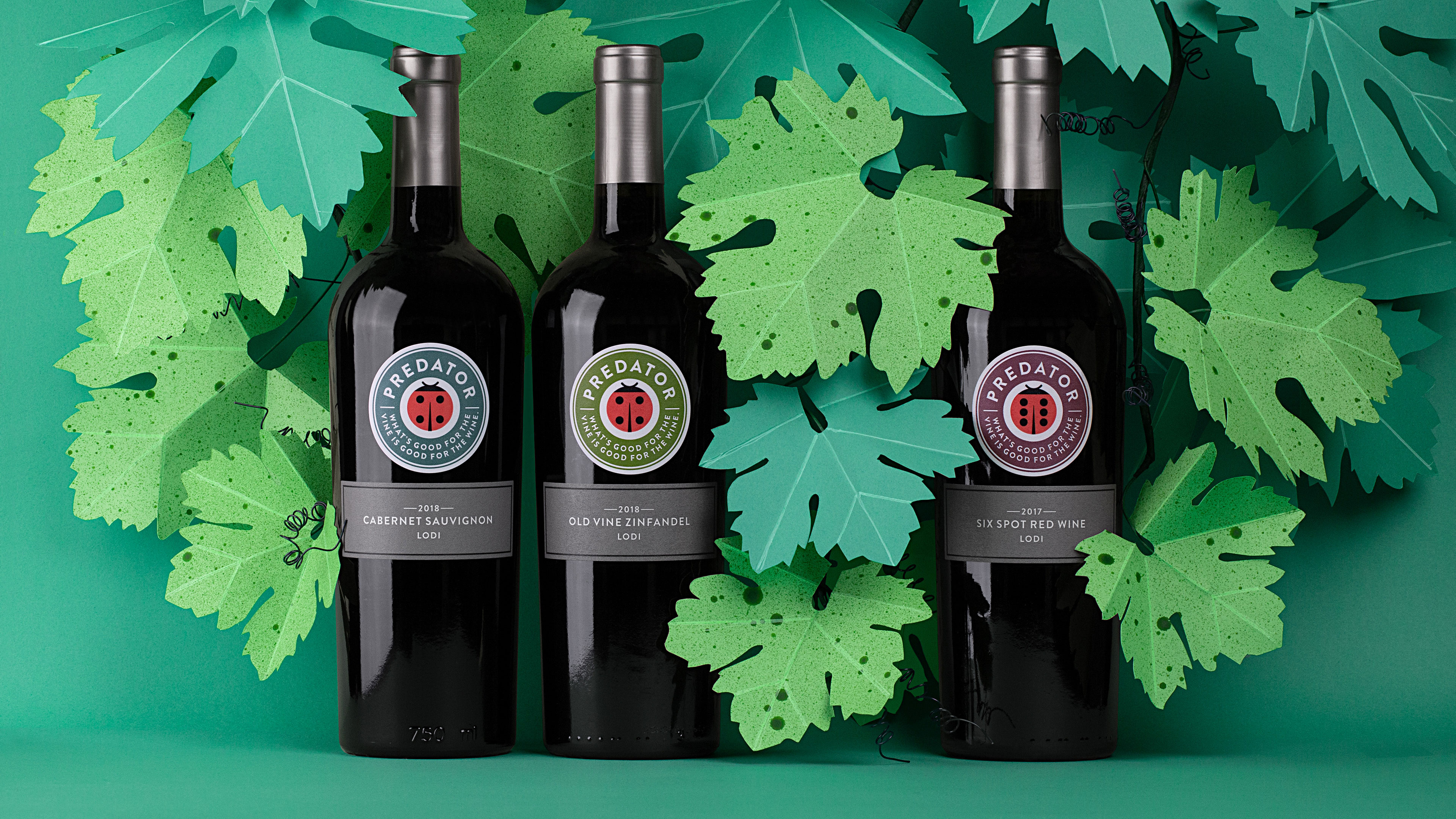
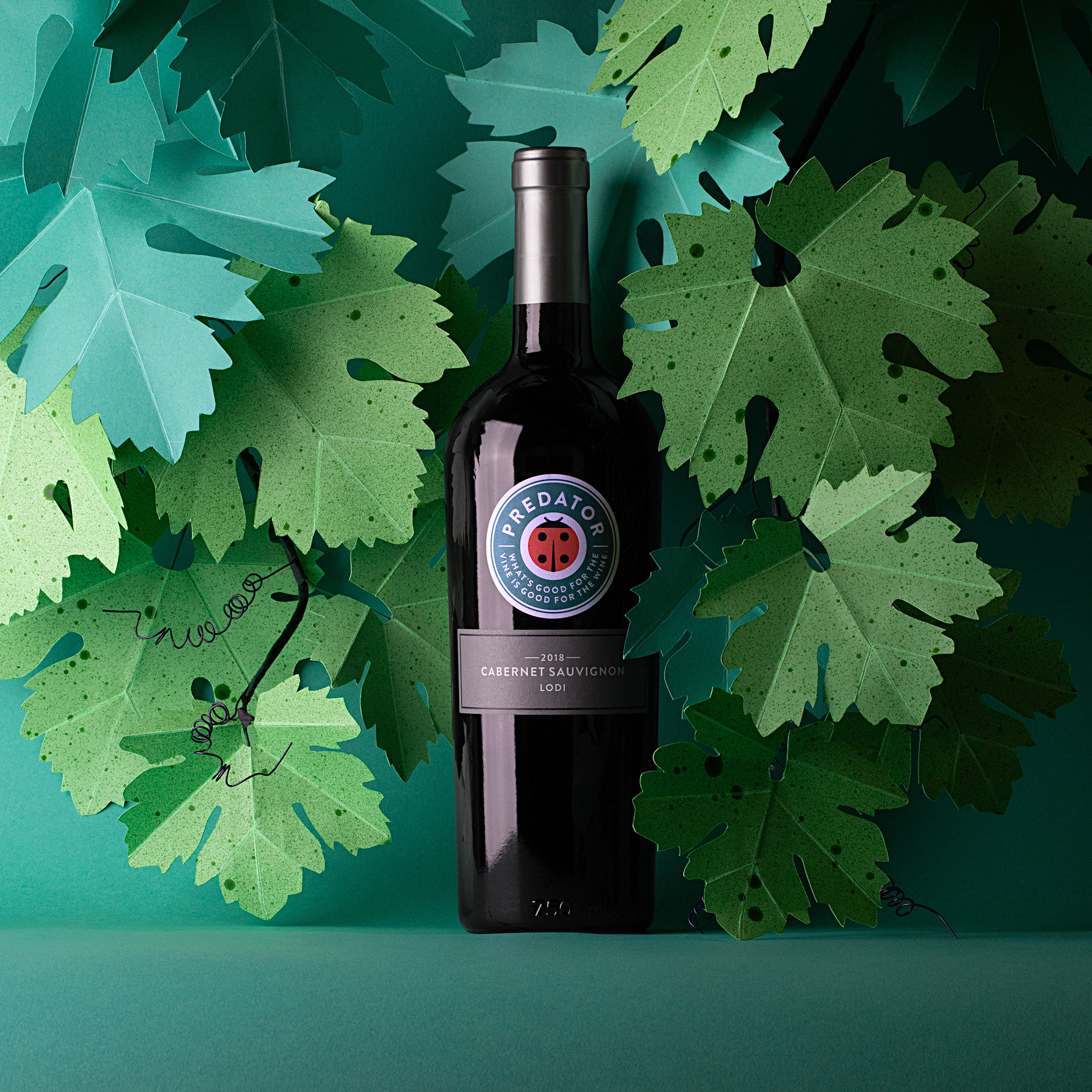
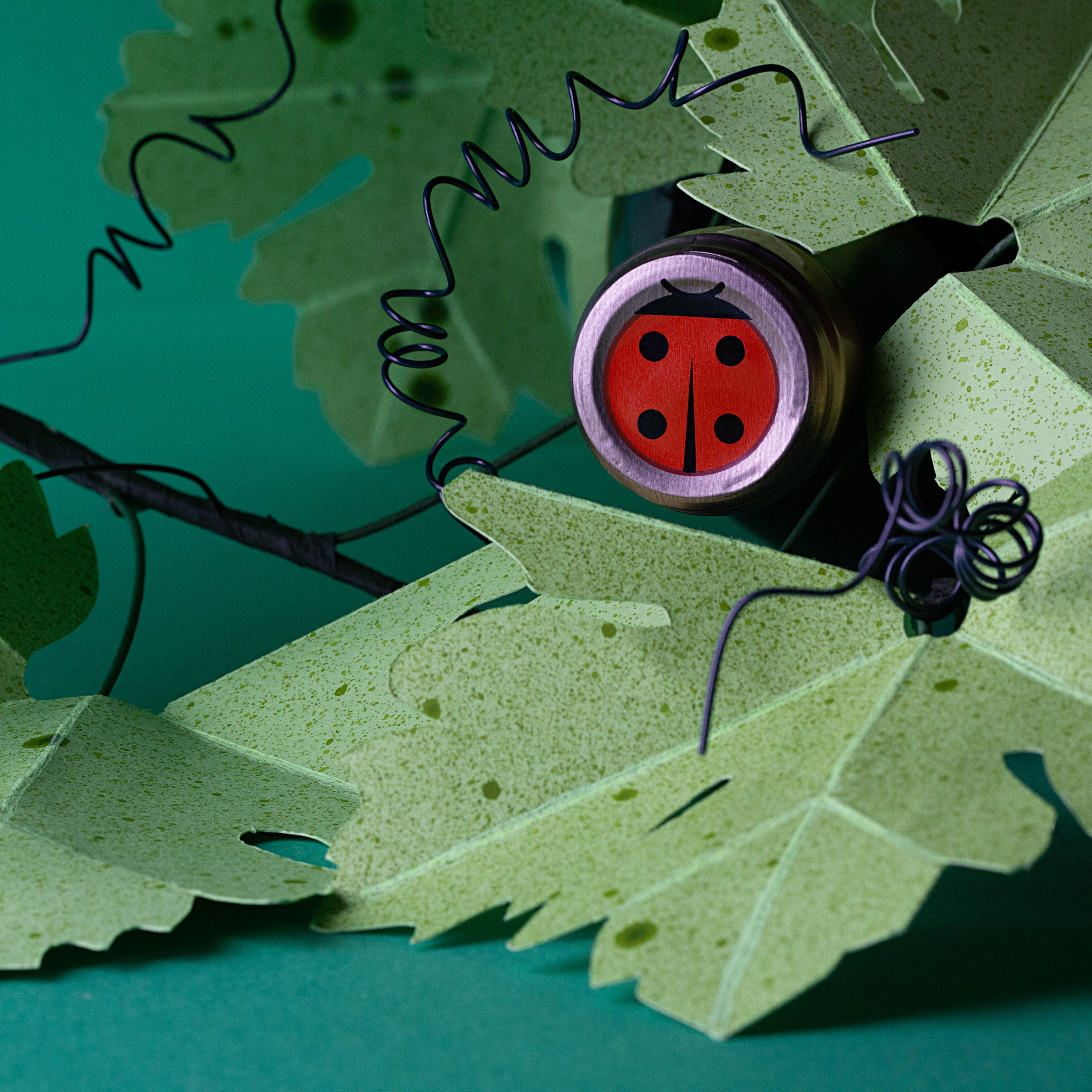
What’s good for the vine is good for the wine. The star of our rebrand of Predator Wines is the ladybug—best known for feeding on aphids and other unwanted vineyard pests. They are are employed by many vineyards as a form of “natural predation”—an eco-friendly strategy which aims to avoid the use of pesticides altogether.
“Our goal with the Predator redesign was to depict a viticultural stewardship angle for the brand while showcasing the focus on our natural and sustainable farming practices. It’s our belief that quality wine begins in the vineyard. The new easy-to-read, colorful labels pop off retailer shelves and are a delightful addition to the dinner table.” —Morgan Zaninovich, General Manager of the Rutherford Wine Company.


CREDIT
- Agency/Creative: Force & Form
- Article Title: Predator Wines Re-brand Designed by Force & Form
- Organisation/Entity: Agency, Published Commercial Design
- Project Type: Packaging
- Agency/Creative Country: United States
- Market Region: North America
- Project Deliverables: Brand Refinement, Packaging Design, Photography, Rebranding, Tone of Voice
- Format: Bottle
- Substrate: Glass
FEEDBACK
Relevance: Solution/idea in relation to brand, product or service
Implementation: Attention, detailing and finishing of final solution
Presentation: Text, visualisation and quality of the presentation


