


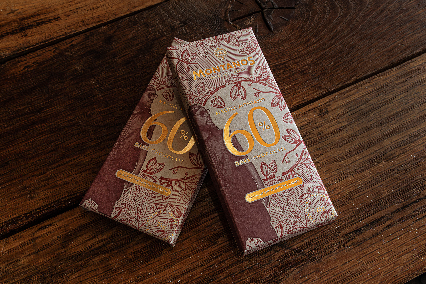
The packaging and identity for the Montanos Chocolate Company were developed in tandem, both drawing their primary reference points from the duality of the main brand ambassador’s public and private personas.
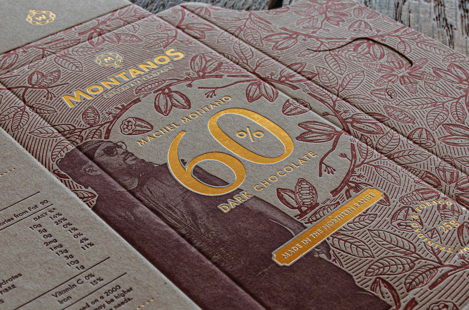
That ambassador, Machel Montano, is a household name across the Caribbean diaspora as a vibrant, charismatic musician and stage performer. In his lesser known private life however, he uses meditation and silent retreat in search of personal growth and internal balance. He spends his down time in the monasteries along the Himalayan ridge, taking great interest in Hindu/Buddhist practices. We used this as a starting point, examining the mandala and its concentric rings, mala beads, and the lotus flower as a symbol of growth and resilience. We then linked these shapes and concepts to our own shores, seeing their reflections in the roots of our Carnival ritual and its costumes, in the rings of our native steel pan, and even in the shapes seen in the cross section of the cocoa pods themselves. Those design cues can be seen not only in the development of the identity, but in brand properties formed by the concentric rings that pull together the illustrations on the exterior of the package. The geometric and organic fusion expressed by these illustrations, was also a nod to the beauty in the organised chaos that can be seen in our Carnival culture. A culture in which Machel is deeply routed and tied to. It also echoes the concept of duality. Duality of the brand’s ambassador, and duality seen in Trinidad’s industrialised infrastructure packaged by our lush and overgrown natural surroundings.
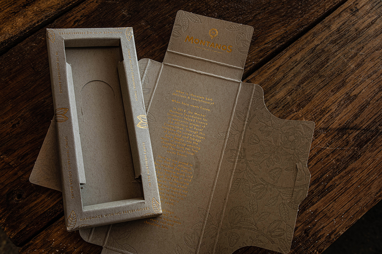
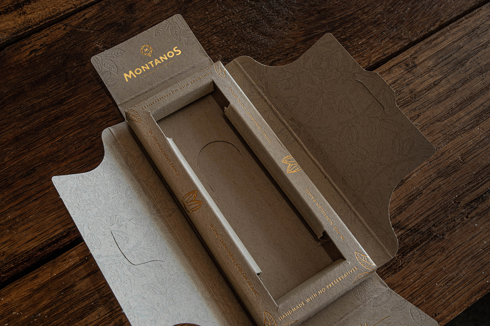
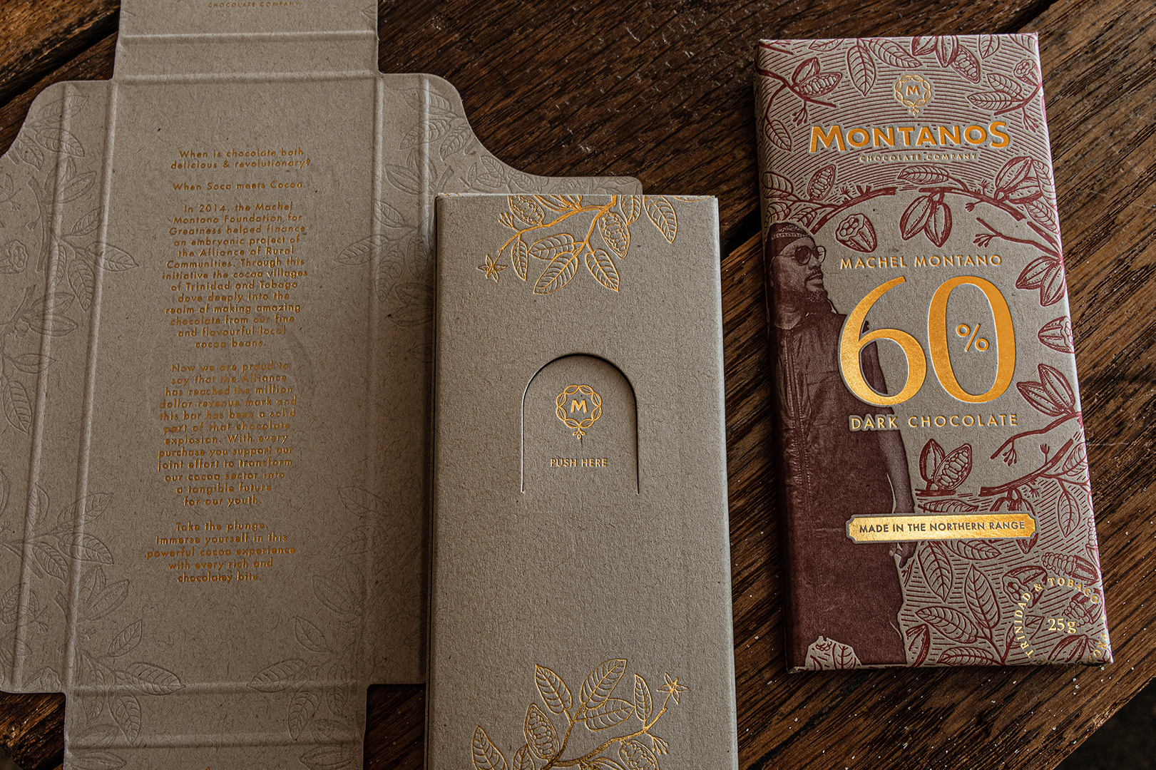
The opening of the box was created to feel like a blooming lotus revealing a hidden treasure. At the centre, a bar of affordable luxury sitting in its own removable tray, which then makes way for the brand story; foil pressed into the centre of a lush, yet geometric tonal pressed forrest of cocoa pods and leaves.
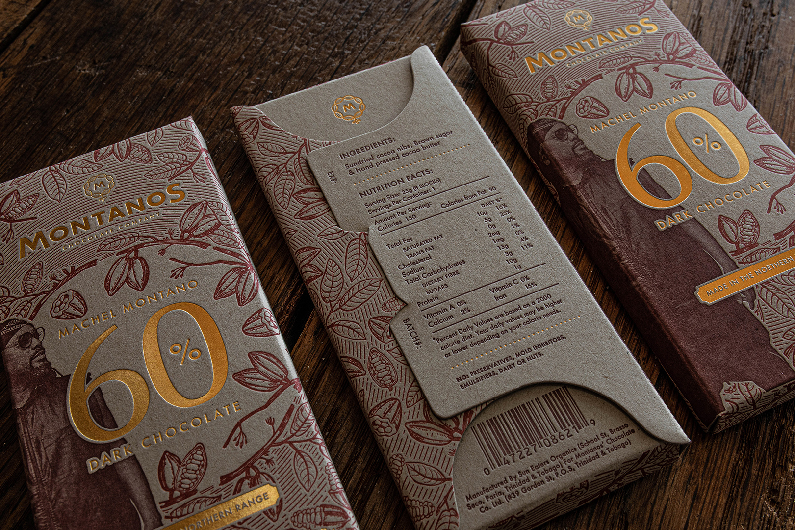
The uncoated, recyclable, kraft finish board was chosen to convey the sustainable practices that went into the making of the product, from bar itself to the package it comes in. The foil pressed elements present a touch of luxury, styled with hints of our colonial past that can be seen in our architecture, ornaments and even our currency. The ink pressed illustrations on the other hand, create a vivid tactile experience that tells the story of our natural surroundings and unique Trinitario bean.
CREDIT
- Agency/Creative: Praktis Design
- Article Title: Praktis Designs New Identity and Packaging for Montanos’ Chocolate Co.
- Organisation/Entity: Agency, Published Commercial Design
- Project Type: Packaging
- Agency/Creative Country: Trinidad and Tobago
- Market Region: Global
- Project Deliverables: Brand Identity, Brand Naming, Graphic Design, Packaging Design, Product Architecture, Research
- Format: Box
- Substrate: Pulp Board


