Goedhuis Waddesdon, a distinguished fine wine company behind the exclusive Rothschild wines, has unveiled its new brand and creative platform, “Pouring with Colour”. It further supports the brand’s peerless position in the world of fine wines, following the integration of Goedhuis & Co, a multi-award-winning fine wine merchant, and Waddesdon Wine of the Rothschild Foundation, the makers of prestigious Domaines Barons de Rothschild Lafite and Edmond de Rothschild Heritage wines.
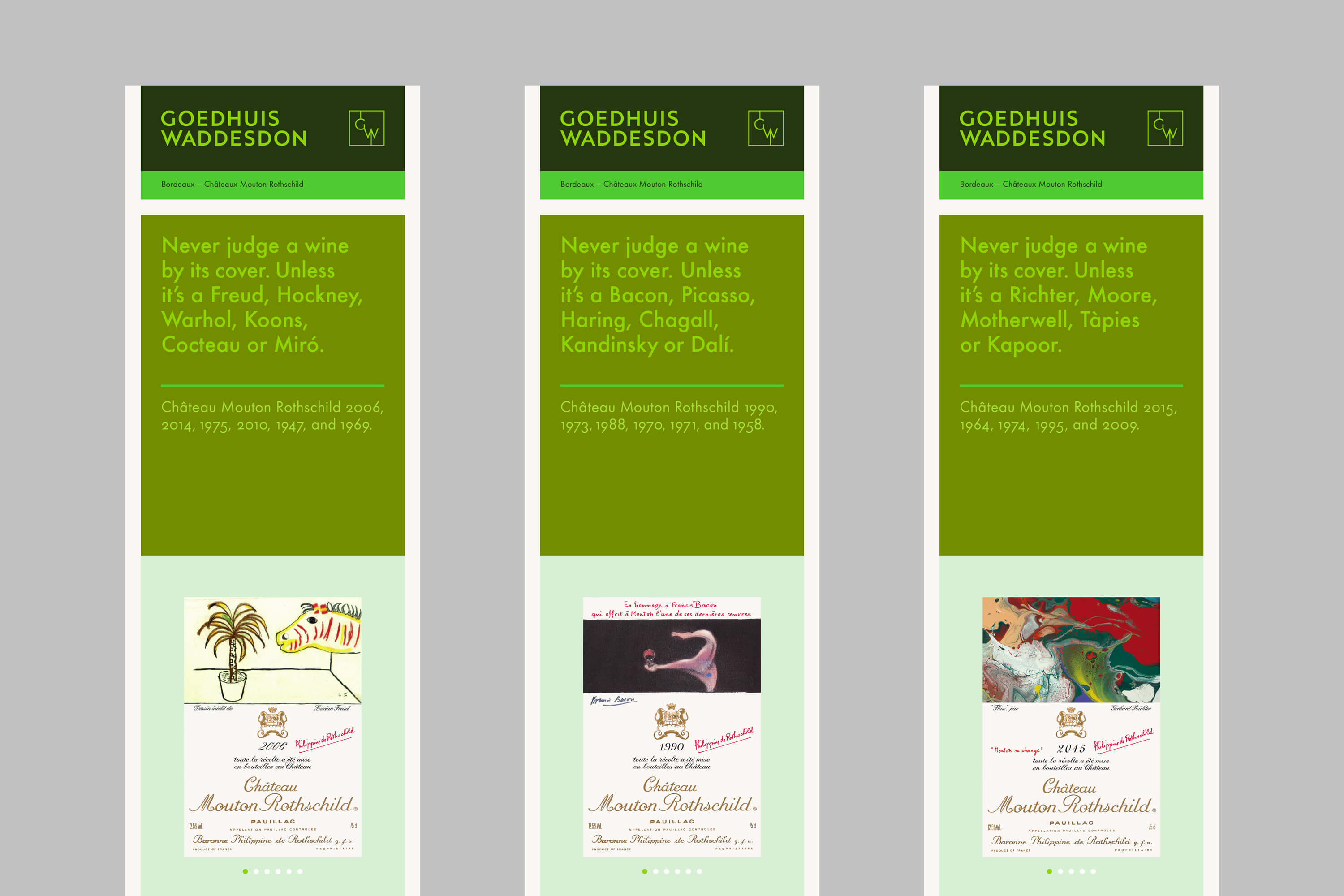
The specialist luxury creative company designed and executed a fresh creative platform and communication framework and a bold brand expression celebrating joy while mirroring the world of fine art filled with colour. In the creative platform, “Pouring with Colour”, the notion of colour captures the experiences of the brand: the landscapes, the grapes, the conversations, adventures, and, most of all, the stories of its people, the wine connoisseurs and winemakers, historical families and the finest vintages and what conspired in their creation. The world of fine art and artists such as Lucian Freud, David Hockney and Andy Warhol. The stories of travels and partnerships that have become generational.
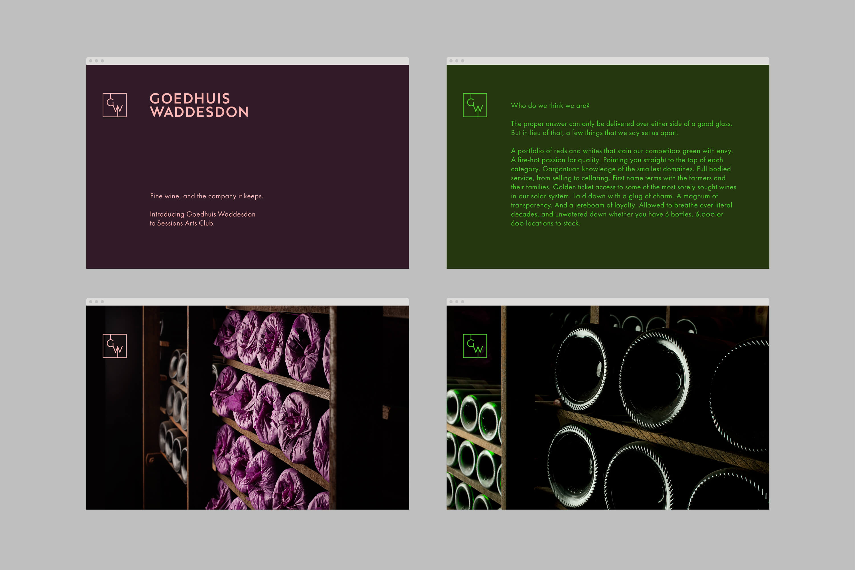
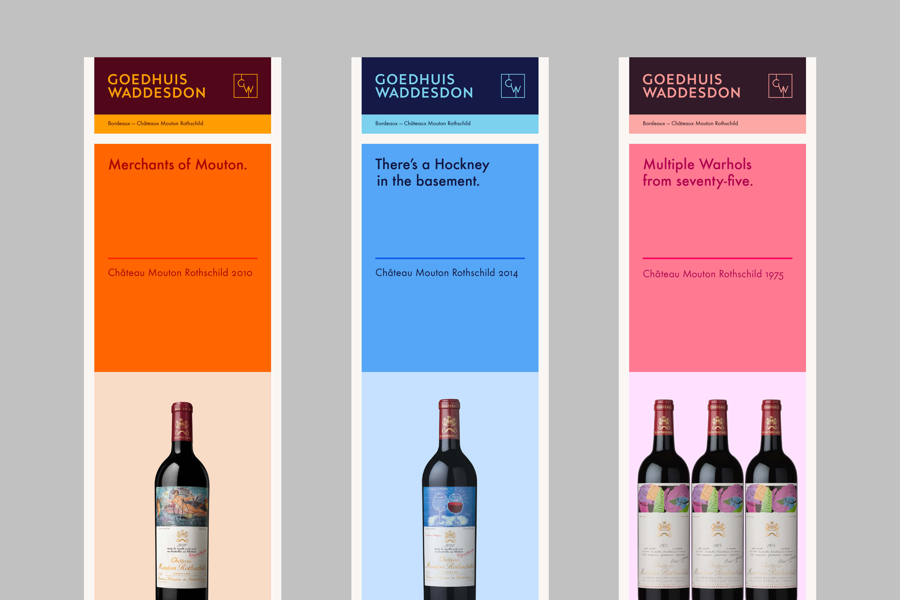
The identity brings the world of colour proudly into centre stage, weaving vibrant threads throughout its finely crafted assets. From the exclusive logotype and word marque to the photography and tone of voice, the total identity creates an approach celebrating the brand’s singular peerless expertise and legacy of fine wine service while inviting the viewer to experience this vibrant world in vivid hues.
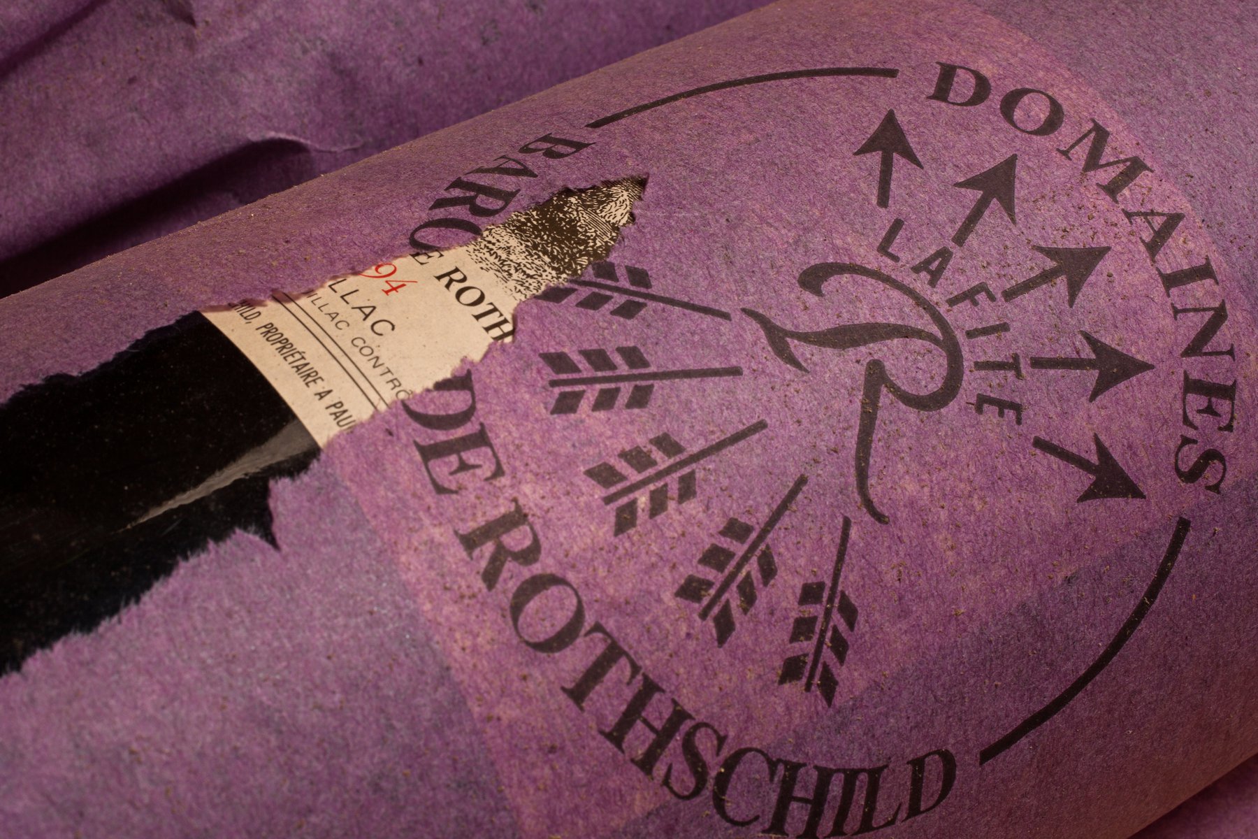
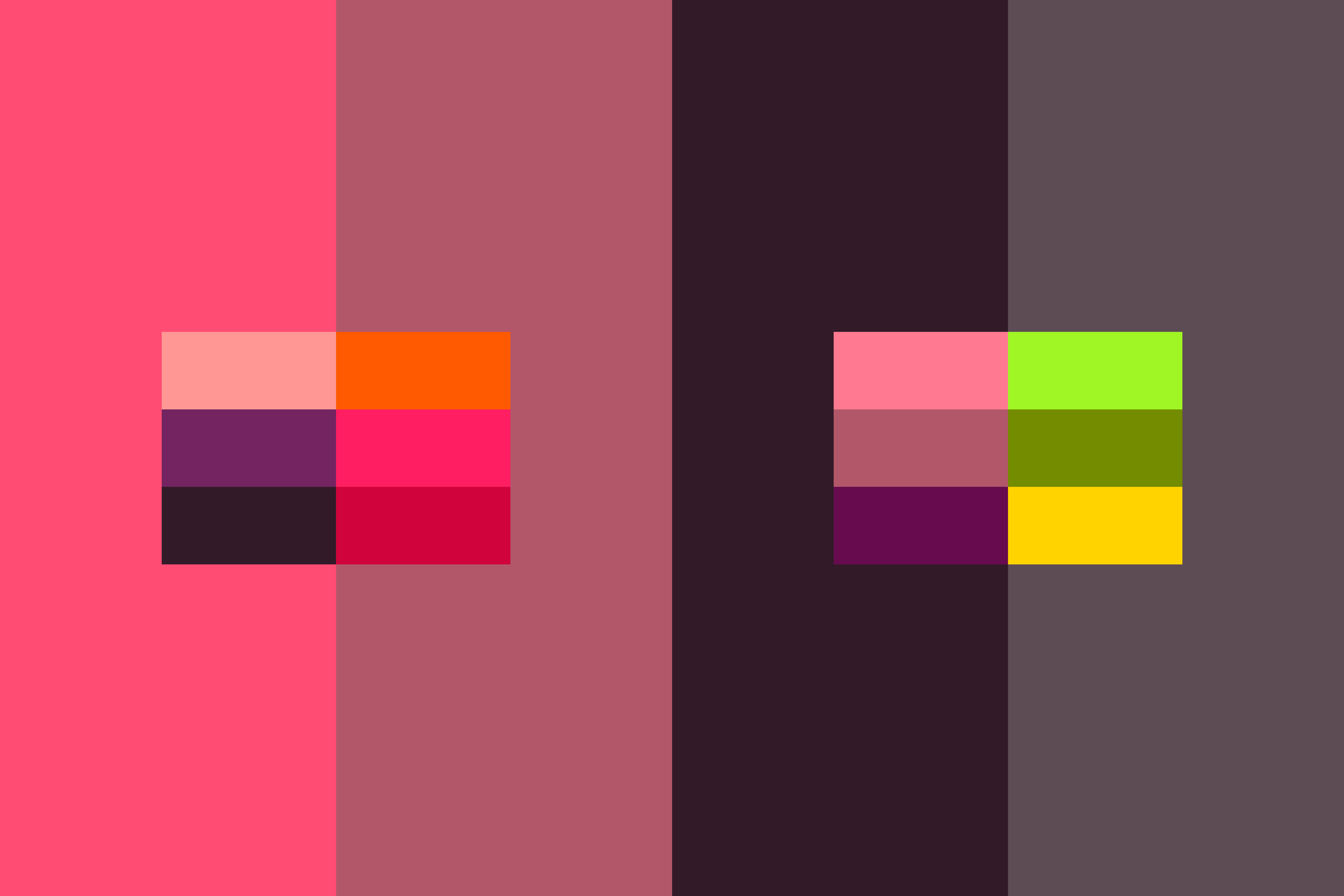
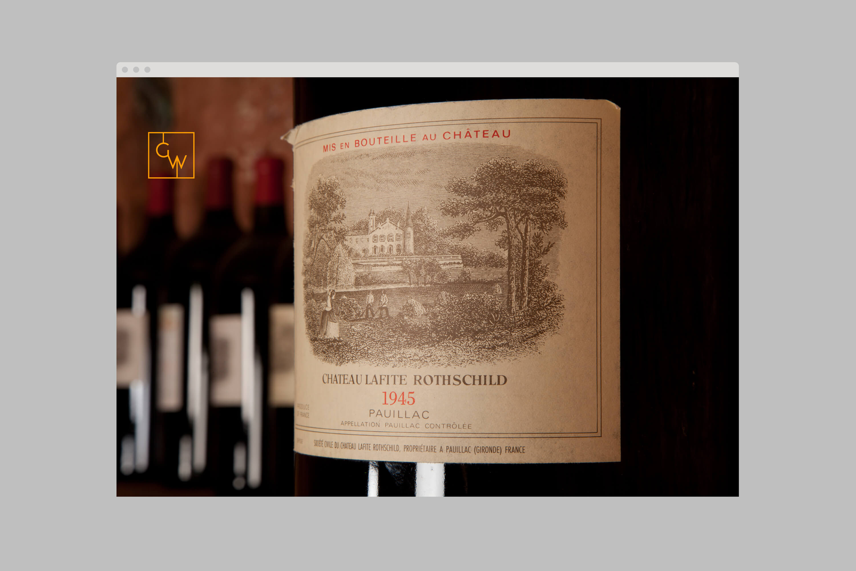
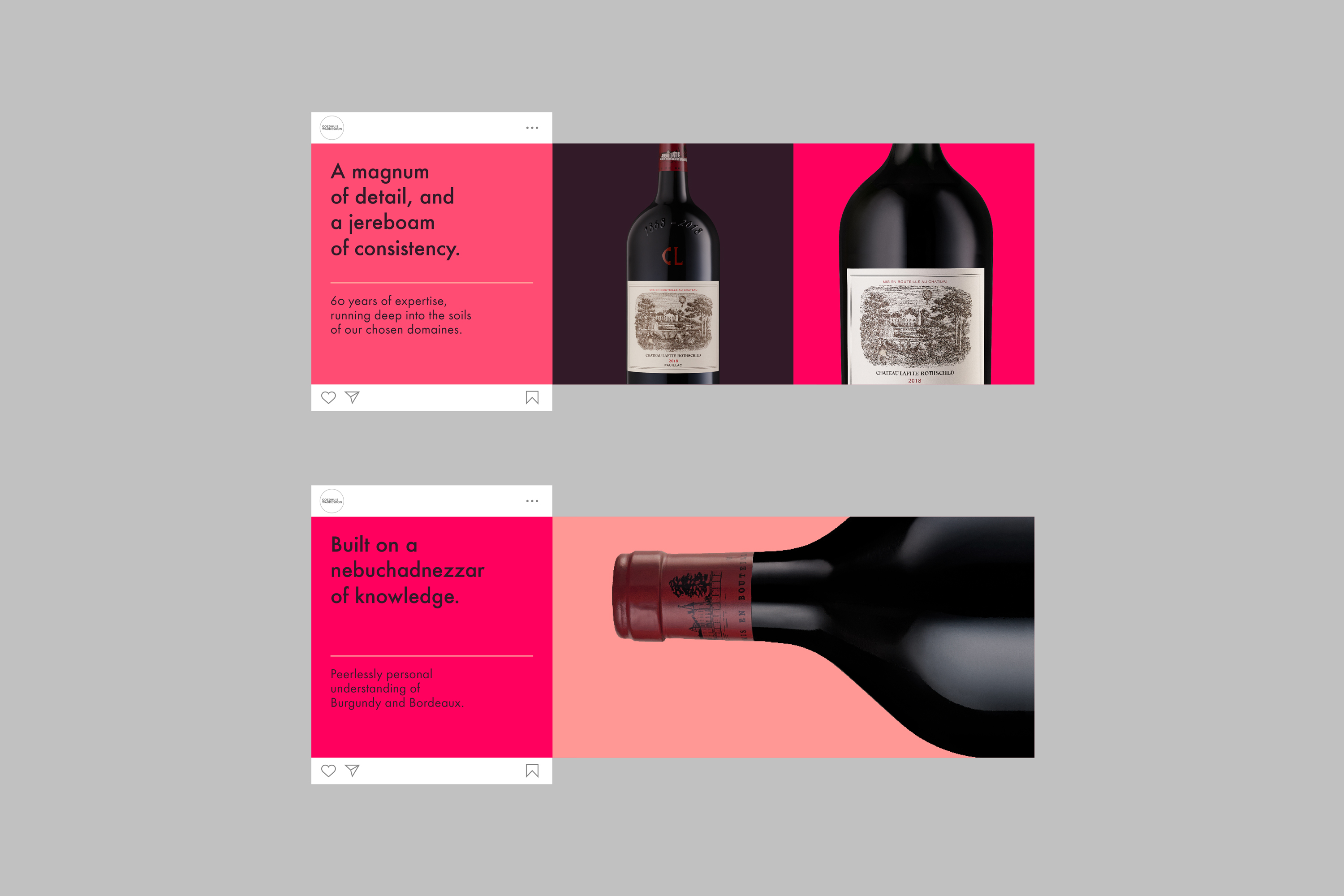
The colour palette pours rich greens, blues, reds, pinks, yellows, and purples, balanced with darker, muted tones. This extends to no less than 40 different colours. Through a multitude of combinations, it creates groupings designed to give the brand an energy that can be harmonious, contrasting, complementary, or surprising. A rich mix that’s distinctive in its breadth. In photography, the art direction and colour create an enriching, enchanting quality, highlighting the brand’s craftsmanship and the stories of its makers in their unique settings—vineyards, cellars, wine-tasting events or other environments—elevating products’ provenance and the connections forged by its people.
The Goedhuis Waddesdon logotype is a piece of bespoke lettering, drawn with a timeless quality in mind. Goedhuis Waddesdon is a long name and the all caps bring a simplicity, restraint and authority to the new entity. And a modernity — something balanced by other motifs that incorporate elements of heritage, its new monogram and brand pattern.
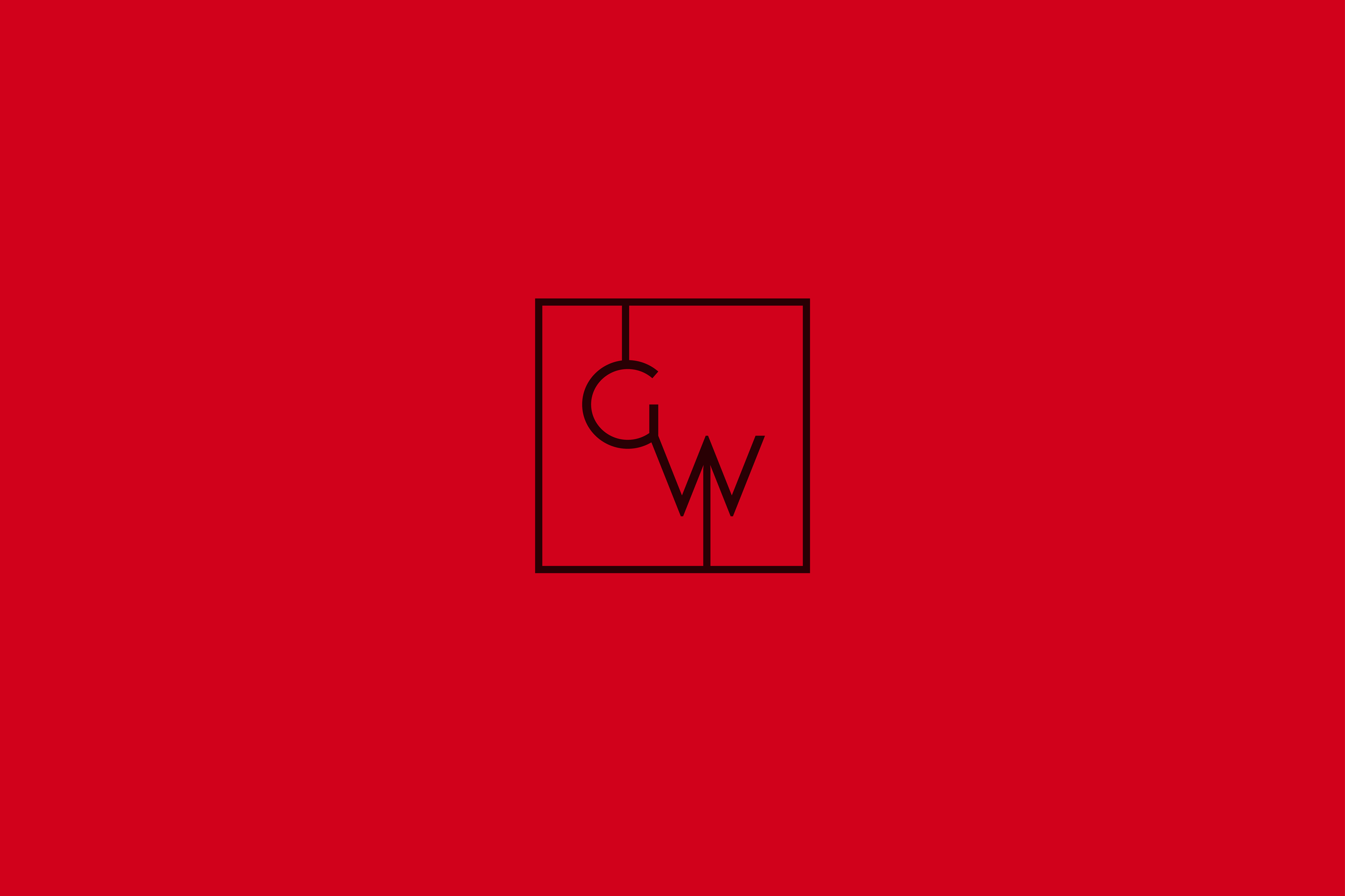
A nod to the Rothschild legacy, the Goedhuis Waddesdon monogram was crafted to combine two initials—“G” and “W”—in a cypher, influenced by the early monograms of French Kings (from 738–1314). These early cyphers and monograms incorporated initials with distinctive joining lines in their designs (rather than interlocking letters more typical of an individual’s monogram). Within the monogram’s linking lines, a hidden arrow is incorporated as a subtle reference to Rothschild’s Five Arrows family symbol (with the UK arm of the family being represented by a single arrow as part of the ‘W’) and as a reference to Goedhuis Waddesdon’s unique relationship with Rothschild Wines. Whilst there is a lock-up relationship between the monogram and logotype, the two elements are also used with flexibility across implementation.
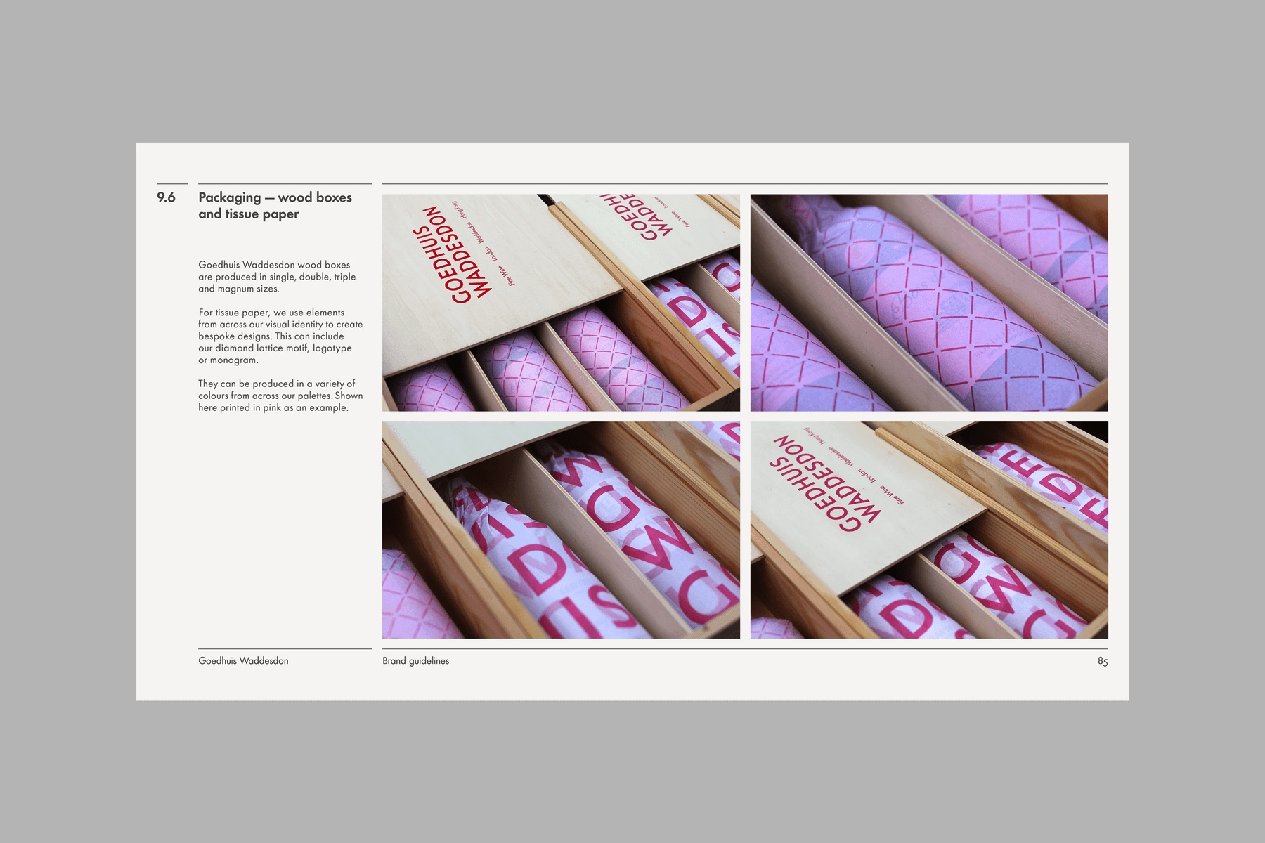
To further highlight the brand’s luxury heritage, the complimentary diamond lattice signature pattern was designed for tactile and digital applications, inspired by the distinctive topiary trained on the walls of Waddesdon Manor, an English home of The Rothschild Foundation.
An engaging tone of voice was developed for the approach to short- and long-form copy, designed to dramatise and bring additional richness of colour to Goedhuis Waddesdon’s communications. This includes emotive headlines such as “There is a Hockney in the basement,” which highlights the investment value of Chateau Mouton Rothschild 2014, or a call to “Treat other people’s treasure as you’d like them to treat your own,” which showcases the brand’s wine portfolio expertise.
CREDIT
- Agency/Creative: Martin Brown Design
- Article Title: “Pouring with Colour”: a New Brand and Creative Platform for Goedhuis Waddesdon, a Fine Wine Company Behind the Exclusive Rothschild Wines by Martin Brown Design
- Organisation/Entity: Agency
- Project Type: Graphic
- Project Status: Published
- Agency/Creative Country: United Kingdom
- Agency/Creative City: London
- Market Region: Europe
- Project Deliverables: Advertising, Art Direction, Brand Creation, Brand Design, Brand Mark
- Industry: Food/Beverage
- Keywords: Rothschild Wines, Design, Communications
-
Credits:
Creative Director: Martin Brown
Writer: Tom Tytherleigh


