


ThinkBoldStudio – OPO wine Spritzer
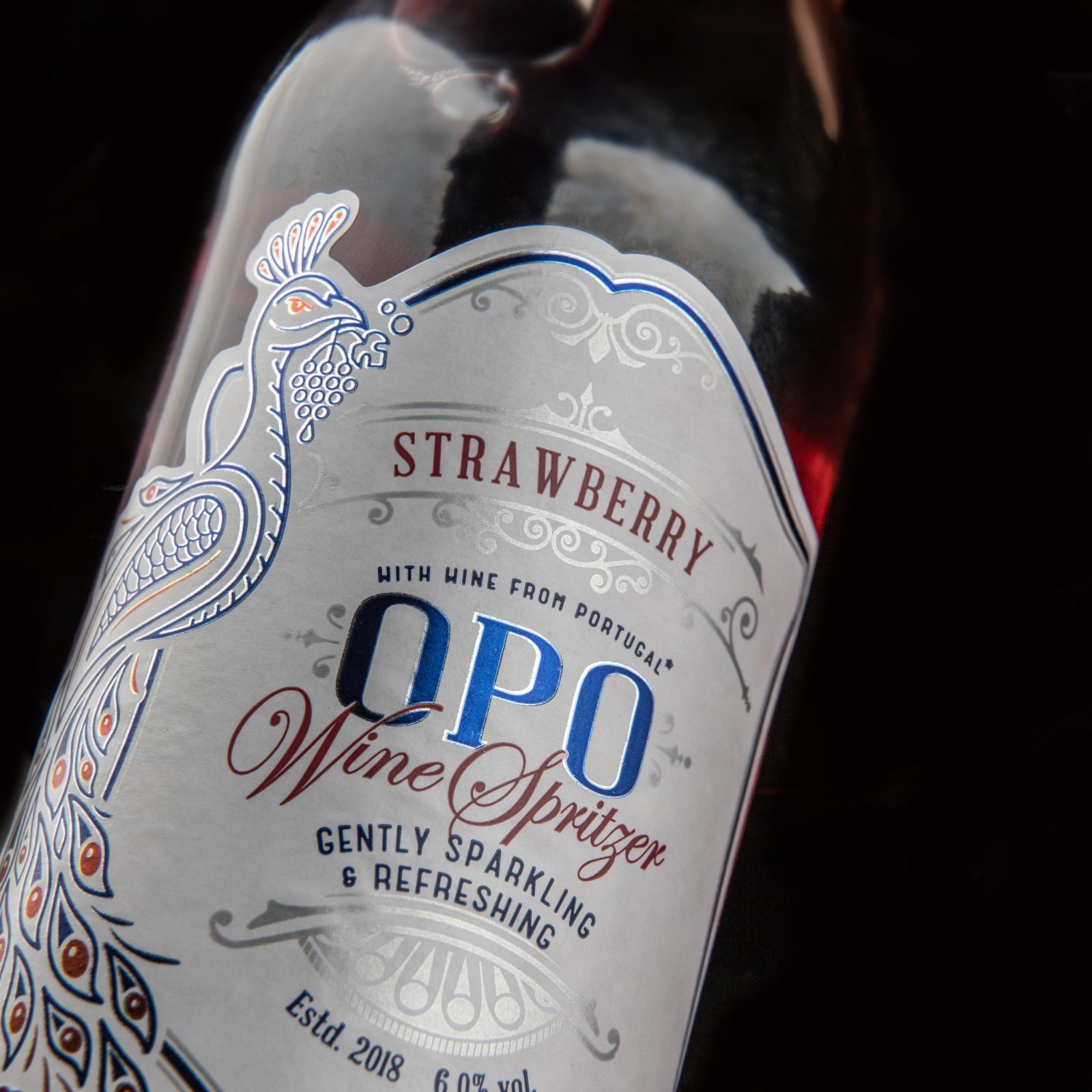
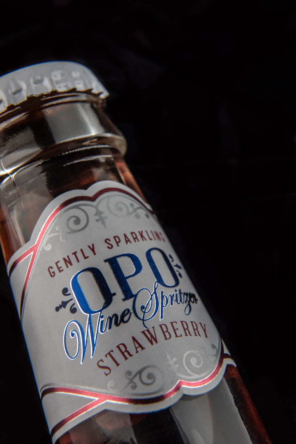
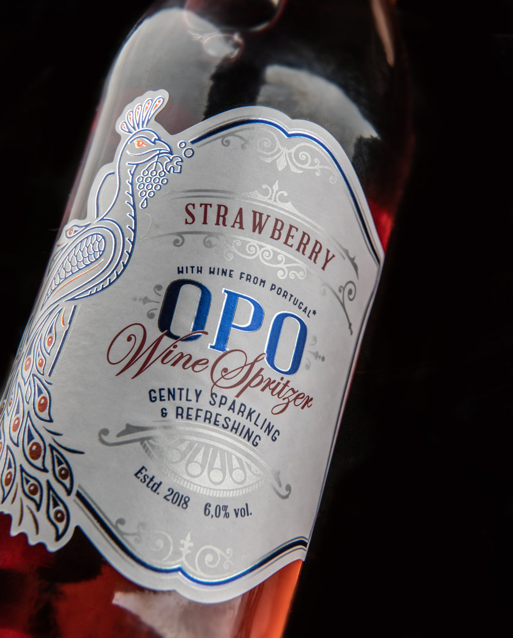
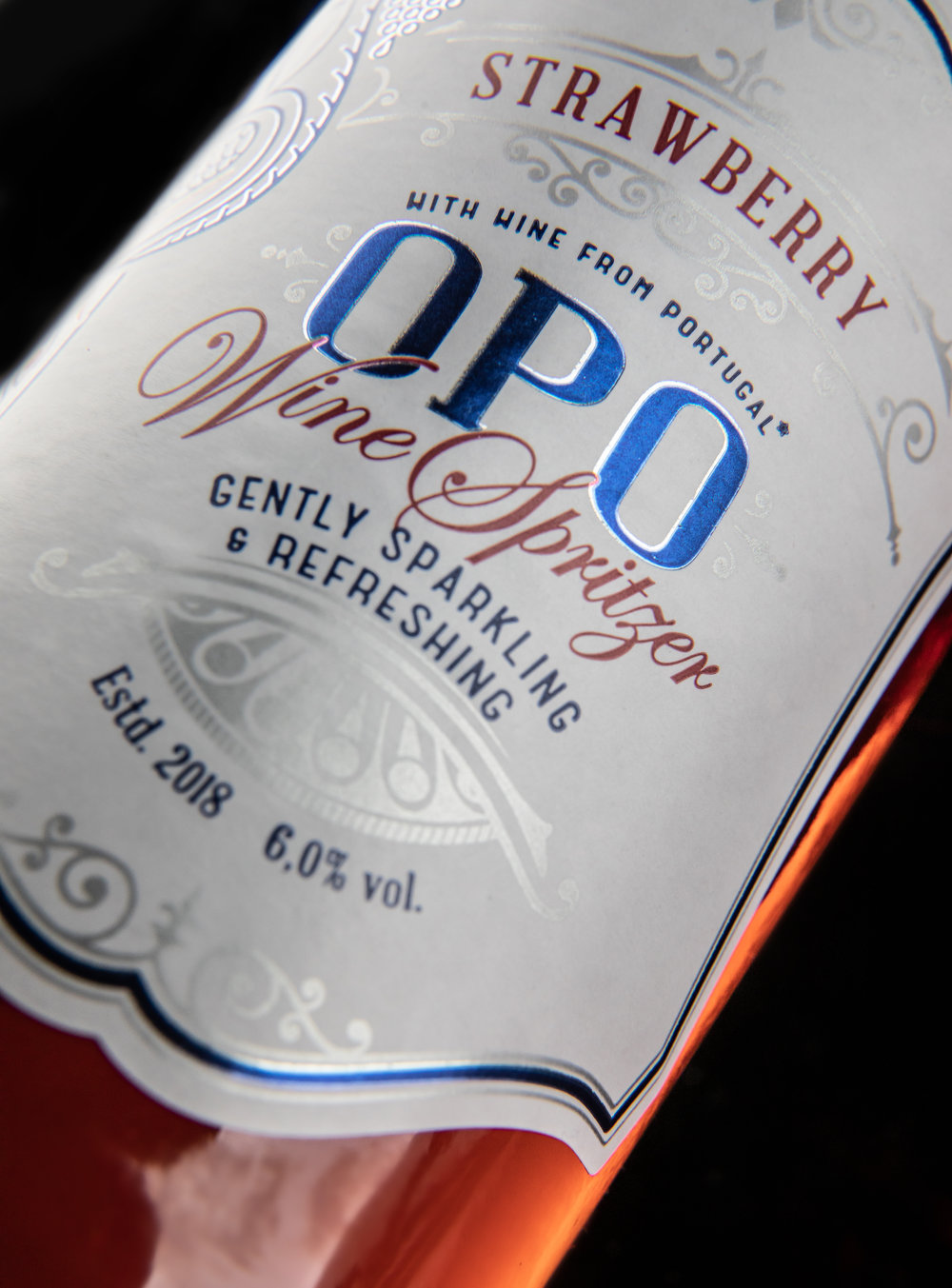
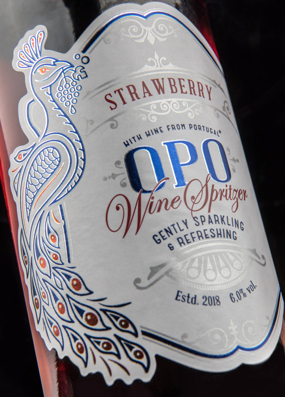
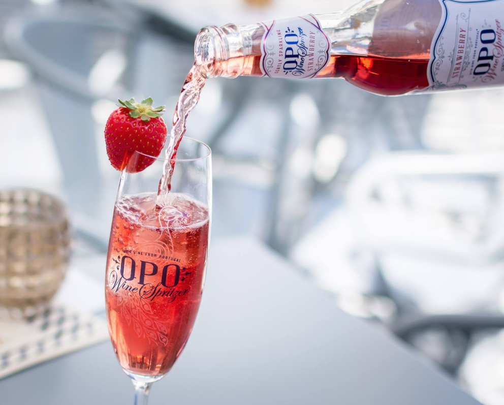
“ In early 2018 a new product was introduced to the Portuguese market, a Portuguese white wine infused with natural fruit extracts, and it´s sparkling 😉
The inspiration for the Branding and label design for OPO Wine Spritzer was the city of Oporto, famous for the ornaments of the wrought Iron Balconies and a traditional charm, these were the key inspiration for the design. The peacock is a symbol of the city park, colorful, vibrant and charming, it resonates with the brand values and gives a fresh look to the overall design.”

CREDIT
- Agency/Creative: ThinkBoldStudio
- Article Title: Portuguese Packaging Design and Branding for Wine Spritzer
- Organisation/Entity: Agency Commercial, Published
- Project Type: Packaging
- Agency/Creative Country: Portugal
- Market Region: Europe
- Format: Bottle
- Substrate: Glass, Pulp Paper
FEEDBACK
Relevance: Solution/idea in relation to brand, product or service
Implementation: Attention, detailing and finishing of final solution
Presentation: Text, visualisation and quality of the presentation


