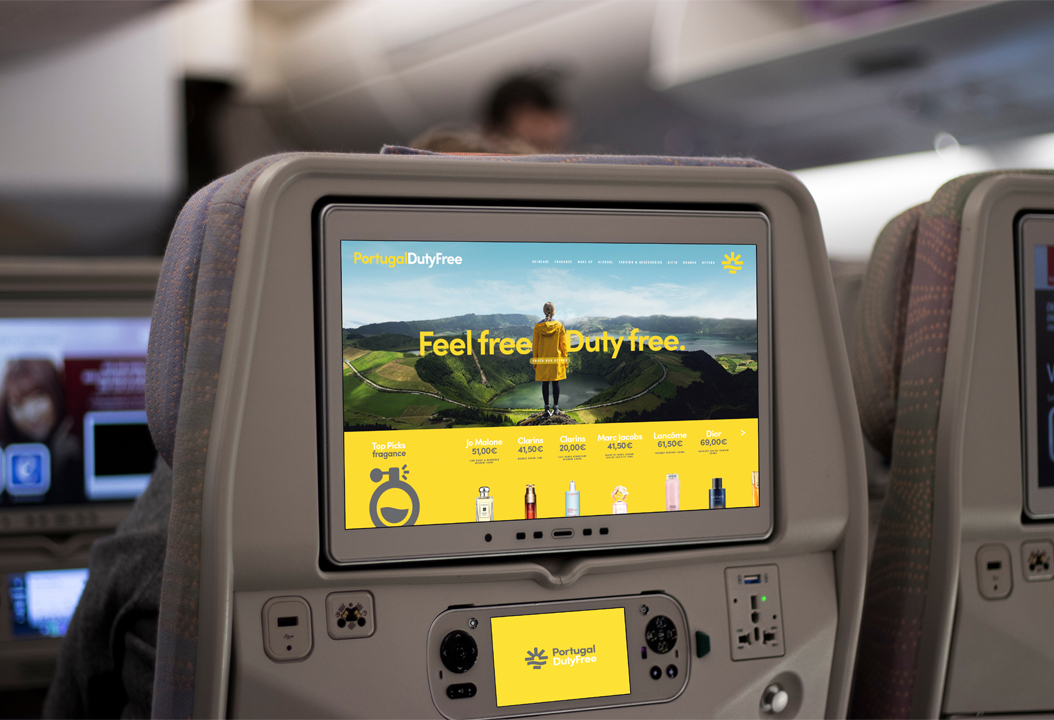
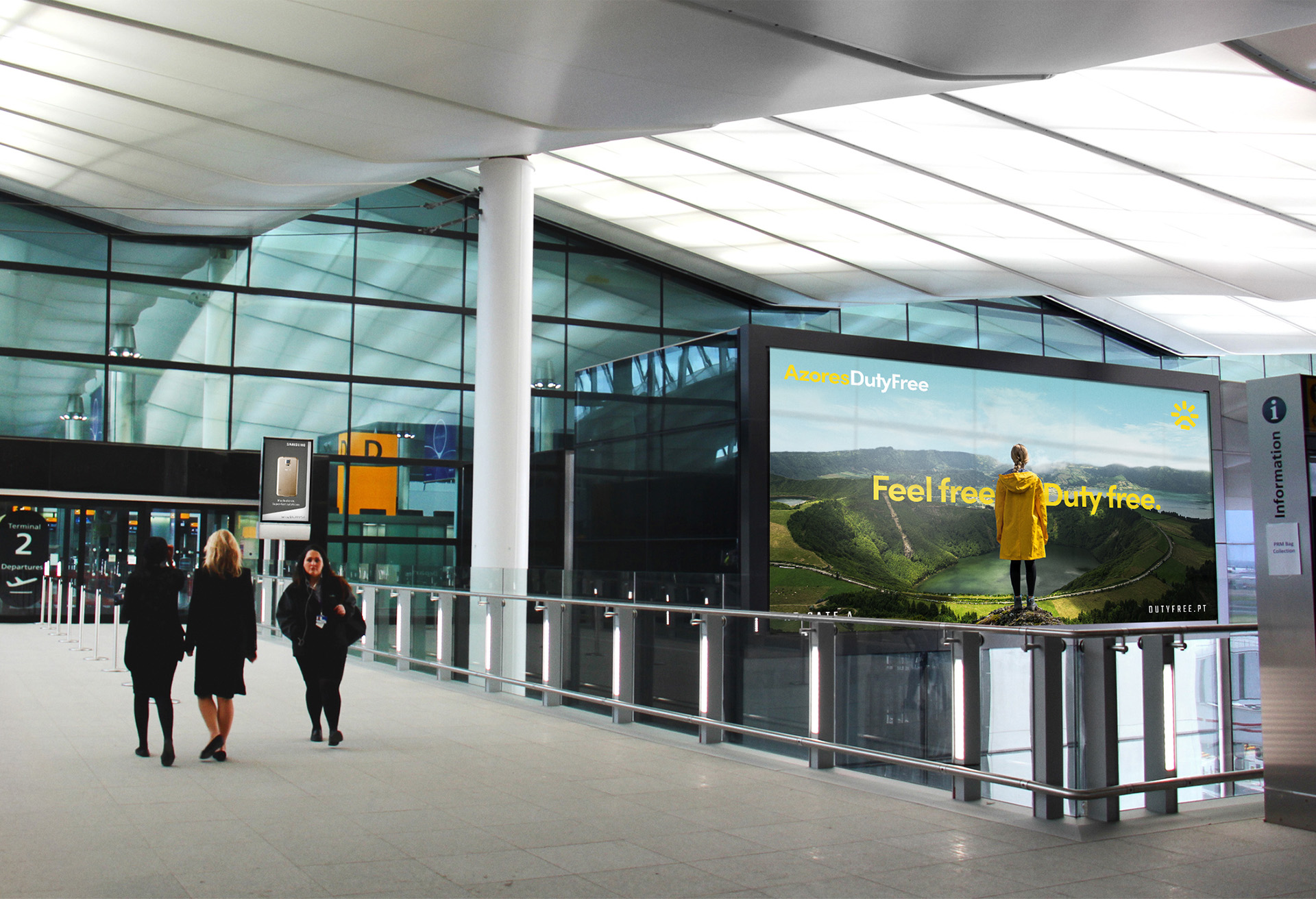
In a partnership with ANA Airports and VinciAirports, Aer Rianta International launched Portugal DutyFree, a chain of duty free stores spread across portuguese airports. As a brand targeted at tourists who visit the country, Portugal DutyFree aimed to capture the positive feelings and imagery the visitors look for in the country: The bright sun, the vast sea, the beautiful coast. But what can we bring into the brand to make that sun, or that sea specifically portuguese? And how what could we do to make the brand system flexible enough to adapt to each regional case?
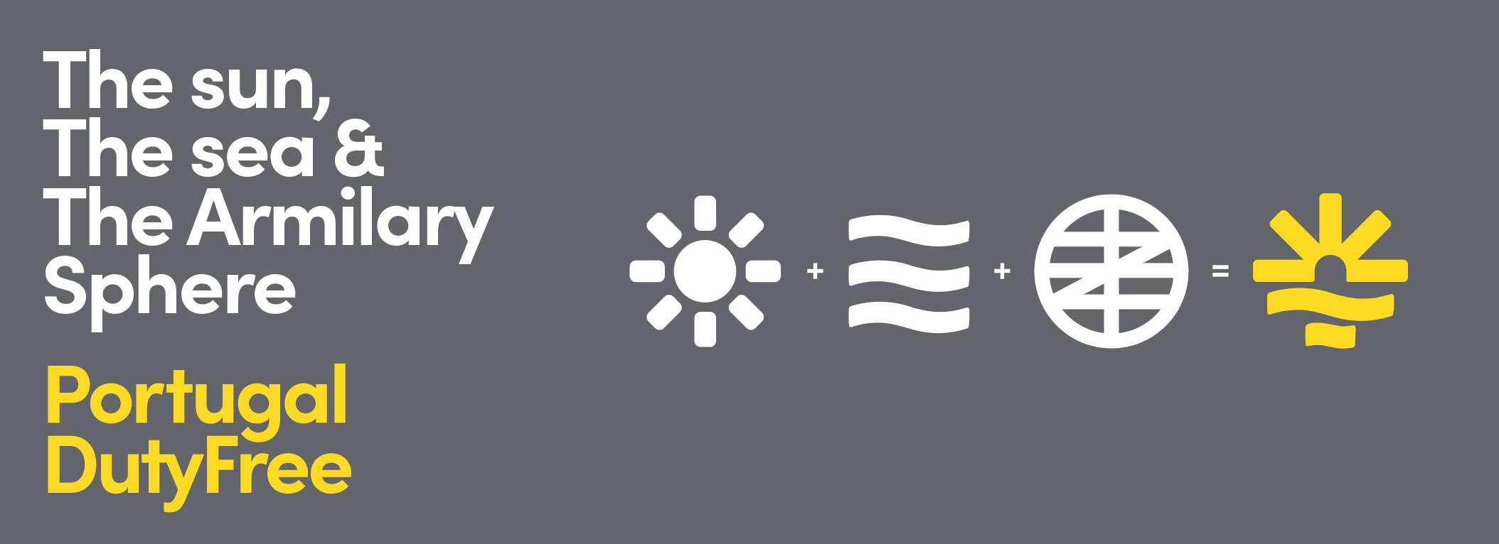
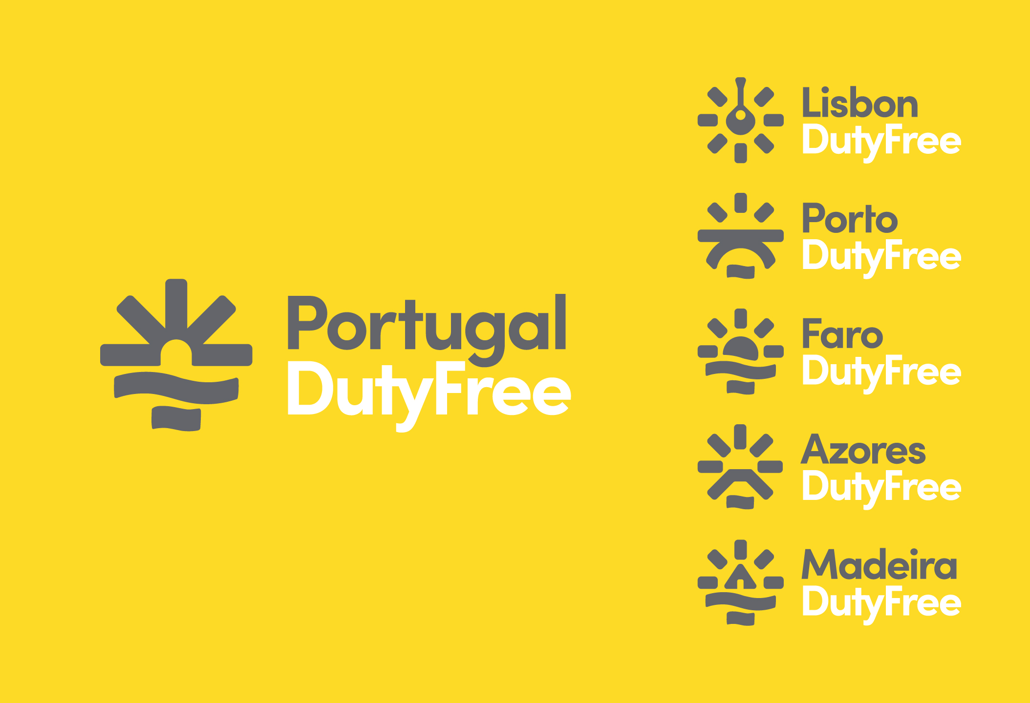
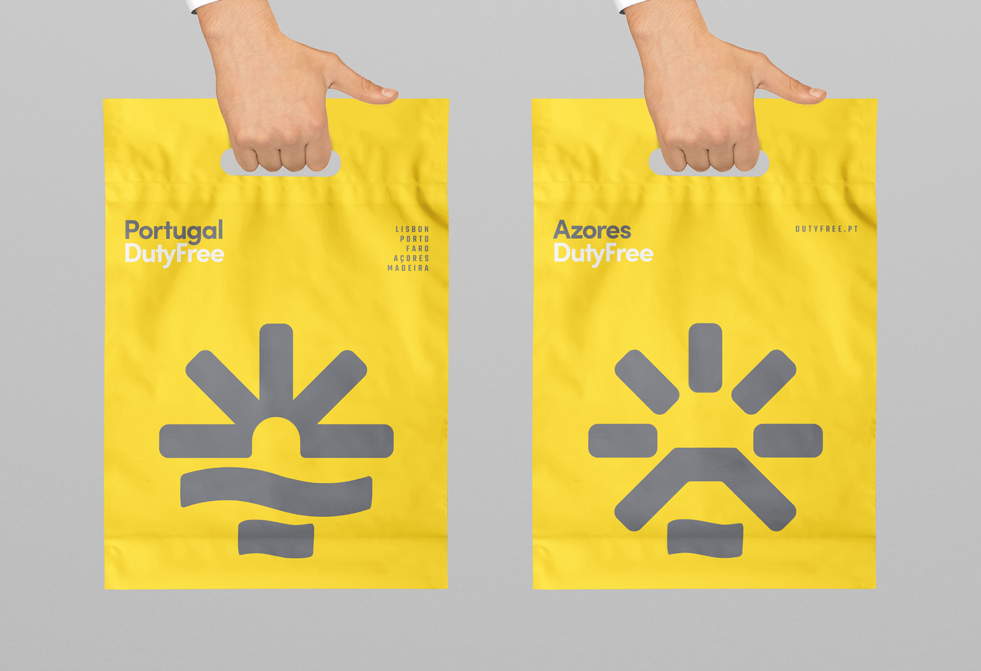
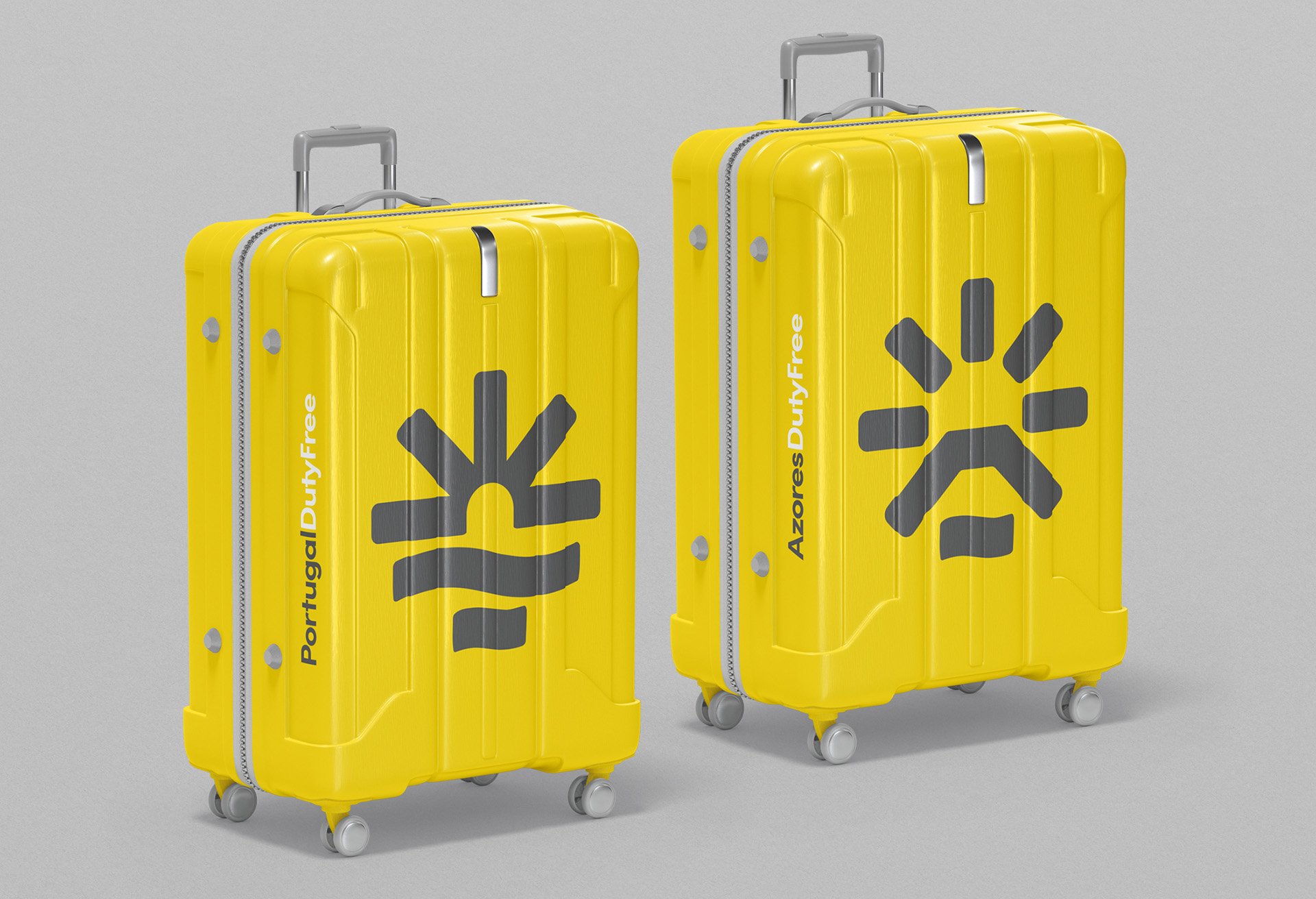
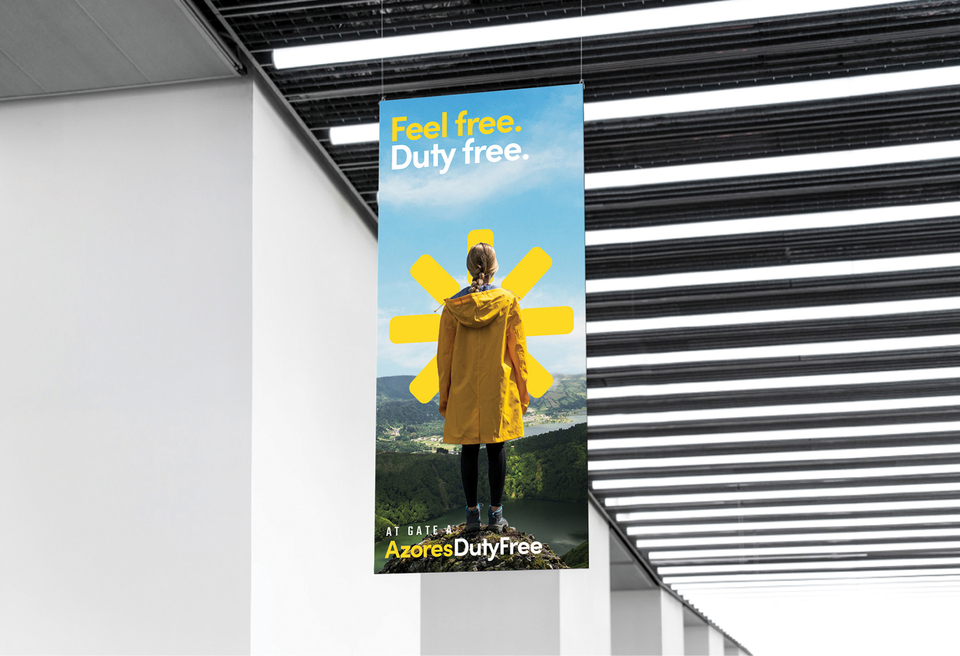
Inspired by the Armillary Sphere, — a symbol of Portugal’s history as a globetrotting, adventurous country — the brand’s main symbol combines the sun and sea in one simple geometric icon, composed of vertical, horizontal and diagonal lines. Besides evoking the historical armillary sphere that lies in the heart of the Portugal’s own flag, this geometrical system allowed Volta Brand Shaping Studio to create regional variations of the logo, specific to each store/location of the brand, while maintaining a coherent brand mood for Portugal DutyFree.
For Lisbon, the portuguese guitar. An eternal symbol of fado, one of Portugal’s greatest traditions with roots in this city.
For Porto, the Luis I Bridge, an iconic construction, located in the most postcard-worthy area of town.
Faro is represented with the Sun Setting over the sea, being the top vacation destination in the country.
The symbol for Azores is the Pico volcano, the highest point in Portugal, and representative of the archipelago’s volcanic origin.
For Madeira, the Santana Houses, picturesque triangular houses believed to be what’s left of some primitive constructions, made of wood and thatch, that spread across the whole island.
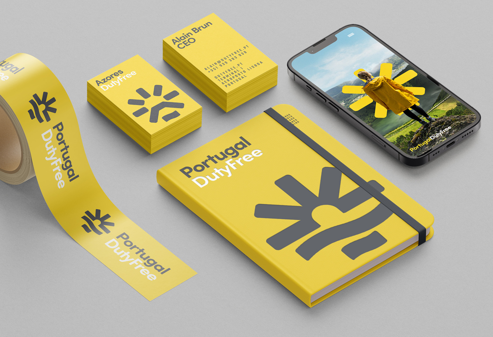
Portugal DutyFree’s brand is vibrant, promising and energetic. The logo is clean, with a clear “Sun and Sea” message, with a modern design rooted in a portuguese symbol — armillary sphere.
In Portugal DutyFree the sun shines inside the airport.

CREDIT
- Agency/Creative: Volta Brand Shaping Studio
- Article Title: Portugal DutyFree Brand Design by Volta Brand Shaping Studio
- Organisation/Entity: Agency
- Project Type: Identity
- Project Status: Published
- Agency/Creative Country: Portugal
- Agency/Creative City: Porto
- Market Region: Europe
- Project Deliverables: Brand Architecture, Brand Design, Brand Identity, Branding, Icon Design, Identity System, Logo Design
- Industry: Retail
- Keywords: Airport, Dutyfree, Portugal, Branding,
-
Credits:
Creative Director: Pedro Vareta
Project Manager: Lourenço Neves
Designer: Rui Magalhães


